

Science in the 1002 Area
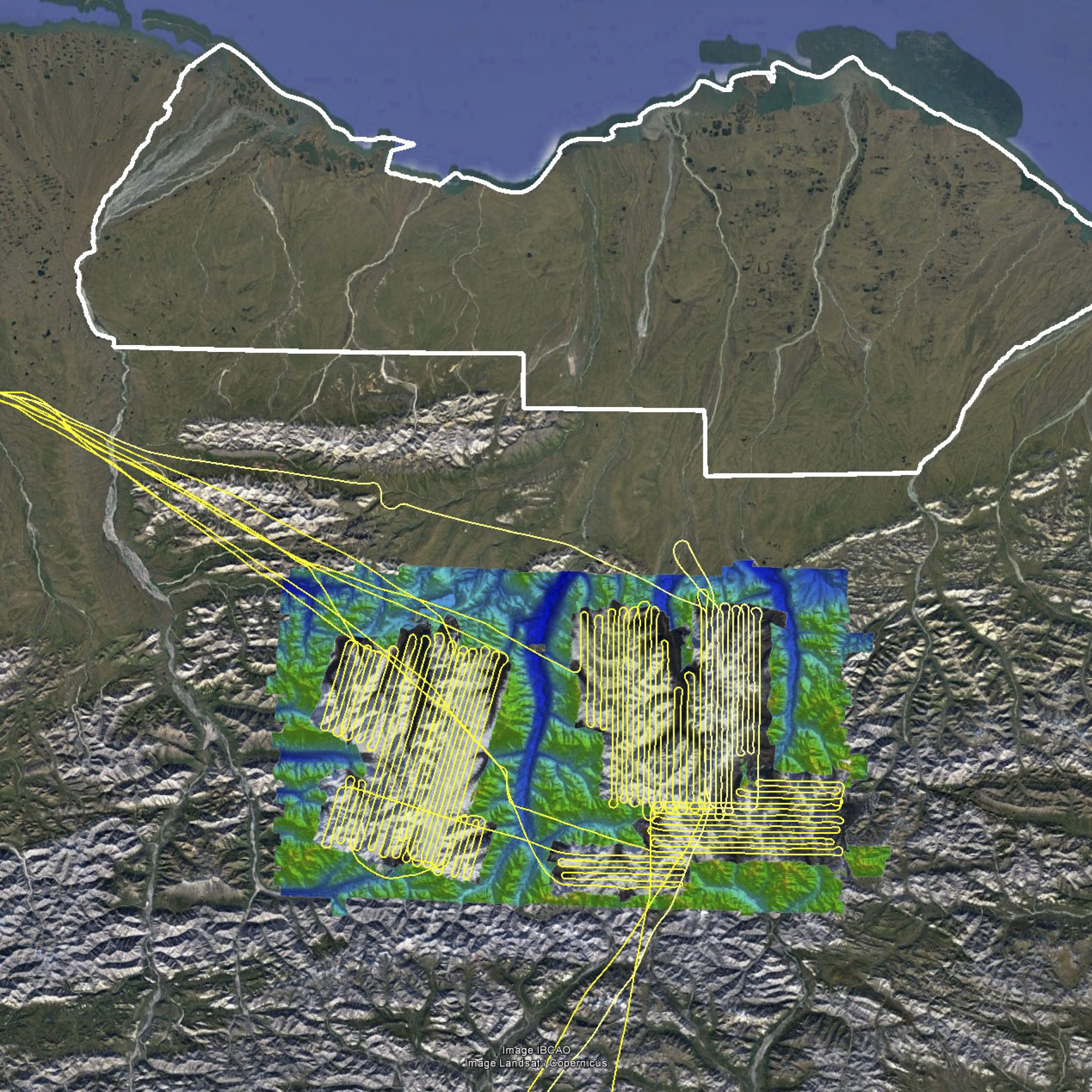
After a successful trip mapping elephant habitats in Botswana at the end of last year, a few weeks ago I began processing my biggest project from last summer, the 1002 Area of the Arctic NWR, focusing first on data I could use to validate the accuracy of the maps — Barter Island, the glaciated Brooks Range, and the Pt Thomson seismic exploration area. The bottom line result is the same as we’ve always found, the repeatibility of these data are in the 10-20 cm range, allowing us to detect changes in topography at the centimeter-level over huge areas. I had no reason to believe it would be otherwise, but it’s always nice to see the data fully processed and confirm that there is nothing funky about it. So that’s one message of this blog — the 1002 Area data I acquired last summer is of the same or better quality as normal and the data quality and analyses I present here are typical of what we should expect throughout the data set. The other message is about the the value of the scientific method here and in our daily lives.
[Note: This post apparently takes a long time to load due to all the imagery, so if you see a lot of text without many images, it means they are still loading. I never made any claims about my wordpress skills…]
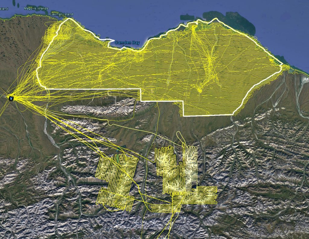
That was a lot of flying last year — the entire 1002 Area plus all of the glaciers draining into it. This blog presents the first of the processed data which indicates that it’s all going to be as awesome as I hoped for.
Barter Island
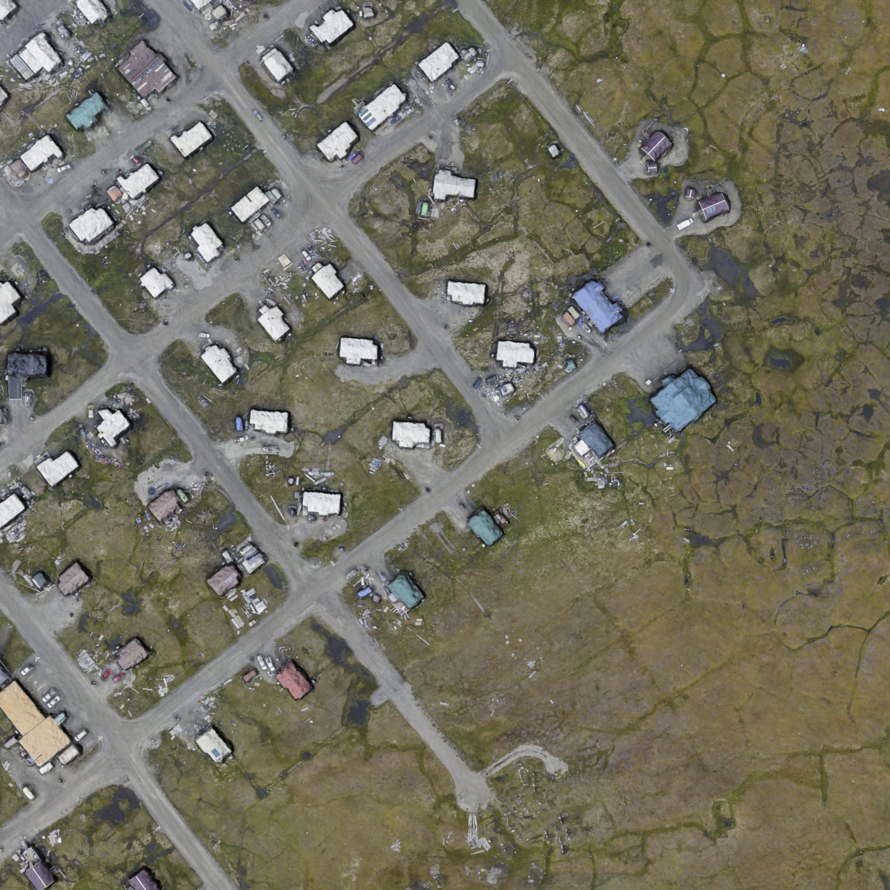
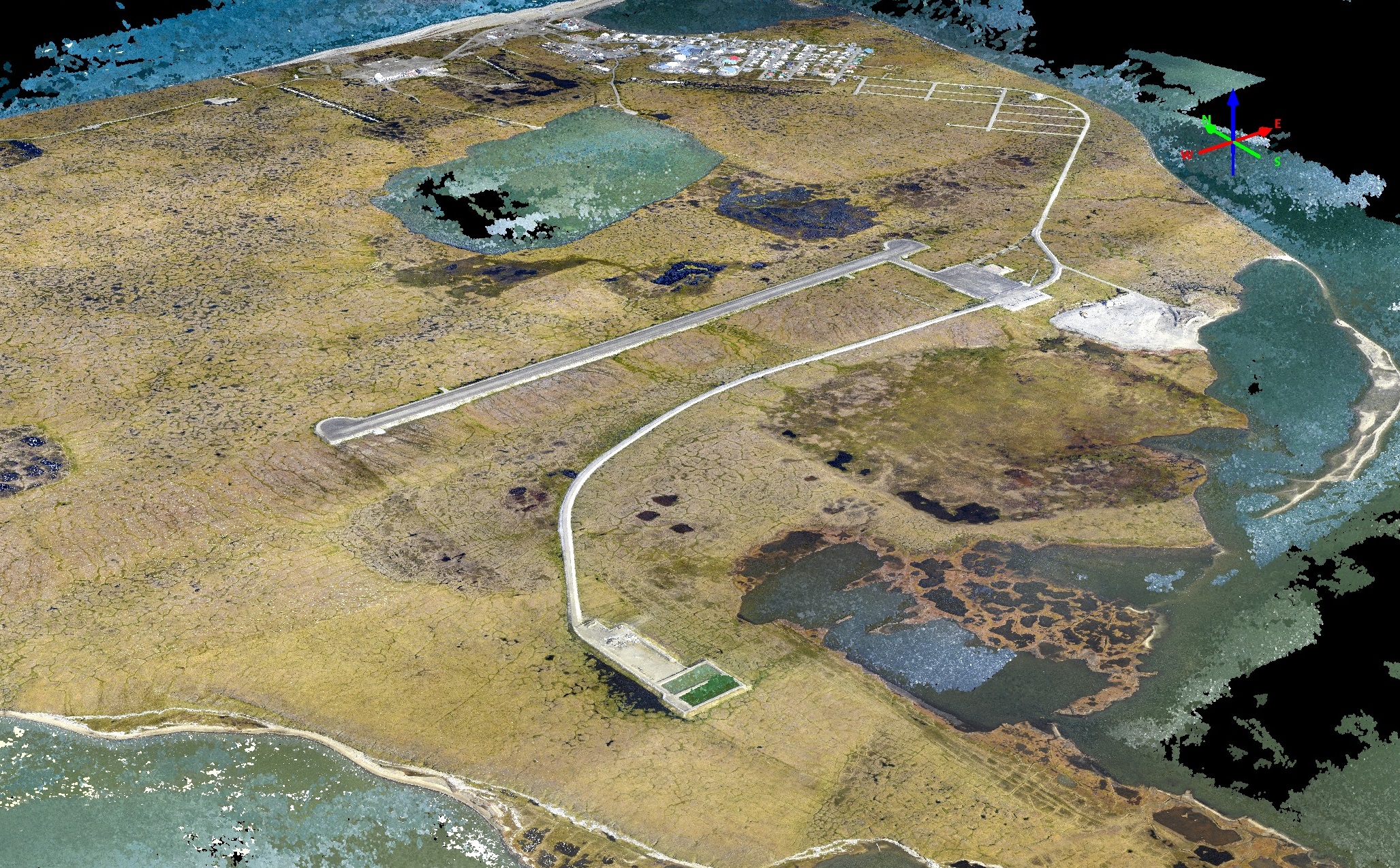
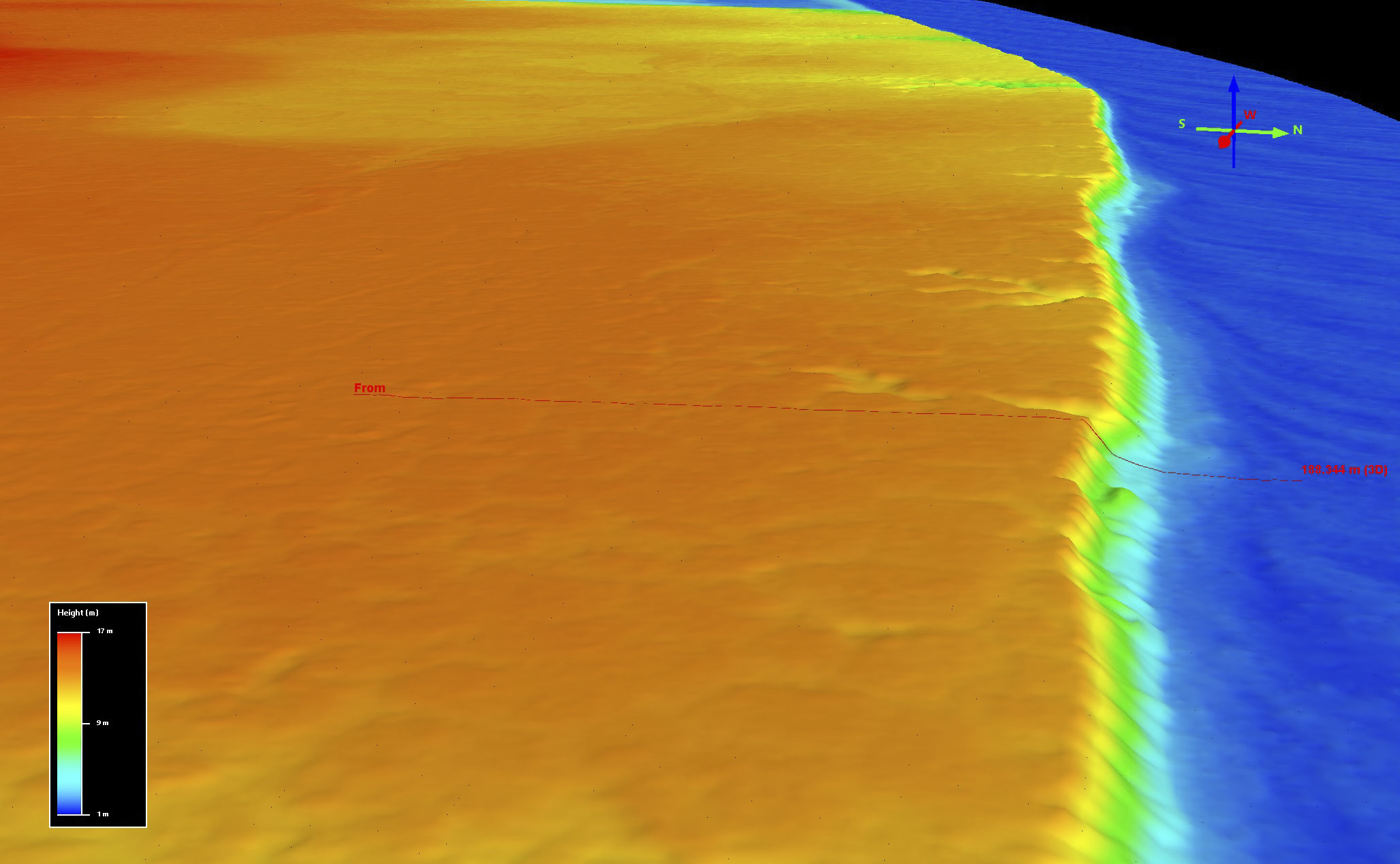
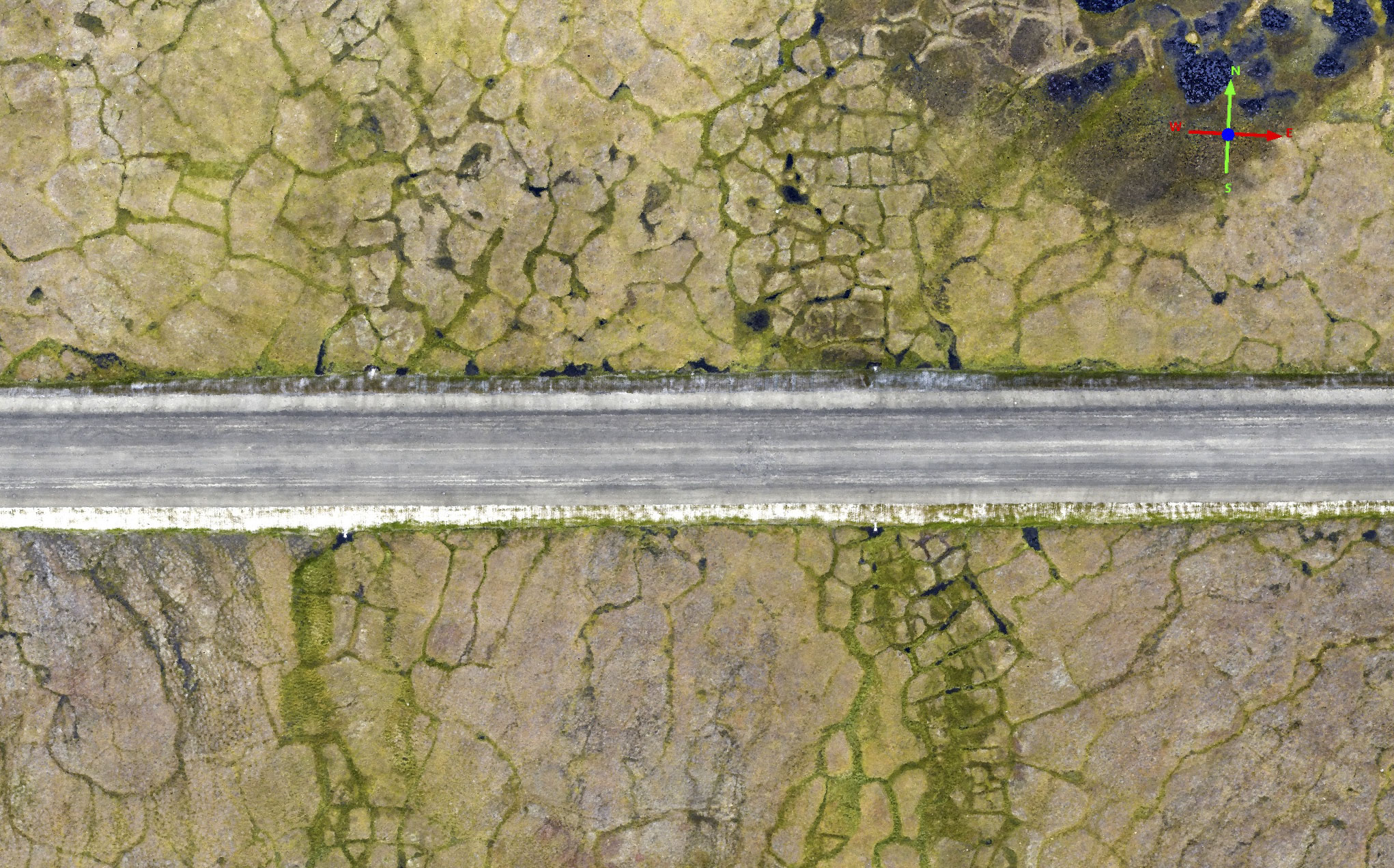
I have spent a lot of time on Barter Island over the years, even living there for a while, and I know it’s features pretty well. The village there is home to about 300 people and was formerly a DEW line site. It’s one the most remote villages in Alaska, 150 miles from the next nearest one. It’s an interesting island in that it is 10-15 meters higher than the much of mainland to the south, possibly even underlain by glacial ice. Whatever its origin, all of the infrastructure there is over some kind of ice that is meters thick, and the absence of sea ice these days is letting waves pound the coasts hard enough to cause erosion at meters per year. But besides my scientific and personal interests there, it’s one of the few locations in the 1002 that has been mapped before by someone other than me at a resolution and accuracy that is useful for validating the accuracy of my data; namely, there is a lidar data set here from 2009.
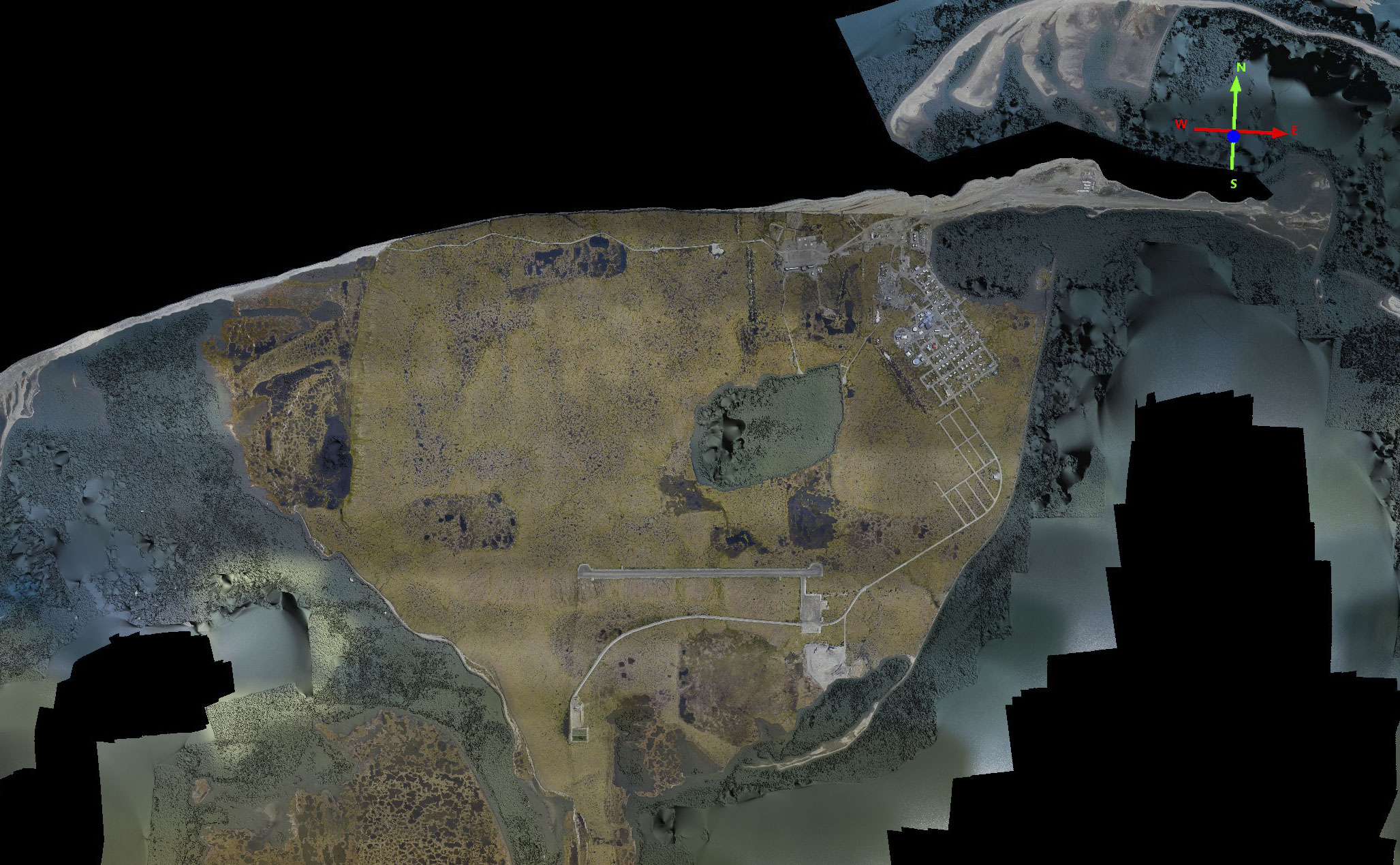
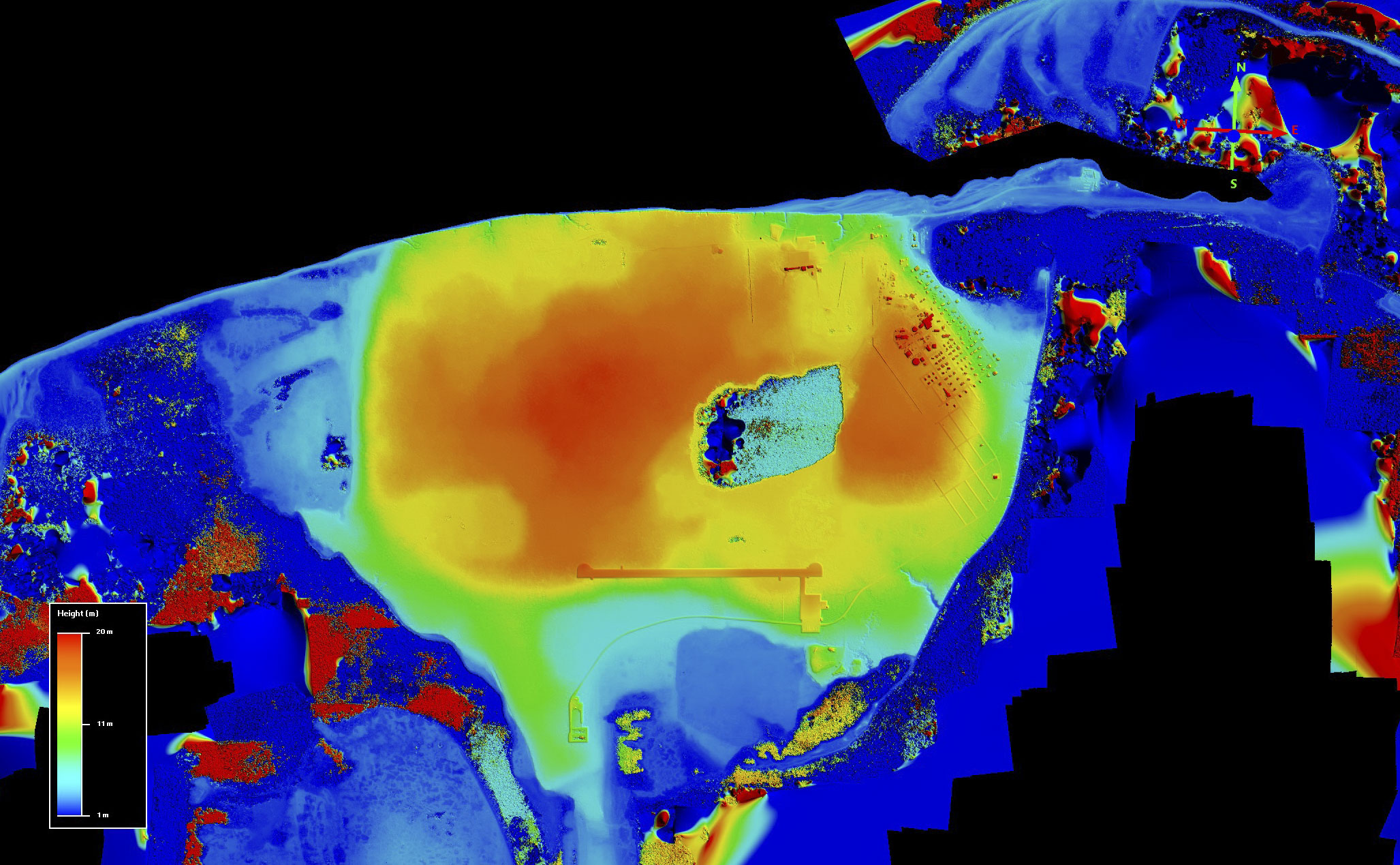
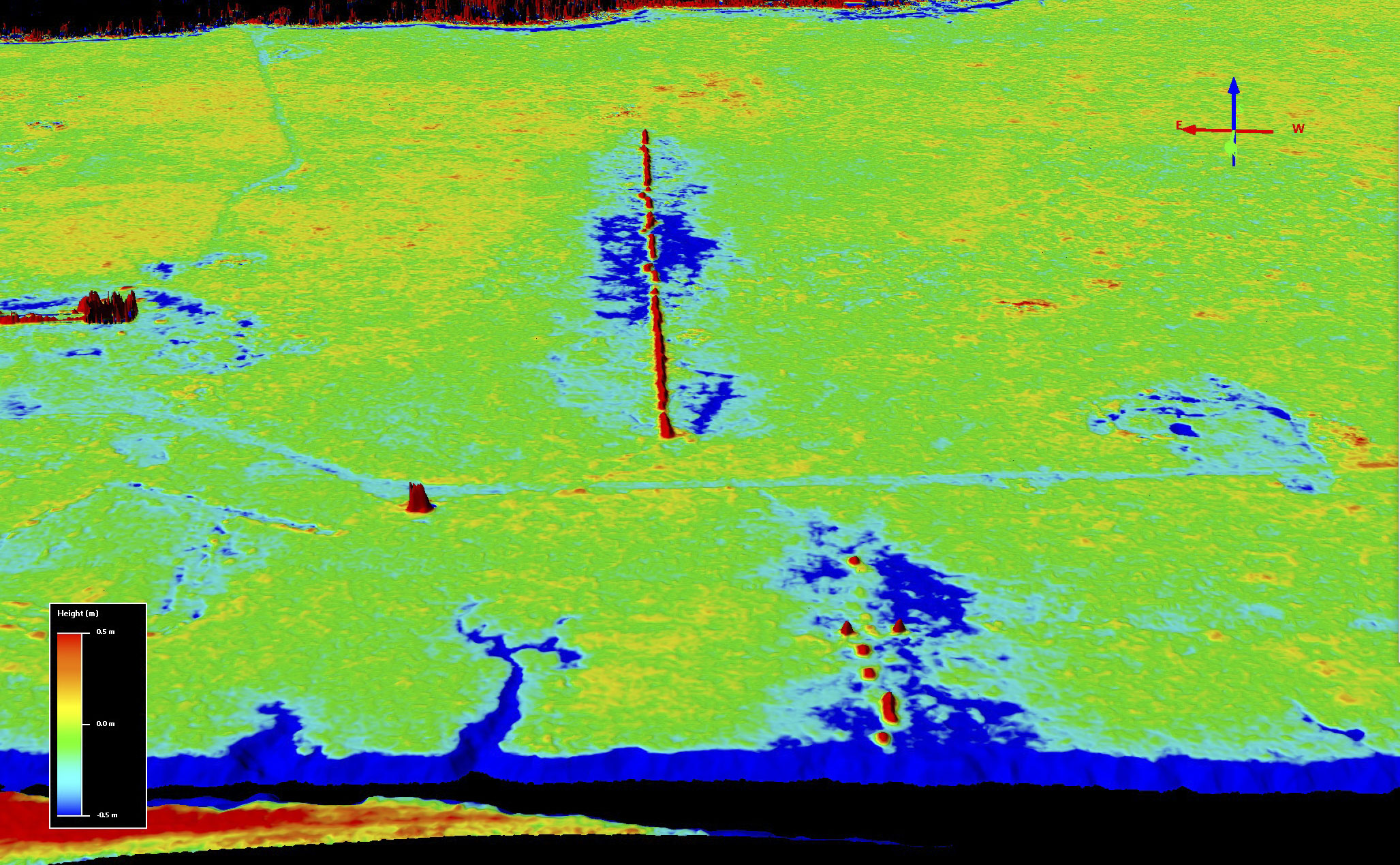
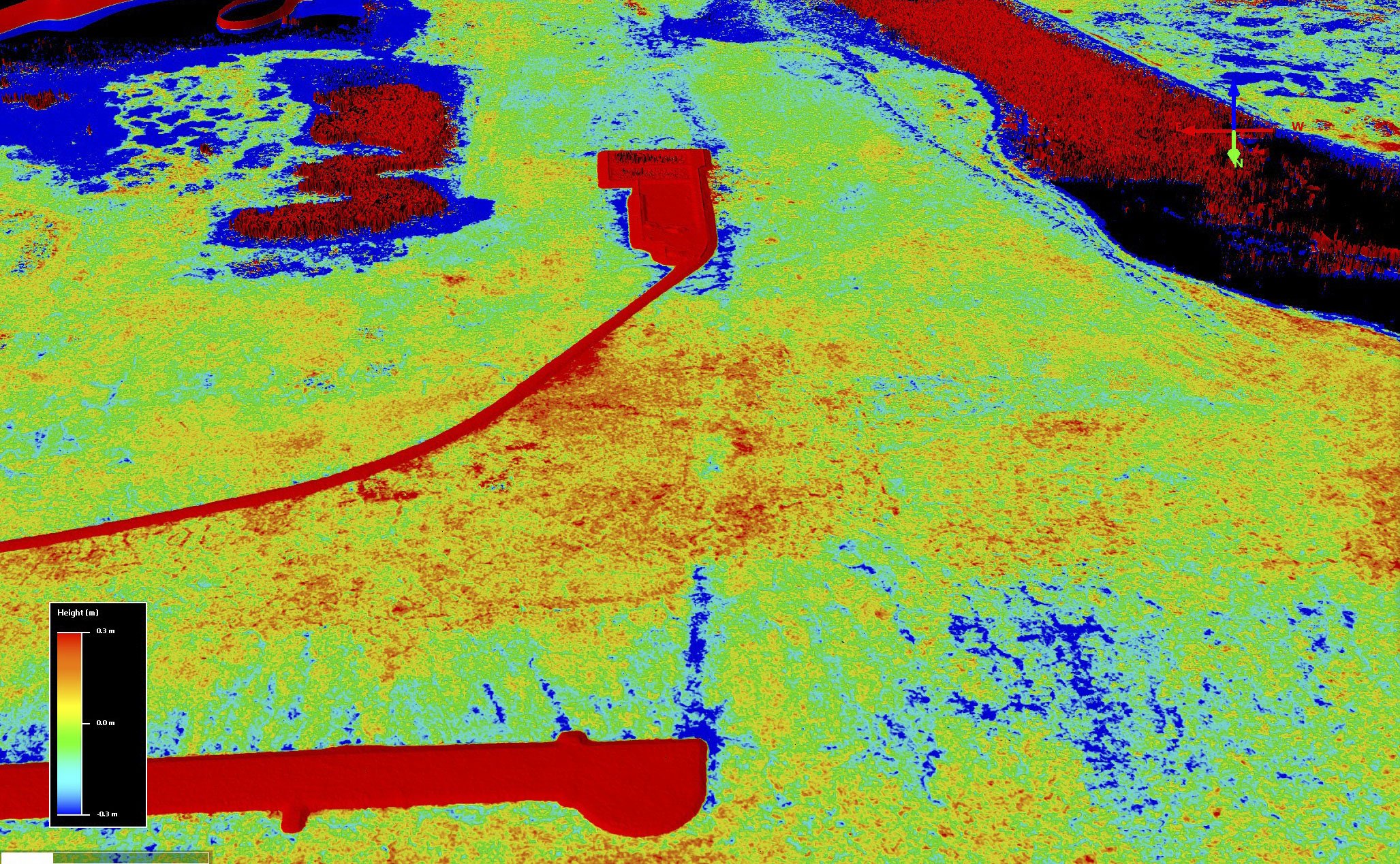
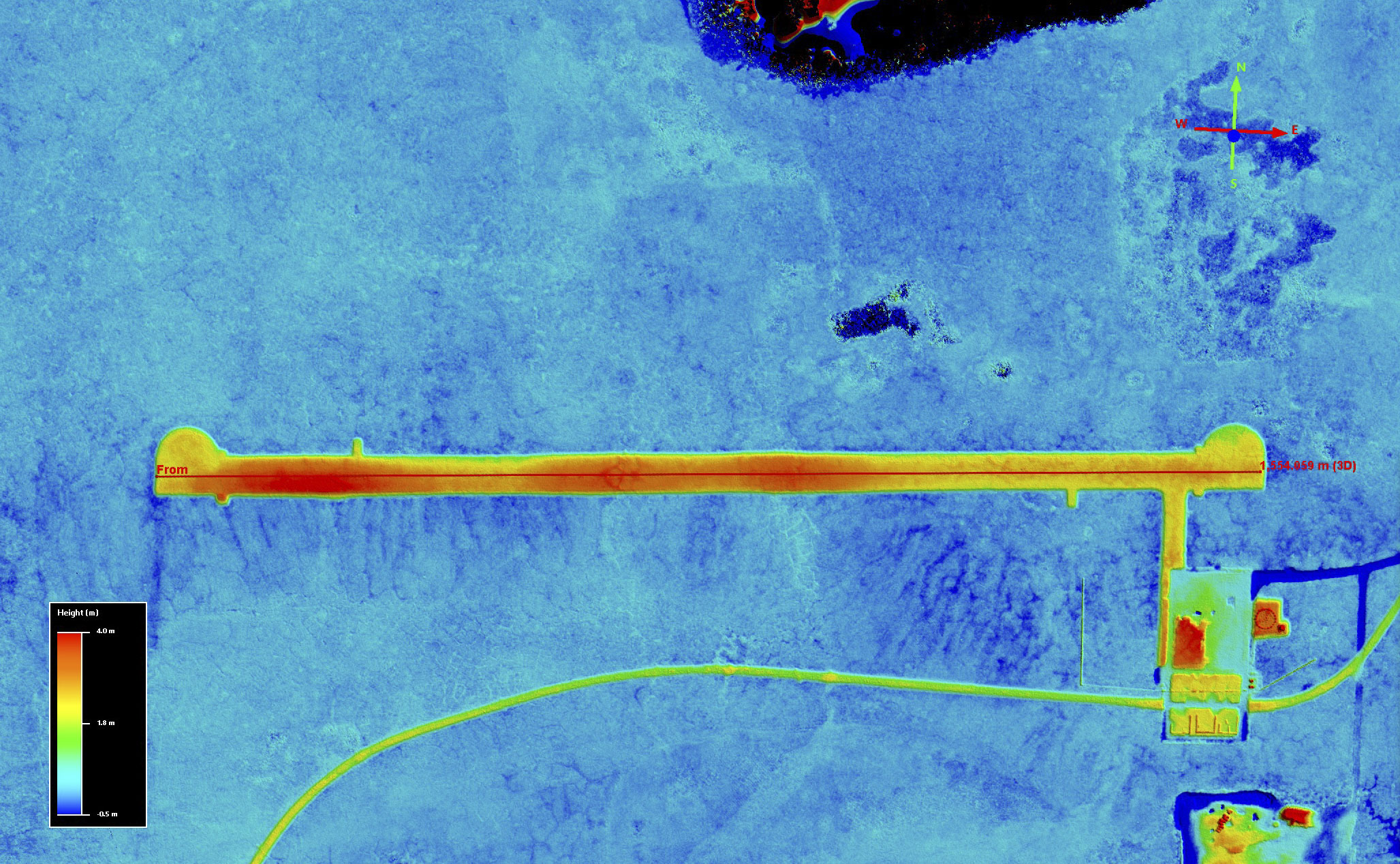
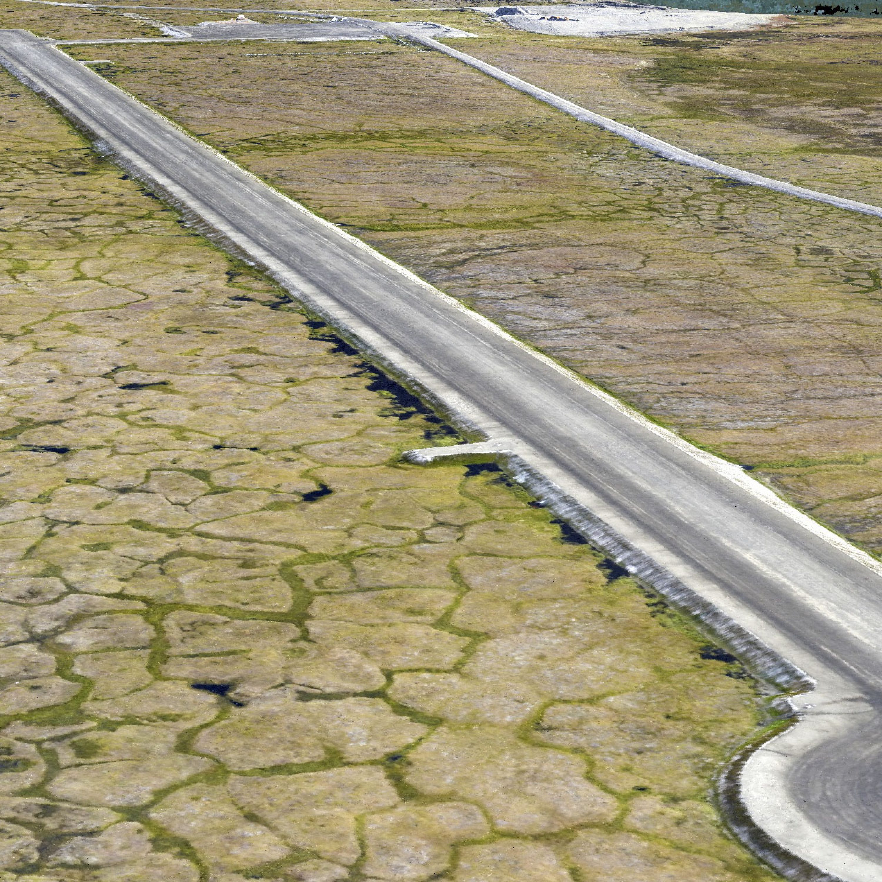
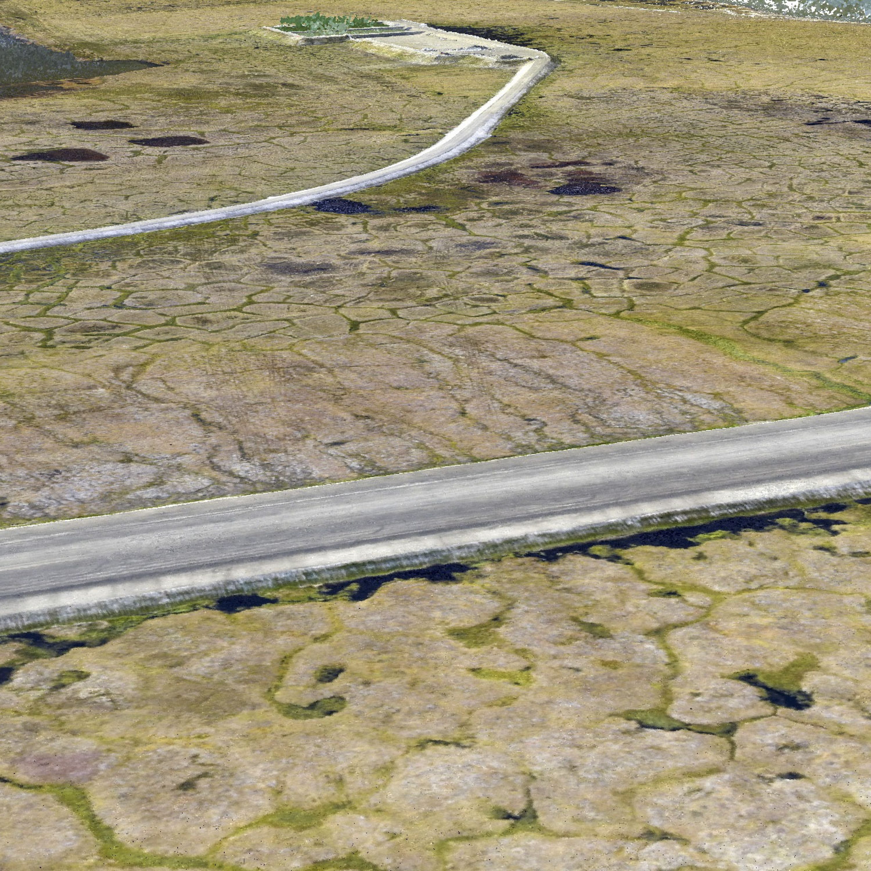
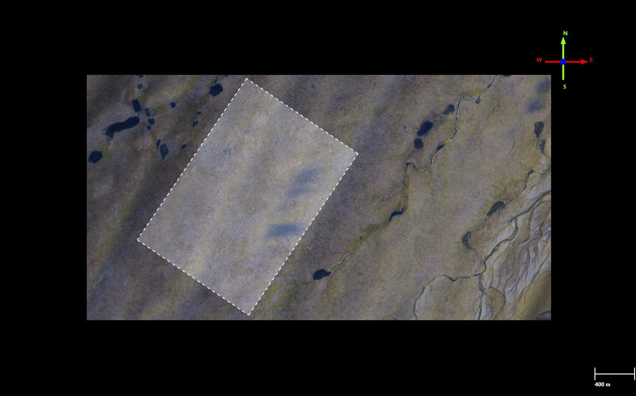
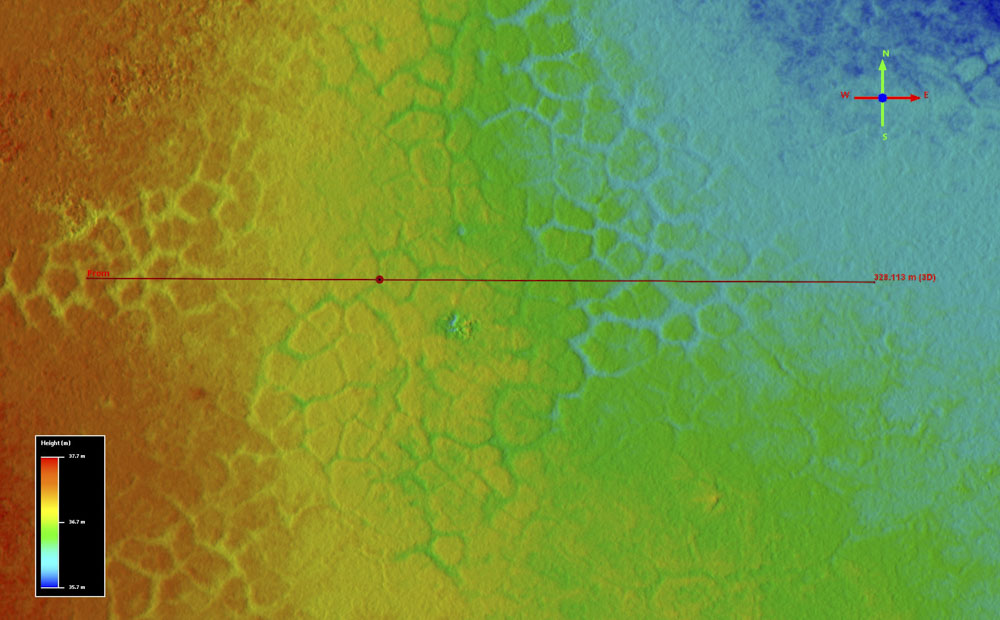
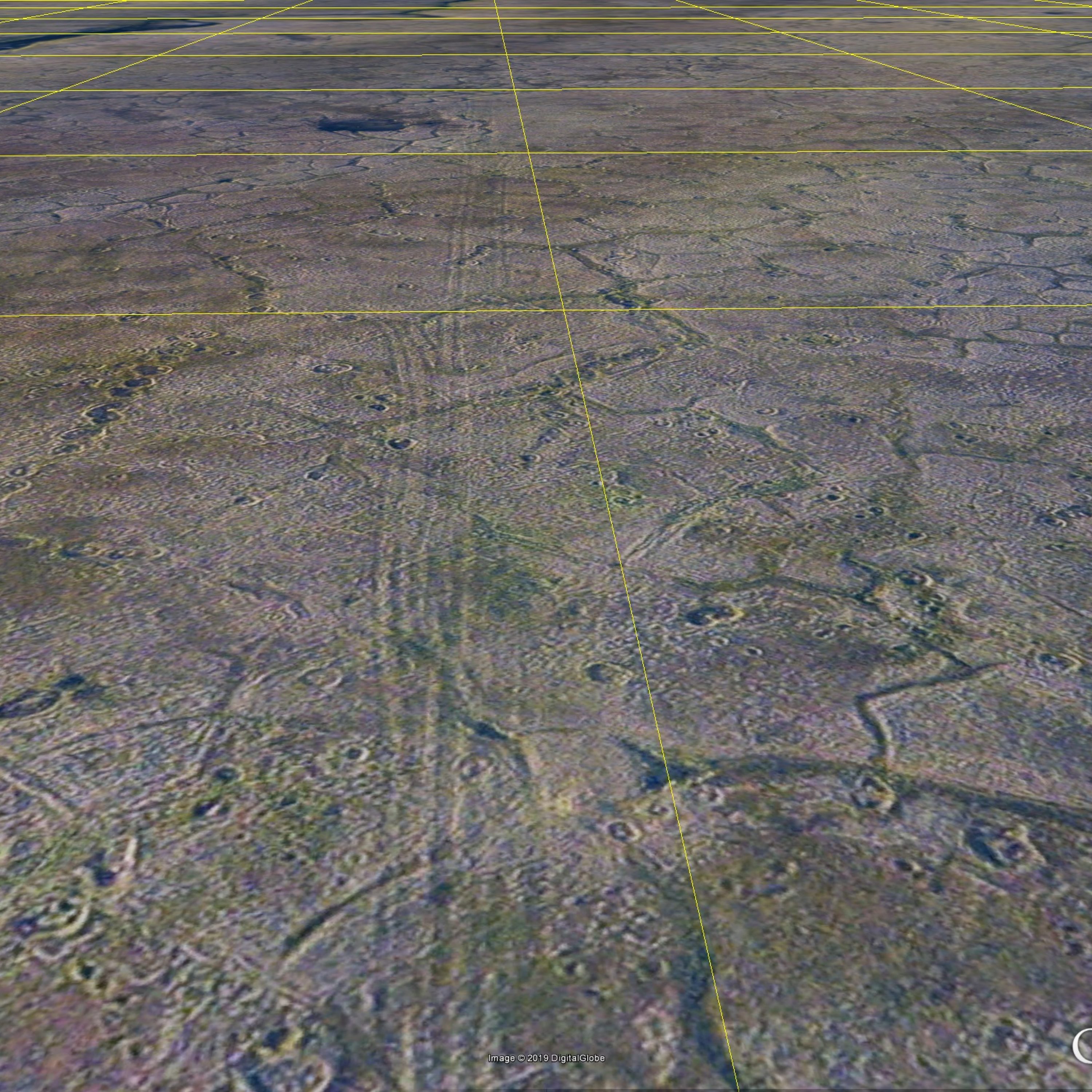
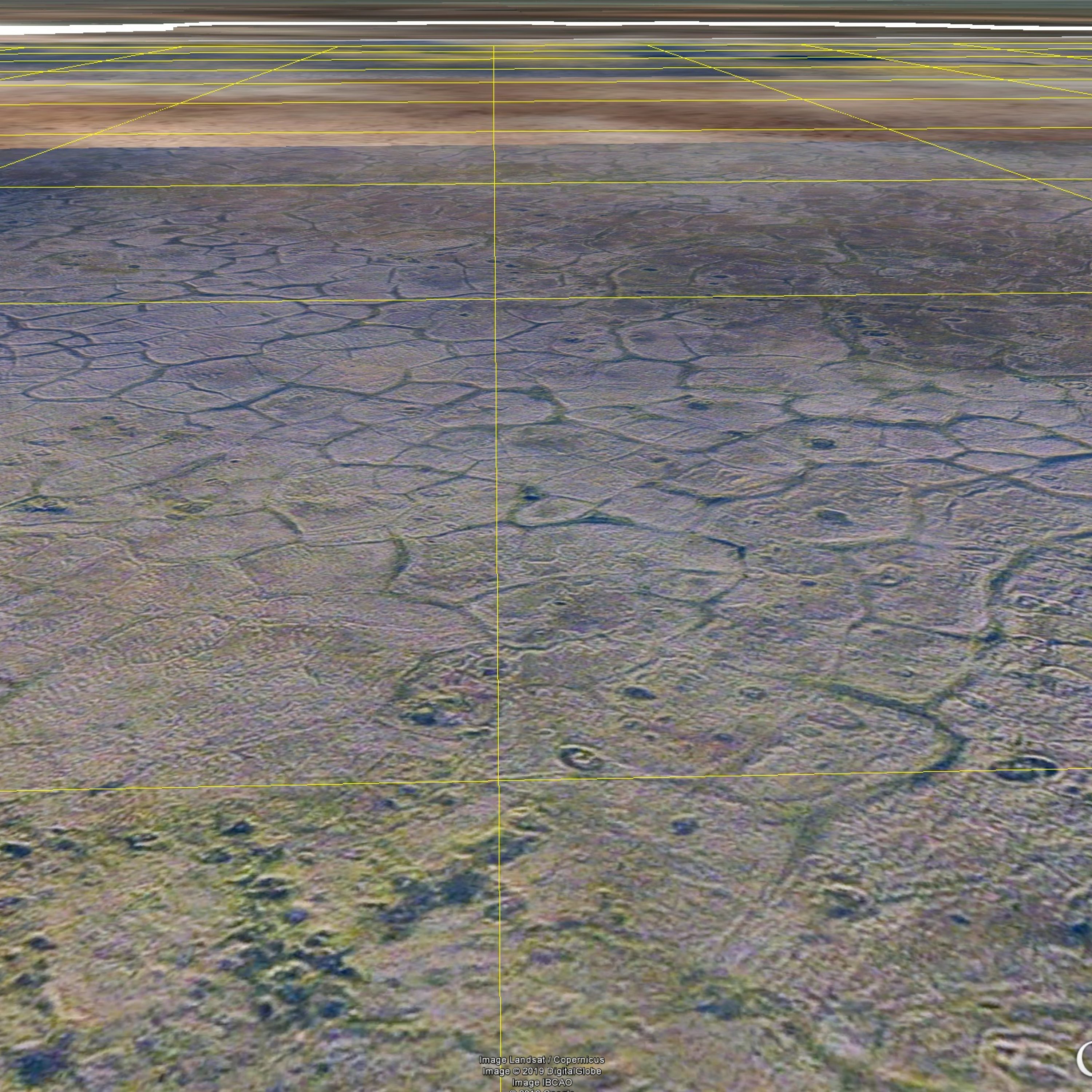
Here is the 2018 fodar orthomosaic (left) and 2018 fodar topography (right). The color stretch on the topography is about 20 meters above sea level from blue (1 m asl) to red (20 m asl). Note that this photogrammetric technique does not provide useful topographic information over large water bodies like the ocean, so you will see a lot of noise there, like spikes or pits of red or blue; just ignore those for now, as all water bodies will be edited out manually at some point. Note the village at the east (right) side of the island and the new runway in the south side, with the large drinking water lake between them. I acquired the 1002 Area data at 12.5 cm GSD and processed them into a 12.5 cm orthoimage and a 25 cm DEM.
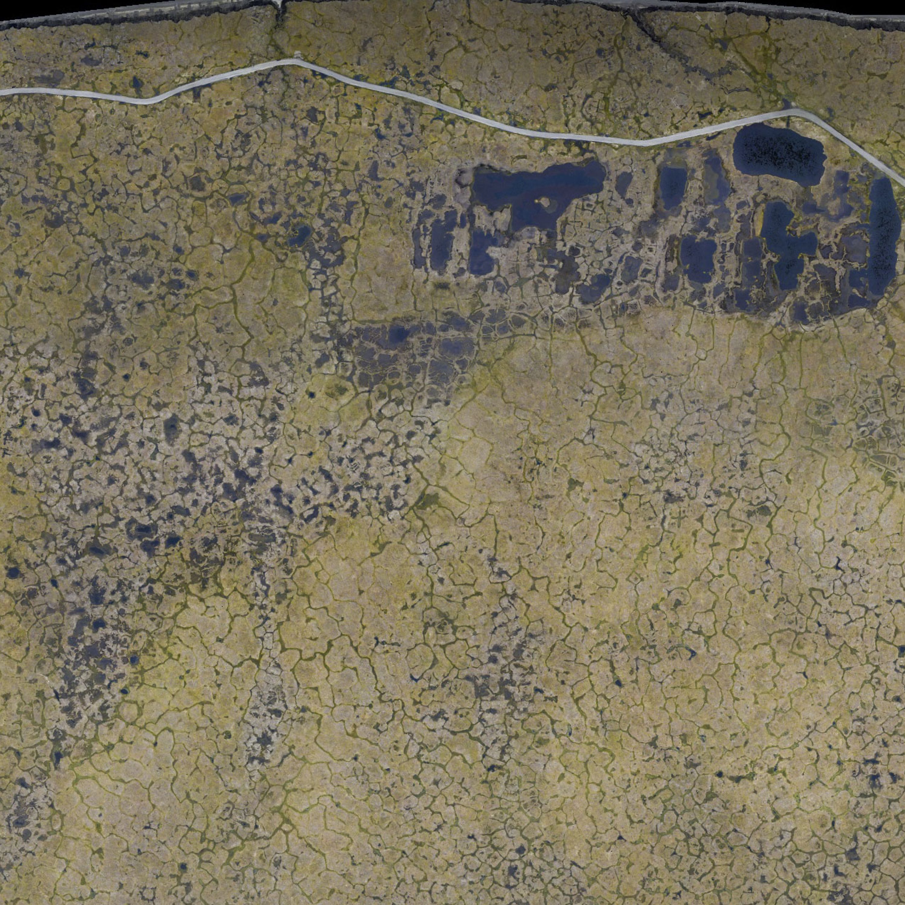
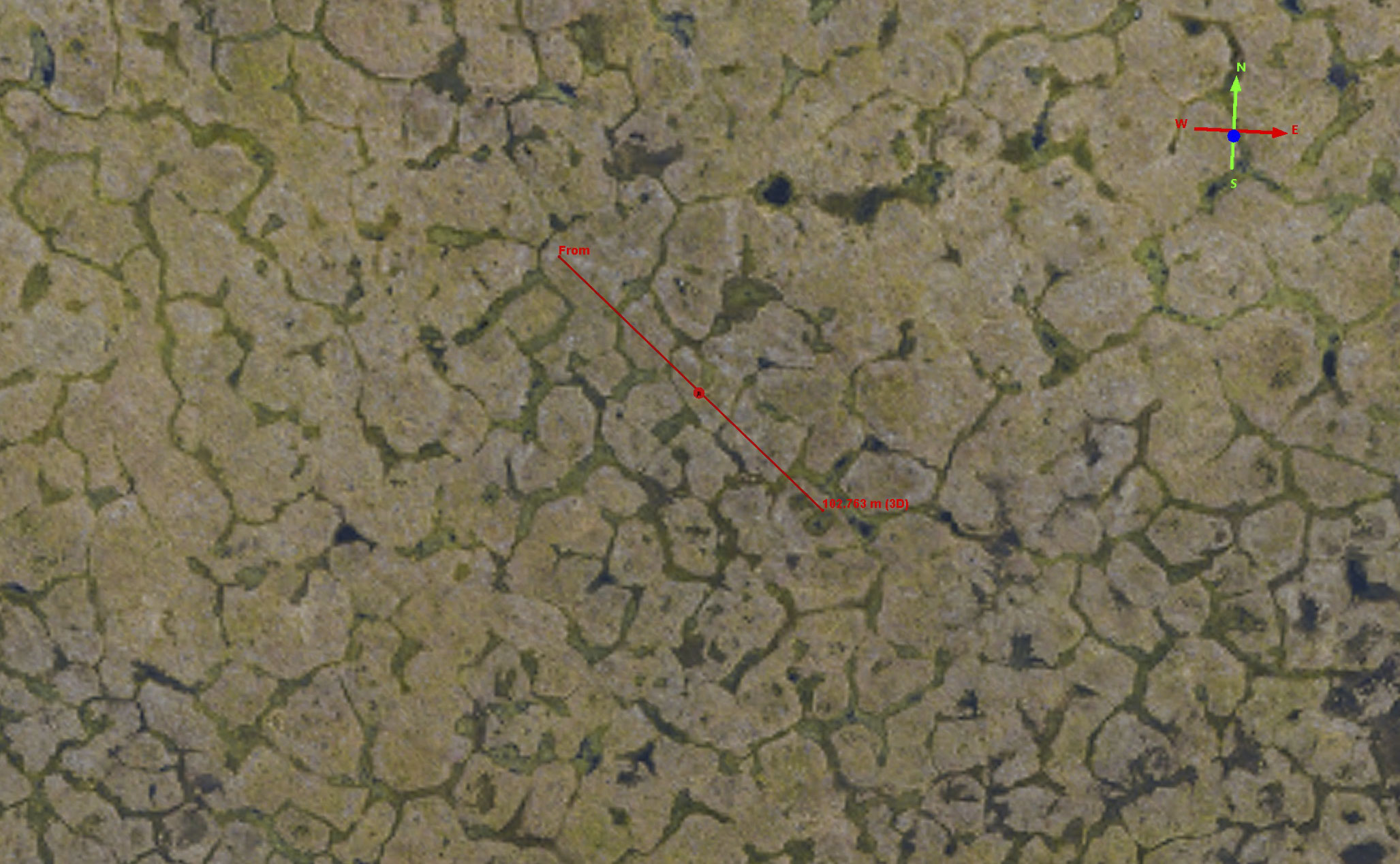
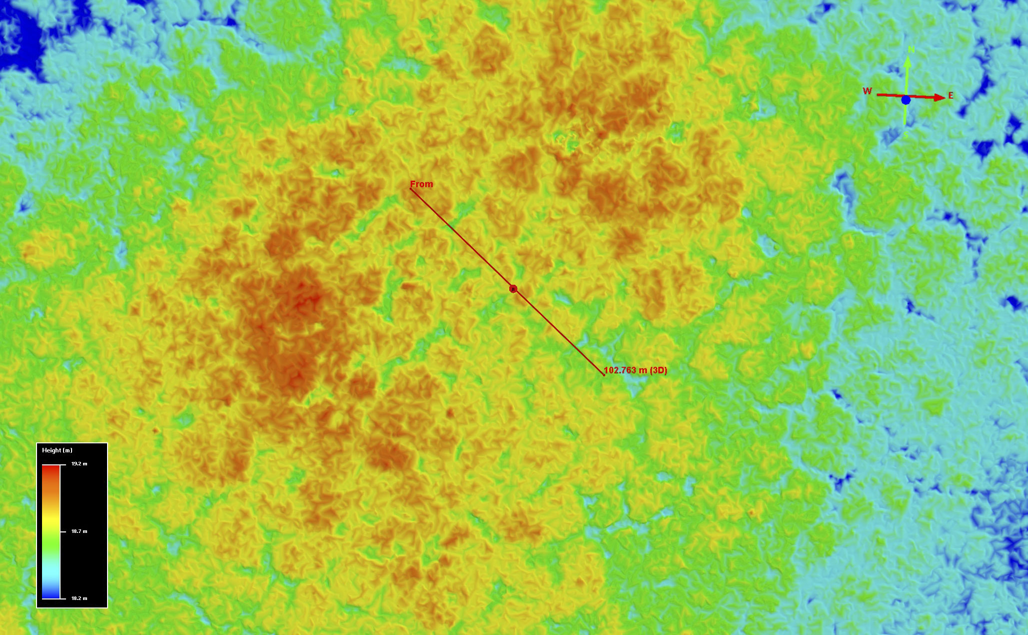
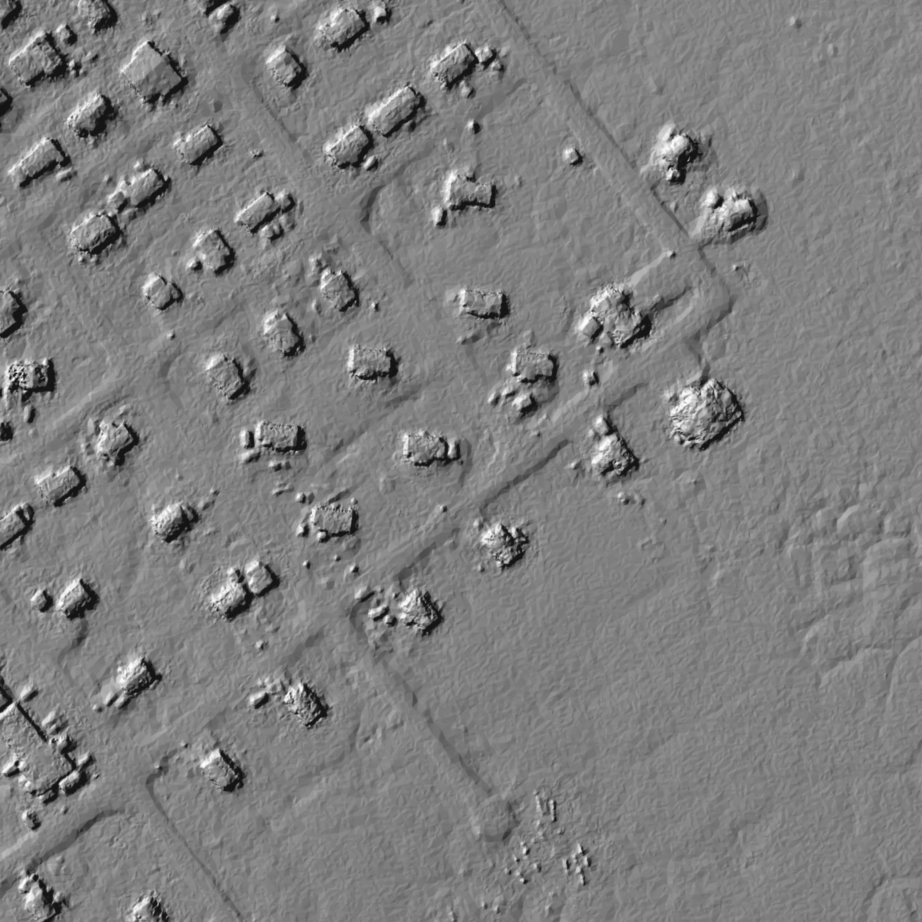
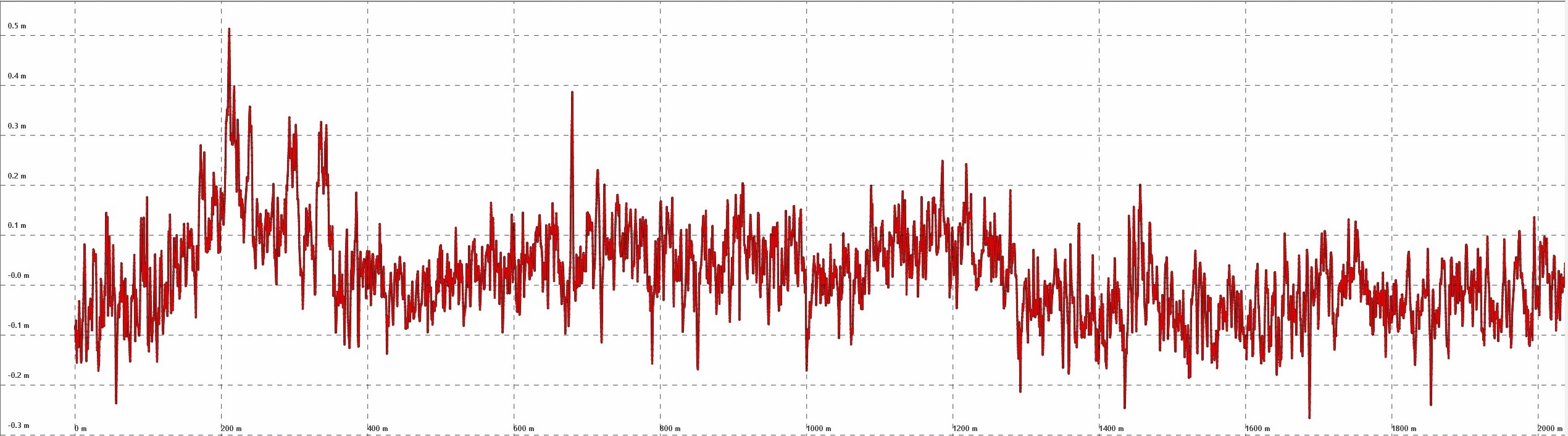
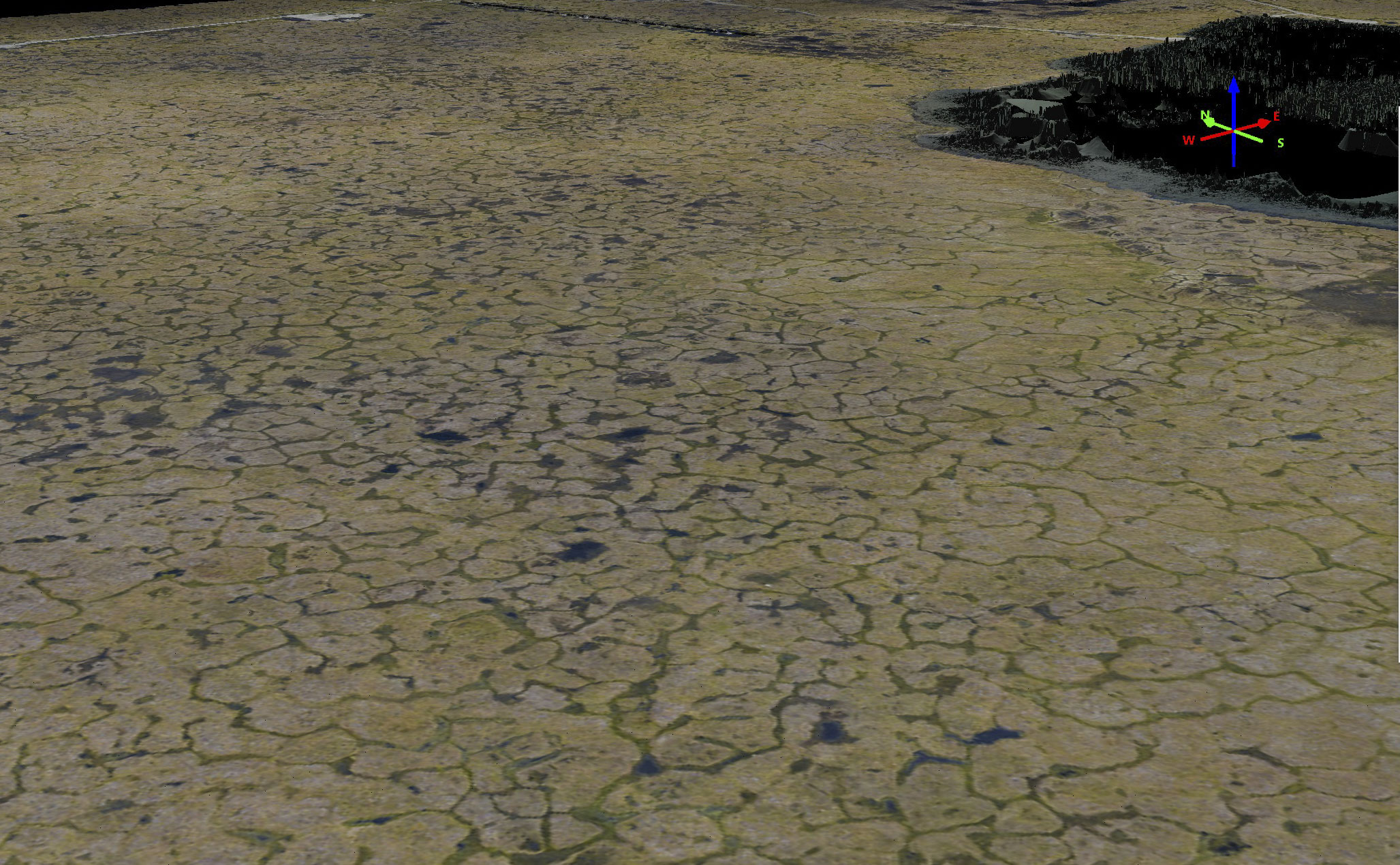
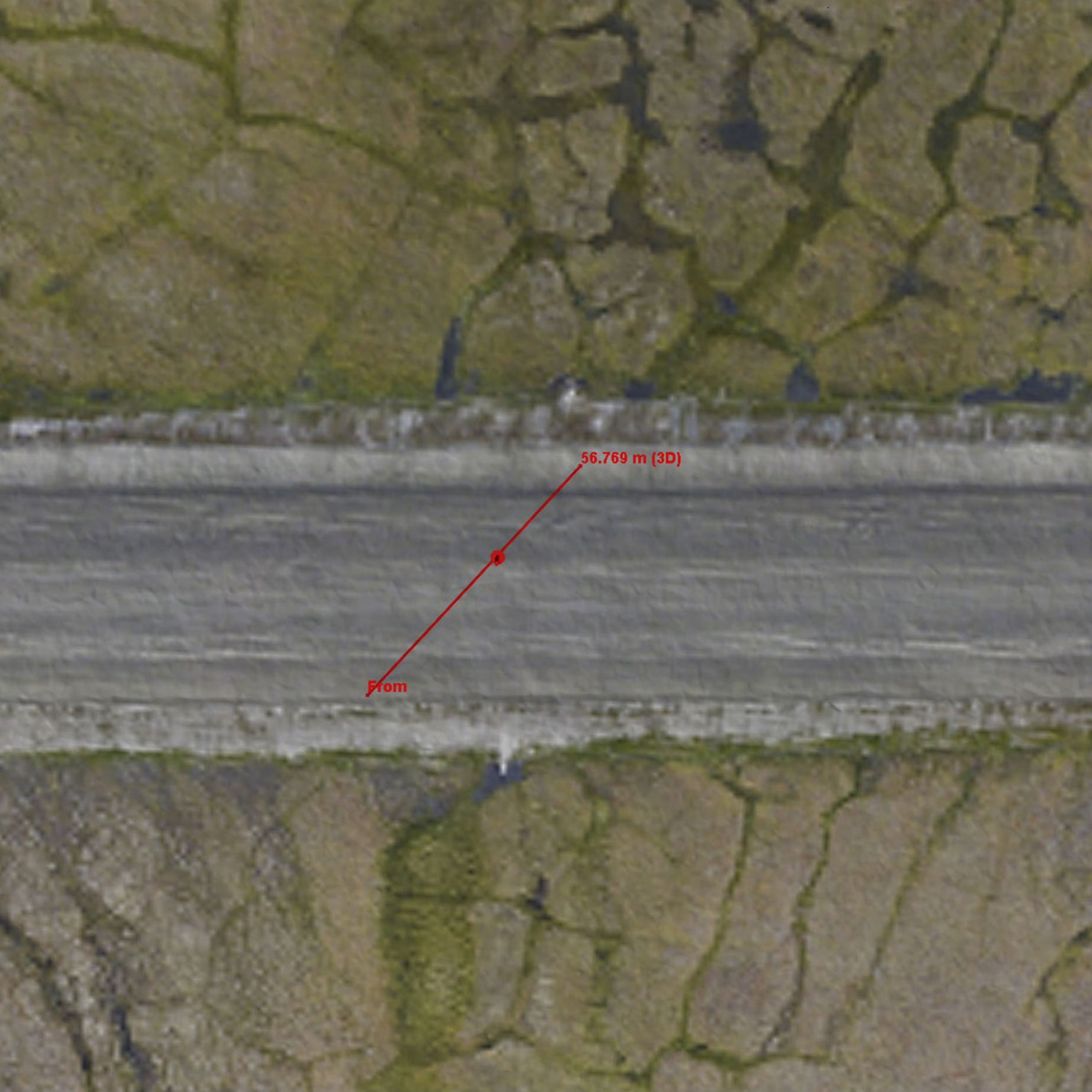
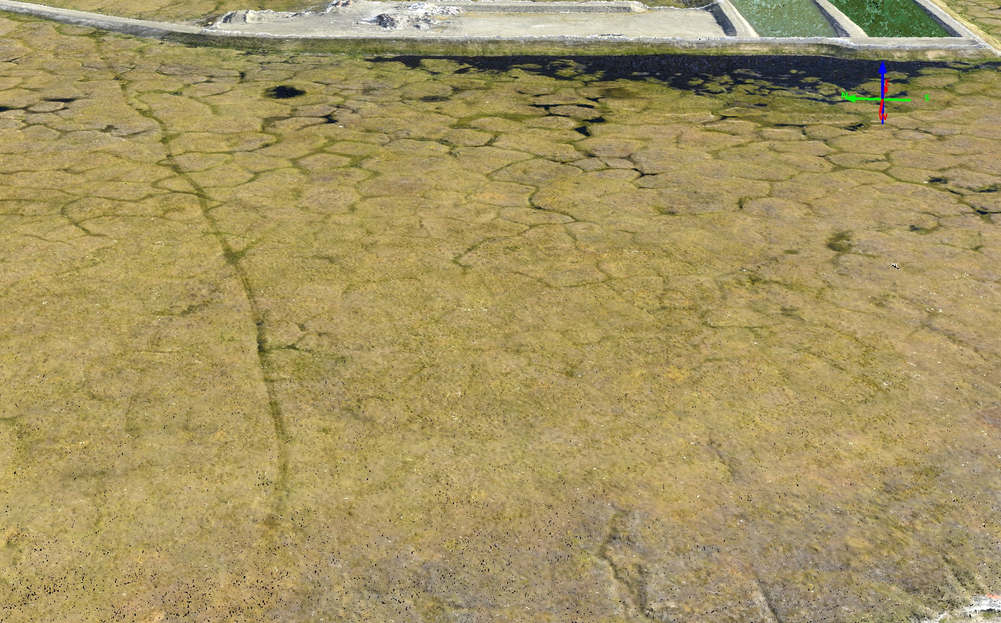
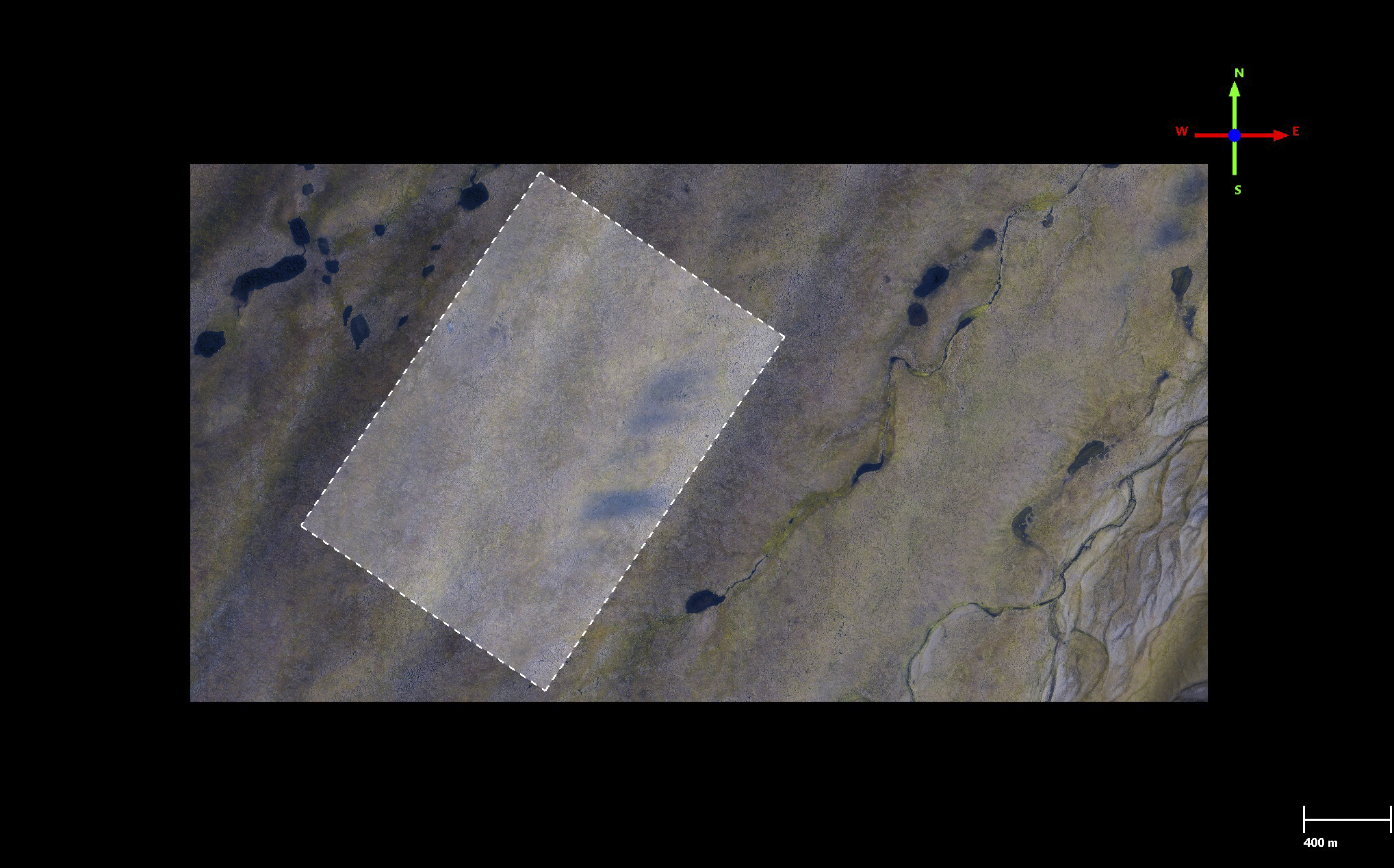
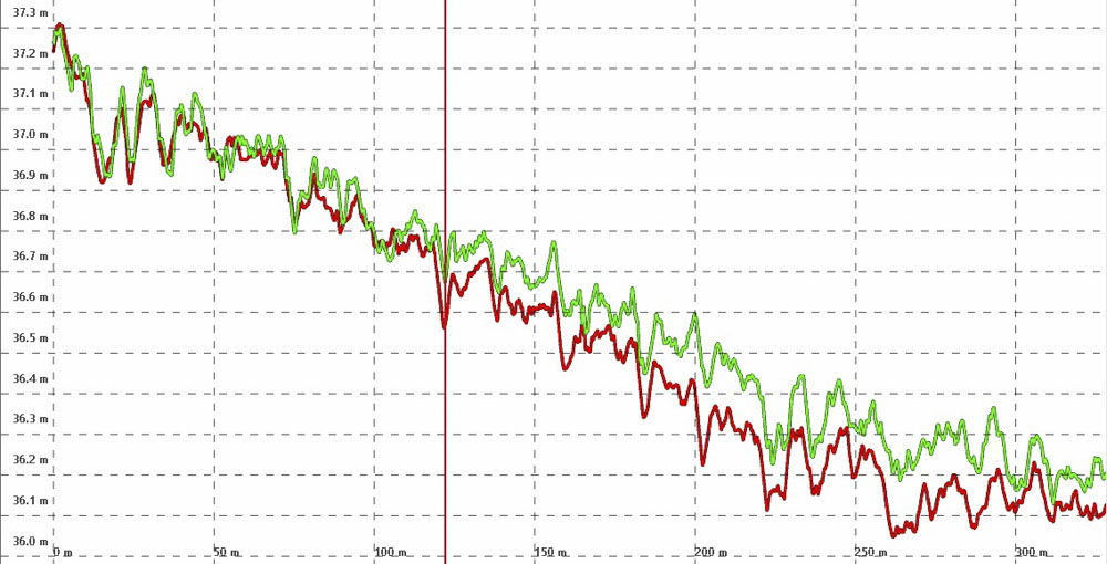
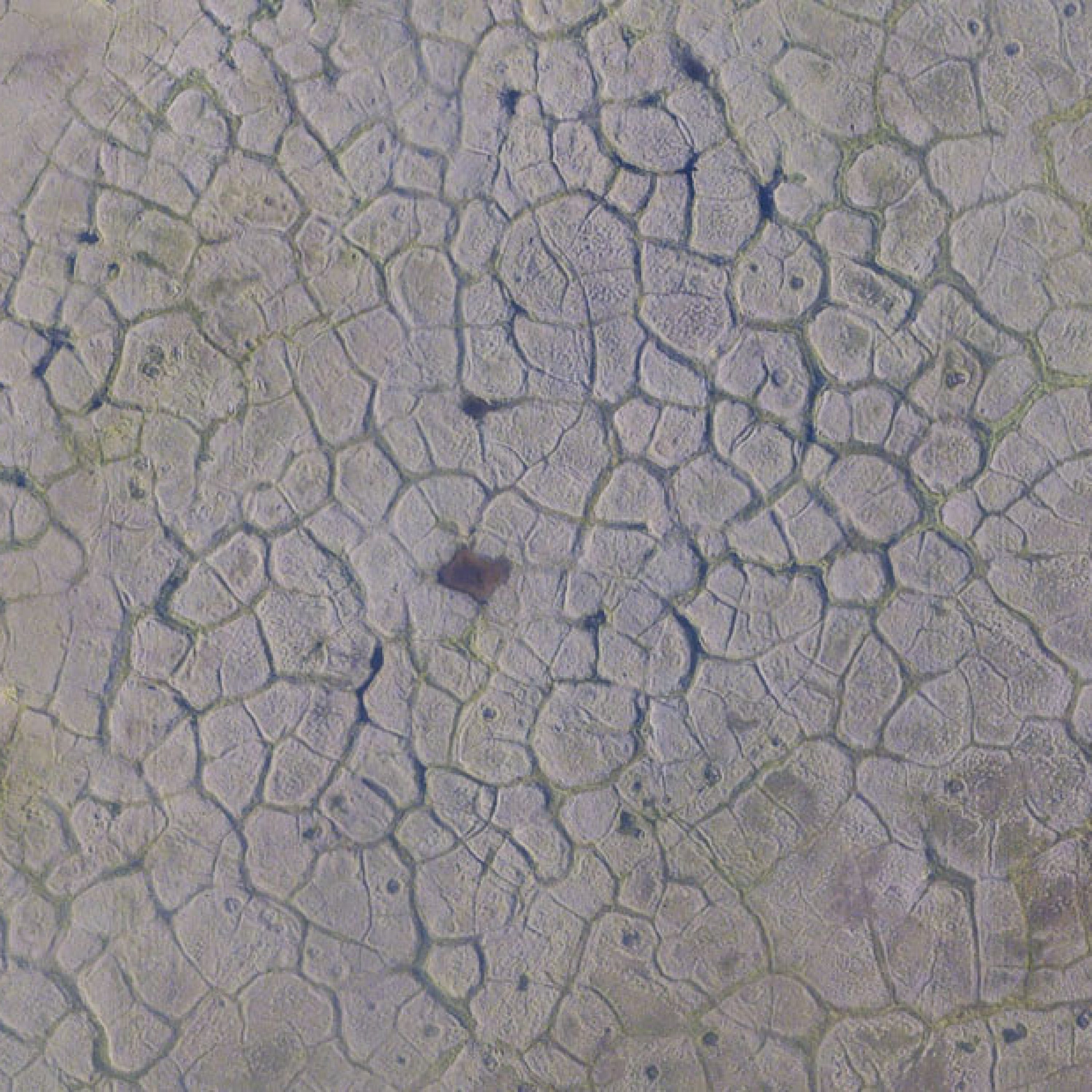
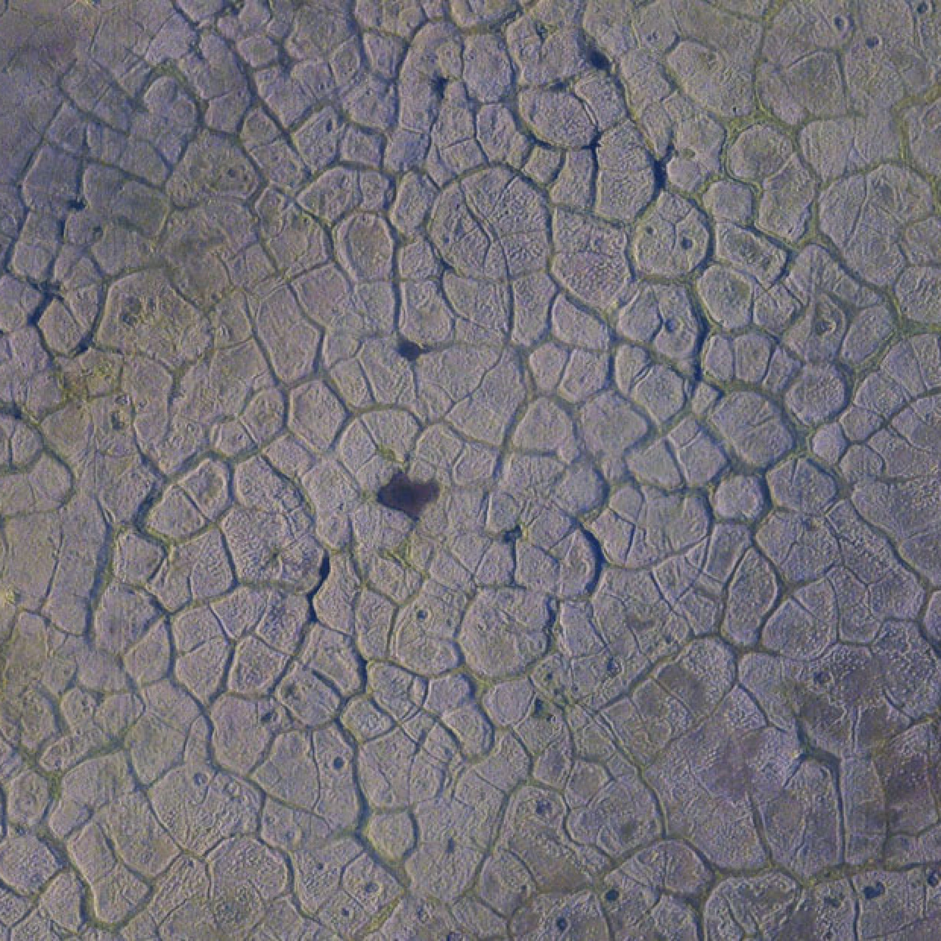
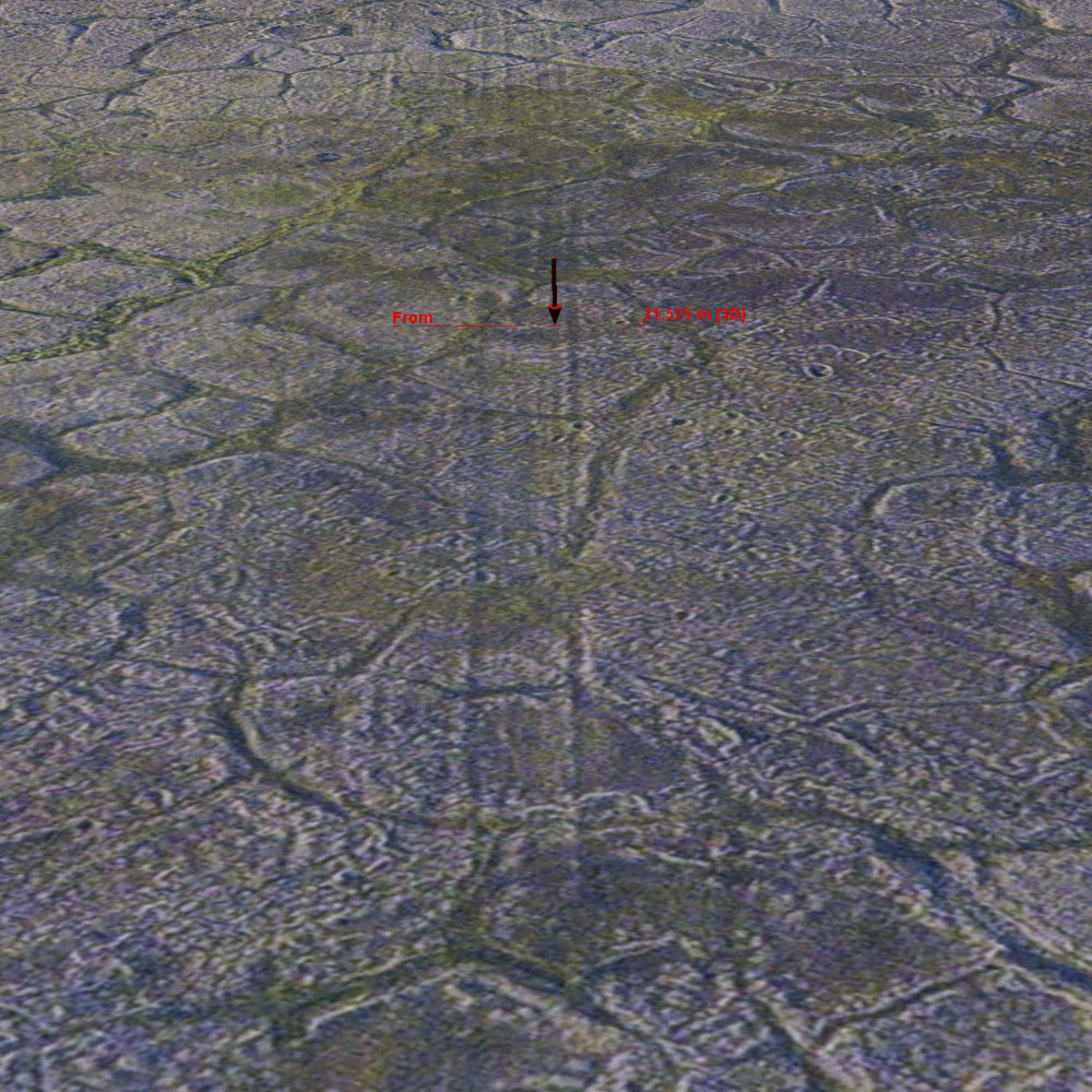
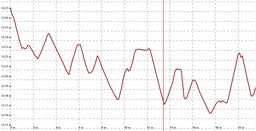
Here’s an example of the fodar topography of permafrost polygons near the center of the island, with the image at left and elevation data at right. This time the color stretch is only 1 m, from 18.2 m to 19.2 m asl. Note that you can see the topographic depression of every ice wedge surrounding the polygons — I expect that when this map is complete, we will have a measurement of every ice wedge in the entire 1002 Area and be able to track their change over time. Here all of the polygons are high-centered, not something that can be conclusively determined by photos alone in most cases.
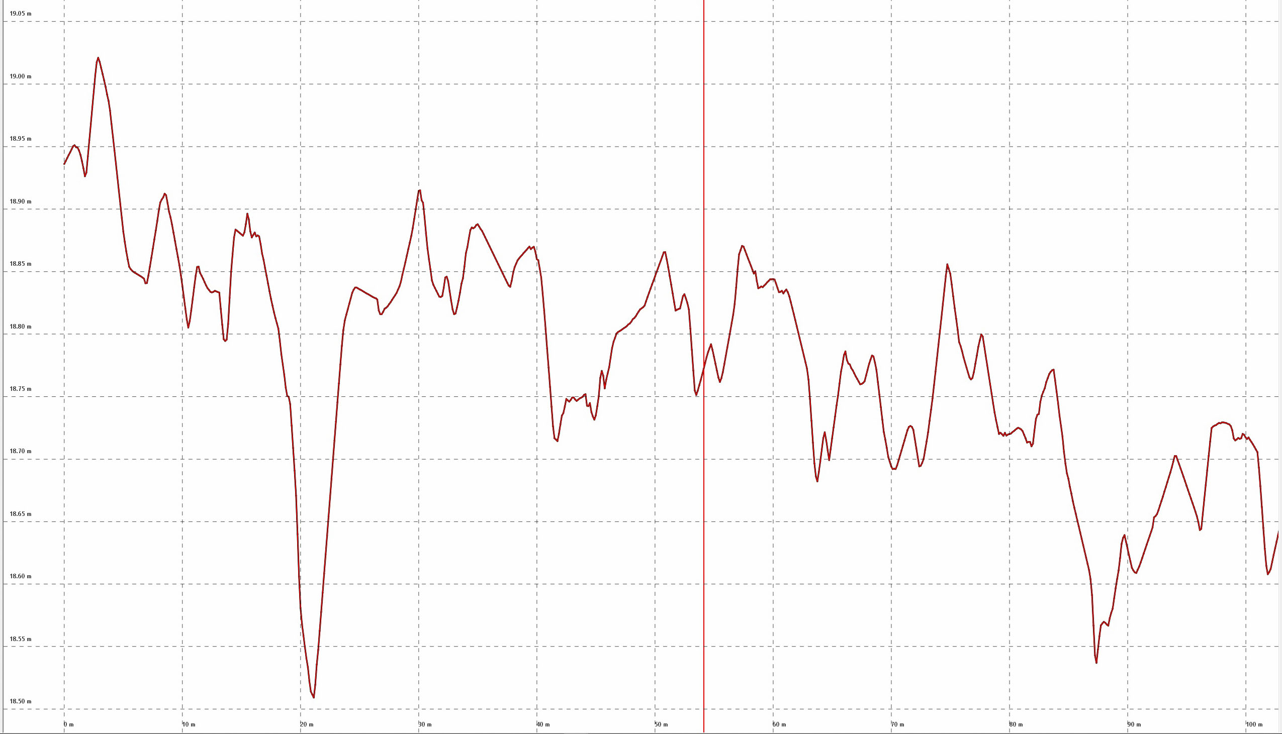
This plot reveals ice wedge topography along the transect shown by the red line in the previous image pair. Here we can verify that it seems all of these ice wedges are in some stage of degradation. Note the > 30 cm dip to the left in this plot, likely all of the ice wedges here will continue along a path leading to such melt. (Note that you can right click on all plots like this and Open in New Tab to see them in more detail).
One of the troubles I’ve always had in validating fodar data is finding non-fodar data of sufficient quality to compare to, usually I’m comparing to something worse so the statistics I generate aren’t as good as they could be because they are limited by the poorer quality of the comparison data. Fortunately the 2009 lidar of Barter Island is a very good data set, so even though lidar in Alaska back then was still working out some kinks it worked out well enough here. For this analysis I created a DEM with a 1 m posting from the lidar point cloud, as the average point spacing was about 1 ppsm (compared to ~25 ppsm for the fodar) and the DEM is easier to work with for these analyses; given the ellpisoid-geoid datum differences, I manually shifted the lidar vertically to best fit the fodar.
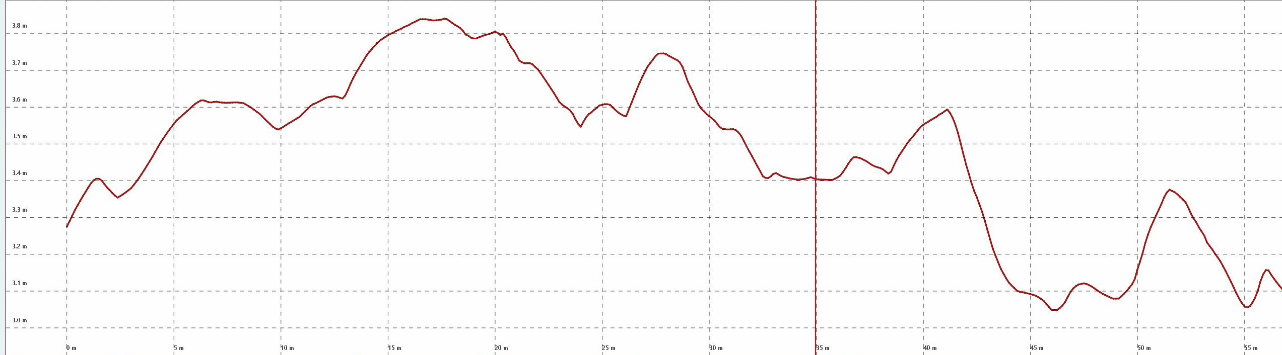
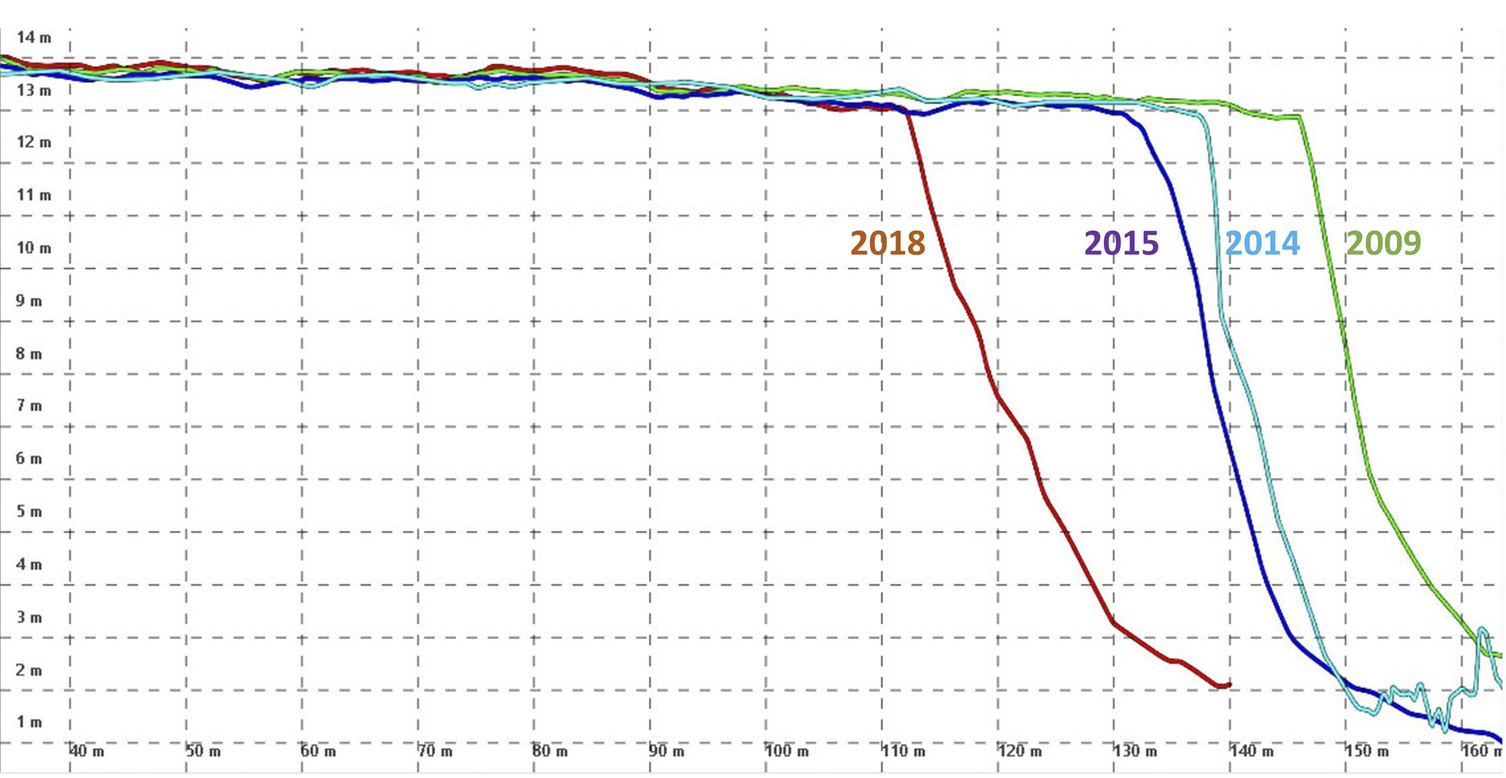
Here is an elevation transect taken from the red line in the previous image pair (right click and Open in New Tab too see in full detail). The horizontal grid lines are only 10 cm apart. The standard deviation of difference between the 2009 lidar and 2018 fodar here is a little over 7 cm, so 95% of the difference lies within 15 cm, as can also be seen visually here in this plot and in the previous color difference image. This means that we will be able to detect change on the single centimeter level, if those changes are spatially-coherent (like snow depth or permafrost melt) over a few meters of pixels. Without a third data set, it’s impossible to know which is more accurate or precise, but it really doesn’t matter — there are few applications where higher accuracy than this is required.
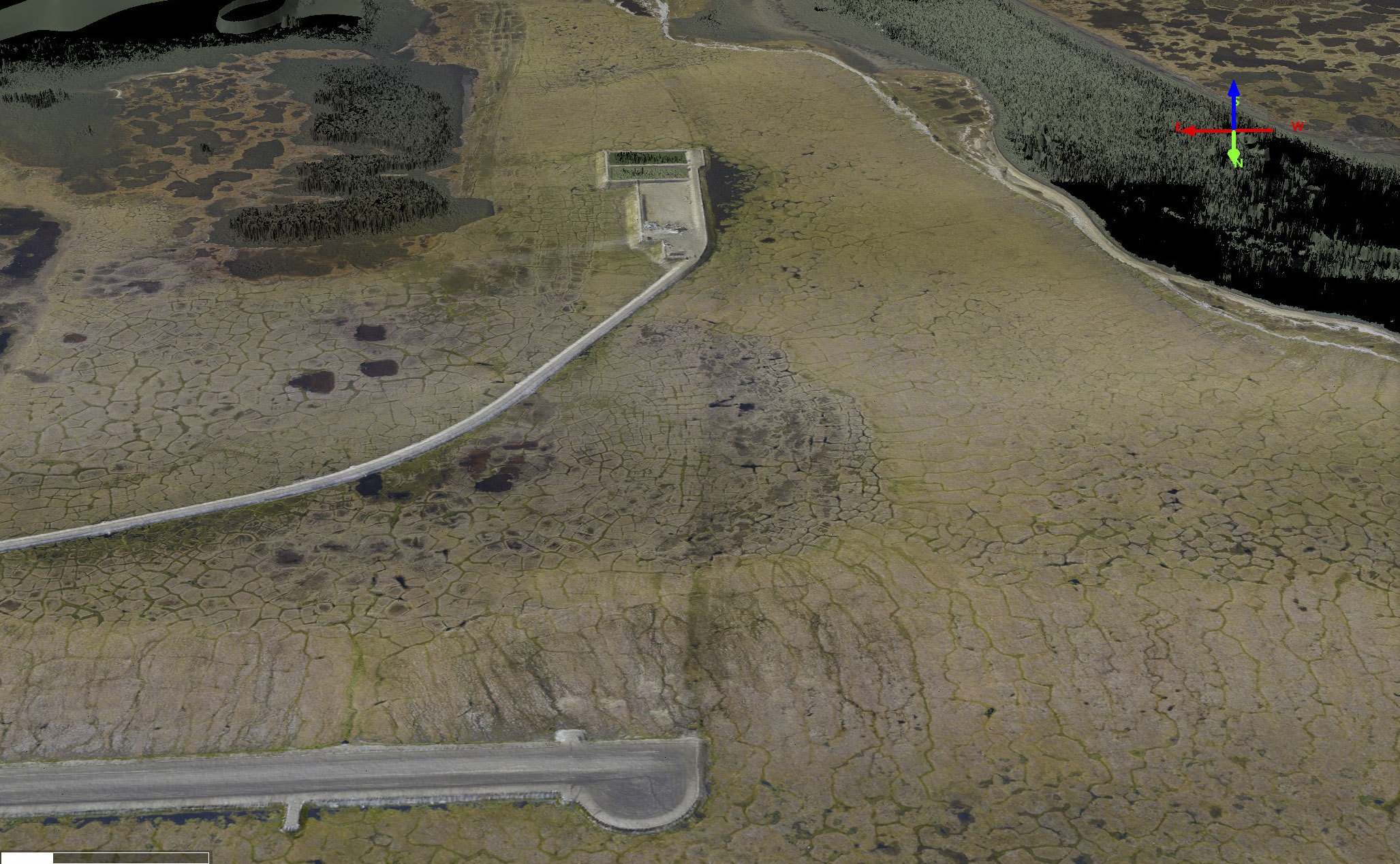
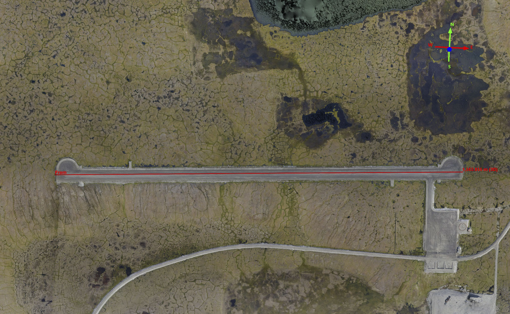

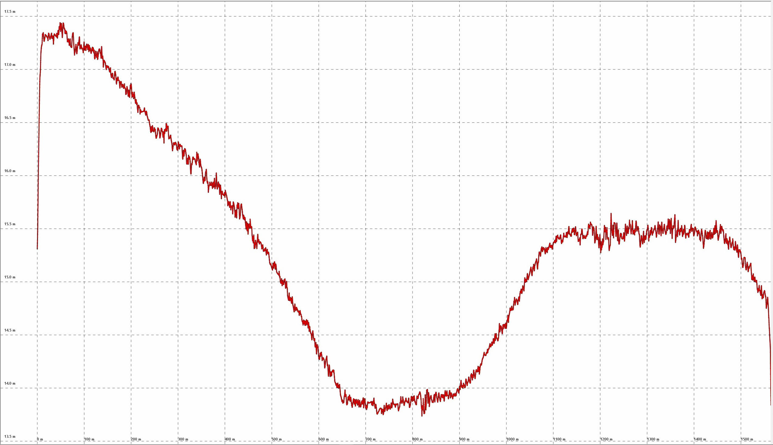
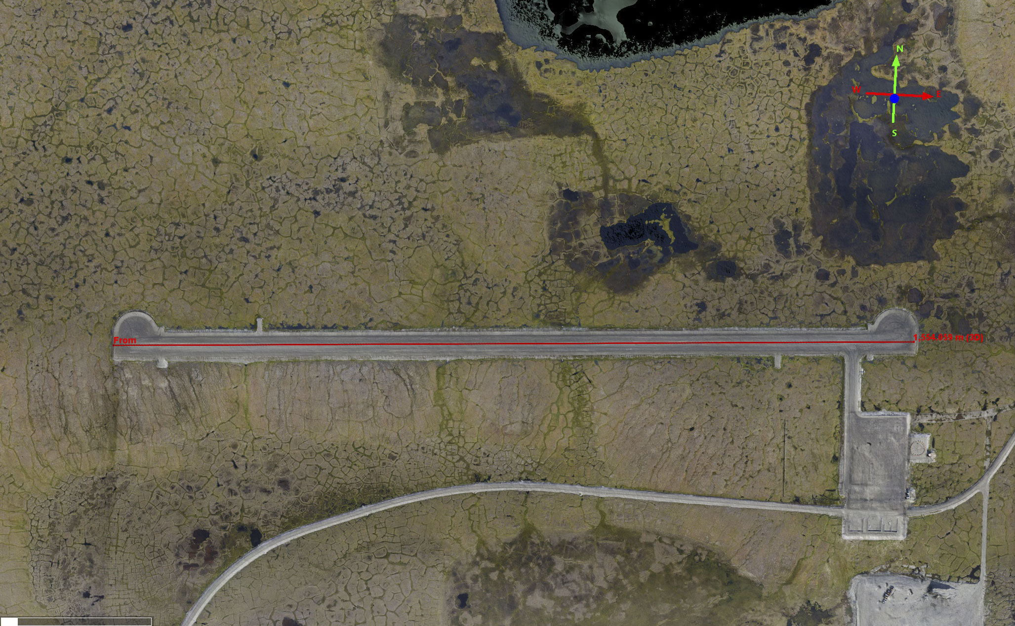
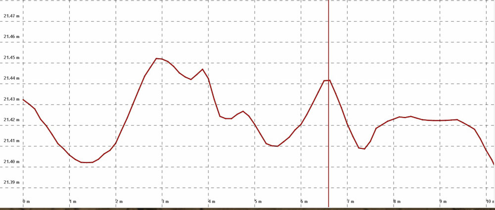
Here is a profile of the runway topography — that dip is about 3 meters and really exists, I’ve landed there a bunch. I don’t know the details, but I imagine that dip is there because they ran out of gravel, money, or interest.
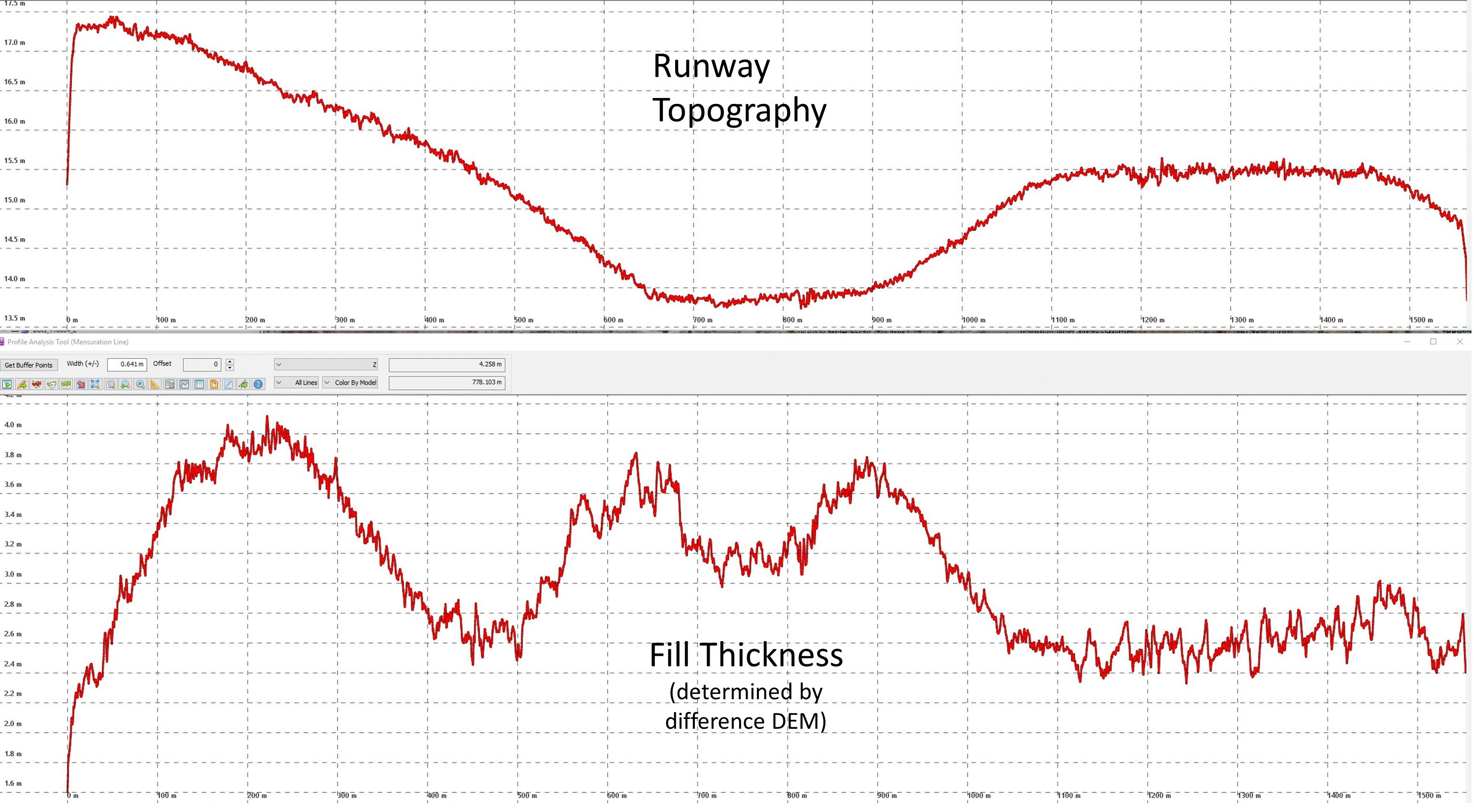
Here is a comparison of the actual runway topography (top) with the amount of fill used to create the runway (bottom). Near the middle (above the words) you can see where two low spots were filled with an extra meter of gravel compared to the center, those low spots are where drainage normally would have occurred.
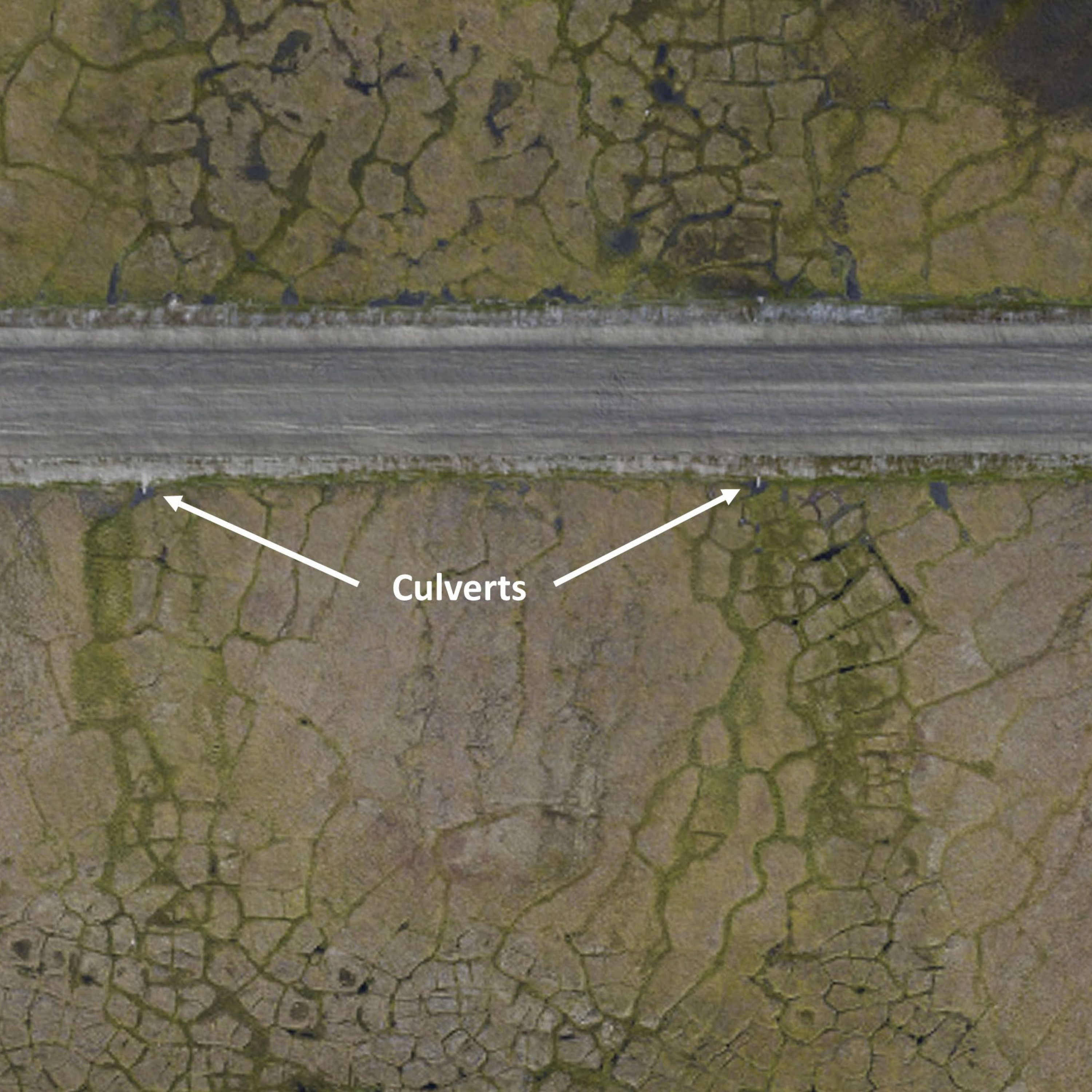
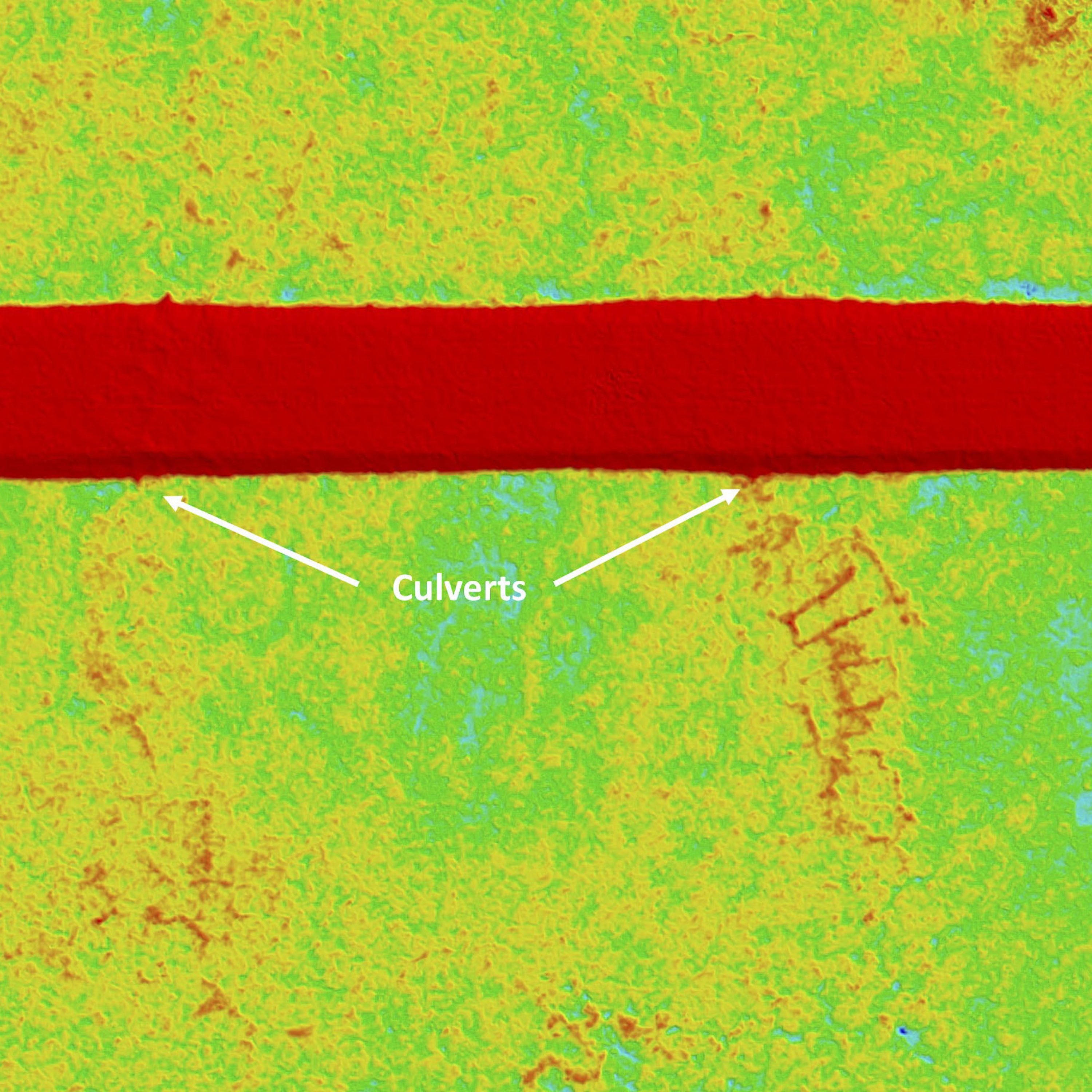
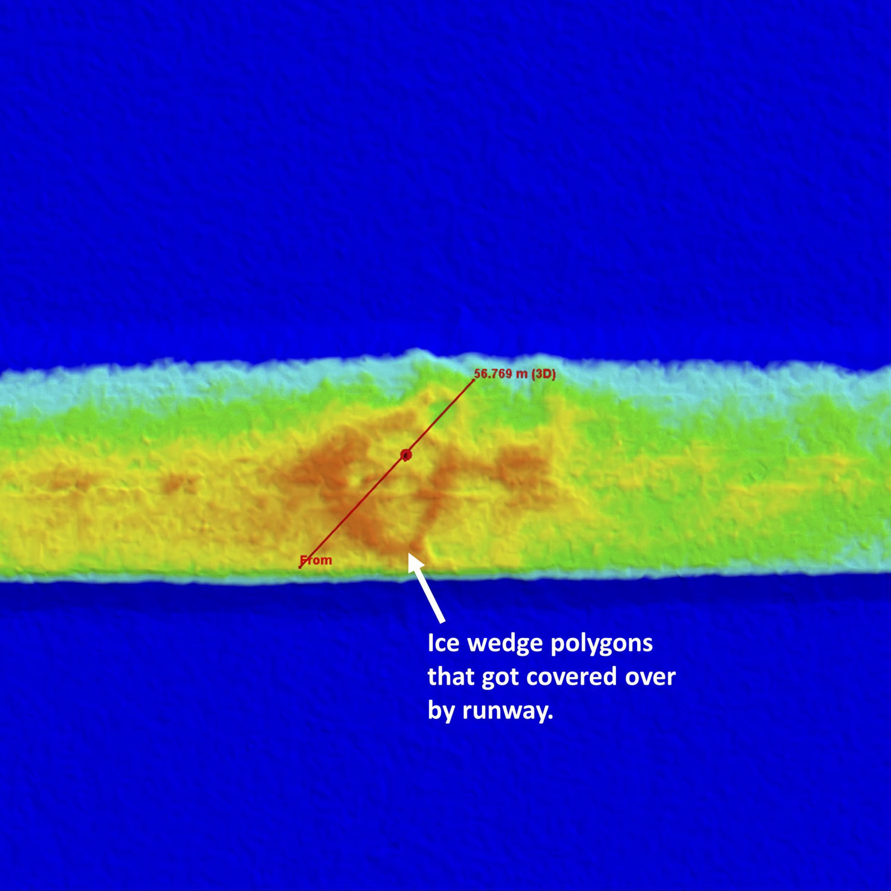
The horizontal grid lines here are 10 cm apart and the vertical red line corresponds with the position of a pushpin in the previous image. Here you can see that it took ~30 cm extra gravel to fill the top of that ice wedge. If the ice wedge was that far below grade, there is a good chance that it was already thermally degrading. On flat ground, laying down so much gravel would likely insulate the ice wedges to keep them from continuing to melt. On this sloping ground, the ponded water the uphill side of the runway will continue to find a way to the low side beneath the runway. The culvert will help, but that warm water could continue to thermally erode the ice wedges, bypassing the culvert, and the gravel insulation not only provides no protection against that but may actual accelerate the process. If the runway was going to fail, my bet is that this will be the first location it happens. And the big fear here in my mind is still the drinking water lake — if it drains in this direction due to linked ice wedges at its edge, it could cause the runway to fail in a matter of hours. I’m not sure what I would have done differently in construction except maybe but in a bunch more culverts, I’m just pointing out what can be learned from these data about the perils of climate change for what it may be worth to the village or those seeking to use the remaining data for related purposes.
Here’s another view of the runway, this time of the raw fodar point cloud. The danger here is that the culverts will get bypassed by water using the ice wedges under the runway for drainage. It kind of looks like this is already happening, especially on the right side of this image where you can see standing water on either side of the runway. The point cloud tends to be brighter due to the way it is lit, and there is a ton of detail there that gets a bit lost in raster products.
Another view of the runway with the fodar point cloud. Point cloud density is about 15-20 points per square meter — so dense you don’t see the individual dots even this close up.
There are only two conduits running under the runway, so areas like this in between them are ponding water, which is never a good thing in terms of permafrost-infrastructure stability.
At left is a track left by a truck driving over the tundra surface, as seen in the fodar point cloud. The topographic expression is barely resolvable, but the two tire tracks are clearly visible because they created slightly mushier ground in which a different vegetation now grows. Regardless of whether those tracks lead to increased permafrost melt, the change in vegetation there will remain apparent from years to decades. Note also the massive ponding on this side of the new dump.
Just a pretty picture made from the point cloud.
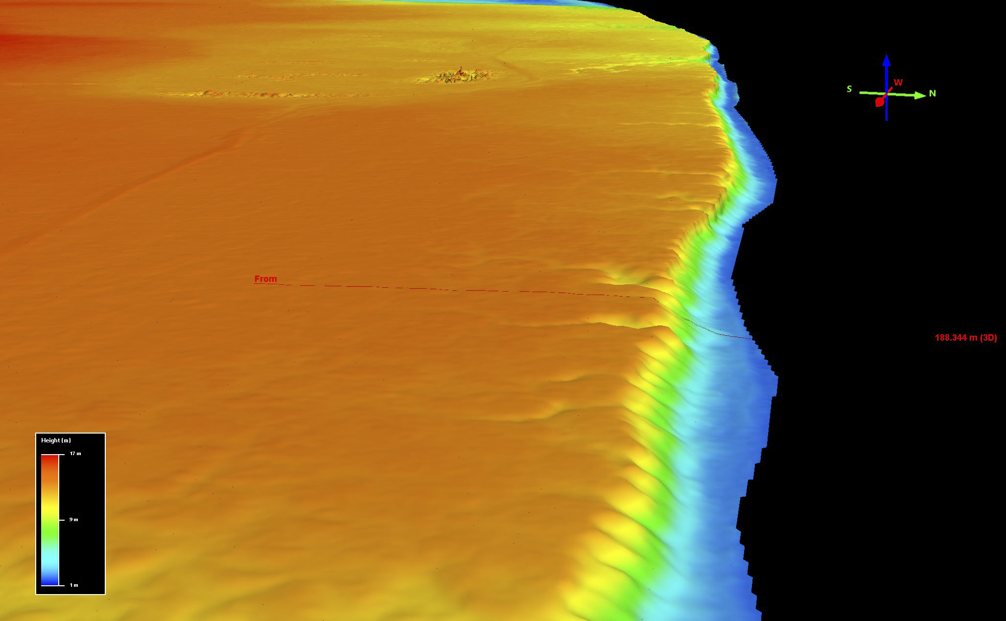
Here is an example transect quantitatively showing the amount of coastal erosion here. The rate appears to be increasing over time after 2009, but individual storms have a huge impact so it will take more years of data before we can determine that.
Brooks Range Glaciers
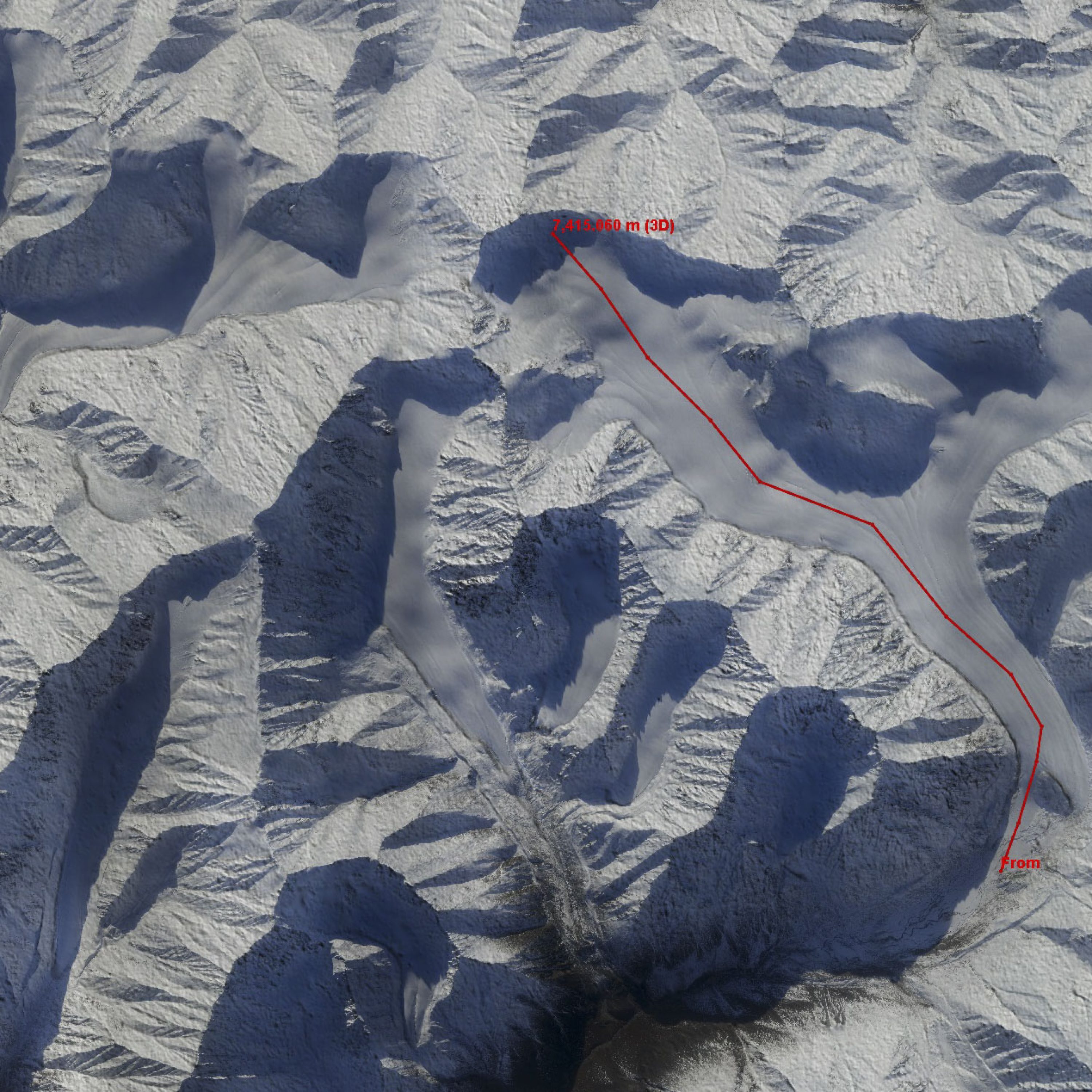
I’ve been studying the glaciers that drain into the 1002 Area since 2003. As part of those studies, I’ve been mapping their surface elevations to determine their rate of volume change. On McCall Glacier we used RTK survey methods to remeasure along a single-track homemade airborne lidar profile made in 1995, measuring this twice per year from 2003-2009. We did the same thing on a variety of other nearby glaciers each year as well. But in 2008 we mapped them all with a commercial lidar, then repeated this in 2009-2011. By 2012 I was mapping them with my own system, and started doing that 2-3 times per year ever since. In most years I also mapped large clusters of other glaciers. But in 2018, I mapped them all again for the first time, giving me a 10 year repeat on our initial airborne measurements. So here we have not only a great time-series of glacier volume change, but also a great validation data set. A few years ago I worked up a rigorous peer-reviewed validation of these data and used them to definitely settle some debate on which are the tallest peaks in this region and then used then used the same methods to measure the tallest mountain in North America, finding the accuracy in both in the same 10-20 cm range as always, so here I’m mostly just excited to see a 10 year volume change. The 2018 acquisition occurred in mid-September, later than I would have liked, so there was about 10-30 cm of snow already in the mountains and this will cause some complications with analysis, but overall the data are sufficient for the purpose, though I think I might do it all again next year in mid-summer because I want to see the glacier ice.
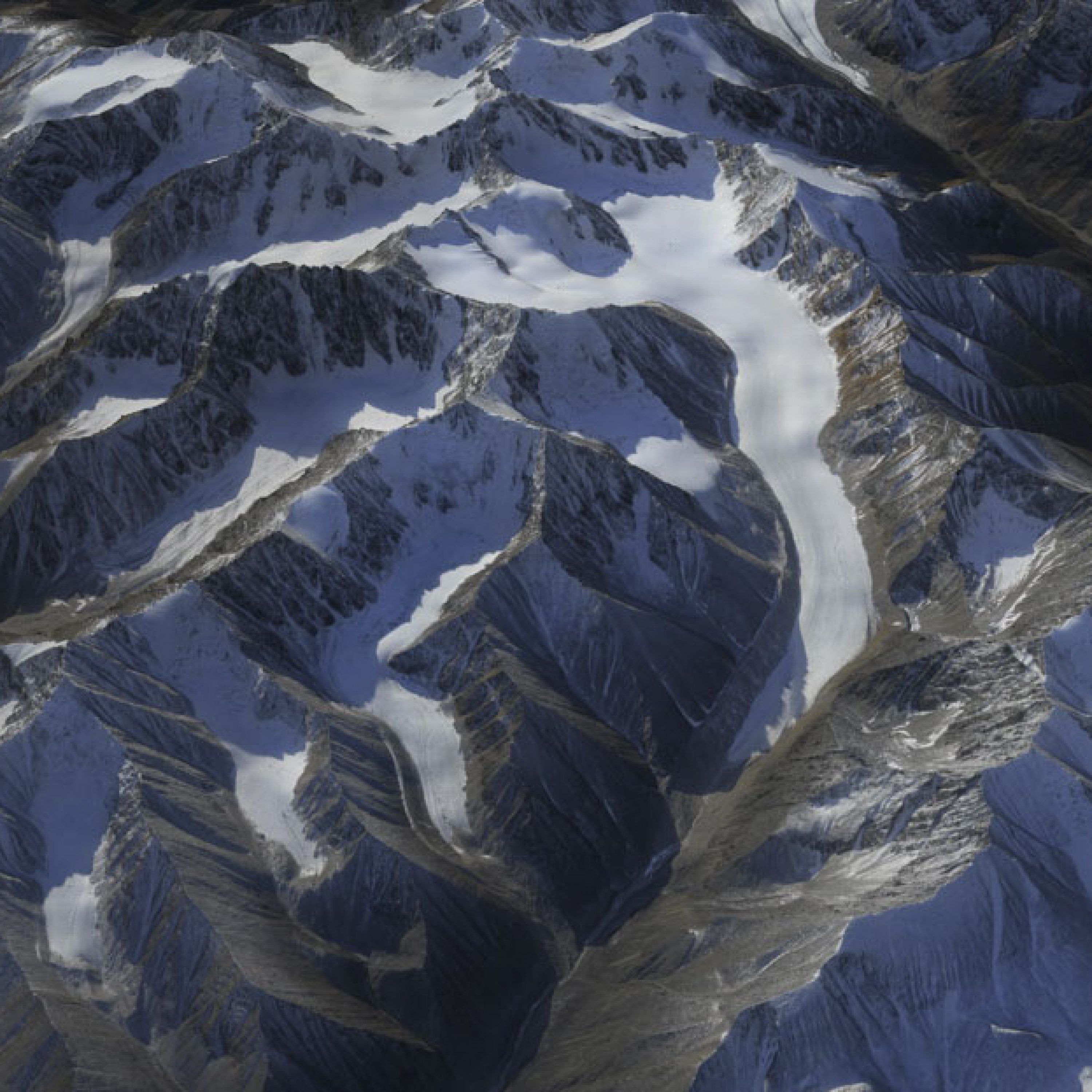
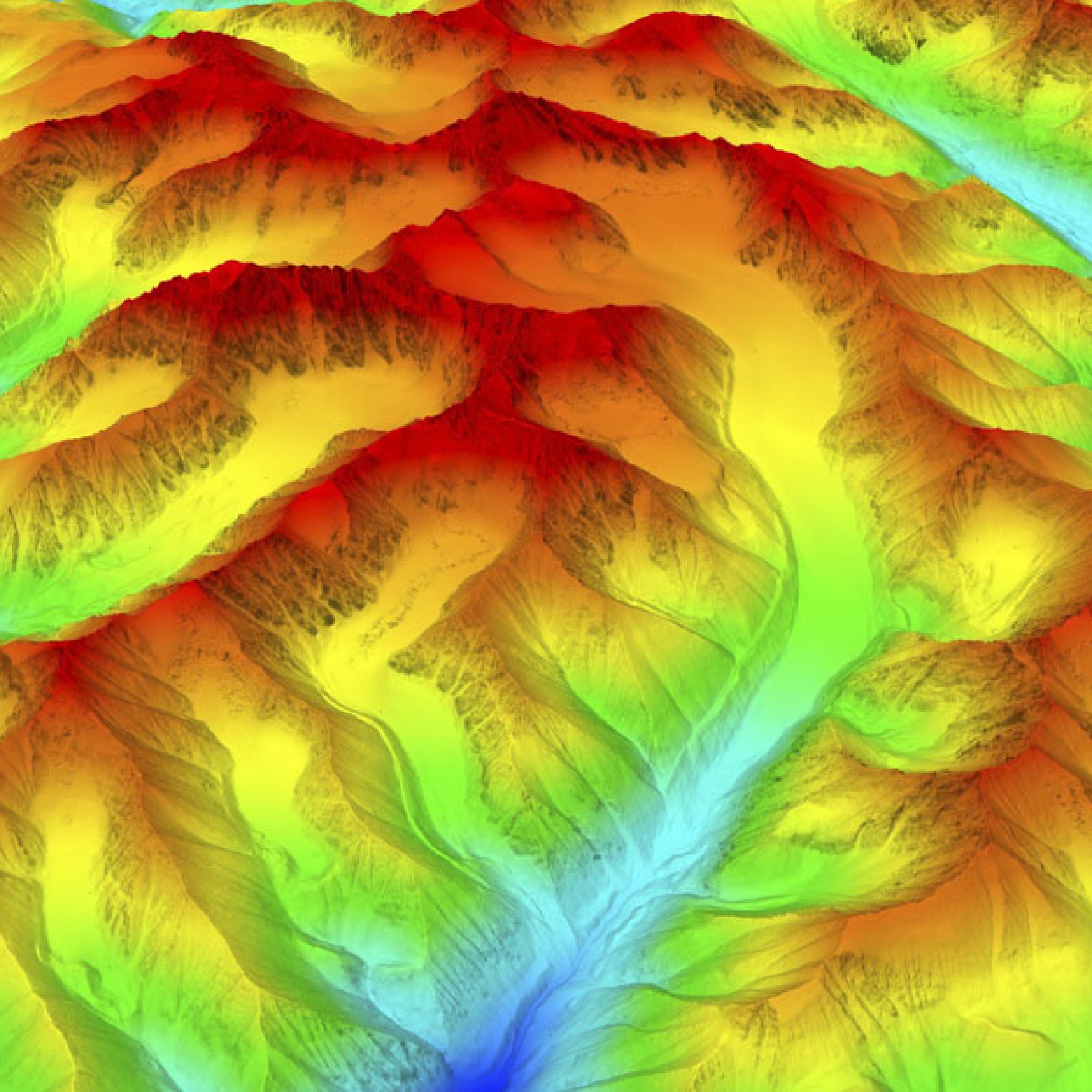
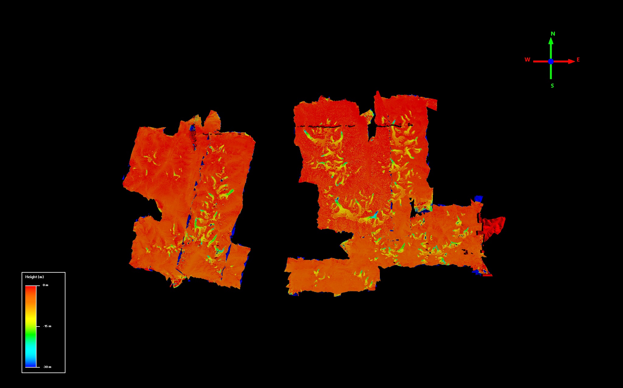
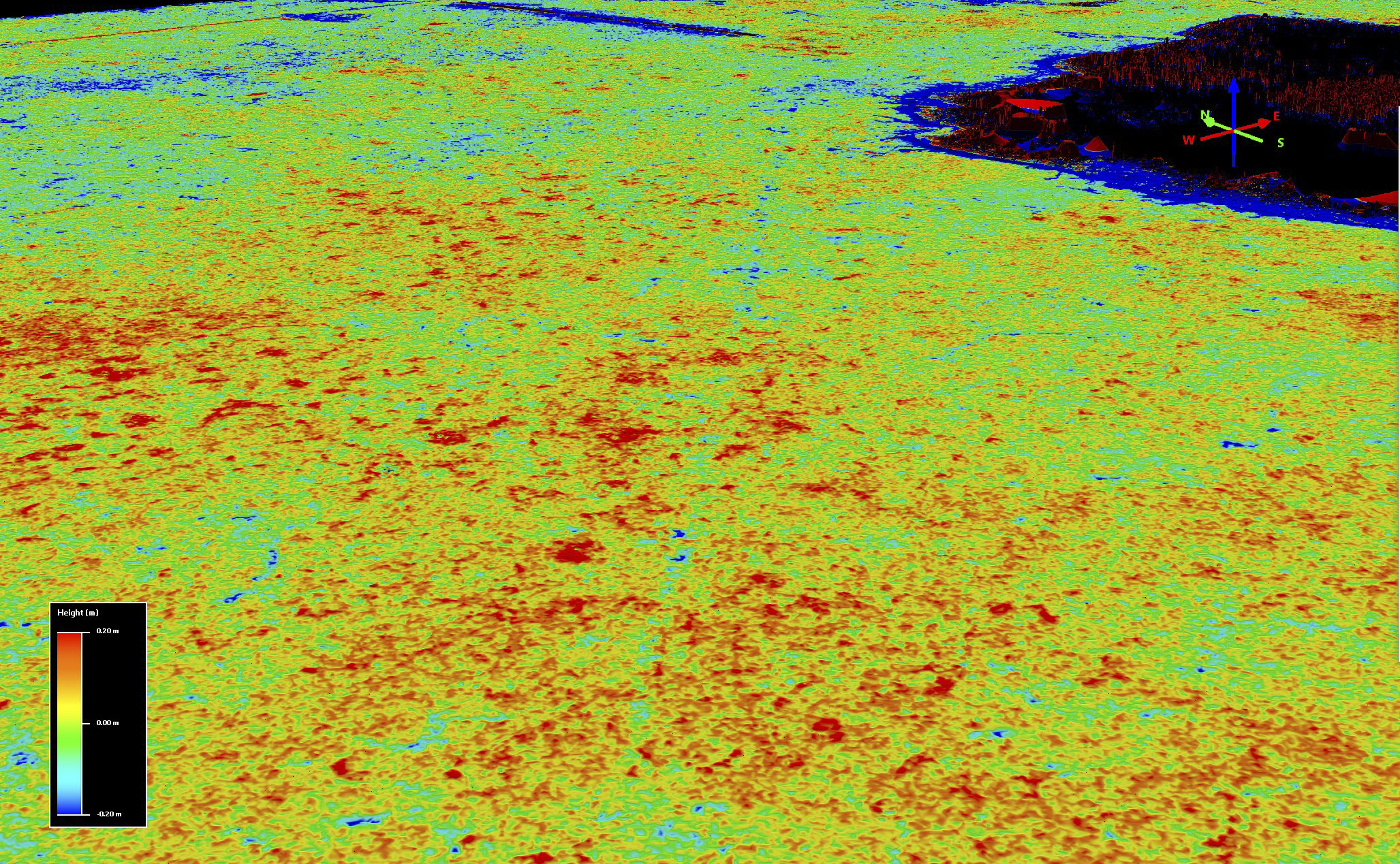
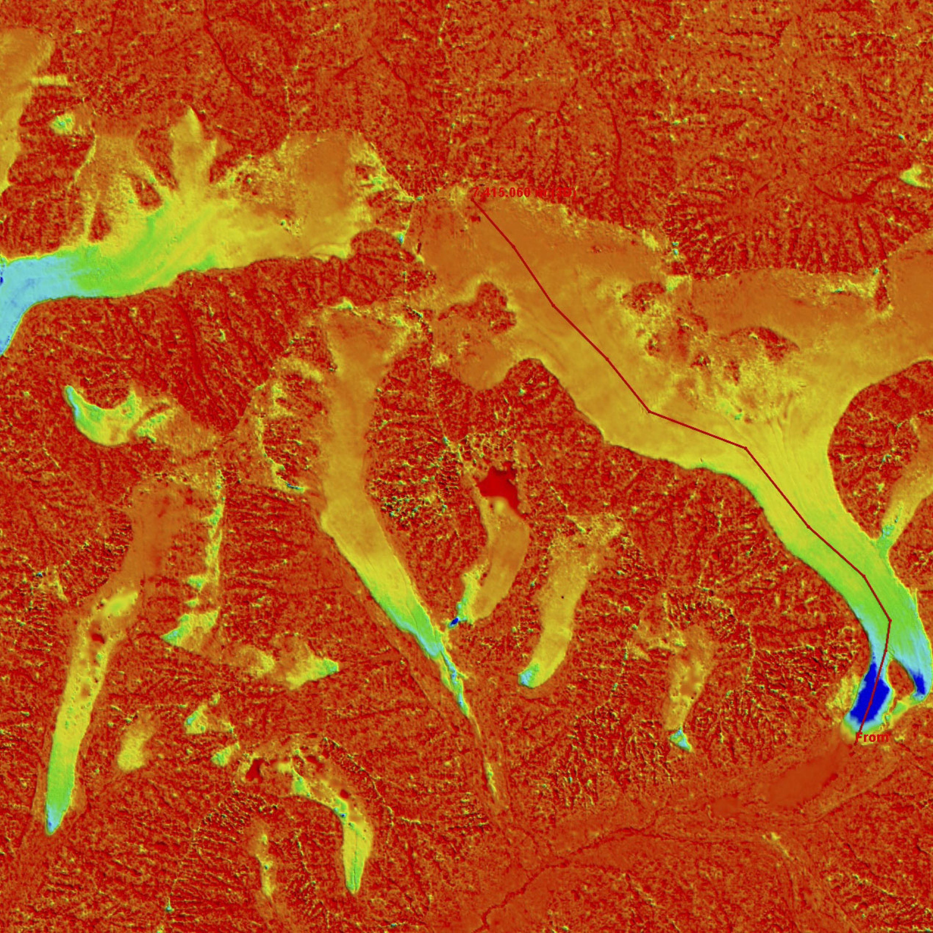
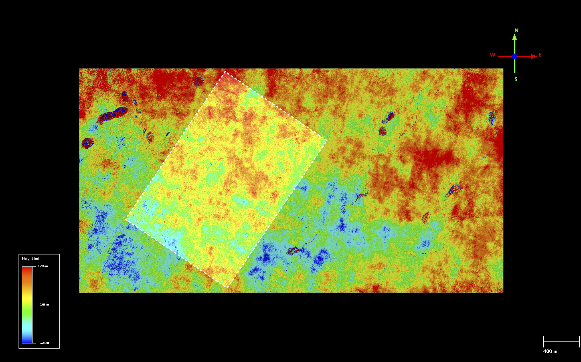
Here is the difference between the 2018 fodar and the 2009 lidar. It’s a little tough to see details, but the red is no change, the yellows-greens-blues are the glaciers; the black lines are either data dropouts in the lidar or the edges of my daily projects (which I have not merged yet, this is just a first look for quality control). Every one of the glaciers here is losing mass and when zoomed in their shape jumps off the screen, their change is so large compared to the noise level.

Here is the difference in elevation between 2018 and 2008 on Okpilak Glacier. It’s lost about 35 meters of ice near it’s terminus, a rate of about 3.5 meters per year (left side of plot). What’s most concerning, however, is that the glacier is also losing volume in it’s accumulation area (here about 5 m, which is typical of what I saw at all the glaciers here), where not only is it losing more surface ice to melt than it gains in snow, but the surface is being lowered due to drawn down by ice flow headed towards the terminus (left). That is, everywhere in this region we have passed the tipping point — the late-summer snow line is now typically above the height of the glaciers and even if climate changed stopped today, these glaciers would all disappear as they are not making new ice. We have already seen this in great detail on McCall Glacier where we have our primary field studies, but this is the first time we can say this is happening everywhere in this region. At current rates of change, the bulk of these glaciers could disappear in the next 50-75 years.
Pt Thomson Seismic
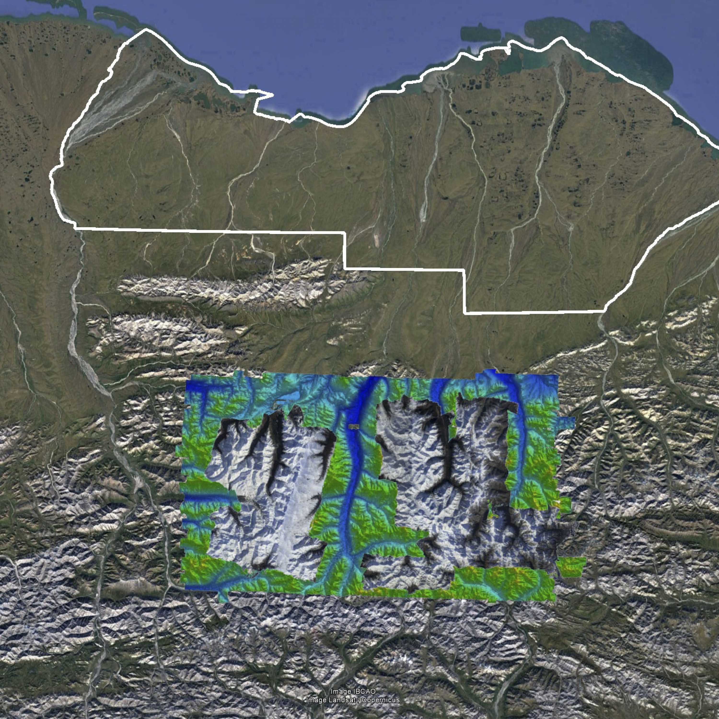
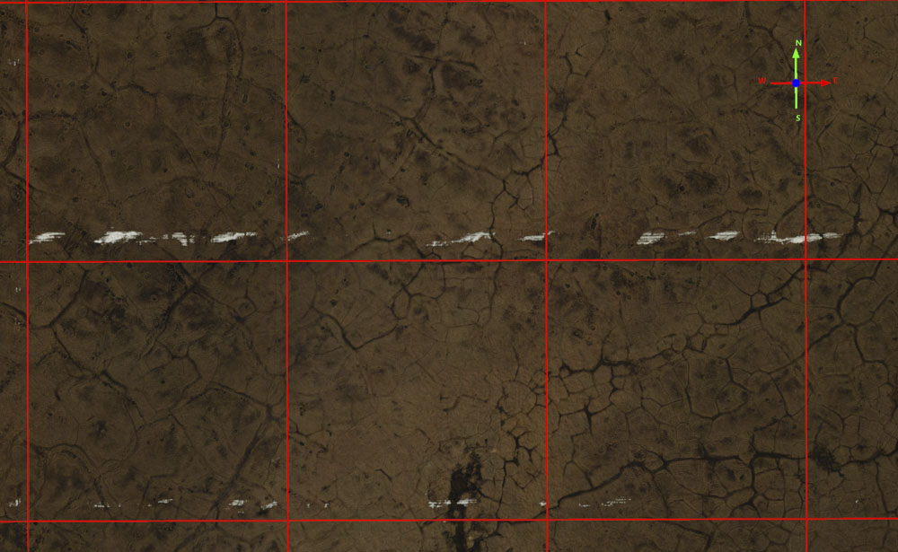
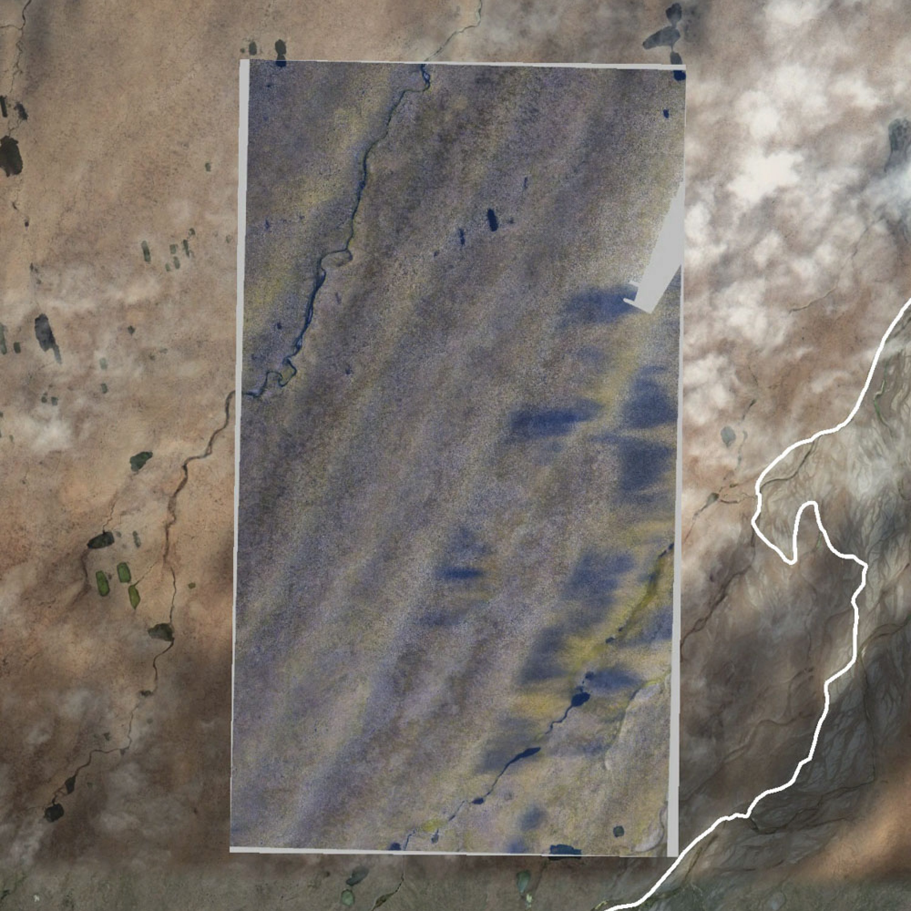
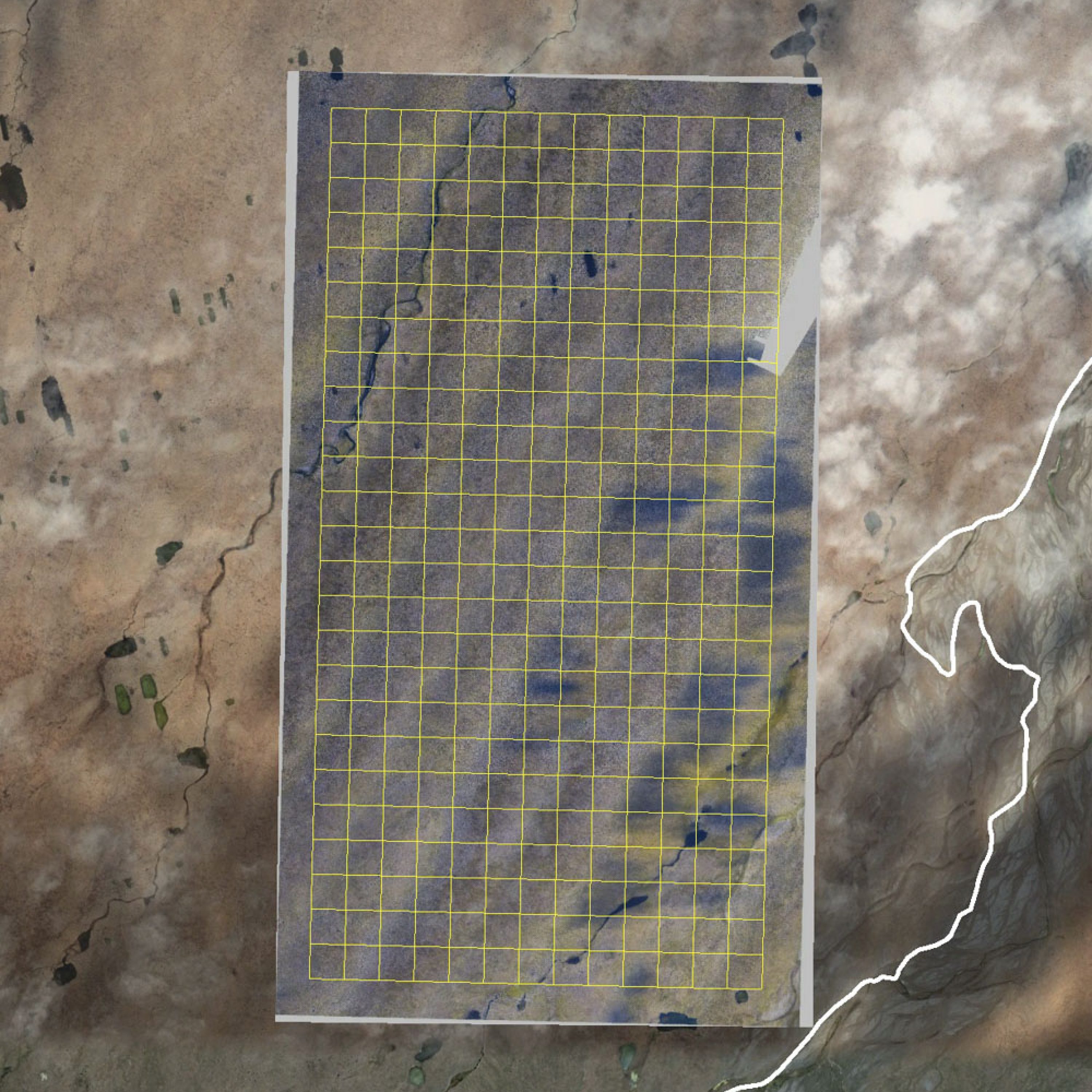
Last year I was able to map the impacts of 3D seismic exploration in the Pt Thomson area, just across the Canning River from the 1002 Area. Since these impacts were something I wanted to track over time, on my last day in the field I mapped much of the area twice, so that I could not only measure the impacts a third time (six months after the seismic work) but use those data for validation, as presumably the only differences between two maps made there on the same day is system noise. In terms of accuracy specs, what I found here is what I always find, a repeatibility of 10-20 cm and a geolocational accuracy of better than 30 cm. In terms of the impacts of seismic work here, I found that I was able to see the tire tracks of every seismic line, over six months after the work was completed. I’ve included a sample of the imagery data in Google Earth format so you can both get a sense of the detail the entire map will have and get a look at the impact of the seismic lines on the landscape on your own.

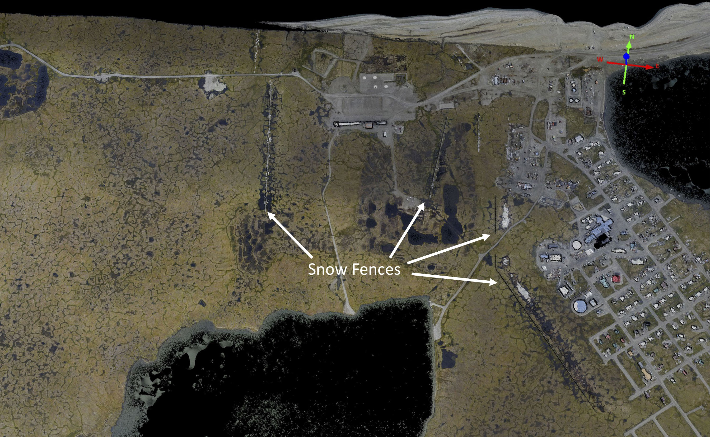
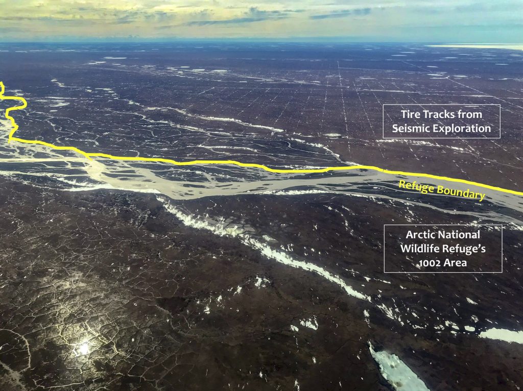
Here are those data superimposed in Google Earth to show their location, just on the western border of the 1002 Area (white line).


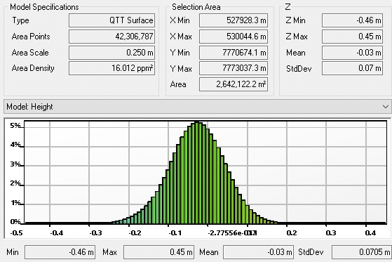
Here are the statistics from the white selection box in the previous image pair. That box included 42 million (million!) points with a mean offset of 3 cm and a standard deviation of misfit of about 7 cm. That means roughly 95% of the points here are within 14 cm of each other. If I choose smaller boxes that have only the tiniest of waterbodies in them, I get down to about 5 cm standard deviation, and when I choose irregular polygon shapes to double the size shown here, I get about 8 cm. It really doesn’t get much better than this — as I’ve shown already and with more below, we can detect changes at the centimeter level with this level of accuracy and precision.

Here are the elevations from both data sets. The horizontal grid lines are 10 cm apart. At left the elevations are identical to within a few centimeters, to the right they begin to diverge up to about 15 cm, which is basically what we found with the statistics above. The spatial width here is less than a single photo, so likely what’s happening here is that in such flat terrain there is enough slop below the error threshold of the bundle adjustment to misplace a few photo pairs by about this much, and I suspect much of that slop is caused by differences in shadow contrast which throws off the algorithm. Regardless, the correspondence is still amazing and most importantly the shape details are still preserved at the centimeter level, meaning that even though there is an offset they can still be used for change detection at the centimeter-level, if those changes are spatial continuous enough that they stand out above the random noise and systematic noise. And regardless of change detection capabilities — holy smokes, we can resolve the shape and size of every single ice wedge and weird permafrost feature in this whole 6000 km<sup>2</sup> area!
Once again, basically what I’ve found here is what I’ve found every time I validate these data, that the accuracy and precision of these data are in the 10-20 cm range and that the noise levels are suitable to detect change at the centimeter-scale. So with that in mind, below I analyze these data to get a sense of the impacts of the seismic work conducted there earlier this year.
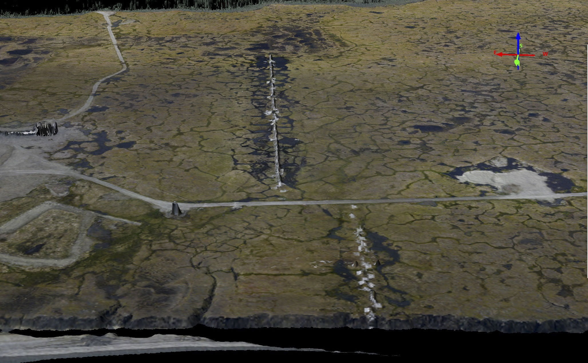
On my first day mapping the 1002 Area in late June I discovered a checkerboard of tire tracks left by seismic vehicles exploring the subsurface just over the boundary of the Refuge. Their hope is to conduct this same exploration using these same methods this winter, like next week. The industry and political proponents of these methods claim there is no significant impact caused by these methods, therefore no Environmental Impact Statement or alternative method evaluations need to be conducted. I am all for this seismic work to occur, but my maps show that by anyone’s standards of ‘significant’ these vehicles do create significant impacts to the fragile tundra landscape and we have plenty of good reasons to believe that the 1002 Area is more fragile than these flat lands to west, so allowing the EIS process to be skipped is simply irresponsible in my opinion.
Several of my blogs from this summer (like here, here or here) showed example results from the maps I made of this seismic disturbance in June and July. There you will find tons of screenshots and movies demonstrating the impacts. For this August data I thought I would try something different — sharing the full resolution data with you so that you can fly around on it and see the impacts for yourself (see link in figure caption later).
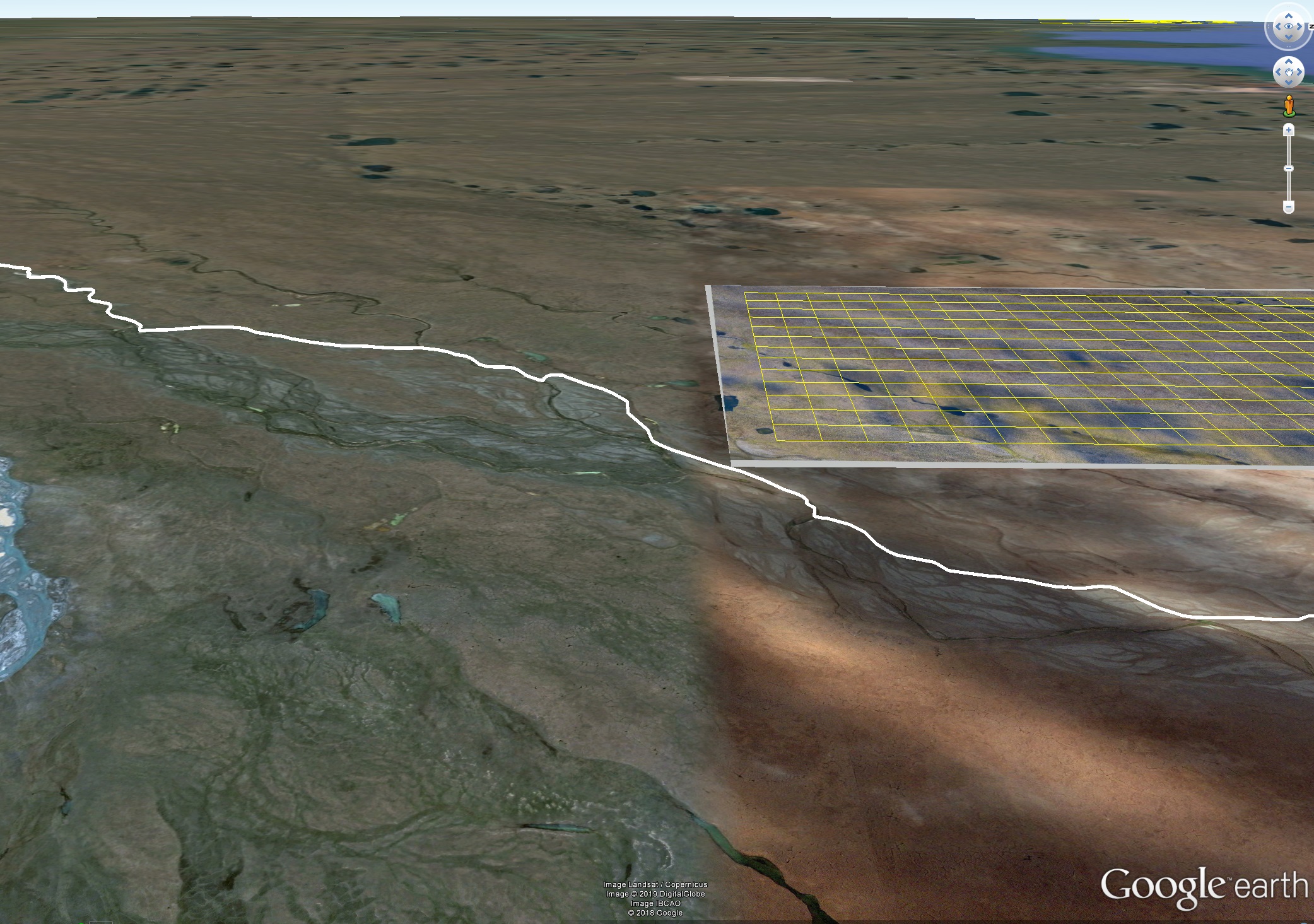
Here is a perspective view in Google Earth somewhat matching the photo I took in the previous image showing the seismic checkerboard made from compressed snow. The yellow checkerboard seen in this image is what I’m sharing below, this image just demonstrates that what I’m sharing is just a small fraction of the whole.
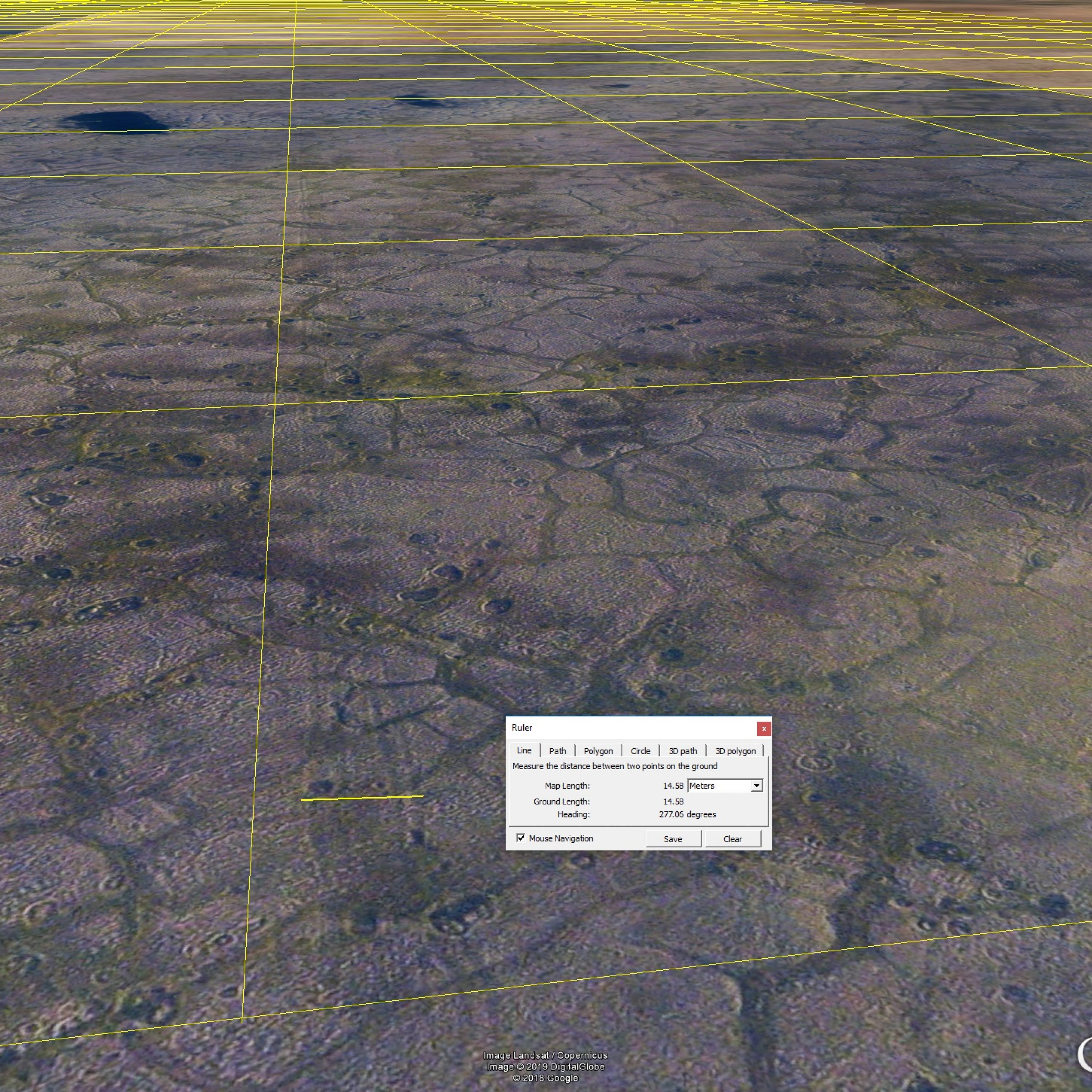
Here is what you can do in Google Earth with the download above, view the impacts of these vehicles and measure their spatial dimensions for yourself. Unfortunately there is no way for me to ingest topography into Google Earth, but I’ll show some examples of it later. The measurement I made here using the Ruler Tool in Google Earth shows the width of this trail to be about 15 meters (45 feet!).
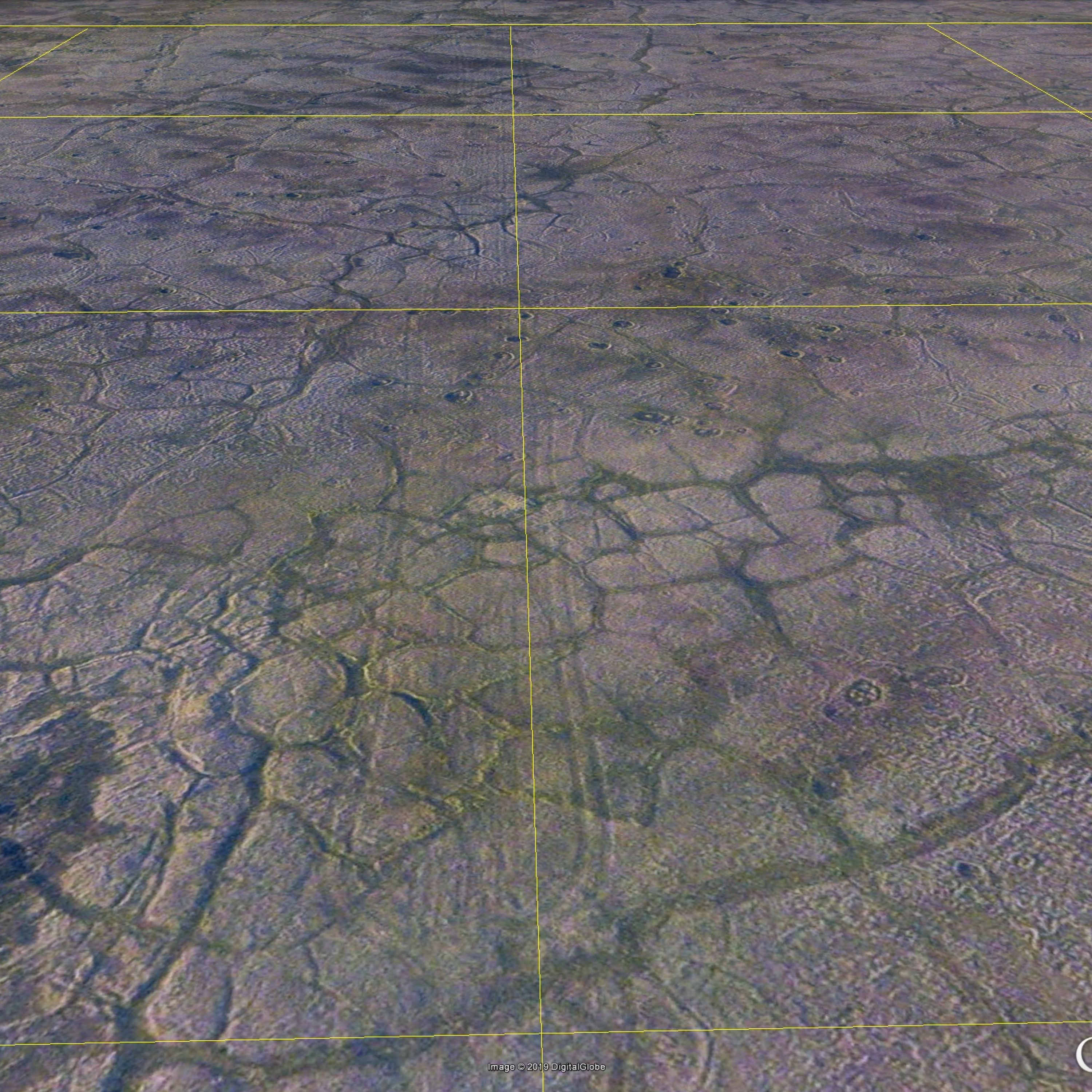
This is a particularly wide trail at over 30 meters, but I think nearly all of these north-south trails are at least 10-15 m wide and are spatially continuous (you can follow them for miles without gaps).
More examples of the same, in the north-south direction. I think these north-south trails must have been caused by the vibroseis equipment which generate the acoustic waves that reflect off of the subsurface. They either ran the trucks in separate tracks, perhaps to use fresh snow each time in an effort to not smush already crushed snow into the tundra further, or they just made wide trails willy-nilly, not sure. In any case, it is clear that the snow did not protect the tundra from the weight of these huge machines, which are designed to smash the ground really hard to made acoustic waves that will penetrate the earth’s crust for miles.
The east-west tracks are much harder to find and are not as continuous, but if you look closely you will find them near each of the yellow lines in that KMZ file, usually offset to one side or the other by 5-10 m (here just to the right of the central line). My impressions is that these were the vehicles used to plant or remove the geophones that record the acoustic reflections from the subsurface. What I find interesting about these trails is that there is hope that overland travel does not have to be destructive and that if we had continuous snow-depth data here we could begin to correlate impact as a function of snow depth and come up with better regulations. Similarly, the soils and vegetation types no doubt differ in sensitivity to being crushed, such that using these data we can also begin to tease that apart (but without snow depths, that won’t work as well as it could).
If you look really close at these data you can find locations that the visible tracks still have a topographic expression, but it is on the order of an inch or two at most, from what I found. Here the horizontal grid lines are only a centimeter apart. The vertical red line is located in the middle of a tire track in the previous image.
I found this in a number of places I looked, that the topography was higher over a track. My guess at the moment is that’s a difference in vegetation caused by a mushy depression.
So is this just cosmetic or does the ecosystem care about these tracks? Well, this is a permafrost ecosystem, and the permafrost here is looking for any excuse it can find to melt and we’re about to make it’s dreams come true.
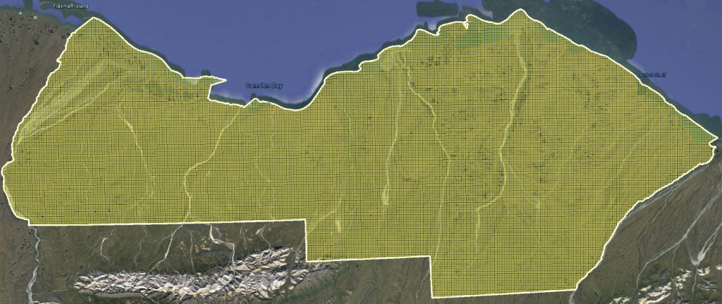
The proposed plan is extend the 200 m x 200 m grid we found at Pt Thomson to the entire 6000 km2 area of the 1002, as seen here. This grid will create about 38,000 miles (!) of checkerboard by heavy vehicles, and with an average trail width of 10 m this means that approximately 10 % of the land area (about 150,000 acres) will be affected. Not only will this checkerboard be visible for years to decades to come, it likely will change the evolutionary trajectory of the entire ecosystem as those trails will accelerate permafrost melt and permanently alter the vegetation over this area and everything up on the food chain that depends on it. Yet this is not a significant impact?
What could possibly go wrong with the most ambitious seismic project ever conducted in this country? It’s only creating a network of trails six times longer than the Manhattan road system over an area almost half the size of Connecticut by driving hundreds of tons of heavy machinery in the dead of Arctic winter’s night over the fragile permafrost terrain of the largest and most pristine intact ecosystem in the US where even caribou footprints can be seen years later.
According to the BLM that oversees the permitting process, nothing could possibly go wrong: there is no possibility for significant impacts to occur, therefore there is no need for any sort of environmental review, any review of alternative methods, any review of need, etc. Nope, nothing to see here, just go have fun boys.
The issue is that we already know this is not true because we’ve been here before. When Congress turned much of the Arctic NWR into a Designated Wilderness and allowed for the possibility of drilling within the 1002 Area in 1980, they mandated an exploratory seismic program within the 1002 Area to estimate the amount of extractable oil, again rushing it through without sufficient environmental safeguards. Subsequent studies of the impacts of those vehicles, using the same seismic travel methods still used today, found 32% of the seismic trails and 64% of the camp move trails showed physical impacts to the landscape and ecosystem 5 years later, with much of that labeled medium or high levels of disturbance. Twenty-five years later 10% still showed disturbance.
Here is a great paper summarizing these studies of the previous seismic work within the Arctic NWR: Jorgenson, J. C., J. M. Ver Hoef, and M. T. Jorgenson. 2010. Long-term recovery patterns of arctic tundra after winter seismic exploration. Ecological Applications 20:205–221 [doi:10.1890/08-1856.1].
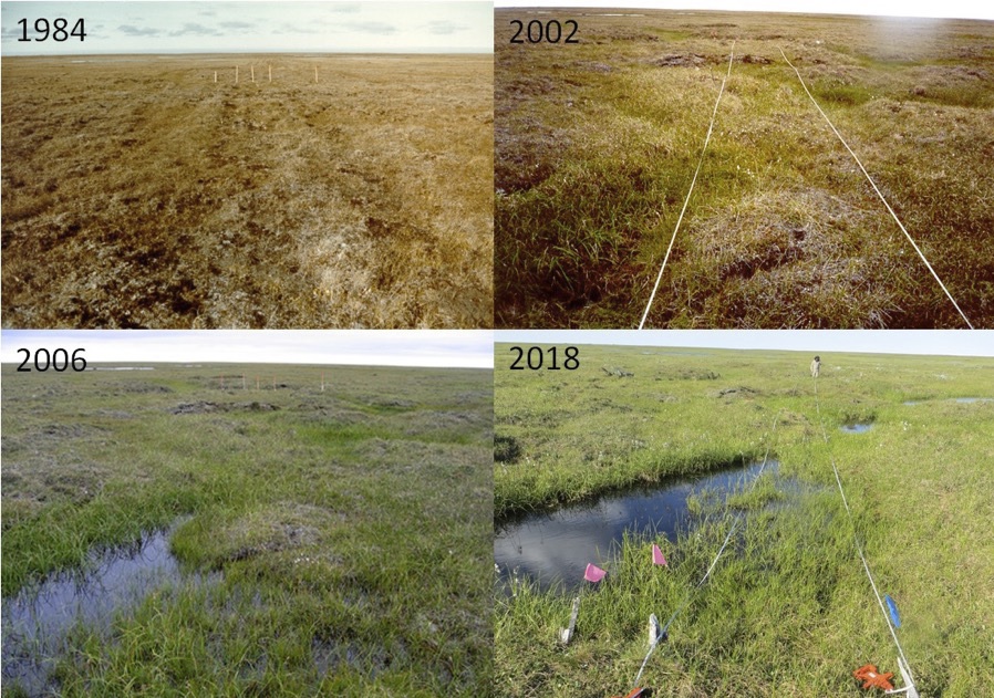
Here’s the problem. Those tracks I’m finding in my data don’t have much of a topographic expression now, but the initial crushing during winter can trigger the underlying permafrost to melt. Above is a series of photos demonstrating this dynamic, taken within the Arctic NWR starting the year after the first seismic work, showing tracks left behind by the seismic campaign the winter before — in 1984 they look remarkably similar to what I’m finding in my data, but 25 years later they have created a swamp where the ice wedges they drove over melted, but not the ice wedges in the control plot nearby; you learn more about this study and these processes in the link below. Imagine the same thing happening now, over permafrost that has already undergone 25 years of rapid warming and is already starting to melt on its own, this time creating 30x more trail for this much more ambitious project. Using the previous measurements of long-term impacts, if the seismic work were to start today as is planned, in 5 years we should expect to see at least 12,000 miles (!!!) of checkerboard in the 1002 Area, that’s about the same length as all the roads in Alaska. But is it reasonable to think that the previous results are the minimum impacts we should find? Nope…
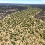
Here’s a photo I took last summer just outside the Refuge giving an aerial view of the process documented by the ground photos above. The seismic trail here is probably over 50 years old and was made by more destructive methods than today’s seismic, but you can see how it triggers melt along ice wedges in its path and how the scar itself is not healing but getting worse. The permafrost was relatively stable then, now it is much warmer and more senstive to disturbance. So even though today’s overland travel methods are less aggressive than yesterday’s, they could still have similar impacts, especially in the slopey, ice-rich ground typical of the 1002 Area. Go back and review what’s happened on Barter Island a few years ago, those impacts likely would not have as noticeable 20 years ago.
Above is a white paper that some of the world’s leading experts on arctic Alaska’s ecology and landscape put together, detailing the expected impacts that these seismic methods might have on the tundra landscape and ecosystem here. It’s not pretty. The bottom is that it is simply irresponsible to use these methods without a full consideration of the likely impacts and the alternative methods, as is required under the EIS process which has been skipped because the powers-that-be claim these methods will have no significant impacts. It’s one thing to be unaware of the impacts, but once made aware by documents like this, going ahead with those same plans anyway is simply uncool, in my opinion, and sets dangerous precedents that could easily lead to our demise.
This white paper focuses on the following ten issues, taken verbatim from the document, and goes into great detail as to the mechanisms and dynamics involved with plenty of references to dig deeper into it:
- The seismic plan will create a “checkerboard” of trails across the entire 1002 Area. The proposed 3D-seismic methods would use fleets of heavy vehicles to create approximately 61,000 km (37,800 miles) of seismic lines spaced at approximately 200 m (660 feet) intervals, that would directly impact an estimated 610 km2 (150,000 acres) with likely long-term impacts on some substantial fraction of this.
- The 1002 Area of the Arctic National Wildlife Refuge is internationally recognized for its intact ecosystems, biological diversity, and its value to wildlife, local people, and the world. It is one of the most biologically diverse protected areas in the circumpolar Arctic and is highly vulnerable to the impacts of 3D-seismic surveys.
- The 1002 Area is significantly different from the Arctic Coastal Plain to the west of it and requires a different approach to seismic exploration. The area is steeper, more incised, and includes more river systems compared to predominantly flat areas further west where extensive 3D-seismic surveys have been conducted. The different topography strongly affects the snow, hydrology and permafrost regimes of this generally hilly region and increases the potential for significant impacts from seismic exploration.
- 3D-seismic technology has not been sufficiently developed to prevent significant damage to arctic tundra. Detailed microtopographic transects across existing 3Dseismic trails show that there is compression of the tundra vegetation mat that is up to 20 cm. These changes to microtopography within the track cause other changes to snow, hydrology, and thermal regimes, which make the tracks visible from the air and set the stage in some areas for thermokarst and thermal erosion. Changes in the microtopography and compression of the vegetation mat also would have likely large consequences to habitats of many species of plants, insects, small mammals, and birds.
- Snow conditions of the 1002 Area are too heterogeneous to allow for an extensive and regular grid of closely spaced seismic lines. Generally, low amounts of winter snowfall, strong winter winds, and the hilly terrain in the 1002 Area combine to create substantial areas of very thin and unpredictable snow cover, such that much of this area would be damaged by seismic surveys.
- The upper permafrost in the 1002 Area contains large amounts of ground ice, which may result in widespread thermokarst in the seismic trails. Permafrost conditions within the 1002 Area are relatively understudied compared to other regions of northern Alaska, but it is known that the soils are almost universally ice rich with large thaw-settlement potential. Exceptionally ice-rich silt deposits blanket much of the 1002 Area. Furthermore, climate-related arctic permafrost warming and feedbacks over time will create pathways for flowing water in this steeper terrain, increasing thermokarst and thermal erosion along the tracks left by the seismic survey equipment.
- It will be difficult to avoid significant long-term impacts to the tundra vegetation. Evidence from past seismic surveys in the 1002 Area in the 1980s indicates that there have been long lasting changes to vegetation in the trails. We summarize the impacts from previous 2D-seismic surveys with respect to vehicle type, snow, permafrost, vegetation, and time since disturbance. We also review the existing evidence of impacts from previous 3D-seismic surveys elsewhere.
- Camp moves are the most damaging aspect of the 3D-seismic surveys with respect to the terrain and vegetation. The technology and available equipment used in camp moves has not changed sufficiently to avoid permanent, significant impacts. Bulldozers and strings of heavy sleds are used for the camp moves and create the most damaging impacts. Some of the camp-move trails created during the 1980s are still visible on aerial photographs and satellite images.
- It is likely that 3D-seismic impacts will combine with other future impacts related to climate change and infrastructure expansion to create widespread and unpredictable cumulative effects to the terrain and vegetation of the 1002 Area. Ongoing climate change will exacerbate seismic impacts. Anticipated oil and gas development will also add to seismic impacts, extending them far beyond the currently projected 2000-acre infrastructure footprint. A realistic adaptation strategy should account for cumulative effects of climate change and realistic scenarios of the direct and indirect impacts that would accompany plans for oil- and gas-field exploration, development and production.
- Major data gaps need to be filled to permit sound decisions regarding 3D-seismic exploration in the 1002 Area. These include (1) detailed characterizations of the surficial geomorphology, microtopography, vegetation, snow, and ground ice, which would also serve as the basis for detecting long-term changes; and (2) data regarding the long-term environmental effects of 3D seismic, which are necessary to understand the resistance and resilience of the various terrain and vegetation types to past and future 3D-seismic disturbance.
No possibility for significant impacts? What’s really going on here?
There are enormously powerful forces at work here, powerful enough to subvert the due process that is supposed to vet and eliminate environmental threats like these. Even if public input could make a difference, the government isn’t even allowing public comment on this seismic work anyway. So what’s left?
I really don’t know, but I do know the scientific method can lead us towards an answer. The scientific method boils down to one simple rule — if someone playing the game called science can successfully call bullshit on another player’s ideas by disproving it, everyone agrees to drop that idea and move onto the next without getting egos involved — there are no winners or losers, there are no allies and enemies, there is no good and evil, there are only disproven ideas and ones yet to be disproven. The method stems from an implicit understanding and agreement that we are all full of shit, that our capacity for self-delusion is unlimited, that we inherently lack the tools needed to keep our own egos in check, and that we need the objective feedback of others to keep us from drowning in the deep end of absurdity and dragging the rest of us down too.
But following the scientific method does not mean we should give up on creativity, it’s the opposite really — the scientific method can only identify wrong answers and it stops there. Finding the right answers relies on creativity, ego, serendipity, love, hate, fear, courage, grit, and who knows what else. I think that’s the part most people don’t understand. Just because I stand up against some bullshit does not mean I know the right answer, or even that I should know the right answer. This is why it is easy to be a mediocre scientist, because it’s easy to disprove wrong ideas but it’s really hard to come up with ones that cannot be disproved. But we can’t wait until we have a right answer before disproving a wrong one because wrong ones can kill us in the meantime, or in any case tie up mental bandwidth that could otherwise be used towards seeking an answer that can’t be disproven. And the scariest part is just because we can’t disprove something doesn’t make it true or accurate. We can’t even prove that the scientific method is the best approach to building accurate predictive models, but it’s the only method we can’t disprove and it does lead to huge predictive power, as evidenced by all of the technological successes we see around us today.
The reason we need the scientific method as a game to be played by a group is that we individually believe that it shouldn’t apply to us — “my actions are always sane, noble, and justified, it’s everyone else that’s nuts”. But this is also demonstrably false — behind all wars, genocides, and even poverty itself is always a self-righteous belief held by those with the power to stop those atrocities that they are justified in their actions. Those atrocities always start by thinking there there is an Us vs Them that can lead to thinking of Them as all vermin or pests, all murderers and rapists, etc.
that leads to dehumanizing some group of humans. Once we stop seeing Them as humans, we feel free to exterminate or mistreat them without any moral qualms. The scientific method implicitly acknowledges that each of us has the delusional power to convince ourselves of the demonstrably false idea that some humans are subhuman and if rightly applied will keep us from letting such ideas attach to our egos and fester, giving us back the bandwidth we so desperately need to continue the search for ideas that cannot be disproved and therefore have a higher likelihood of solving our problems.
So I’d like to think that we can still differ in opinions but agree on facts. That we can support different ideas, up until the time someone can disprove them. And once disproven we can all move on to the next idea without gloating or sulking. These are the unspoken rules of the scientific method, and for civility and sportsmanship in general for that matter.
Imagine a life without the scientific method, which doesn’t take much imagination these days. A life without the scientific method means a life where we are ruled by superstition and fear and ego, where we do not vet our predictive models by eliminating ideas that are demonstrably inaccurate but who yells the loudest or plays the dirtiest. For example, we like to pretend that communism and socialism have failed in so many countries because of some inherent idealogical dysfunction, but we see the same things happening now in our constitutional republic — every governmental system will ultimately fail once it becomes disconnected from reality by only believing that which it thinks will perpetuate itself without any objective checks and balances on those beliefs, and likely any governmental system will succeed as long as it is ruled by the scientific method because every such system will ultimately converge on the same truths by eliminating the same bullshit, it’s just a question of speed and the creativity of it’s populace.
So to me the controversy over the 1002 Area is really a controversy about how we want to rule ourselves. Do we want to use the scientific method or use the rules of the jungle? To me, those lines seem pretty blurred to those around me.
As I’ve said many times, I’m all for doing seismic out here, it’s just the methods I object to (including lying about the absence of impacts to bypass an environmental review). Do I think the world will survive if we don’t do seismic out here? Sure. But it would still be cool to have this information, you can read why I think so here. But most importantly I support it because I support science, even science that does not appear to directly benefit me (I’m no geologist, but I want the geologists to tell me new things about the origins of the 1002 Area). Supporting science means supporting the scientific method even when it is likely that the outcome may have some adverse impact on your ego. It means not only agreeing to give up ideas that can be disproved, but agreeing to use the method on ideas you don’t want to be disproved, lest you tacitly grant superstition, fear and ego a foothold in governing our predictive models.
Unfortunately, other than by a few professional scientists, I do not find myself surrounded by many others that support science on the seismic issues in the 1002 Area.
Clearly the politicians and their administrative lackeys driving this seismic plan through the system do not support science. They have a goal and they do not want to hear about any scientifically-vetted results that interfere with those goals. They refuse to let go of ideas which are demonstrably false, violating the central rule of the scientific method, and they will attack the egos or dehumanize anyone they feel is not touting their party line, violating the unspoken rules of the method, sportsmanship, and civility, driving out or emasculating anyone within government that is trying to play by the rules.
Do those doing the seismic work support science? In a civilization structured around a division of labor, perhaps the individuals involved can get some leeway here. They are, after all, following the rule of law — the ‘experts’ have granted them the permits needed, so as long as they stay within those sideboards, they are doing the job that their cog in the wheel is supposed to. The issue is of course that the ‘experts’ are largely being replaced by shills of Big Industry hired by a government that has been bought out by the Big Money that rules those industries. This is not something they even keep secret these days — there is an open war to eliminate the checks and balances between permittees and permitters in the name of shrinking government and promoting industry. So in this context, we should blame the game not the players, a game played by a different set of rules than the scientific method.
Perhaps less obviously it seems to me most of the big NGOs and ‘green’ companies weighing in on this issue do not support science either. They come to me because they see me disproving the bullshit of government, but they have outright told me that even if there were no impacts of seismic out here that they would not support it because they don’t want that information facilitating oil development and they don’t want their donors and supporters to stop supporting them due to the appearance of capitulation.
Let’s think that one through. How is that any different than Big Industry not wanting guys like me to study climate change because they don’t want my results limiting their profits or bruising the egos of their stockholders? Both sentiments are identical to me: “We only support that science which we believe will tell us what we already know we want to hear”. That is not supporting science, that’s supporting fear and superstition. So to me, right now, the industrialized government and NGOs are two sides of the same coin, and so is anyone in the public taking their word for what to support out here.
And that is the way I view the world, you either stand with science or you stand with superstition and fear, there is no other grouping or allegiance that makes any sense to me. It’s the only Us vs Them that is allowable in my mind, at least until someone can disprove it for me. This line, to me, is one that does not lead to dehumanization. It is not a line that is drawn in the sand by Us, it is drawn by Them and They have the power to redraw it whenever they like. History, right understood as science, is a series of lessons disproving ideas that are not conducive to large groups of people living peacefully together. Utilizing those lessons of history is standing with science, reutilizing those disproven lessons is not. That this line exists at all, in my mind, should be an indicator to Us that we have failed Them, that our predictive models of persuasion are being disproven by the existence of Them such that we should not blame Them, but rather blame ourselves for sticking to disproven models. We need to lead by example despite our fear. I don’t know the right answers or the right models, but I do know the right method to getting there, and it begins with letting go of what is demonstrably false, and it is clear that our current methods of education and advocacy fall within that category.
So where does that leave us regarding seismic in the 1002 Area?
Again, I really don’t know. What I do know is that a lot of assertions about the methods are demonstrably false. And I do know a lot of things about permafrost ecology that have not yet been disproven. And we have learned a few things about looking closely to the impacts of the Pt Thomson data with fodar that may be useful in a new plan. But I recognize that none of that will lead to a better plan if I’m the only one standing with science.
The best I can come up with as a mediocre scientist is that what we need are new heros. Heros who are brave enough to stand with science even though doing so frightens their ego and leads their so-called friends to criticize them for not taking the party line. Heros with the creativity and grit to come up with new ideas and test them knowing they might fail. Heros with resources powerful enough to counter Them — not the oil companies, but anyone not standing with science. As corny as it may sound, in science the journey is the reward, Sportsmanship is Science: if we keep striving to not be stupid we will continue to get smarter, so our collective success comes from playing by the rules not by individually winning battles.
Standing with science means standing with seismic in this case. It doesn’t mean paying for it, it doesn’t mean allowing it alter or destroy an ecosystem, it doesn’t mean supporting oil drilling, it doesn’t mean losing your friends or becoming evil. It means supporting science that may lead to events that don’t stroke your current ego. It means disproving the alternatives to Truth. It means demonstrating that if you can do it, than anyone can.
Here’s a personal example of what I mean. I made these cool fodar maps showing the ruts these vehicles were leaving. I then got a lot of calls from NGOs, all of them requesting to use my images to support their agendas and asking me to write letters to do the same. None of them demanded I stop doing this science. What if I could do seismic from my airplane — would they suddenly think I am the enemy rather than an ally? It’s still science from the same airplane with the same impacts, an airplane that requires gas and infrastructure in the arctic that ultimately must have some impact somewhere. And when it comes down to it, even my fodar is quite useful to the oil industry, whether it is used to measure snow depth to prevent tundra damage, used to engineer infrastructure that will survive climate change, etc. Should we no longer make maps because that information threatens our egos? Should we stop studying caribou? Or what they eat? Or what they breathe? Where does that thinking end, except in being ruled by superstition and fear?
So where do we find such heros? Again the best my mediocre mind can come up with are those that spend a lot of money claiming to speak for the trees, but that’s due to my own creative limitations, hopefully this is just one idea of many that others can come up with.
How would it look if those NGOs and green businesses stood with science? In my mind, it would start with a recognition that there is nothing inherently wrong with seismic (ie, with science) and go from there. Once we accept that seismic is science, presumably they could then apply their resources towards solving the real problem: is there a way to conduct that science without causing unacceptable impacts to the ecosystem? Now they are working as heros for science instead of opponents to science, now they are Us finding new ways to educate Them, rather than a different flavor of Them pointing fingers at Themselves.
Now we have a technical problem that is limited by our collective creativity instead of our individual egos. I believe it is possible to do this work without permanently scarring or altering the ecosystem; I’ve suggested a bunch of ideas along these lines in previous blogs and letters to BLM you can find there. And I’m no expert, so hiring the right creative experts should come up with a variety of such plans that would work, so let’s just assume that’s true for the moment.
Once we take ego out of the equation, implementing those ideas becomes just another technical challenge. For example, Patagonia and The North Face make shitloads of money, they are no non-profit angels, yet they make tons of noise about fighting the good fight for the environment. If they wanted to stand with science rather than against it, they could use their enormous resources to be heros for science — what is stopping them from forming their own seismic company except their own egos and creativity? With their own seismic company they could implement the right methods, apply for the same permits, win those permits because their methods are better than the only other company even applying, and make the shitloads of money that other company is about to. The same could easily be true for the major NGOs, Amazon, Google, or any one of several dozen preposterously rich old white guys, etc. What’s it really take to form a seismic company? I bet there’s a ton of seismic experts out there looking for new ways to get laid, and what better in is there than to be a hero for science in the most pristine intact arctic ecosystem in the country? Once you form the company and get the permits, the profits are a lock and the staffing and equipment will find you. Or just short-circuit the process like the big boys do and buy the current seismic company, or buy the oil companies, or just buy back the fucking government for that matter. As long as you are implementing the rules of the scientific method, everyone wins.
My point here is not that you should not be limited by my meager creativity, but that by standing with science and applying the scientific method you can declutter your own mind to come up with the creative solutions needed, whether that means giving up on past narratives of yourself and reinventing a new one, or something completely different. And I hope what’s clear is that no matter who wins the latest battle in the dogmatic trench warfare that we see all around us today, the scientific method is always the loser as those battles are fought by a different set of rules.
So to me the debate over seismic in the 1002 Area is about much more than some squashed tundra, it’s about the trajectory of our governing ecosystem. If we can’t get our shit together on issues like this, putting science ahead of our egos, then we may as well give up and throw a party now because at this rate it won’t be long before the arctic oil fields become concentration camps and guys like me get marched off in chains to work there until we drop.
[Note: I had some glitch in my system where the blog on my development side was not being updated online, so the original post was an unfinished draft that I’ve since updated. I hope.]
