Fodar makes 50 billion measurements of snow depth in Arctic Alaska2022-08-112022-08-11https://fairbanksfodar.com/wp-content/uploads/2014/09/fodar_logo4mn.pngFairbanks Fodarhttps://fairbanksfodar.com/wp-content/uploads/2022/08/snow_polygons7_snowslice_crop.jpg200px200px
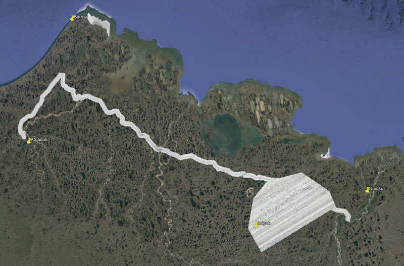
I mapped snow depth and permafrost topography at the tussock-scale on over 3000 km2 of the western Alaska Arctic between March and September, 2021, resulting in about 50 billion (yes, billion) snow depth measurements accurate to ~10 cm, representing the largest, highest-resolution snow-depth measurement-campaign within Arctic Alaska (and probably the world) ever made, in support of a variety of scientific and regulatory needs. I flew a small single-engine plane over approximately 20,000 miles of flight lines in both snow-covered and snow-free conditions (that is, 3000 km2 two times) with both normal Red-Green-Blue (RGB) and near-infrared (nIR) cameras using fodar, our proprietary implementation of modern digital photogrammetry. I took over 256,000 photos which I used to produce digital elevation models (DEMs) at 25 cm, perfectly co-registered orthophoto mosaics at 12.5 cm, corresponding point clouds, and a difference-DEM between winter and summer topography that largely represents snow depth within this area. The study area includes the majority of the Fish and Judy Creek watersheds within a large contiguous block of about 2000 km2 where the Willow oil field is located, as well as a two-mile wide swath of ~135 miles of the Community Winter Access Trail (CWAT) trail running from near Nuiqsut to near Utqiagvik to Atqasuk (~1000 km2), all within the NPR-A. Coverage of the intended study area was 100% complete and cloud free, and contains enough information to support many informational needs to support regulatory decisions on responsible development as well as several graduate theses right now, but as importantly it will also serve as a benchmark of scientific comparison of landscape change for decades to come as the visual (RGB and nIR) and topographic detail resolved in the snow-free map of the degrading permafrost terrain is unprecedented at this enormous spatial scale. This work demonstrates conclusively that fodar is superior to lidar for the measurements of Arctic snow depths: fodar is just as accurate and able to capture snow-depth variations on the single-centimeter scale in these thin (0-50 cm) snow packs, lidar itself provides only topography not the orthoimagery required for interpretations, and fodar is a fraction of the price. Note also that these measurements were made during a pre-vaccine covid surge, requiring me to base the plane outside on the tundra away from civilization during the Arctic winter, demonstrating the flexibility of fodar compared to lidar. This blog gives an overview of the data itself, it’s potential utility, and it’s data quality, along with some relevant data acquisition and processing notes that may be useful to anyone working with the data or anyone interested in future snow-mapping or permafrost-change projects. The data (~25 TB) were archived in April 2022 with the Alaska office of the Bureau of Land Management, who had the foresight to fund this world-class project.
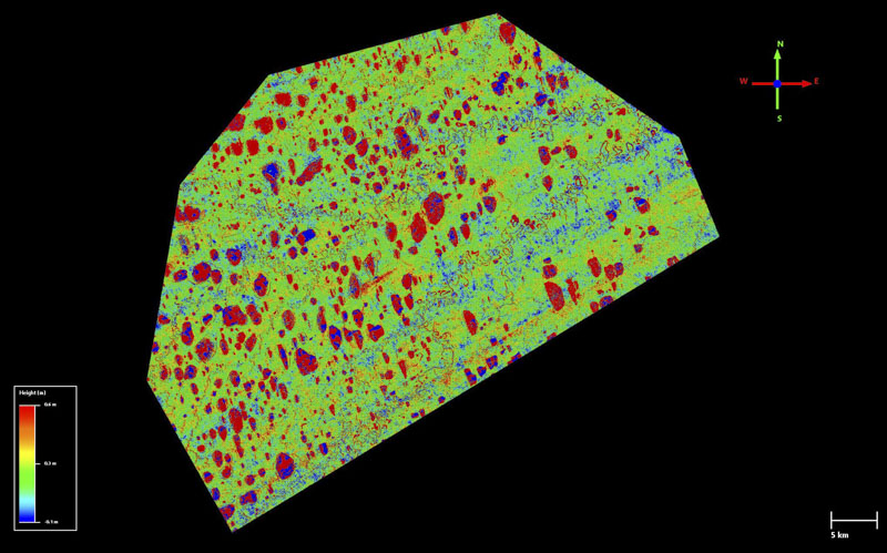
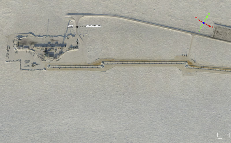
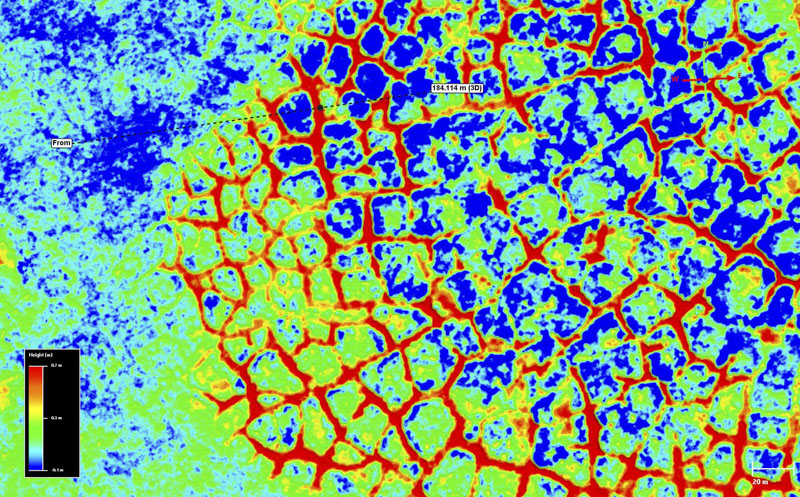
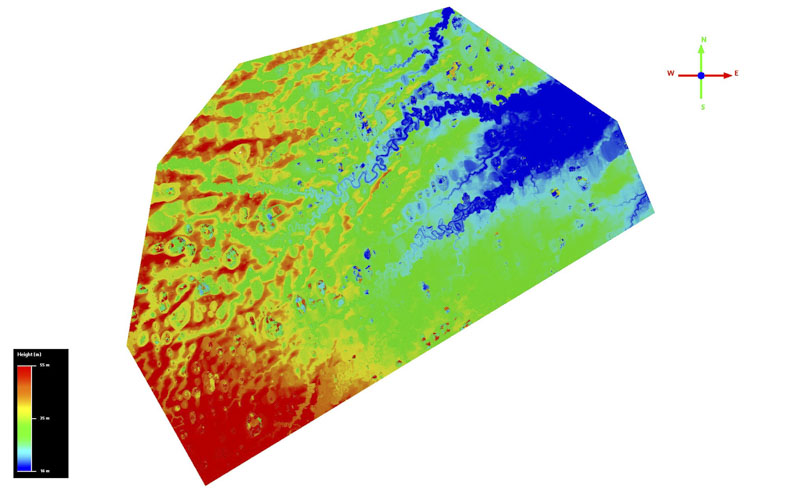
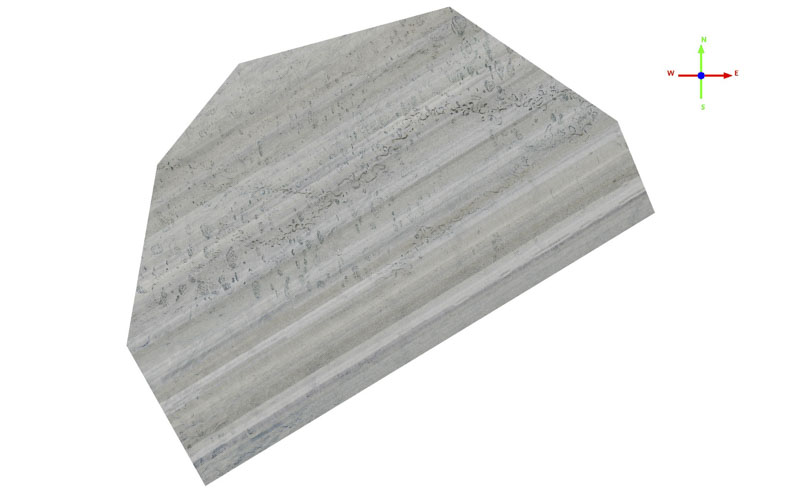
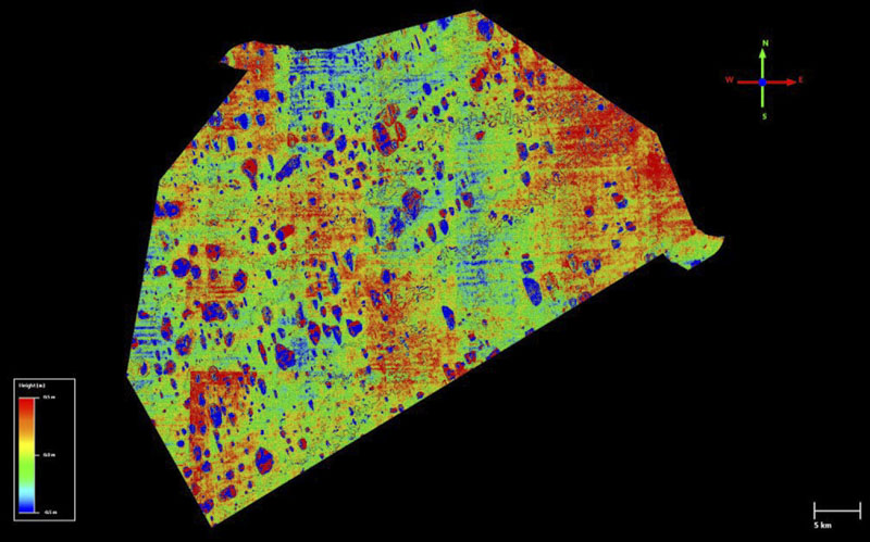
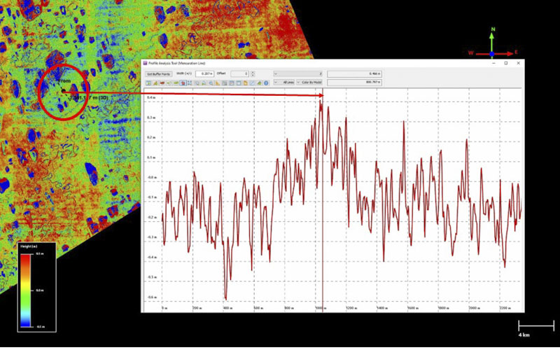
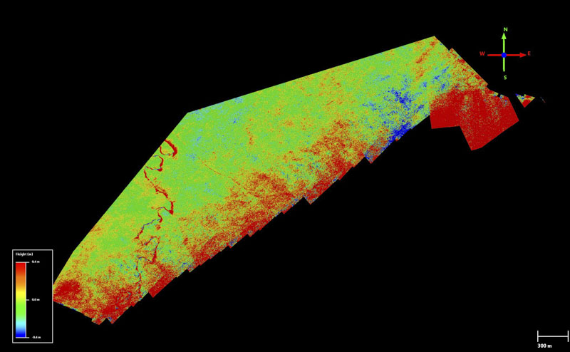
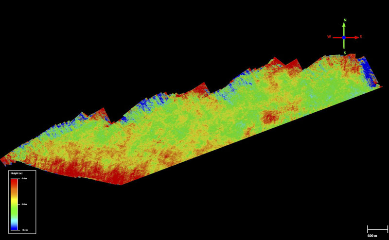
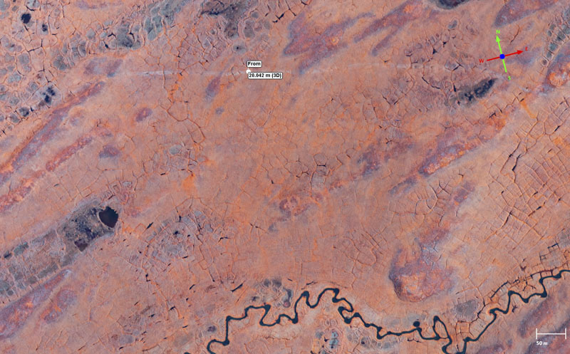
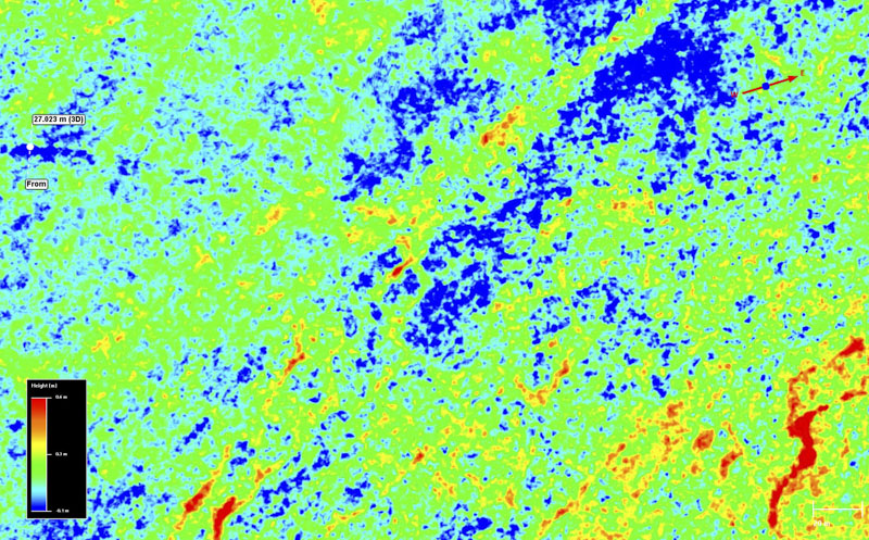
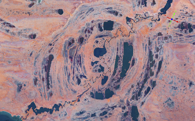
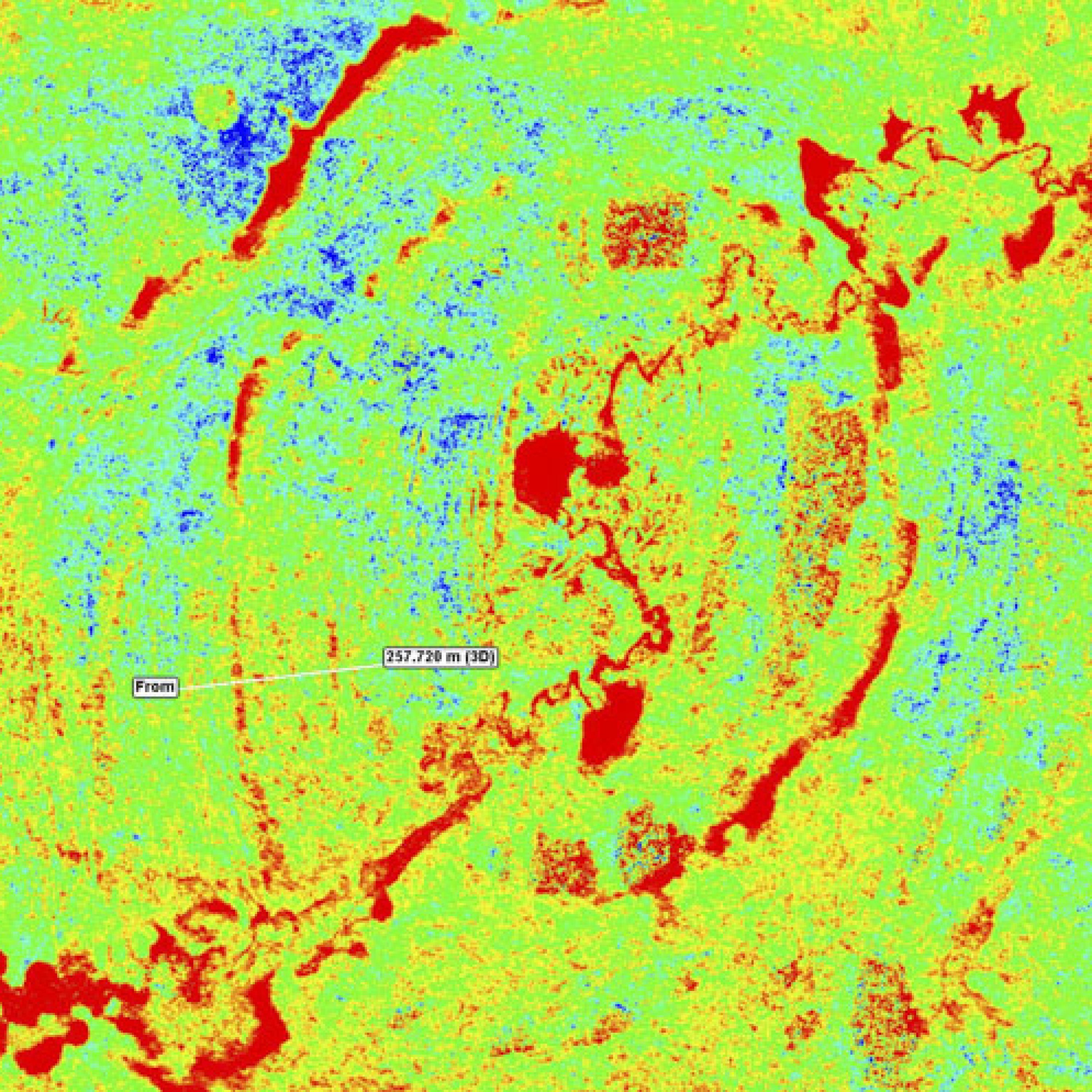
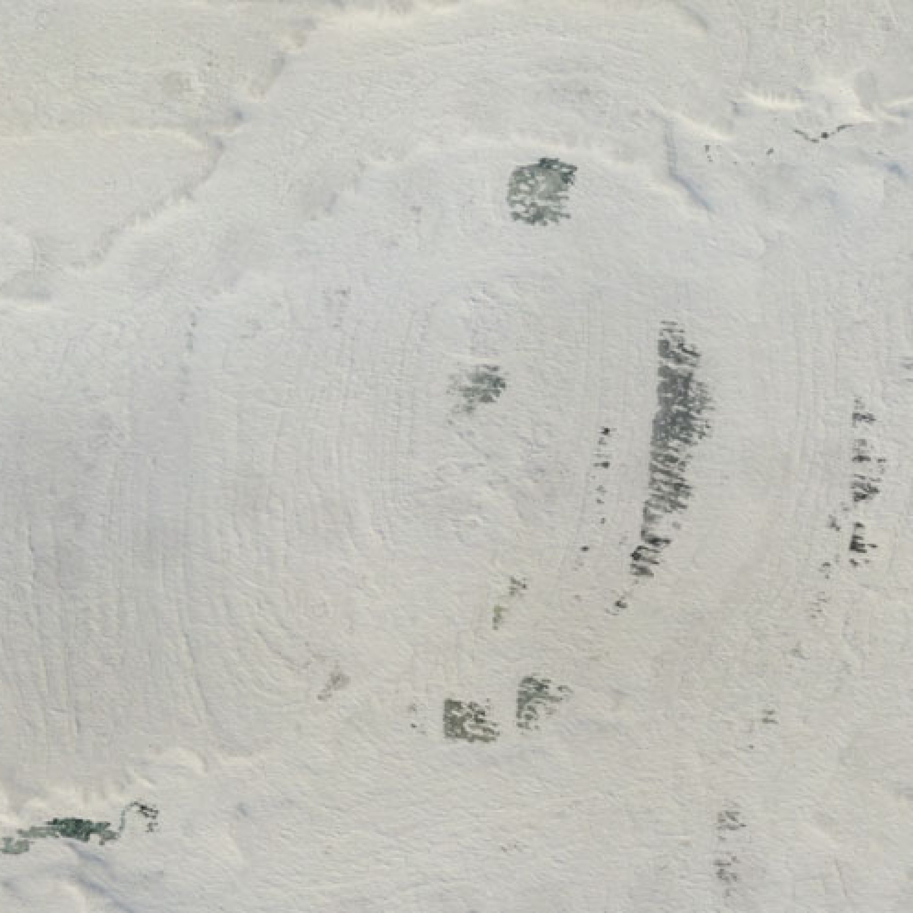
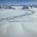
Here is the snow depth map for the Fish Creek block, which is roughly 60 km x 40 km. The color scale here is -10 cm (blue) to +60 cm (red); that is a 70 cm stretch. Note that there are no warps, tilts, or curls visible here — this means that neither the summer nor the winter Digital Elevation Model (DEM) used to create this difference DEM contains such large-scale artifacts at anywhere near this magnitude (indeed, even a 10 cm color stretch does not reveal any). Note also that the majority of the values here are greens and yellows (10 cm to 40 cm). This is exactly the range of values we would expect for an Arctic snow pack here. Note also that the many lakes are pure red because photogrammetry cannot measure liquid water and the elevation values there are erroneous.
Example Uses of Data
Before getting into details of the study area, the methods, and data validation, I thought to share examples of what we can learn from these data. These examples are far from all-inclusive, they are just meant to give a flavor of what’s possible and a sense of the data accuracy. If you are not familiar with DEMs, orthomosaics, and their qualities then check out this blog or this blog or this blog, and if you are not familiar with how we can measure snow depth using fodar check out this paper or this paper or this blog or this blog. Or just enjoy the show…
NOTE: The image sliders in this blog seem to work much better on a computer than a phone — I never said I was a great web designer, only a great cartographer…
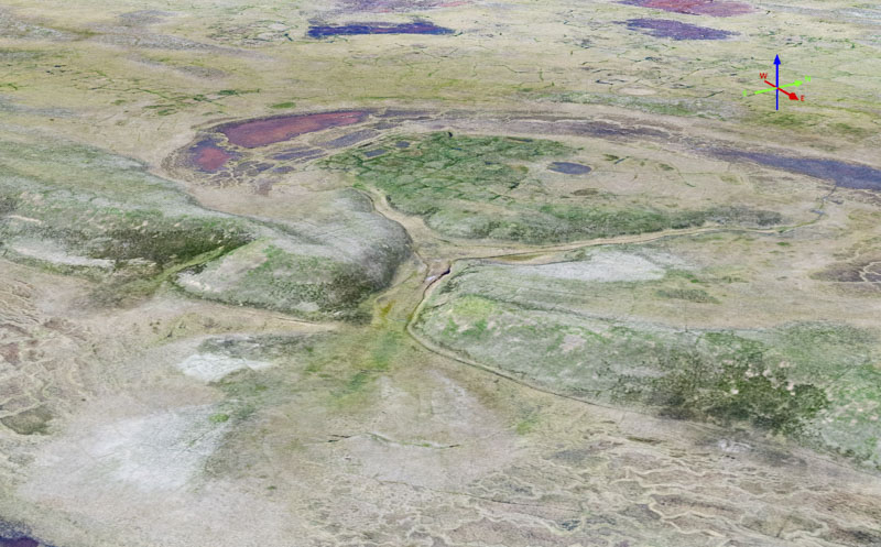
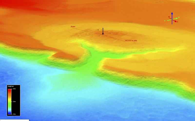
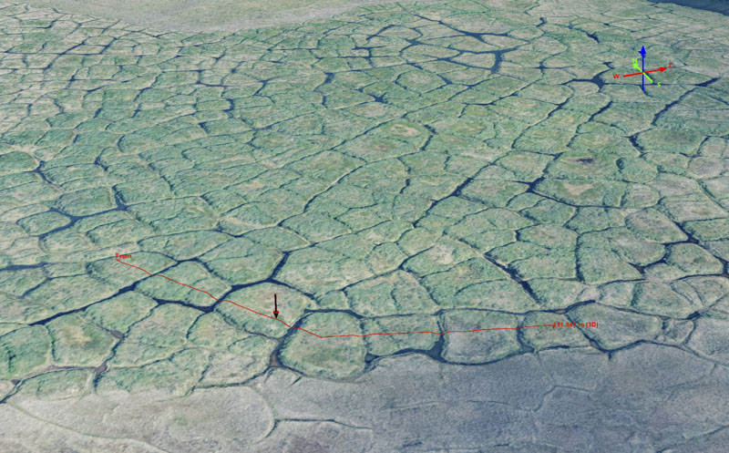
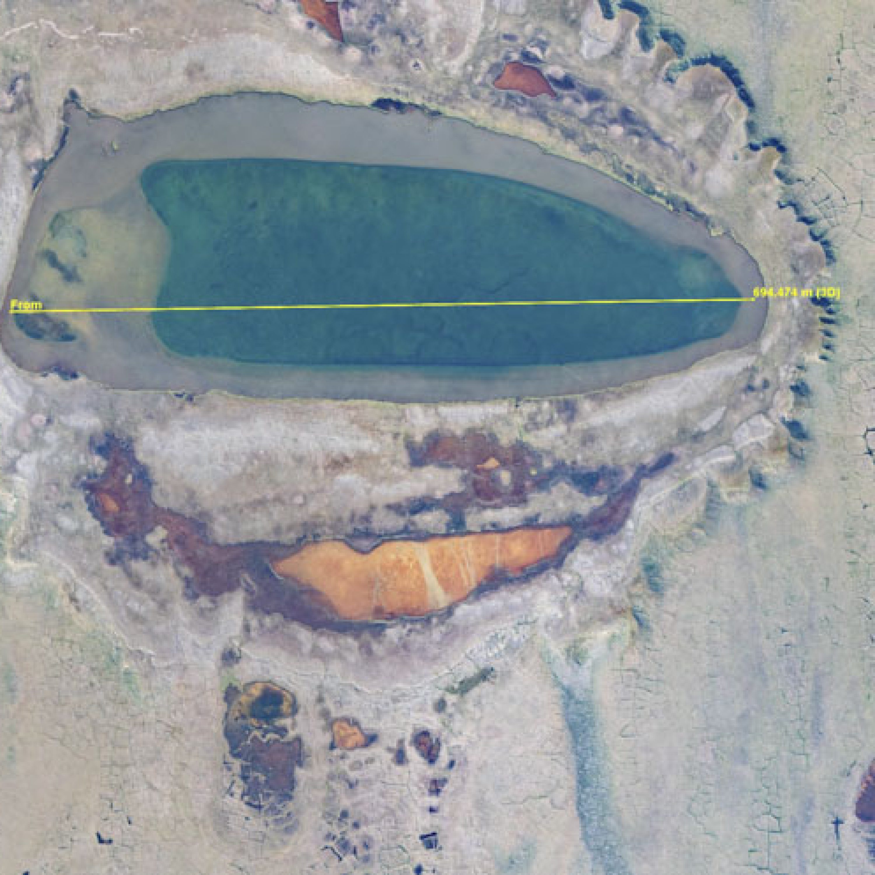
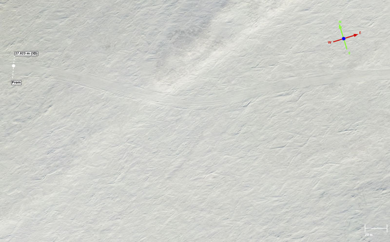
Here is a summer orthoimage draped over the associated summer DEM of a small lake which has breached its banks and drained to lower elevations. This 3D visualization is similar to what you find in Google Earth: digital imagery (an orthomosaic) draped over digital topography (a DEM). The DEM here is colored by elevation, with red the highest elevations and blue the lowest, and the orthoimage is colored by the Red-Green-Blue (RGB) data from the camera.
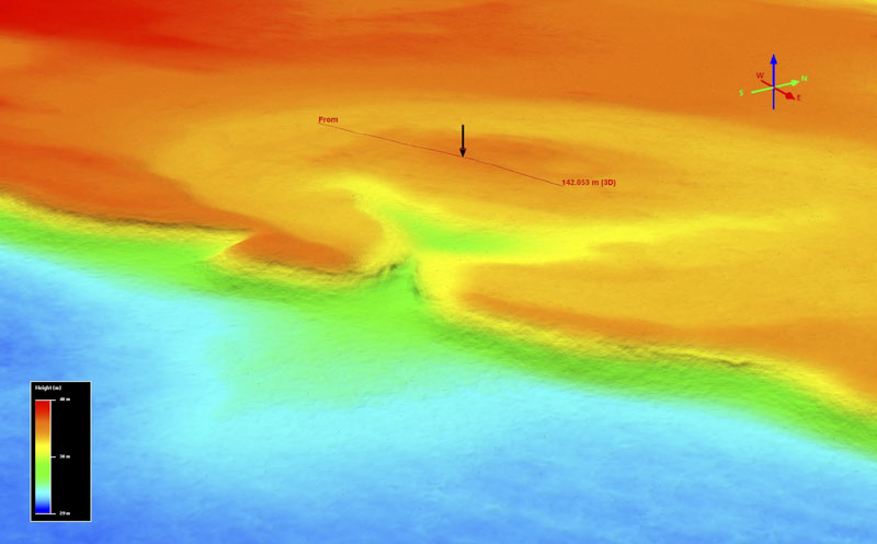
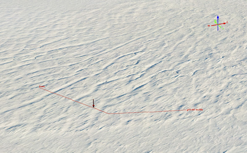
Here is the same drained lake basin shown in winter.
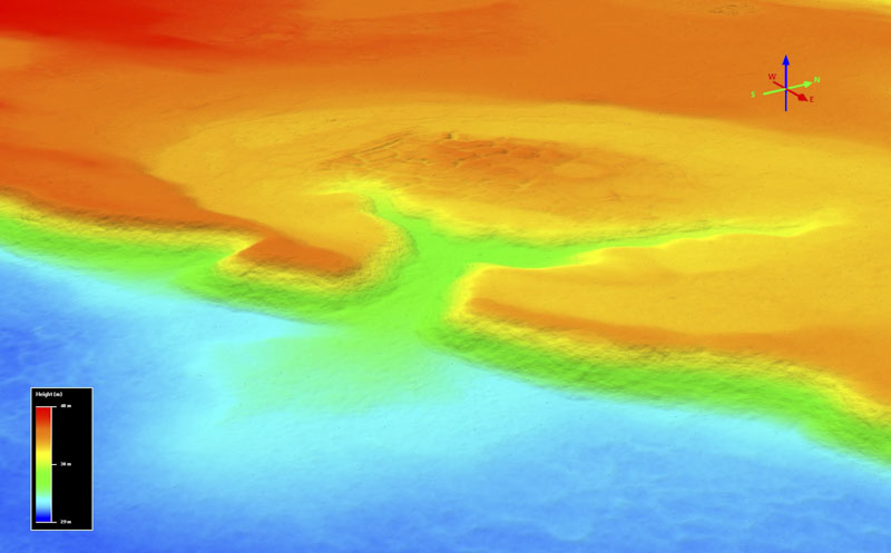
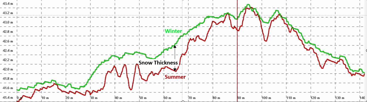
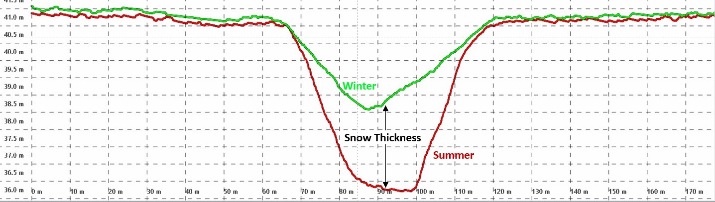
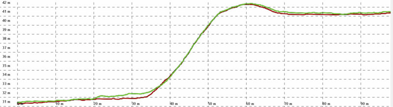
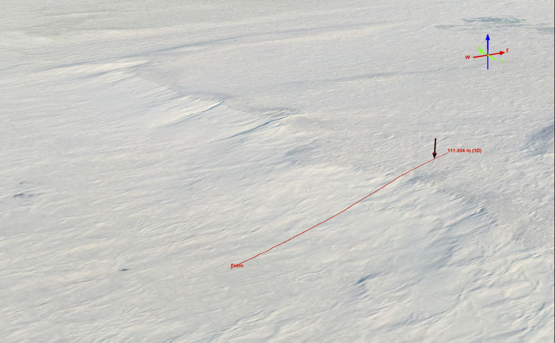
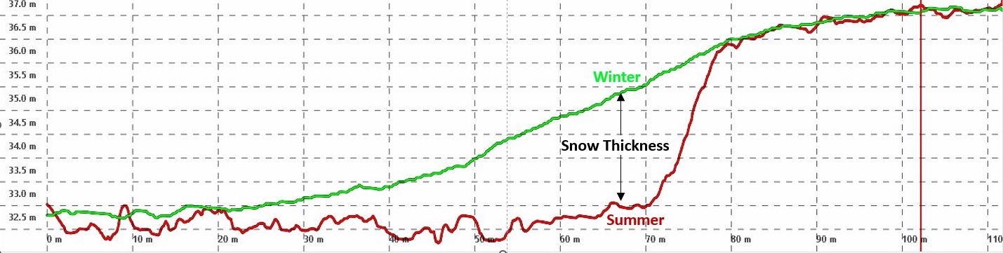
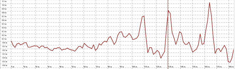
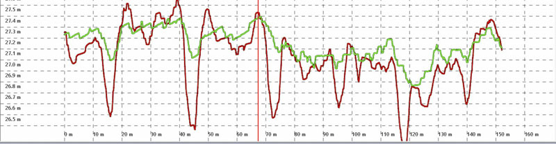
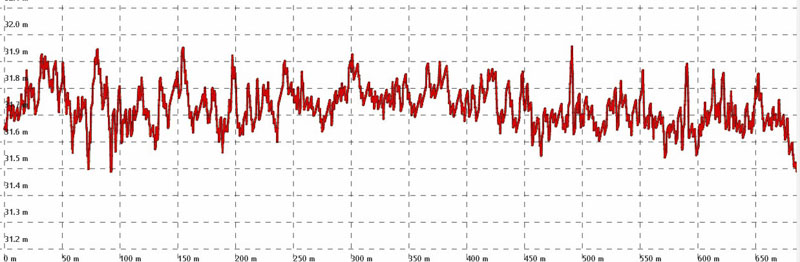
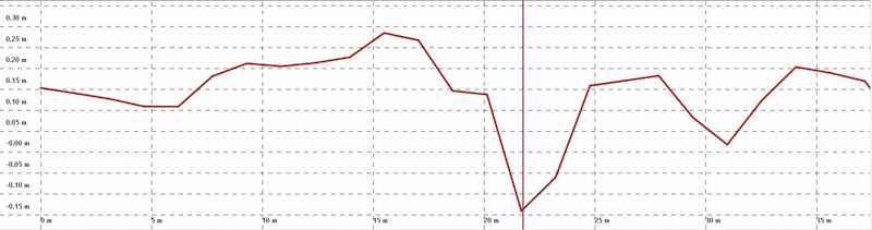
Here is the summer DEM (left) compared to the winter DEM (right). Notice how there is more detail in topography in summer as this topography largely gets filled in by the winter snow. The profile line in the middle of the lake is used to extract the actual elevations of both in the plot below. The red arrow above corresponds to the vertical red line below.Here are the actual elevations of the profile line in the previous image pair, with summer in red and winter in green. The difference between these two lines is snow depth.Horizontal grid lines are only 20 cm apart here, giving a good sense of the level of detail fodar provides. That is, these measurements of snow depth at the 5-25 cm level match our intuition as to what the thickness and distribution should look like here — the snow is thicker where it has filled in the ice wedge cavities and thinner over the tundra, at thicknesses we expect.The vertical red line corresponds with the arrow in the imagery, located over an ice wedge that has largely melted, leaving a cavity behind.Here is the same winter view with a different profile line, drawn across the gully that keeps the lake drained.Here are the elevations associated with the profile line in the previous winter image, showing the main drainage gully was filled with about 2 meters of snow: the difference between the green (winter) and red (summer) elevations.Notice how on the flat areas of the tundra on either side the snow depth is only 10-30 cm deep, as expected from our intuition of Arctic snow packs.Here is the same winter view, this time with a profile drawn across the bluff. Notice that you can see dirt showing through on the bluff, so we expect the snow depth to be pretty thin here.Here are the elevations associated with the profile line in the previous image over the bluff. As expected from the imagery, the summer and winter topography are almost identical here over the bluff, with thin snow on either side of it. Horizontal grid lines are 1 m here.Note that we are essentially measuring snow depth on this bluff-face at the 0-10 cm level!And on a steep slope!This is essentially the definition of awesome topographic data. Twice. Meaning that we have no reason to think that we cannot measure changes in the permafrost terrain itself on the order of 0-10 cm in the future.
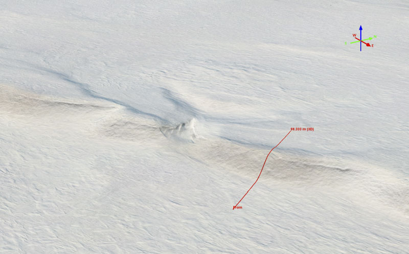
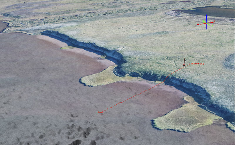
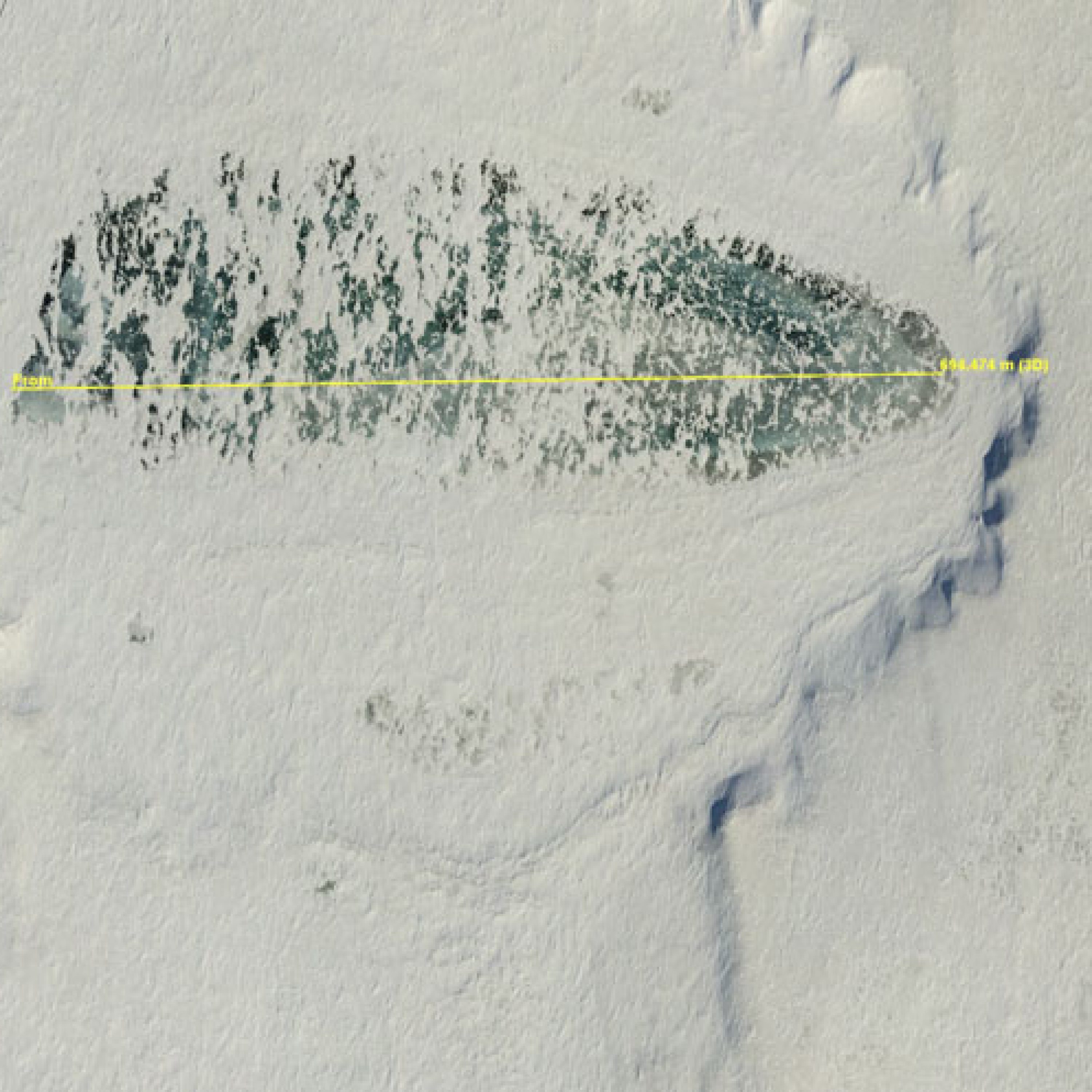
Here is the edge of a lake surrounded by bluffs of frozen ground. The bluff exposes ice which melts in the sun during summer, causing the tundra to blorb out into the lake basin. Wind action on the lake in summer further erodes the substrate, and causes the tundra itself to raft together into peninsulas which protect other parts of the bluff from further erosion. Note that I’m not saying this based on prior knowledge about this lake or any lakes here, I’m just using these data to learn the story. That is the value of having both visual and topographic data of this quality. So forgetting about snow for the moment, these data clearly allow us to learn more about the dynamics of permafrost thaw than we were able to previously, especially when we consider we can continue to make such maps to study the evolution of these dynamics to better understand the process involved, their rates, and how widespread they are. In winter, these cut banks slow the wind down, causing snow to deposit in deep drifts. The profile line shown here across the bluff face extracts the elevations shown below. Here the elevations in summer (red) are compared to the elevations in winter (green), showing the thickness of snow (the difference between the lines). Here over 4 m of snow has accumulated. These drifts persist long into summer, somewhat protecting the bluff from melt.The red arrow in the image corresponding to the vertical red line here indicates where some shrubs are growing along the side of a melted ice wedge, resulting in higher topography in summer as the shrub gets compressed by the snow in winter.
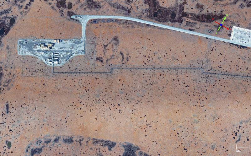
Here is a drill pad and pipeline (under construction in winter) within the study area, as seen in near-InfraRed (nIR) in summer on the left and in winter on the right. Notice in the nIR you can see where the ice pad had extended beyond the gravel pad in winter due to the disturbance in the vegetation, as nIR captures differences in photosynthesis caused by those disturbances. If you look close you will find such vegetation disturbances in other places caused this year where they align with this year’s snow plowing and in previous years where they do not, getting glimpse of the scientific value of the nIRdata for understanding any long-term impacts of these activities. The horizontal scale bar at lower right is 80 m.
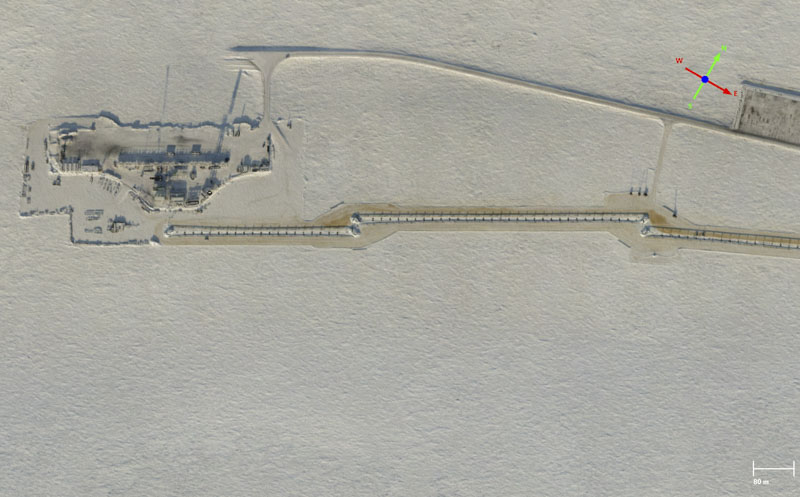
Here is the same drill pad in winter (left) and the snow depth map (right) created by subtracting the summer DEM from the winter DEM — this is our first look at spatial distribution of snow depths. The color stretch in the snow DEM is only 80 cm total, from -10 cm (blue) to +70 cm (red), but note that this color stretch is arbitrary and varies throughout this blog. Notice how in previous image pair of nIR-winter that there are a lot of connexes and trucks stored on the gravel pad in summer that are not there in winter — this causes what appears to be negative snow depths. The snow depth is of course not negative, because we can only loosely call this difference-DEM a snow depth DEM — really it’s just the difference between the winter and summer DEMs, which most of the time can be interpreted as snow depth. In this case, because what was stored on the pad in summer was higher than what was there in winter, the difference is several meters negative change, but this has nothing to do with snow. The same thing happens with shrubby vegetation that stands taller in summer than it does in winter. Note how you can see the thickness of the ice road (rectangular red arrows around the pipeline, which is mostly blue since it changed height during installation) surrounding the pipeline they are assembling as well as the ice pad surrounding the gravel pad. You can also see how drifts tend to form on the west side (up in this image) of the access road due to prevailing winds. I measured a profile across the main access road where it enters the pad, which you can see in the winter orthoimage has snow berms on either side. The plot below extracts the elevations of the snow DEM.Here is the snow thickness from the profile line in the previous image. The horizontal ticks are 10 cm, ranging from 0 to 1.5 m. Here we can see the berms are roughly 1.4 m high with 10-20 cm of packed snow on the gravel road. That we can measure such thickness smoothly as they grade from near zero means the precision of the data must be substantially better than 1.4 m else we could not resolve the shape so smoothly, and given we can also measure the ice-road thickness so consistently (see snow depth DEM above, it’s mostly a single color, green) suggests the precision is in the 10-20 cm at worst. This means that we can correlate ice-road thickness with any long-term impacts on the tundra to improve regulatory protections if needed! In the section on precision and accuracy, I show how we can resolve snow depth down to the order of single centimeters.
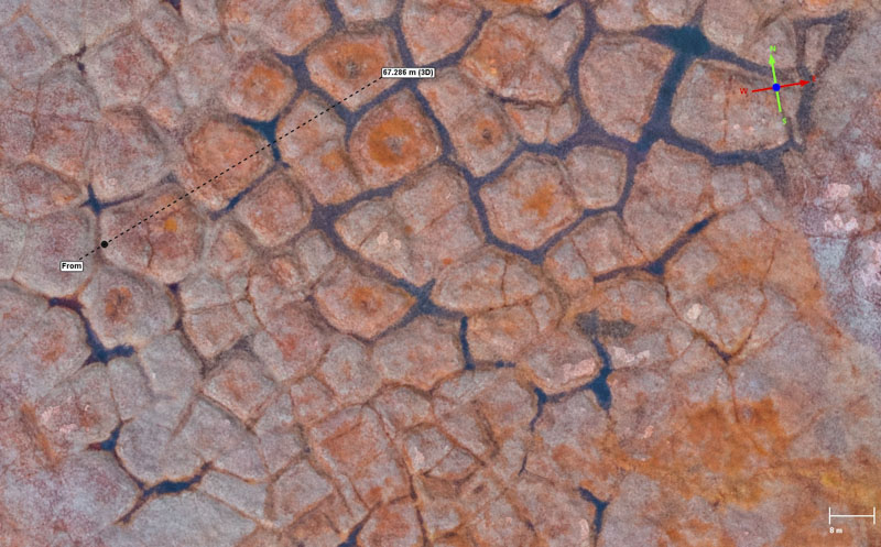
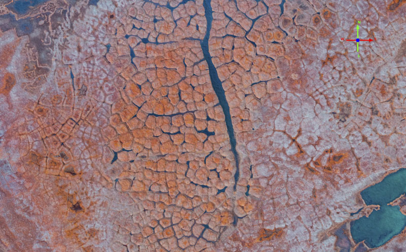
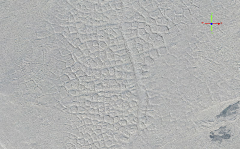
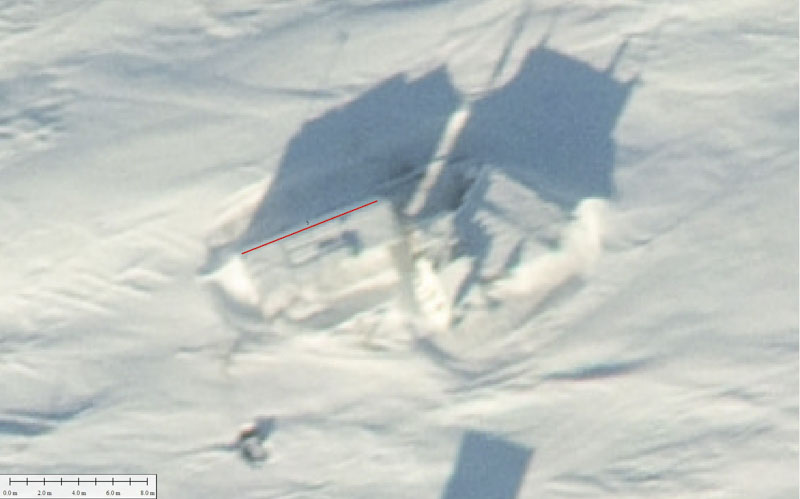
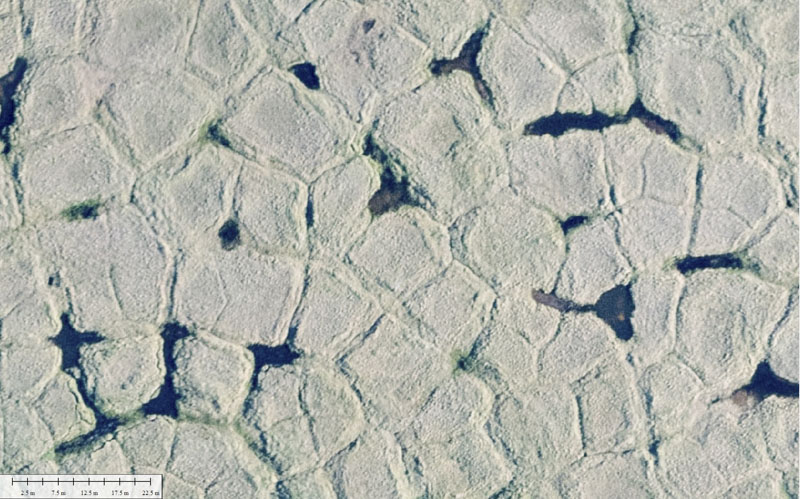
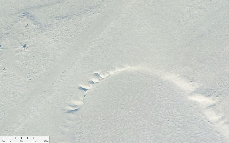
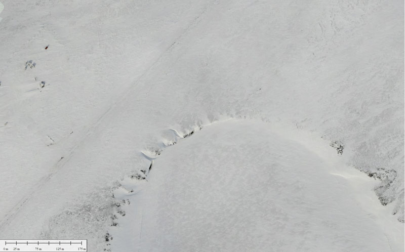
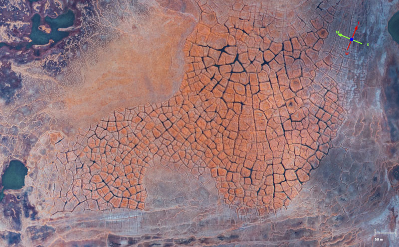
Here is a polygon field in mid-stage collapse, seen in summer and winter. The ice wedges surrounding many of them have largely melted out and are filled with water. Once they connect across a large enough slope the water will begin to flow, thermally eroding the ice wedges further and start to wash away the polygons soil itself. The horizontal scale bar at lower right is 8 m.
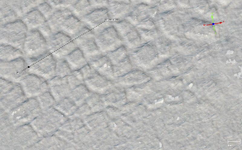
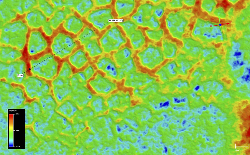
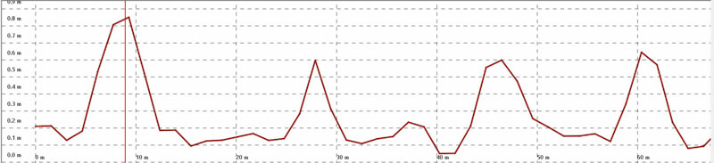
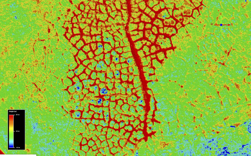
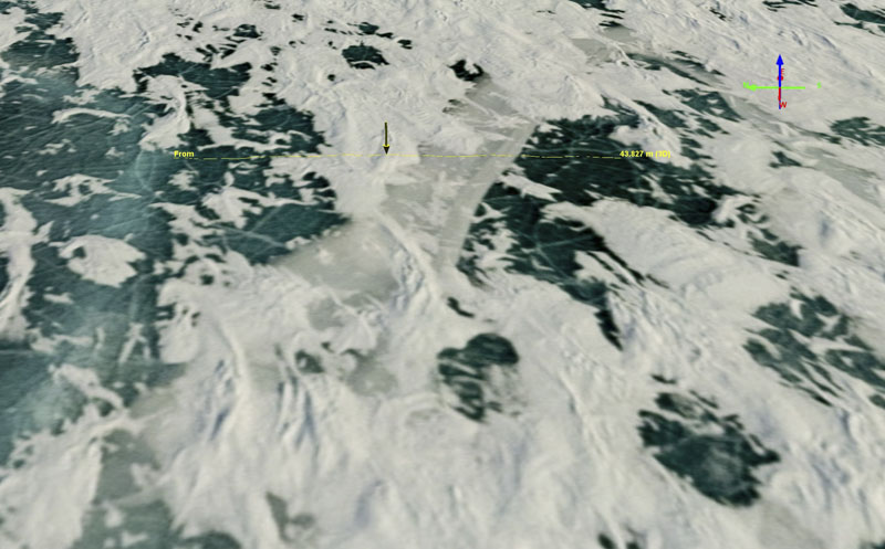
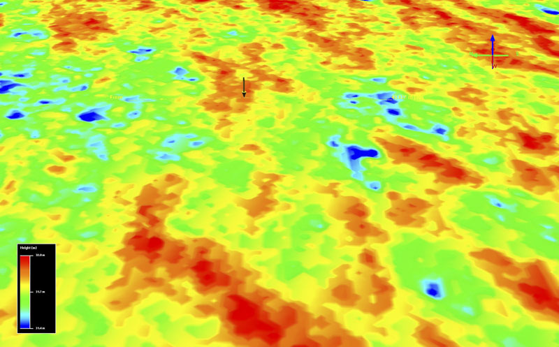
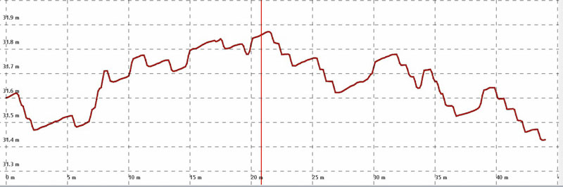
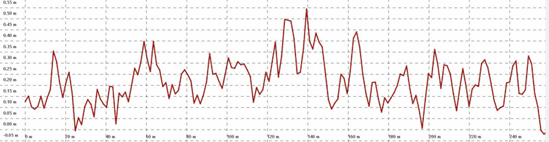
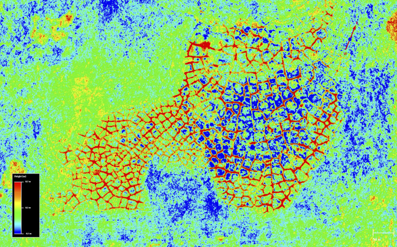
Here is the same polygon field seen in winter and as snow depth. The color stretch for the snow depths is one meter, from -10 cm (blue) to +90 cm (red). This now gets at the sort of science we want to be able to do that we couldn’t previously — the next best DEM of this area is way too coarse to even see the ice wedges let alone resolve the snow depth filling their voids in winter, as we can see here. I extracted a profile of snow depth across a few polygons below. Note the shiny spots in the winter ortho — this is where synthetic sunshine is glinting off high spots caused by vegetation, which reveals itself as ‘negative’ snow depth (blue) because those shrubs get compressed in winter by the snow and thus stand taller in summer.Here are the snow depths from the profile above. The horizontal tick marks are 10 cm apart, ranging from 0 to 90 cm, such that the largest peak is about 80 cm. The smaller peaks (where snow has filled the voids left behind by melted-out ice wedges) are about 50 cm; the fact that they are so smoothly resolved means that the vertical precision must be substantially better than this. Imagine the possibilities here — being able to measure snow drifts this small over thousands of square kilometers to get at the processes involved with permafrost melt and dynamics! Note that the snow depth filling these wedges is probably a little thicker than shown here, as we are approaching the limits of the spatial resolution for this project such that the deepest, narrowest part of the cavity is smaller than a pixel of resolution. This DEM was posted at 25 cm pixel size, but I regularly create 10 cm DEMs and can do even finer — the limitation is time and expense, not technology.
Here is another disintegrating polygon field. Towards the left end, the ice wedges are still intact and the ground is fairly flat. Moving towards center the ice wedges have largely melted out but are filled with water. Towards the right, the water has large drained from the ice wedge channels and been replaced by silt. The polygons there are apparently warmer and better drained, thus leading to colonization by shrubs. These shrubs can be seen in the near IR and color RGB imagery, but are clearly indicated by the presence of negative snow depth (blue) in the snow DEM. It is dynamics like these that we can finally watch unfold to more fully understand, build better numerical models, and test those models against awesome data like these.Here is the elevation profile from the snow DEM from the profile line shown in the previous image pair. Note that on the left where the ground is flat that snow depth is fairly uniform at +/- 10 cm, but large ~1m where it fills ice wedges that have melted out. This again speaks to the awesome vertical precision of the data, as described in more detail later.
Here is an example of the late-stage evolution of the distintigration of a polygon field. Near the center of the summer image you can see that most of the polygons are covered in shrubs and that the ice wedges surrounding them have not only melted out but have largely filled back in with dirt. The polygons surrounding these are less vegetated but starting to become so, and the old ice wedge troughs are filled with water. Eventually this water will be replaced by dirt too and shrubs in these better drained polygon tops will grow fuller (see the previous image comparison). Note again that I’m not speaking from prior knowledge of this site, I’m letting these data tell this story! The plot below shows how ‘negative snow depths’ arise — take a look at the transect above and you will see the line crosses shrubs mostly located at the edges of the polygons where presumably the soil is better drained and a bit more disturbed.
In this plot, you can see snow-covered topography (green) partially filling the empty ice wedges in summer topography (red). You can also see that the edges of the polygons are often taller in summer than they are in winter. This is due to vegetation growing near the edges that get buried by snow and compressed. So where the red line (summer) is higher than the green line (winter), the snow depth DEM has negative values. While this confounds our understanding of snow depth here, it highlights the fact that compressible vegetation is present — one scientists’s noise is another’s signal!Consider how much more complicated this sort of analysis would be if only lidar data were available — without the corresponding summer and winter imagery, a lot more guess work would need to occur, limiting our scientific certainty and ability to understand and predict dynamics.
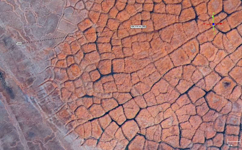
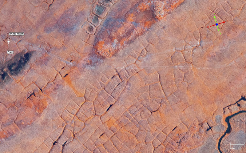
Here is a larger scale view of a polygon field in various stages of disintegration. The most prominent feature is a small river running through it — here is where the melted out ice wedges surrounding the polygons filled with water, linked up, and began to flow. This effectively washed away the polygons that used to be where the river is now, and led to the drainage network becoming more efficient. You can see in the nIR image where the shrubs have grown as they are slightly more orange — note surrounding them that the ice wedge channels hold little water as they already have filled with dirt. The disintegration is moving from the center of the image to the left and right, where the polygons are still lower centered and unaffected by ice wedge melt-out.
If nothing else, this snow depth DEM is a quick and easy way to identify where ice wedges have melted out because they fill with snow and we can easily measure the thickness of that snow, as shown here. But there is so much more information content here, especially when one considers making maps just like these over time to watch the progression of degradation. As this is occurring within an active oil field, it is especially important to understand the ‘natural’ dynamics of landscape change here to disentangle them from those more directly man-made in terms of surface disturbances like building snow/ice/gravel roads etc.
Hopefully these examples give some sense of both the value of these data to permafrost science and the data quality itself. The next two sections give an overview of the project and the data accuracy and precision
Project Overview
The Bureau of Land Management hired Fairbanks Fodar through a competitive bidding process to map a large block of NPR-A and as well as the Community Winter Access Trail (CWAT) for snow depth, covering about 3000 km2 in total, for the purposes of understanding the natural distribution of snow cover, for understanding the impact of snow roads on the landscape, and for responsibly managing development in this area. Note that a snow-depth mapping project of this magnitude had never been undertaken before. In this project I (Matt Nolan) worked alone and was responsible for all aspects of it: flight planning, logistics, piloting, airborne system operations, data QA/QC in the field, data processing, data delivery, and writing this blog. Thus everything in this blog is described from personal knowledge (or recollection…) and I am solely responsible for the decisions made during the project itself.
To support these goals I topographically mapped the areas of interest in winter and in summer, using both RGB and near-IR (nIR) cameras. By subtracting the summer topography from winter topography, we can get a measurement of snow depth, at least in areas without significant shrub growth, which is typical of the area. These methods, the importance of snow cover, and how fodar is the only viable method for massive-area high-resolution measurements of snow depth are well described in this paper and in this paper, this blog, this blog, and this blog and wont be repeated in any detail here.
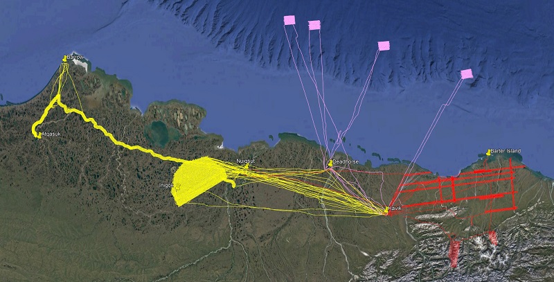
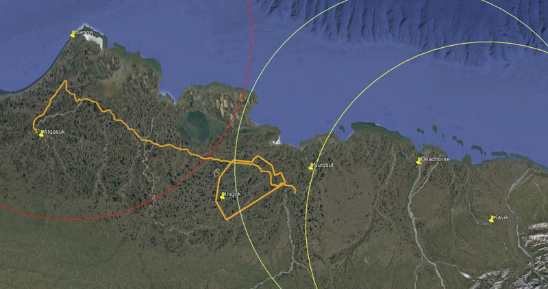
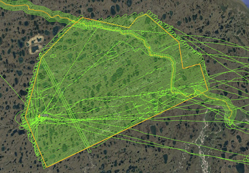
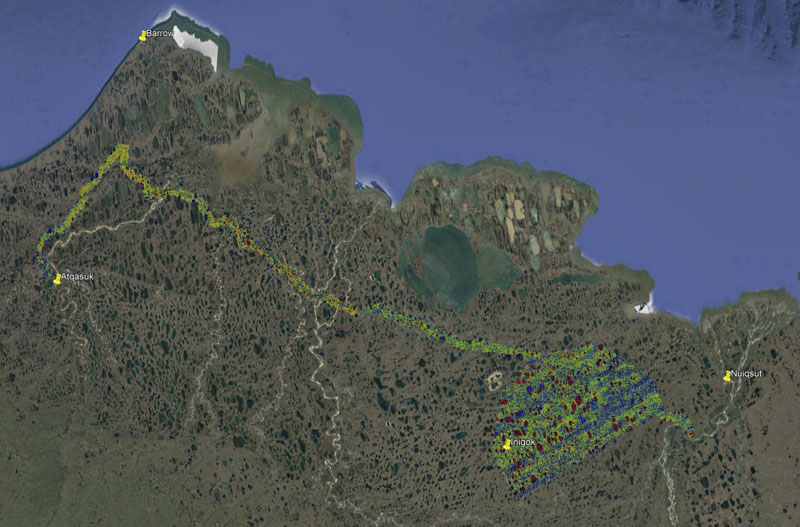
Here are my flight lines from March-April 2021. I pursued three winter projects during this time, allowing me to maximize my flying by working in whatever area had decent weather. The pink lines show an ice floe I mapped four times as it drifted west, similar to this project. The red lines show snow mapping I did in the Arctic National Wildlife Refuge similar to this project. And the yellow lines show the snow mapping I did in NPR-A for BLM, which is the focus of this blog. As it turned out, I was able to utilize every good-weather day in the NPR-A as the weather was always poor elsewhere during that time, and vice versa.Making centimeter-scale measurements of snow depth over thousands of square kilometers required overcoming a lot of logistical challenges, especially during pre-vaccine covid times. Here the study area is shown in orange and the circles represent 100 mile range-rings from the only three locations where aviation fuel was commercially available (Kavik, Deadhorse, and Barrow Airports).
It cannot be understated how enormous and challenging the logistics for this project was – making two complete maps of ~3000 km2 in the Arctic in both winter and summer, where there are only 3 places within 150 miles of the study area to get fuel and both winters and summers are short and plagued by bad weather. Winter temperatures being in the -35C to -25C for the bulk of the winter acquisition did not speed things up nor reduce the overall logistical challenges… Regardless, any one or any company trying to pull this off would have faced daunting tasks in the planning and acquisition stages.
It was not necessarily my intention to work alone on all these aspects but covid largely left me no choice. My initial plan was to utilize two of my aircraft based out of Deadhorse for this project, not just to speed up acquisitions to minimize field time but really to make better use of shorter weather windows to minimize temporal changes in snow cover between acquisition days. This project was funded in October 2020, too late for a summer acquisition and thus initial planning was geared towards the winter maps. At this same time, the first major surge of Covid infections was ramping up in Alaska and this was months before vaccines were available or even known to be effective. Thus by December 2020 I had to largely abandon the idea of utilizing a second pilot/plane largely because I could not plan adequately for my safety, let alone theirs, I simply had to accept the project could be cancelled at any moment given the rapidly changing conditions. Likewise, I had to abandon the idea of basing Deadhorse because in my mind that was the nexus of covid danger within the state – hundreds of workers rotating in for shift work daily, many of which based on personal experience were not the type to take covid precautions seriously…
I based in Kavik (at right) for several reasons, not the least of which was due to covid. This project began before vaccines were available and while an infection surge was occurring in Alaska. There was no way I was going to base in Deadhorse, as the risk of getting infected was simply too high. At Kavik it was mostly just me and RIck for March and April, where temperatures were usually -25-30C and didnt warm up past -10C until late April. To capture the last bits to the west, I based out of the Barrow Airport. Remember too that I flew all this twice: in winter and summer.
Thus to safely pull off this project in this particular winter I made the decision to base in Kavik River Camp which added it own set of challenges on top of the enormous ones already present. Kavik lies about 100 miles from the eastern edge of the AOI and has no hangar facilities but it does have reliable publicly-available fuel, only one of three such locations on the North Slope. The temperatures there averaged in the -30C range throughout most of March and rarely got above -10C in April except towards the very end, and that’s without wind chill. Thus after each flight I had to uninstall the photogrammetric system to keep it from suffering from the temperatures and then reinstall it each morning, along with all of the mob/demob necessary to keep the plane safe and ready to fly in the morning, creating roughly 3 hours work per day just to fly. Added to this was at least a one hour commute in each direction which turned into a 1.5 hour commute towards the western edge of the Fish Creek block. On top of this, the weather camera system at Inigok, within the AOI, was fairly flaky so there was a lot of guesswork needed in daily flight planning and many days ended up being flightseeing trips over the commute area rather than actual mapping days. All else equal, basing at Inigok would no doubt have speeded up acquisitions as much smaller weather windows could have been utliized, but all else was simply not equal in this case and Kavik was the only viable choice. On top of all that, short daylight in March meant taking off and landing near twilights to maximize flight time, though this challenge rapidly dwindled away by April.
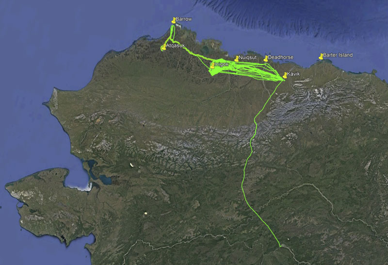
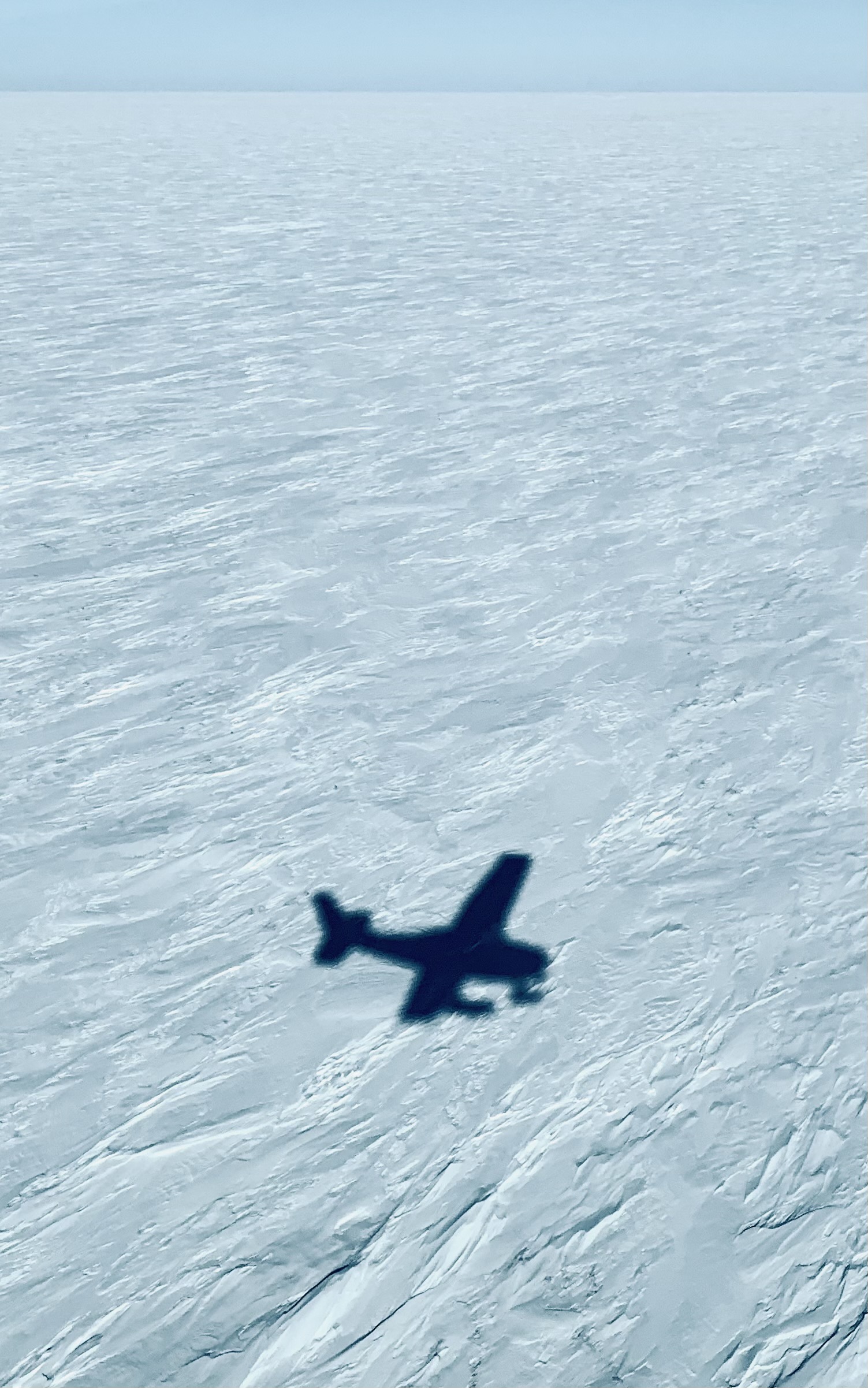
For scale, Fairbanks is at the end of the green line at bottom. This was a pretty big area a long way from anywhere. But if I can do it here, I think I can do it anywhere.
Because it was so far east, there was no way to map the CWAT trail while based in Kavik, thus I had to base at the Barrow Airport for this, which had its own set of challenges. Here also there was no hangar space available and avgas availability was always in question. Indeed, in September I had to make the decision to fly there after they told me that they did not have avgas available just to see if I could find some, which meant ensuring I landed there with enough fuel to get back to Deadhorse. Once there, we found a way to tilt their near-empty 2000 gallon tank to slosh more to the exit pipe which was on the uphill end how it sat, which has its own risks once in the plane. Added to this was simply weather in the area, which is notoriously bad for VFR flight and notoriously unpredictable. Thus in both winter and summer, the Barrow-based acquisitions were always the crux of the trip as it had the greatest logistical and flying challenges.
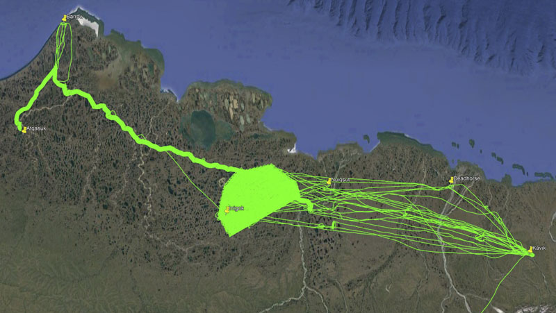
The Fish and Judy Creek block was about 2000 square kilometers. I started with the lines to the southeast and worked my way northwards here before starting the CWAT mapping. In total, I flew about 20,000 miles over about 200 hours for this project.
Another major logistical challenge for the winter acquisitions was choosing a start date: the idea was to get there late enough so there was enough daylight and yet not too brutally cold, but early enough so there was enough time to finish mapping before the snow began to melt. I arrived on March 1 with the plan to sit in Kavik until either I finished the mapping or the snow melted. I had one other project in the area which took 4 days throughout March in total and it was located over the sea ice 100 miles offshore and it always worked out that the weather over NPRA was poor during those days, and vice versa. That is, in the 7 weeks I was based in Kavik that winter, I used every available day I could for acquisitions for this project – and I still barely got it done before snow melt began. Indeed, snow melt had already begun on my last few days of mapping as evidenced by the increased amount of dust visible around the rivers and shrub points beginning to poke out of the snow pack. Air temperatures were still below freezing, so this was mostly (if not entirely) sublimation, I saw no evidence from the air or on the ground of liquid water. In any case, I do not believe the data quality or analysis are substantially affected by this, I was just glad to get it completed before it began in earnest.
During these 7 weeks there were also numerous storms lasting 2-3 days. I don’t believe that these substantially changed snow thickness, but they certainly changed snow surface shape (ie, sastrugi forms). This did wreak some havok with data processing, as described later, but I think it did not affect the usability of the data for their intended purposes. Given the magnitude of the delivery I did not do any specific analysis on storm impacts nor did I include deliverables which would help study the changes caused by storms, but there certainly is enough spatially-overlapping temporal-data available to fund several graduate theses on just this topic and I’d be happy to assist with that in the future.
I mapped snow-covered and snow-free topography of essentially everything in view, and much more, at about the resolution you see here. Don’t try this with a drone unless you can cancel snow-melt for a few years…
Summer acquisitions also had their challenges. Here I also decided to base in Kavik River Camp. At that point I had already received my first vaccination and the first surge seemed to be slowing down, but the covid infection uncertainty (at least for me) by basing in Deadhorse was still weighing on my mind, and I was able to stay nearly completed isolated while in Kavik, as turnover was low and I prepared my own meals in my room there as well. The biggest challenges were finding good weather days, maximizing fuel, and basing at Barrow Airport, as before. Choosing the start date was again an optimization of guessing when snow melt was complete (or complete enough) and maximizing use of full daylight. I arrived on July 5 and stayed there full time for this project until July 20th. By that time I had completed the Fish Creek block, but extended bad weather was predicted for the next week so I decided to return to Fairbanks. It took nearly 6 weeks to return due to extended bad weather over the Brooks Range and over the CWAT trail, as well as a 10 day trip for other field work in August I had planned prior to this award. Thus despite being packed and ready to travel nearly the entire time I was in Fairbanks, it was not until September 2nd that I was able to return, and it took two more weeks to map the CWAT trail and return home.
Yet despite all of the challenges, I was able to map the entirety of the AOI in summer and winter with 100% cloud free conditions and it felt like an honor to spend so much time in such a beautiful area working on such a valuable project.
In total I delivered these products for this project:
Winter RGB DEM, orthomosaic, and point cloud
Summer RGB DEM, orthomosaic, and point cloud
Summer nIR DEM, orthomosaic, and point cloud
Snow depth DEM
These products each covered both the Fish Creek block and the CWAT trail. Each of the orthomosaics was posted at 12.5 cm (the raw GSD) and the DEMs at 25 cm. As described a bit in the next section, each DEM had a vertical precision of probably better than 10 cm standard deviation and the snow depth depth was about 10 cm. Horizontal and vertical accuracy was at that level too.
Here is the summer RGB orthophoto mosaic (left) for the Fish Creek block overlain onto the DEM (right); use the slider to compare one to the other. The striping in the orthomosaic is part of the mosaic process — the stripes follow my flight lines and largely correspond to different lighting conditions on different acquisition days. The dimensions of the block are roughly 60 km by 40 km. The DEM is colored by elevation, with red being high and blue low.
Here is the summer RGB ortho (left) compared to the winter ortho (right). Again the striping is caused largely caused by acquisitions occurring on different days with different lighting conditions. Snow brightness is even more sensitive to lighting conditions than summer terrain is, but this does not affect the topographic data in most cases.
At left is winter orthomosaic shown over the full extent of the project — both the Fish Creek block and the CWAT trail, a two-mile wide corridor around a snow road connecting several of the villages here.
Data quality: Precision and Accuracy
Fodar as a technique has been vetted through over a dozen rigorous studies over the past decade, so there is no need to do so for every project. All that’s required here is to ensure that nothing is different about this acquisition than the fully-vetted ones, and that’s a much simpler task requiring much less rigor and expense in the field. One well-known error worthy of note here is that this method of fodar cannot measure the height of lake water when its liquid (that is, it measures frozen lakes just fine), so all summer values of lake elevations are erroneous, often by tens of meters, and should be ignored or masked out. So here I explore data quality numerically in several different ways, as well as provide more examples that appeal to our intuition:
Comparison of fodar to ifsar
Comparison of fodar to fodar
Comparison of fodar to snow probe measurements on the ground
Comparison of fodar to our intuition
I begin with a fodar-to-insar map comparison as the insar is the next best map for comparison. Then I explore the fodar-to-fodar comparisons which get at the heart of the assessment. Then I compare fodar snow depths to snow probe measurements I made in the field as a GCP assessment. And finally I end with a further exploration of the data itself, comparing what we know already about the real world to what we see in the data, much like in the examples that led off this blog. All four of these methods come to basically the same conclusion: the snow depth accuracy has a random noise of roughly 10 cm standard deviation — maybe its 7 cm or maybe its 13 cm in this place or that, but for the vast majority of the area 10 cm is a good number to use. And considering that’s over 3000 km2 in the Arctic in both winter and summer, that’s saying something. Let’s dive in.
Comparisons of fodar to ifsar
Throughout the previous decade, the State of Alaska and its partners paid for two companies to make a new topographic map of the entire State using airborne ifsar. Ifsar is an active microwave technique that I have a lot of experience with (eg, this paper, this paper, this paper, this paper, and this paper). I was also the first to use airborne ifsar in Alaska (eg, this blog), and so in general am a big fan of it. However, I think the acquisition was 10 years too late in terms of technology, and I offered to do it for $5M instead of $60M and at literally 100 times higher resolution, but nobody seemed to believe me… In any case, it is the best data we have in most of Alaska (mountain topography being a big exception as I detail in this blog) and certainly in this location. Thus here I compared the ifsar (with 5 m spatial resolution) to fodar (with 25 cm spatial resolution resampled to 5 m) to see what could be learned. Note that the nominal spec for the ifsar was that it’s vertical errors should be limited to less than 3 m (!!!), and I’m trying to assess fodar’s vertical errors which a dozen other studies show as being in the 10-20 cm range (that is, over 10x better accuracy and 400x better resolution), so this exercise requires some hand waving and can only serve to constrain the fodar error not quantify them… Nevertheless, these comparisons do clearly indicate that fodar precision and accuracy is substantially better than ifsar and that it is indeed in the 10-20 cm range despite not being able to put an exact number on it.
Here is a difference-DEM of the summer fodar minus the statewide ifsar, with the mean difference of 38 cm (explained later) removed. The color scale is +/- 50 cm; note that many differences exceed this amount and saturate at red or blue, as here I’m trying to pull out the subtleties in the 10-20 cm range and dont really care about the larger ones.
At a glance we can see several very important things in the comparison above: there are no tilts, curls, or other warps in this difference DEM, meaning essentially that neither data set has such large-scale artifacts, or at least not near the +/- 50 cm color scale used here. That lack of such tilts, curls or warps anywhere near the +/- 50 cm level is important — there’s lots of crappy photogrammetric techniques that do have such artifacts and they simply cannot be used to measure snow thicknesses of 10-20 cm. Even with a color scale stretched to +/- 10 cm (not shown here), no such large-scale artifacts appear so it is safe so say that there are none.
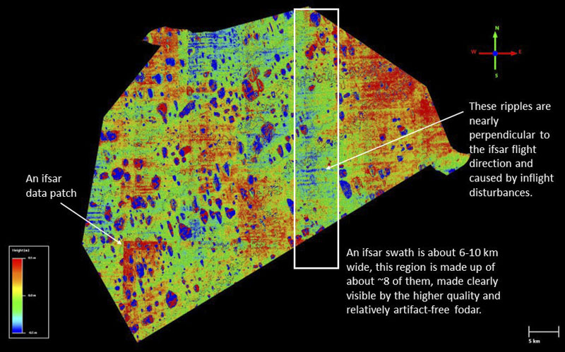
If both DEMs were perfectly accurate, we should see no color variations at all here (except for real change between acquisitions), so the fact that we see regularly-repeating variations means that one or the other or both DEMs contain spatially-coherent errors (systematic or non-random errors, as opposed to the random noise that more commonly defines precision). Ifsar flight lines were oriented North-South (up-down here, see example highlighted by white box), fodar flight lines were oriented with the lower boundary of the block (NE-SW). Notice that nearly all of the differences here are oriented with the ifsar flight lines, not the fodar flight lines, as described further next. Note that the ifsar errors I discuss below are all well known and documented by the companies that did that mapping as inherently part of their technology, so I’m not describing something new here, just using their errors to constrain fodar’s vertical precision.
The clear ifsar artifacts are measurement errors disguising themselves as actual topography — that is, we can’t imagine that topographic variations actually align themselves with the ifsar flight lines and swath widths, so they can’t be real. Clearly visible are their swath seam errors in the direction of flight and ripples perpendicular to flight caused by multipath within the radome or turbulence at 30,000’. Also visible is some data patching. The point here is that the fodar is clearly pulling out the error from the ifsar, meaning that fodar’s random noise and systematic artifacts must be much smaller than ifsar’s artifacts else the ifsar artifacts would not be so clearly visible. The next several images reveal the magnitude of the ifsar artifacts as a means to constrain the vertical precision of the fodar data — that we can smoothly measure ifsar artifacts at the 40 cm level over large spatial areas means the fodar precision must be substantially better than that.
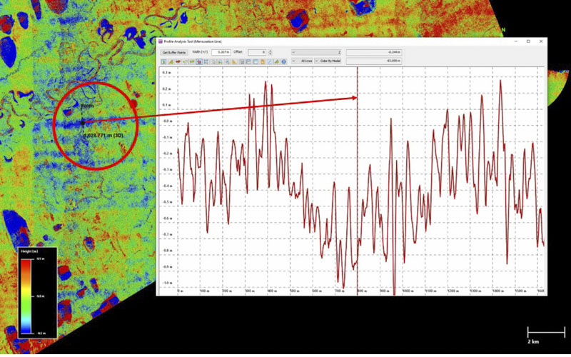
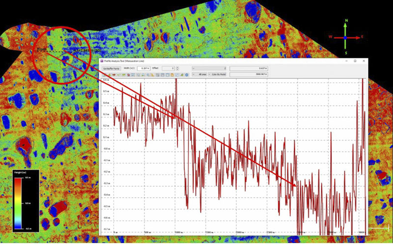
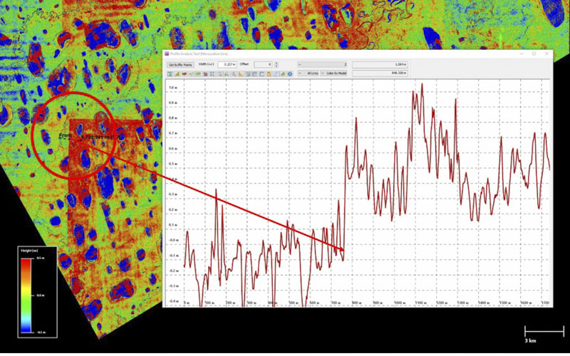
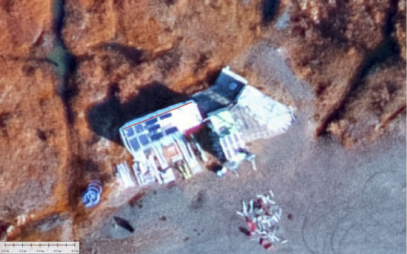
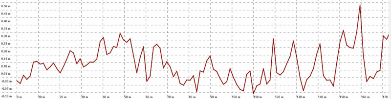
Here I created a transect (black line) across one of the ifsar ripples (blue band in image) to create the plot at right with horizontal gridlines spaced at 10 cm. You can see the amplitude of these bands are nearly a meter, or +/- 50 cm around a ~40 cm mean. The point here is that to resolve these ifsar ripples, the fodar must have substantially less random noise, or in other words substantially better precision. I explore a few more examples next to reinforce the point.Here I created a transect across an ifsar seam artifact where several swaths were merged. It appears that either three swaths were merged or more likely some averaging went on between two swaths with little feathering. The three steps apparent in the color (red down to green down to blue, arrows) are also apparent in the plot, with a total amplitude of about 80 cm. However, the clearly-visible individual steps are only about 40 cm apart, indicating that the fodar is substantially more precise than 40 cm. If we assume the higher frequency differences are purely noise (which they are not), the vast bulk of the variation is +/- 20 cm or roughly a 10 cm standard deviation.Here I created a transect across an ifsar patch artifact. It appears that some data were spliced into a full swath, and the northern edge of this splice is offset roughly 70 cm from the surrounding swath. Again that this is clearly made visible by the fodar DEM indicates it has substantially superior vertical precision.And again if we assume the high frequency variations are purely noise, they fall within about a 10 cm standard deviation about the mean.Here I’ve created a transect (black) across a summer fodar seam artifact (it’s almost too small to see in the map). This is the most visible fodar seam I could find in the summer DEM and this is about the highest amplitude part of it. Judging the plot by eye, it appears that 95% of the misfit here is +/-25 cm from the mean of – 5cm, so about 13 cm standard deviation. Given that this is the worst of the worst here, I believe we can confidently say that the precision of these data is much better than that, and all prior studies have found this precision to be about 10 cm standard deviation or better, as clearly seen here. Thus numerous examples of pulling out ifsar artifacts indicate the fodar precision to be better than +/- 20 cm at 95% misfit, and the lack of fodar artifacts at this level indicate this is an upper limit. That is, simply by qualitative comparison with the ifsar, we can see that the fodar has a vertical precision better 10 cm standard deviation as it’s clearly resolves ifsar artifacts at about that level.Here I present the same fodar-ifsar comparison but using the winter fodar data instead of the summer. The important point here is that the same north-south east-west oriented artifacts are present here, indicating that ifsar is the common factor and cause of those artifacts. The ifsar intensity image (not shown here) also confirms the same conclusion. Note too that the winter fodar does not reveal the ifsar artifacts in exactly the same way as the summer fodar because it is covered by 10-60 cm of snow. The white arrow highlights the worst of fodar seam artifacts in winter, discussed below.Here we are looking at the fodar winter DEM minus the ifsar DEM. The winter DEM suffered from a few challenges that the summer data did not, namely that some areas (that is, this location) had to be repeated later in the winter due to some data quality issues during the first acquisition (eg, cloud cover, data corruption, operator error…) and by then several storms had literally changed the snow’s topography (which is not a problem in summer). Here I’ve created a transect across the most visible fodar seam artifact across about the most visible part of it, so about the worst of the worst. Judging by eye (10 cm horizontal gridlines), the amplitude across the larger artifact is +/- 25 cm at 95% around a mean of 5 cm, so a standard deviation of 13 cm or so. It’s important to note here, as just described, that some of this change is real and what’s not real is explainable by the logistics of temporal change causing confusion with the bundle adjustment because the shape of the sastrugi changed, so this is not a flaw in the fodar methodology itself. That is, nature has played a role here and we just have to roll with that.
Fodar-to-Ifsar Conclusion: Comparisons of fodar to ifsar reveal that the fodar data has no warps, tilts, or curls, that the worst fodar systematic artifacts are about 13 cm with the rest much below this, and that the random noise level is likely below 10 cm standard deviation as the fodar data can so clearly resolve ifsar artifacts with 30-50 cm amplitude.
Comparisons of fodar to fodar
Comparing one fodar map to another is a great way to assess precision and accuracy of the data. I start with a few comparisons showing horizontal accuracy by comparing the orthomosaics then move into vertical precision — if horizontal accuracy is way off, then subtracting the winter-summer maps will yield errors in snow depth due to the misalignment. In short what we find here is that horizontal accuracy is about 1-2 pixels and vertical precision is about 10 cm standard deviation about the mean, as always.
Vertical precision in this case is a measurement of repeatibility — by comparing the elevations of one fodar map to another we measure the misfit between them, but both maps could be vertically off by meters or more and we wouldn’t know it. That’s usually not the case, typically the vertical float with these data is on the order of 10-30 cm based on many prior studies, which is also what we find here and I describe in the comparisons to snow probing. There were good reasons for this float, which I now know how to eliminate in future projects. So typically, a measurement of precision starts with eliminating the mean offset between the two datasets (that is, eliminate the accuracy error) such that the remaining misfit is all random or systematic noise (precision). In any case, vertical precision is really all that matters in the summer and winter DEMs, because any accuracy errors in common (like both DEMs being 10 m high, which never happens anyway) cancel out when subtracting them to determine snow depth.
It could be argued that my measurements of horizontal accuracy are also really measurements of precision, but recall that each orthomosaic uses over 30,000 points of air control determined by GPS to within several centimeters (which is orders of magnitude more ground control than any project has ever used in the history of photogrammetry) so if we get the same answer repeatedly then the answer effectively is accuracy. This same logic is used for GPS in ground truth– the only reason GPS is considered ‘truth’ is because it gets the same answer time after time (precision) and so we declare it accuracy by consensus because we can’t think of any good reasons not to.
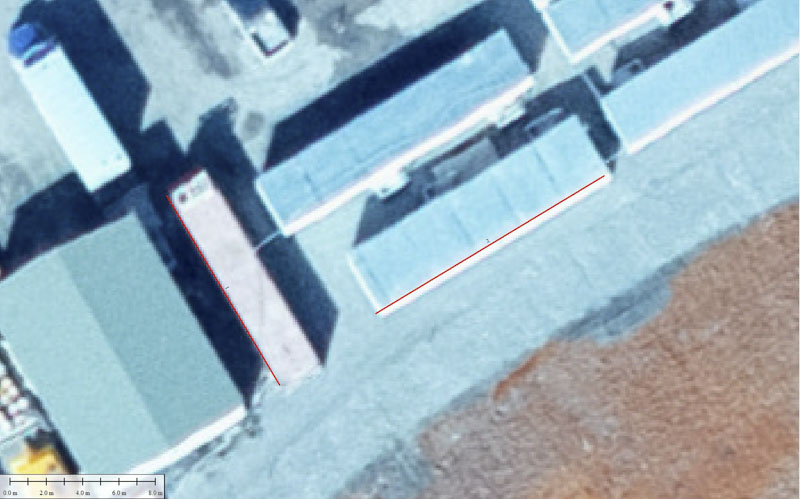
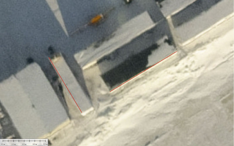
Building edges (though rare in this study area) make great locations to assess horizontal alignment between data sets. Here I’ve added the red lines to make the comparison easier. Note the lack of apparent movement of the buildings relative to each other in either map and relative to the red lines. No corrections were made to accomplish this, the data here are straight out of processing with no horizontal shifting and this accuracy is the case nearly everywhere we look. That is, I have found a few places where the local alignment exceeds 1-2 pixels, but they are so rare that I couldn’t find one when I went to create an example of that.
Here is another example similar to the last one. Wind drifting of snow complicates the comparison a little, but the red line indicates that any differences between the two are within 1-2 pixels.
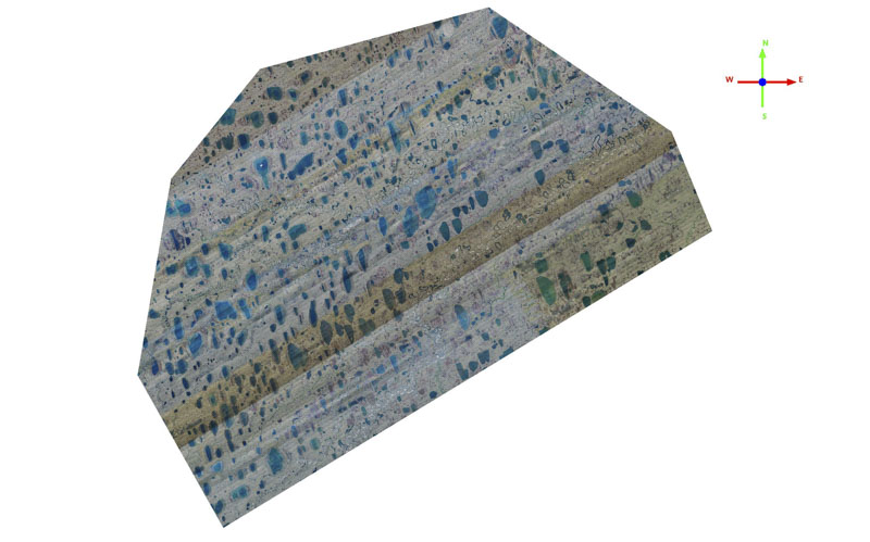
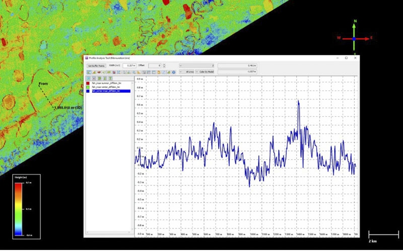
Here is the summer nIR (left) and RGB (right) imagery of some polygons in the Fish Creek block. Notice you can see individual tussocks in the nIR imagery. This is typical of the nIR imagery. Individual tussocks are also visible in the RGB, but not as clearly. In general, the nIR captures finer details than the RGB, and the RGB data suffered through several unfortunate lens failures. Though the RGB and nIR share the same airborne GNSS solution, they are independently positioned based on the time the photos were taken and processed independently photogrammetrically. So it’s no surprise they align horizontally so well, but it’s nice to confirm it. Further confirmation can be seen in the oil pad examples in the previous section.
Here is the winter imagery corresponding to the same nIR image. The point here is that it is really useful to have some buildings to use for the alignment-testing purposes as the snow drifts obscure the underlying topography and generally blur everything.
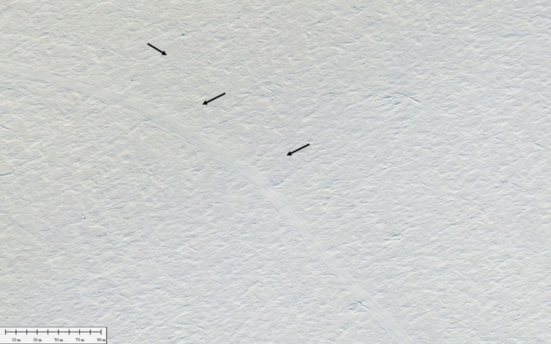
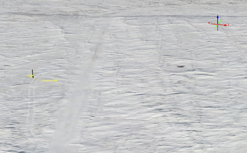
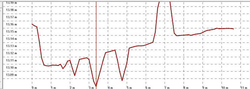
I found that excursions by vehicles off the main CWAT trail provided useful means to assess horizontal alignment, as shown here. The black arrows point towards tire tracks from a single vehicle that can be seen in the winter and nIR imagery. Information like this is of course not only useful in data validation, but for the purposes of the project itself — what long-term impacts might these excursions have on the tundra?
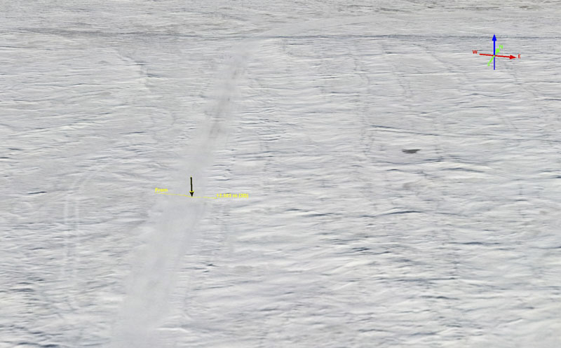
Here is another example of nIR-RGB alignment, this time revealing some differences in information content between the two. The green arrow shows the location of tire tracks caused by an excursion from the main snow road that is useful in assessing fine-scale alignment. The black arrows show the location of the snow road in 2020-2021. The white arrow is described below, just note here that there is a big difference between what the nIR sees and what the RGB sees there.
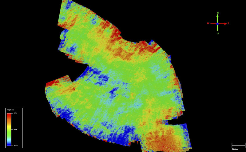
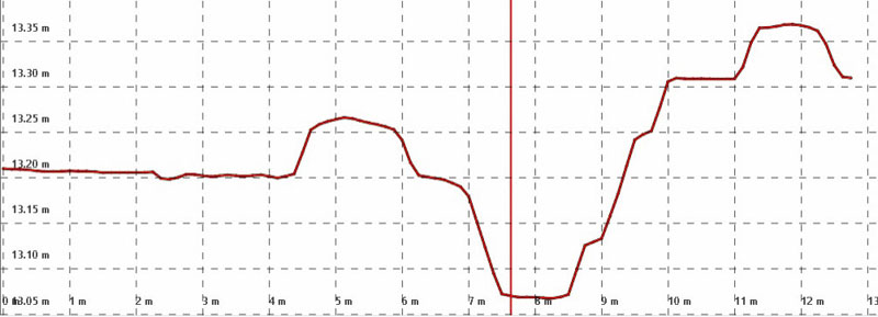
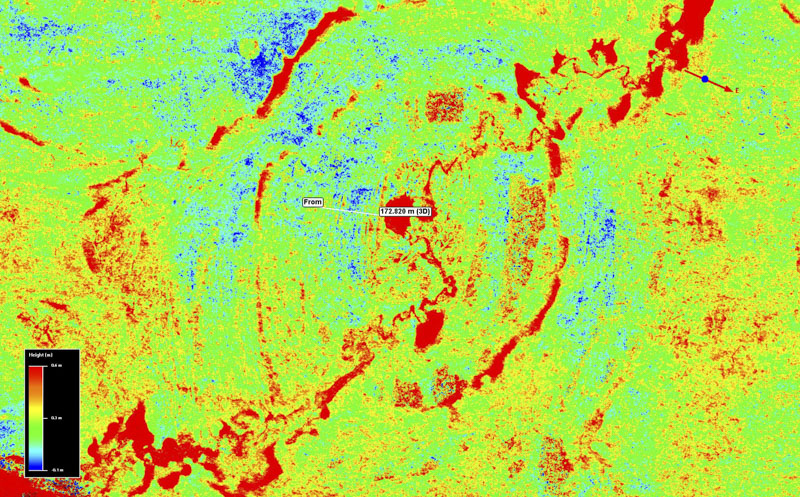
Here is the same nIR image as above, compared to the winter image. Note again that the black arrows highlight the route of the 2020-2021 CWAT trail, yet the white arrow is clearly highlighting the disturbance in the nIR image caused by a snow road, but not this snow road!? The answer must be that the white arrow on the nIR image is highlighting a road from a prior winter. I haven’t dug into this to learn what year, but the point here is that fodar’s nIR camera is clearly documenting multi-year impacts on the health of the tundra vegetation and potentially the topography underlying it, suggesting that repeat-acquisitions of fodar over the next years and decades can yield useful and novel insights into the role these roads play on the form and function of the tundra ecosystems here.Here is the snow depth map for the Fish Creek block. The color scale here is -10 cm (blue) to +60 cm (red), that is a 70 cm stretch. Note that there are no warps, tilts, or curls visible here — this means that neither the summer nor the winter DEM used to create this difference DEM contains such large-scale artifacts at anywhere near this magnitude (indeed, even a 10 cm color stretch does not reveal any). Note also that the majority of the values here are greens and yellows (10 cm to 40 cm) — this is exactly the range of values we would expect for an Arctic snow pack here. So even if we called all of the greens and yellow pure noise (which they are not), the bulk of the noise would then only be in the+/- 20 cm range. Note also that the many lakes are pure red because fodar cannot measure liquid water and the elevation values there are erroneous and should be ignored or masked out.Here I am comparing the overlap between two fodar acquisitions to assess them separately. This location is in the south-east corner where the CWAT trail enters the Fish Creek block. The color stretch here is -40 cm to +40 cm, so the yellows and greens represent +/- 10 cm. Note that the noise increases towards the edge (red) but that we really don’t care about that — the acquisition plan deliberately over-acquires around edges so that these data can be trimmed, as the last flight line in any block always has less overlap with its neighbors because it is the edge (the upper left edges). So where we expect good data we have it — the difference between the two acquisitions where we planned for good data confirms misfits on the order of 10 cm.Here is a similar comparison between the CWAT trail and the Fish Creek block, this time in the north-west corner. It is the same story here, where the data sets merge, the the misfits between them are in the +/- 10 cm range.Here is where two acquisitions along the length of the CWAT trail overlap. Again the edge data from both show the largest errors, as expected, but we don’t care about those — all that matters is where both data sets independently have full overlap, which is near the center of this image. Here again we find that the misfit between them is mostly in the +/-10 cm range (greens to yellow). Note further that the larger excursions of reds and blues are largely cropped too as these extend beyond the width of the CWAT corridor by design.
Fodar-to-Fodar Conclusions: My fodar-to-fodar comparisons found basically the same thing that they have always found: that horizontal accuracy is within 1-2 pixels and vertical precision has about a 10 cm standard deviation about a zero mean. Here I was also able to compare my largest-ever contiguous block of repeat-fodar (~3000 km2) to see that there are no large-scale warps, tilts, or curls in the topographic data that can be found even at the centimeter-scale. Any misfit between acquisitions on various days was eliminated to better than 10 cm, so overall vertical accuracy was reduced to this level using ground control, described next.
Comparisons of fodar to ground control
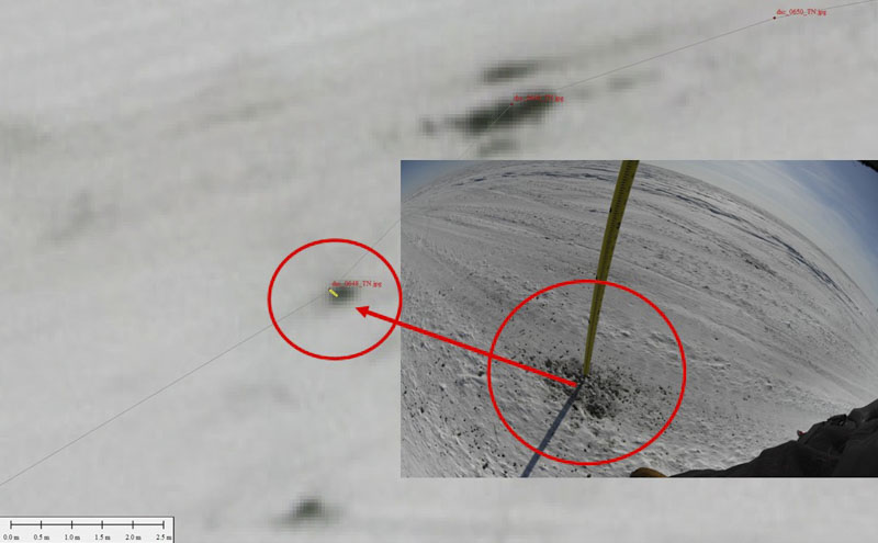
I collected about 1000 snow probe measurements on the ground, geolocated to within a few centimeters. While any type of probe measurements can be useful, because the fodar snow pixels are so small (25 cm) ideally we want the snow probe measurements on the ground to be geolocated to better than that. I also wanted to use these data to set an absolute vertical reference for the airborne fodar data, down to single centimeters. There are some existing snow probes with integrated GPS that do geolocate the probe measurements but only to within several meters, so to get the data I wanted I had to build my own probe system.
I saved the ground control portion of the project until the end of winter, as I figured it was way more important to get the airborne acquisitions finished that to divert to do this. Plus the snow drifts on this runway and in the field were large and rock hard, enough to break my landing gear, so I needed to wait until they softened up. Unfortunately by the time I got enough good weather to finish the acquisitions, snow melt had just started. Actually it was probably snow sublimation, but the impact was the same — some of the thinner snow had been lost and dirt or vegetation began to shine through. I think this process had only started perhaps 1-2 days earlier as there was a stretch of good weather while I was finishing up. So I made a second acquisition in this area on the day I made the ground control measurements just so that I could document this. These are the two acquisitions.
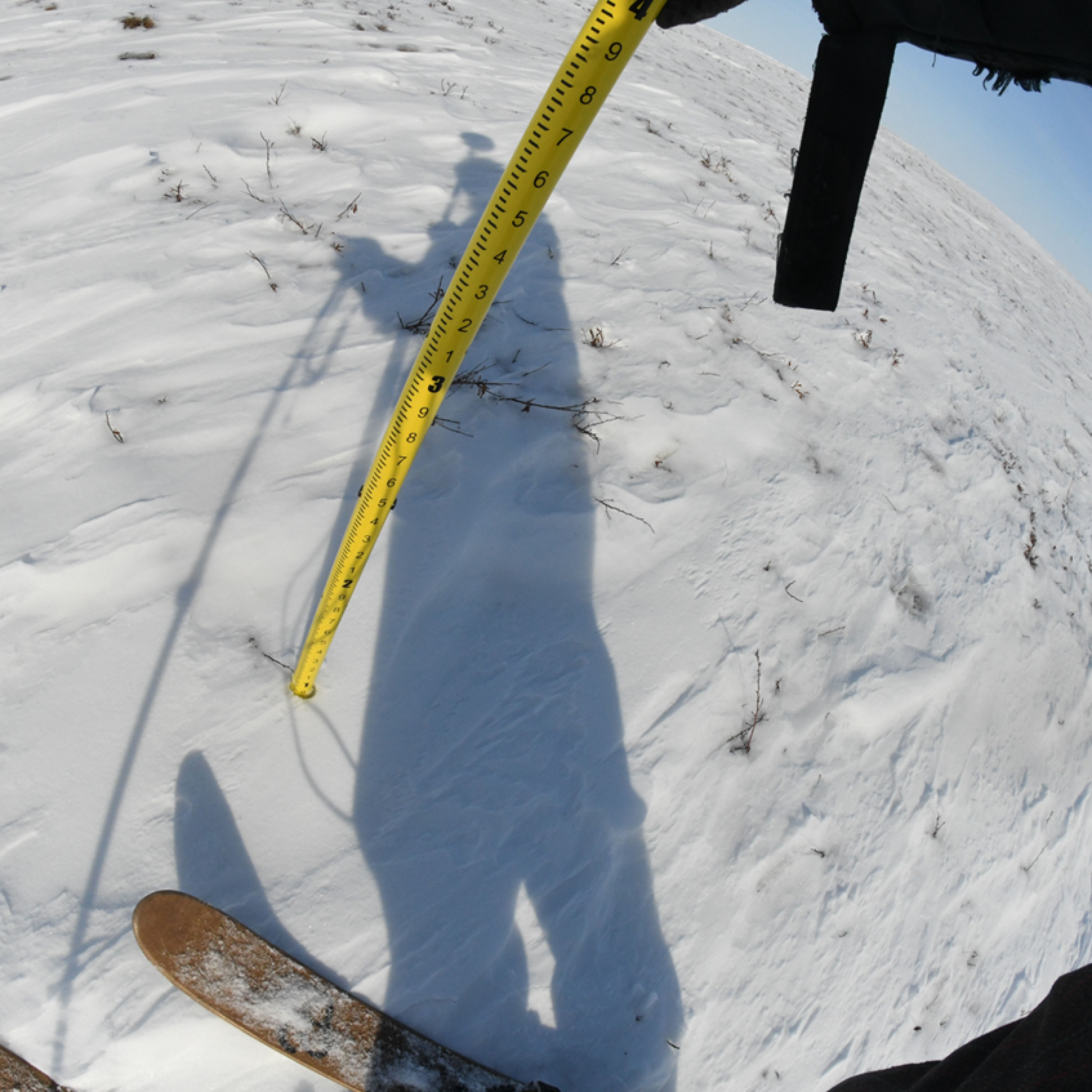
Here’s the best photo I have showing my system, in shadow. It works essentially just like my airborne system — when I take a photo of the snow probe, a survey-grade GPS records the position of the antenna on top of the pole. Later I look at each photo and transcribe the snow thickness and the heights of the summer and winter surfaces. I figure my transcription accuracy is +/- 0.2 inches at 95%; blunders were rare and easily found when looking at the results. I traversed on skis to avoid postholing and keep my balance…
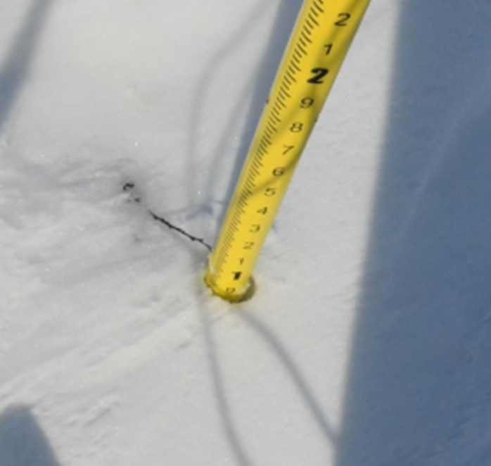
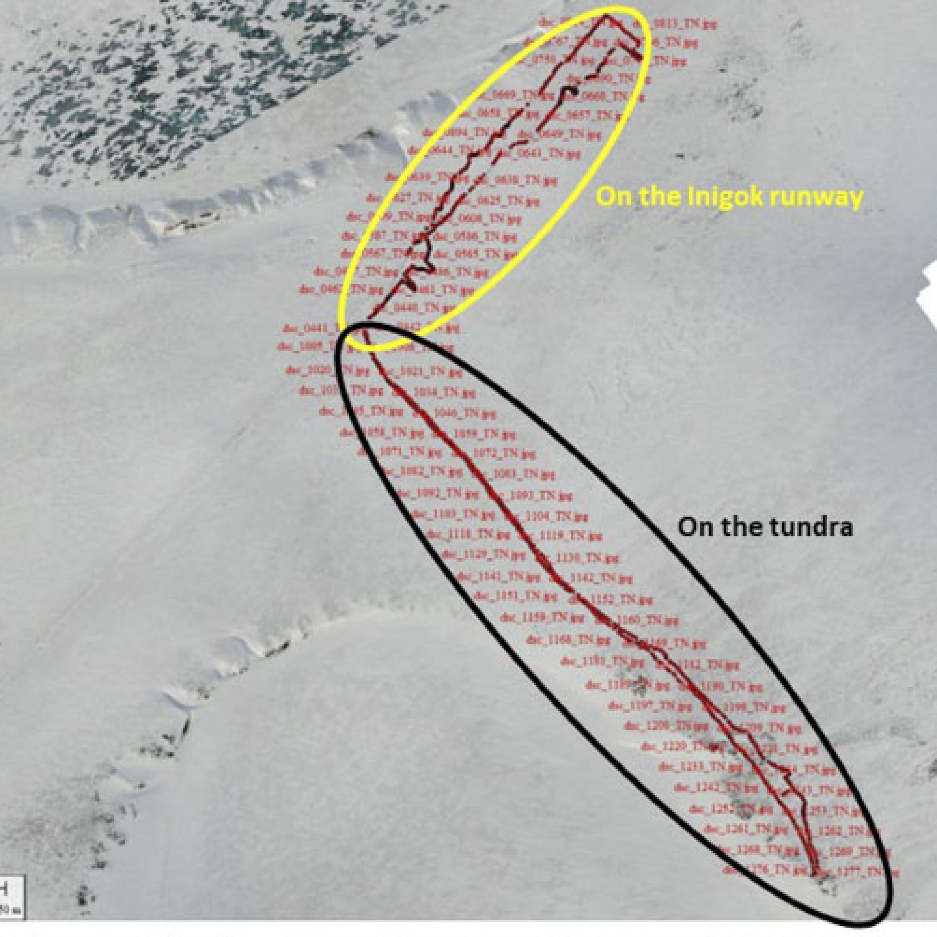
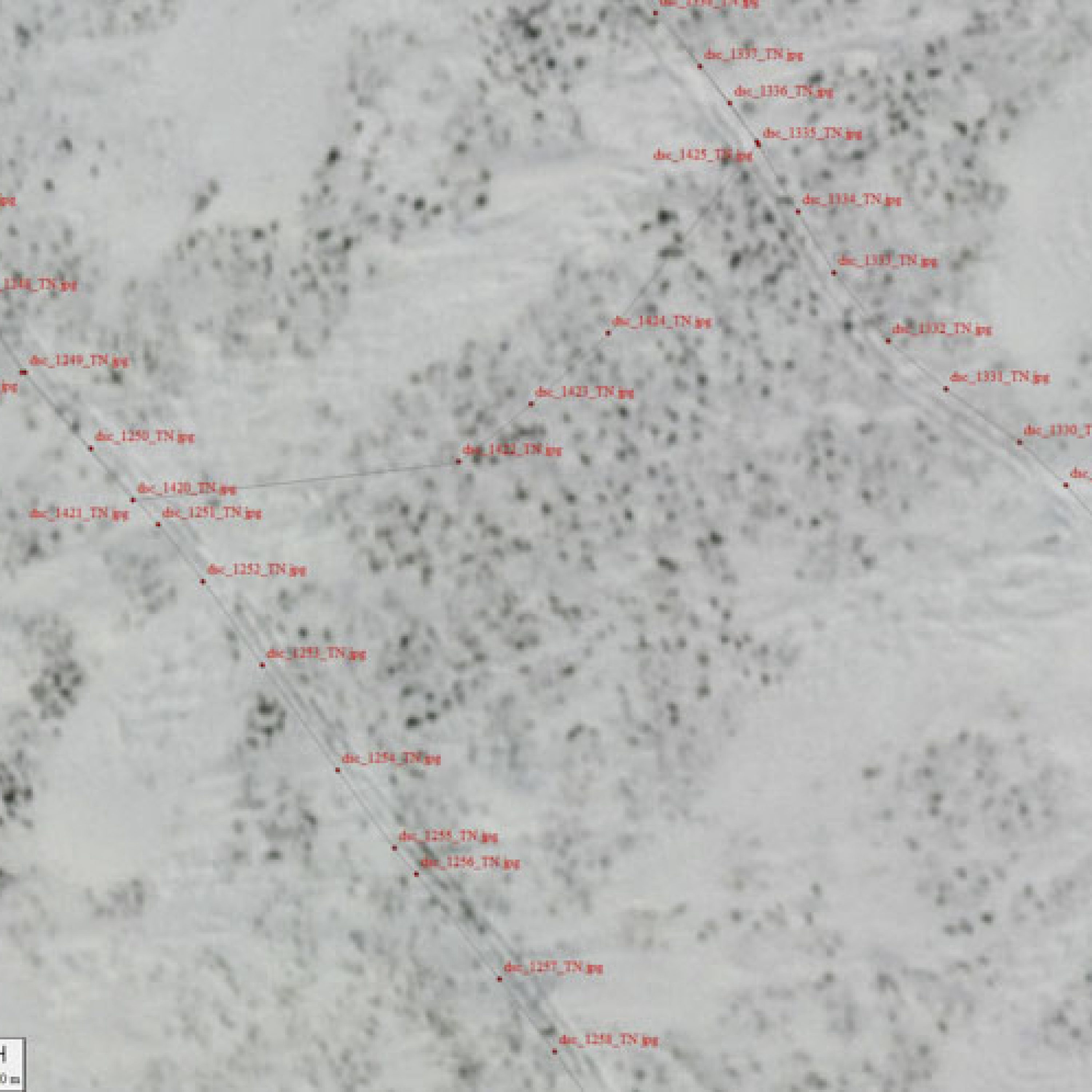
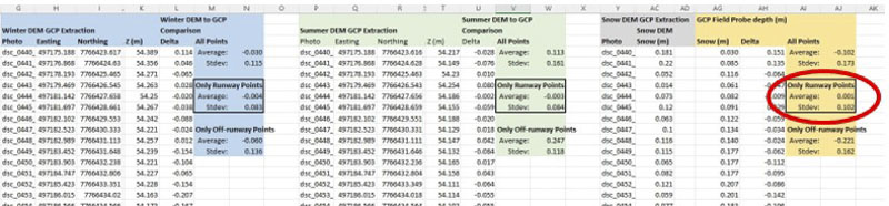
Here are the locations of my probe measurements. I took some on the runway at Inigok which were free from vegetation and some on the tundra itself.Here is some detail on a few of the measurements to assess horizontal accuracy. I held the probe with my right hand, out about 20-40 cm from my skis. You can see my ski tracks here in the orthoimage I created an hour later and the probe measurements about that distance to the right of them, confirming a general agreement horizontally.Here is detail on a single probe measurement, made on a bare spot on the runway at Inigok. The bare spot is maybe 15-20 cm wide. The imagery here is about 6-8 cm GSD, as I flew lower on this day for this purpose, so the bare spot covers about 4 pixels of imagery. The small yellow line is where the probe measurement plots out, which corresponds well with the actual photograph. Geopositioning here is a function of GPS accuracy (2-4 cm) and tilt of the probe (up to 5-10 cm), so I wouldn’t expect any better than this.The misfit between airborne and probe measurements had a mean of zero and a standard deviation of 10 cm, based on about 800 measurements, confirming what we’ve found in other ways. I also used these data to set the absolute heights of the summer and winter DEMs by reducing their mean misfits to zero; these network adjustments were 10 cm and 16 cm for the winter and summer Fish Creek DEMs, and less than 5 cm for the CWAT trail DEMs. The mean misfits in summer and winter on the runway had about 8 cm standard deviations, which is about what we usually find. Off the runway in the tundra in the summer and snow data, the mean offsets and standard deviations were higher, in the 10-20 cm range, but winter remained the same. This is clearly due to the vegetation (completely covered in winter), which had some small shrubs. These data are first-surfaces, meaning I made no attempt to remove the shrub canopy. This is possible and I’ve done it before, but it’s more work than this initial project budgeted for and something we can always process in the future.
Fodar-to-GCP Conclusions: Comparisons of shrub-free snow-probe data to fodar resulted in a 10 cm standard deviation misfit between them about a zero mean. The misfit was higher on the tundra here, which contained a lot of small shrubs; future work with these airborne data could eliminate the shrub canopy to yield more accurate snow data. The GCPs at Inigok were also used to set the absolute vertical reference for the DEMs — any large subset of these ~1000 points yielded the same results, as noted in the caption above, with the largest vertical adjustment being 16 cm. Note that in the fodar-to-insar comparison I found a mean vertical difference of 38 cm. I did not explore the reasons for this in any depth, but I suspect their Geoid09 vertical reference compared to the fodar’s Geoid12B reference could explain some of it, and the fact their own analyses showed a 42 cm mean offset to their own control here with a 90% confidence of +/- 68 cm (see their metadata) tells me I shouldn’t worry about this at all; that is, it is much more likely that the fodar is better truth and the insar should be adjusted to it. Because the GCPs I collected and used for the vertical reference are not well-distributed over the study area, there is a possibility for bias or blunder (I am not a professional surveyor) local to this location, but given that the snow depth map’s values match our intuition (snow depths are mostly in the 10-50 cm range), any vertical bias or blunders must be small (< 20 cm @95%), though a detailed look at snow-free areas distributed throughout the study area could refine this further. Thus vertical precision and accuracy appear to be well described by a 10 cm standard deviation from truth.
Comparison of fodar to intuition
This project covered an enormous spatial scope to do something that had never been done before: make many billions of snow depth measurements every 25 cm over thousands of square kilometers of Arctic terrain, where most snow depths likely in the 30 cm range thus requiring a mapping system with precision better than this. Budgets being what they area, not everything is possible and our ground control was limited to what was just described. Indeed, given the budget it is amazing how much we did accomplish. But just because we weren’t physically on the ground measuring things doesn’t mean we can’t use our intuition and expertise about the nature of permafrost terrain to assess the precision and accuracy of these data. Don’t forget, we already have a decade of prior research telling us exactly the same thing as we found above — that we can resolve features on the centimeter-scale accurately over huge areas, with a precision on the 5-10 cm range (standard deviation). And the point of this project was to better understand the terrain on this level of detail — the level where processes actually occur — so let’s simply explore some examples of what’s possible for science and land management purposes.
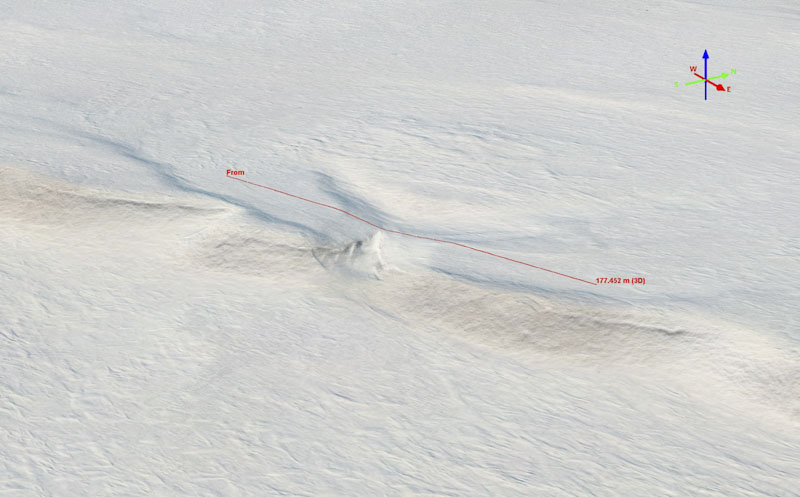
This region of NPR-A is filled with lakes and anyone studying snow is going to be familiar with the size and shape of sastrugi on lakes. Here is a lake shown with about 700 m profile line drawn across it. We know that the lake surface is mostly level, though not exactly, so looking at the sastrugi compared to the bare ice surface gives us a reference for a feature we are all familiar with.Here is the elevation profile across that lake in winter. Note that this is not snow depth, the water surface in summer is not measurable so here we are looking at actual elevations. Even if all of this variation were pure noise, which it is not, that is if we assume this lake surface should be completely flat, this analysis would tell us that 95% of the random vertical noise of these data is within 15 cm of the mean, for a standard deviation of roughly 8 cm. But here you can see the ice surface elevation has large scale variations on the order of 5-10 cm and you can see the weirdness of ice morphology varies spatially, so likely some of that is real. In the next image, I demonstrate that most of the short-scale variation is real too — this is sastrugi topography. Note too that lake elevation itself is valuable information that have no other good way to get — there are thousands of lakes here, and knowing how full they are in fall (when they freeze up) gives us loads of information about fall soil moisture, spring thaw dynamics, and lake-interconnections into summer.
Here is a close up of the lake in the previous image pair, this time comparing the winter ortho to the winter DEM with a color stretch of 60 cm over a profile of only 50 m. Flickering between the two, you can see that the sastrugi elevations visually align with the imagery and so are not just random blobs. Note that here we are approaching the resolving power of these data — the imagery is 12.5 cm but the snow depths are 25 cm, and there is spatial biasing (a blurring) of the sharp peaks of the sastrugi because they are too much smaller than the pixels themselves. It’s not that we can’t map at 2-3 cm, it’s just an optimization process when dealing with a project that is 3000 km2 — where is the balance between cost, time, and scientific need? In any case, I hope this comparison alone is enough to convince any Arctic scientist that fodar represents the state-of-the-art with resolutions and accuracies suitable for tons of new scientific purposes.Here is the elevation profile across the few drifts in the previous image. They have an amplitude 10-30 cm, just as we would expect for sastrugi on a lake.A main motivation for this project was to study the impact of snow roads on the tundra. Here just for fun I isolated an excursion from the road (yellow line) to show the resolving power of the data. See the profile below.Again here we are looking at winter snow-surface topography, not snow depth, with horizontal gridlines only 1 cm apart. I have aligned the marker visually in the ortho inside of one of the tire tracks in the excursion. In this plot we can see that the tires sunk into the snow about 5 cm! While this could just be random noise lining up coincidentally, the next several comparisons indicate this is not the case. Likely the depressions were a bit deeper than this, but since the tires themselves are only the width of 1-2 DEM pixels, they are too narrow to resolve fully. Nevertheless, analyses like this one clearly indicate that the random vertical noise of the data is on the order of single centimeters, else these tire tracks could not be resolved at all.Here is the same inter ortho image draped over the winter DEM, this time measuring a profile across the road itself.Here we see the road is depressing about 15-25 cm below the undisturbed snow surface, and that drifts caused by wind or plowing have built berms of 5-15 cm on either side of the road. This is not just an interpretation from this plot, you can see those berms in the imagery itself. And though we do not have ground measurements of their height, we also have no reason to doubt based on the imagery or plot or prior studies that these magnitudes are incorrect.
Here is a bigger section of the 2021-2022 CWAT trail, seen near the top of the nIR and winter orthomosaics. The road stands out clearly in the nIR imagery. My impression flying low over stretches like this to scope the dynamic out visually is that the eriophorum here did not bloom where the snow road was, but I’m no botany expert. In any case, it is clear that the nIR imagery will be valuable to botanists both now and in future acquisitions in studying any long-term impacts of these roads and how to minimize them.
Here is that same stretch of road this time shown with winter imagery compared to the snow depth DEM (note that previously I was showing the winter DEM, but this one is the actual snow depth). We can see clearly that the snow road’s snow depth differs from the surrounding topography, sometimes thicker but usually thinner, which makes some sense since it compressed.This 20 m profile across the ~4 m wide road shows that the snow thickness here is about 15-20 cm thinner than the surrounding area. Because the snow depths are negative, it suggests that the tundra vegetation was compressed 10-15 cm in winter and rebounded in summer but without the blooms.
Here is another stretch of road, as seen in winter and in snow depth, in which we see little to no variation between snow depth on the road and snow depth in the surrounding terrain. Because I’ve shown in previous comparisons that we can detect differences on the 5-15 cm level, we can have confidence here that because we do not see variation in snow depth at that at the 5-15 cm level that there likely is no variation.Here is the snow depth profile corresponding to the previous images, showing roughly 30 cm of depression in the road here. Why here and not elsewhere? It’s beyond the scope of this blog to say, but I can say that we plenty of data to answer that question sufficiently. My impression is that it has to do with the substrate — the ground is mushier or shrubbier here, so the snow isn’t necessarily thinner, it’s just pressed deeper into the tundra, as indicated by the negative snow depth values.
Here is another example of what imagery alone can tell us, from the same location as the previous example. At left is the nIR orthomosaic clearly revealing the impacts of single-vehicle excursions from the snow road. At right is the winter 2021 orthomosaic showing that those excursions seen in the nIR came from a prior year, thus the tire tracks from this excursion are not reveal in the snow depth DEM from the prior comparison. Lidar is a great tool, but alone it would produce neither of these images and these impacts would go unseen and unstudied as it only measures topography.
Here is a really cool drained lake, seen in nIR and snow depth. I think it’s really cool for a bunch of reasons, but in this context mostly because you can see that it drained in stages, with each one creating a new shoreline or bathtub ring, through the ‘connect-the-dots’ stream that seems clearly to have formed from melted-out ice wedges diagonally through its center. And here we can not only see the bathtub rings in the nIR imagery, but also the corresponding snow drifts in the snow depth DEM. Here the color stretch is -10 cm to +60 cm. There’s tons of other information here having nothing really to do with snow depth measurement, I imagine there is a master thesis just in studying the evolution of this lake drainage using this fodar data to guide a variety of field studies.Here is the snow depth profile from the imagery above, showing 10-35 cm variations in snow depth over about 180 m length. Again, if for the sake of argument we said that the variations seen here were pure noise (which it clearly is not), we could claim that this noise was constrained to the 10 cm standard deviation level about a mean of 15 cm. But this is not noise! These variations are spatially consistent and align with bathtub rings we can clearly see in the imagery. We obviously don’t have snow probe data here to validate this, but at this point I don’t believe any further validation is needed — these are data we can now trust and learn from!
This is the same drained lake as in the previous example, this time showing the winter imagery and extracting another snow depth profile from some slightly thicker drifts.
Here the profile confirms what is seen in the snow depth DEM, that the drifts are thicker here. The thickest drifts seem to be consistently around the same bathtub ring — perhaps the lake stayed at this level for quite some time, until new ice wedges were melted out? Who can say right now, but these are the type of questions these data can motivate and answer in the future — what could be more exciting?
Fodar-to-Intuition Conclusions: Comparisons of fodar to our intuition about what the landscape and its snow cover should look like are as valuable as any other method for establishing data quality but are often overlooked as being too subjective. Personally, as a client, I have received too many data sets where the vendor never took the time to explore the data and thus never found how their limited GCP validations did not catch major blunders or biases or simply crappy data. Here in addition to a simple subjective analysis, I’ve also shown how by looking at subtle, real features (that we know are only 10-30 cm in height in nature) and assuming these measurements were pure noise we know at worst the noise level is quite low, but by looking at the spatial data we can see these variations correspond with real features it allows us to claim that the data are clearly able to resolve features 10-30 cm in height smoothly at the single-centimeter scale.
Conclusions
In this project, I conducted repeat-fodar to measure Arctic snow depths at 25 cm resolution and 10 cm accuracy over a spatial area of over 3000 km2, the largest such undertaking ever (I believe more measurements of snow depth were likely made in this project than have ever been made in Alaska in the past). Snow depth is important in its own right for tons of scientific and responsible-development purposes, but in the larger picture what we’ve demonstrated here is that we have the ability to reliably measure any change to topography on the 10 cm level over huge spatial domains. What an amazing time to be alive! We are witness here to a scientific power unrivaled in the history of Arctic permafrost dynamics: the ability to affordably map Arctic tundra topographically over huge areas (potentially ALL of it) at the tussock-scale as often as we like. The need for extrapolation or statistical sub-sampling is eliminated as we can detect, study, and model the melt of every ice wedge, thermokarst, coastal bluff, or pingo within a study area.
The timing for this study could not be better in my opinion. The next International Polar Year is only 10 years away. In IPY4 we waited too long to begin the fund-raising process at the scale of national governments, such that by the time IPY4 occurred a burst of new science projects could not actually be funded in most countries. Then we also lacked what we have now — fodar. Fodar studies like these not only inexpensively create brand new opportunities for science, they intrinsically have phenomenal outreach built into them. After perusing the examples in this blog if you are an Arctic scientist your jaw may still be on the floor and if you are not you now know more than many Arctic scientists do about the state-of-the-art in permafrost mapping and its possibilities. That is, the visual and graphic component of this technology and its revelations should not be undervalued — when someone visually sees a dynamic process like permafrost melt or snow depth revealed in this way, they cannot unsee it. And that has real value, not just in funding our science but in communicating it to those who have the power to make regulatory decisions for our society’s benefit.
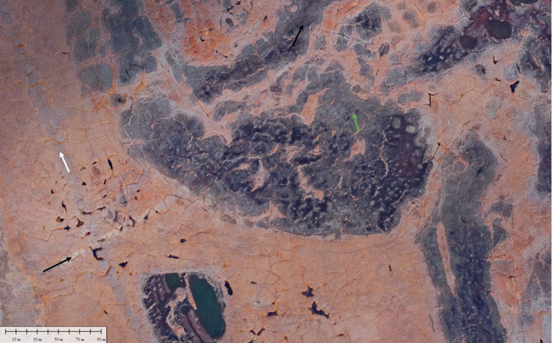
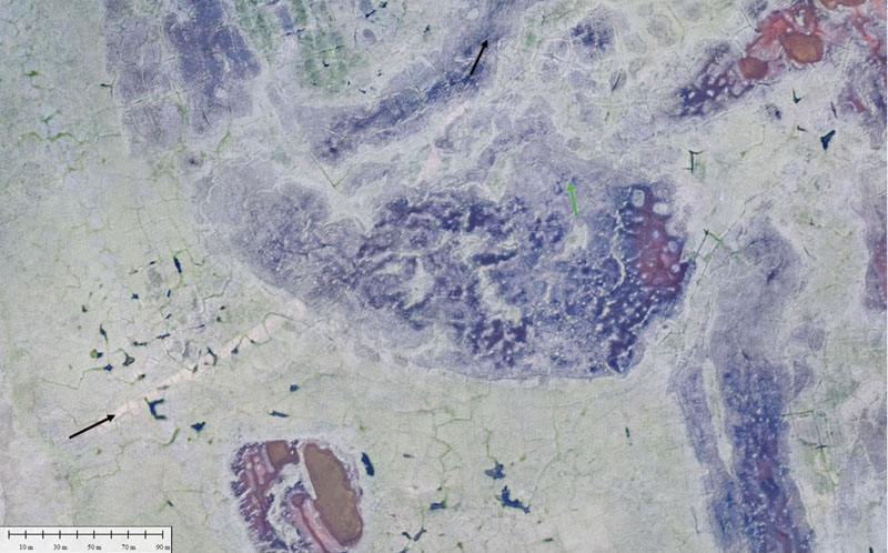
This one of my favorite examples from this data set– so much information content here! In the summer nIR imagery, you can see a large field of polygons. Look more closely and you can see it is surrounded in places with harder-to-see polygons. What largely determines what makes them easy to see is whether they are surrounded by water — that is, have the ice wedges started to melt out yet? Near the center of the main field, you can see the polygons appear to be actually joining together. Comparison to the snow depth DEM shows that here the ice wedges have melted and the water that used to fill them has largely been replaced by dirt, as we can see clearly in the snow depth DEM that these polygons are covered by shrubs. Examining the nIR orthoimage in detail (not really possible here) shows that indeed shrubs are growing there. Why? Presumably because the polygons aren’t surrounded by cold, impermeable ice, they are surrounded by warm, drainable dirt. That is, here is climate change in action. How do I know? I don’t really, that’s just what I’ve surmised from looking at the data as a guy that normally studies glaciers — imagine what a permafrost expert could learn! We also have the capability to re-map this polygon field as often as we like now to observe rates of this transformation, and then compare that to the same study done on polygon fields throughout the Arctic to assess spatial variations, and then compare these to polygon fields which have been disturbed by development, and then begin to elucidate the nature of the actual processes involved in ways we were unable to before, and then improve our models to have increased predictive skill, and then…
Contact Us
We're not around right now. But you can send us an email and we'll get back to you, asap.


