
Landscape Change in the Noatak National Preserve
Today we delivered three projects to the National Park Service’s Arctic Network related to understanding the impacts of climate change on the Arctic Landscape. The data I show below is just another step in a long-term study, led by Dave Swanson at NPS.
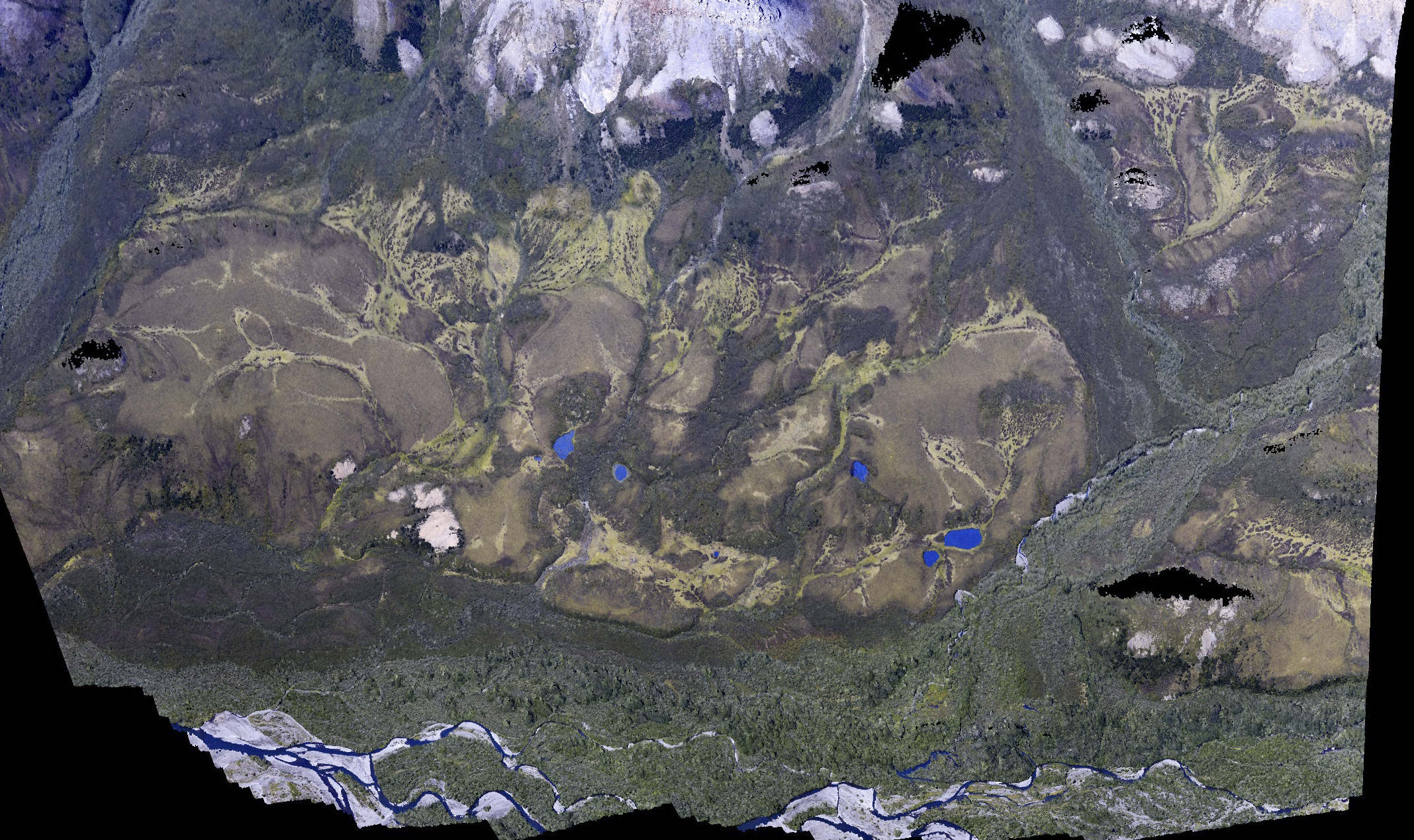
This delivery included DEMs and orthomosaics at 10 cm for 7 permafrost thaw slumps. We have been mapping these periodically since 2011, and Dave mapped them several times before that. Each year these expand in size, largely due to melting of the ice rich ground which becomes exposed as the tundra surface fails and slides downhill. The goal is to measure these changes to better understand their dynamics and improve predictions of their behavior, as well as our understanding of how widespread these failures may become in the future. You can read about the acquisition of these data here; below are a few screenshots of these thermokarst as depicted by fodar.
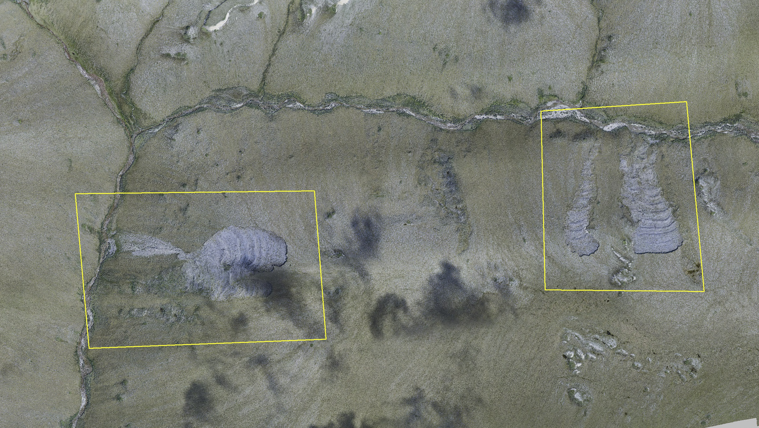
Here are two sets of slumps that we have been measuring with fodar since 2011. Mouse-over to see the topography as shaded relief.
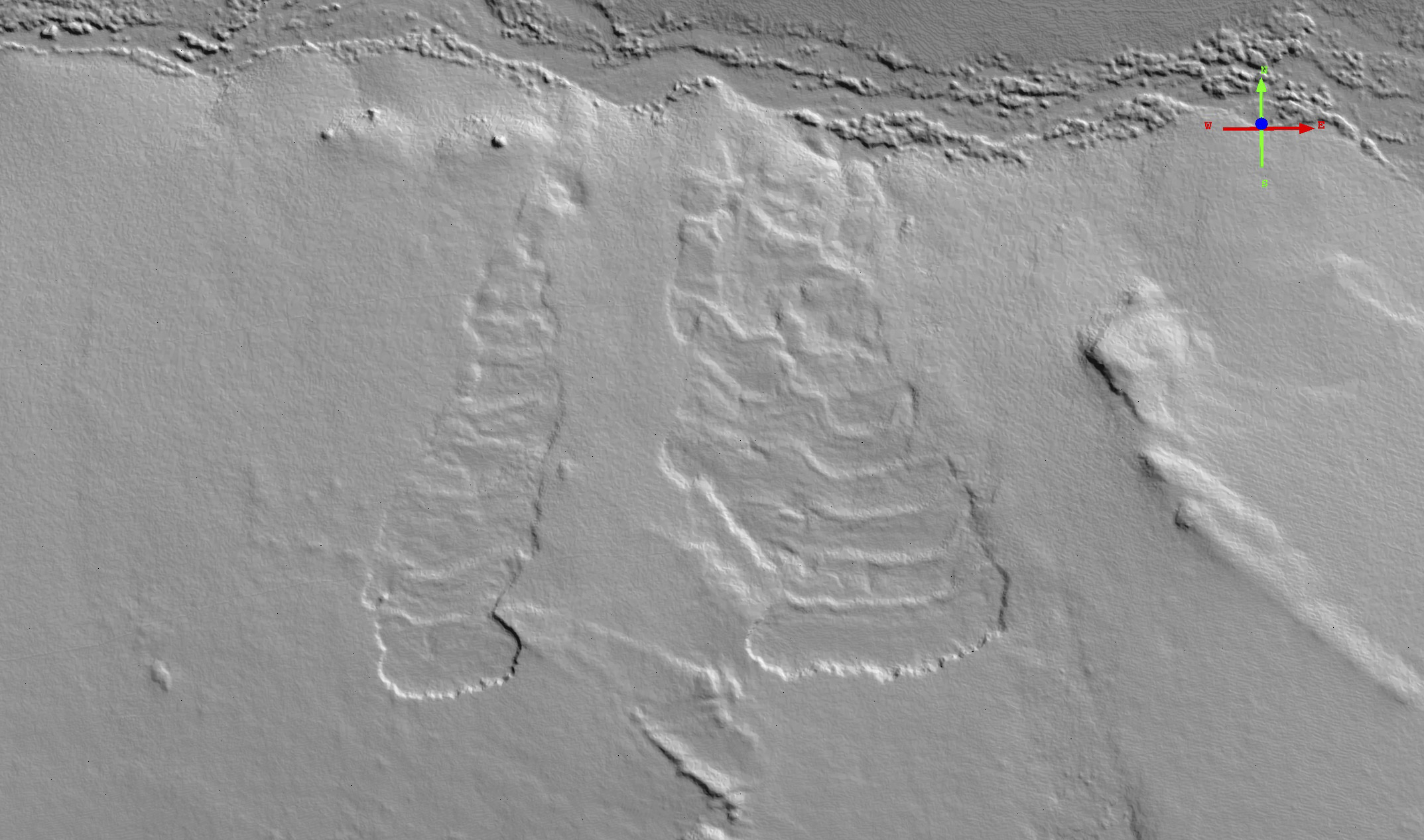
Here is a shaded relief of 2014 topography. Mouse-over to see how they have grown in two years.
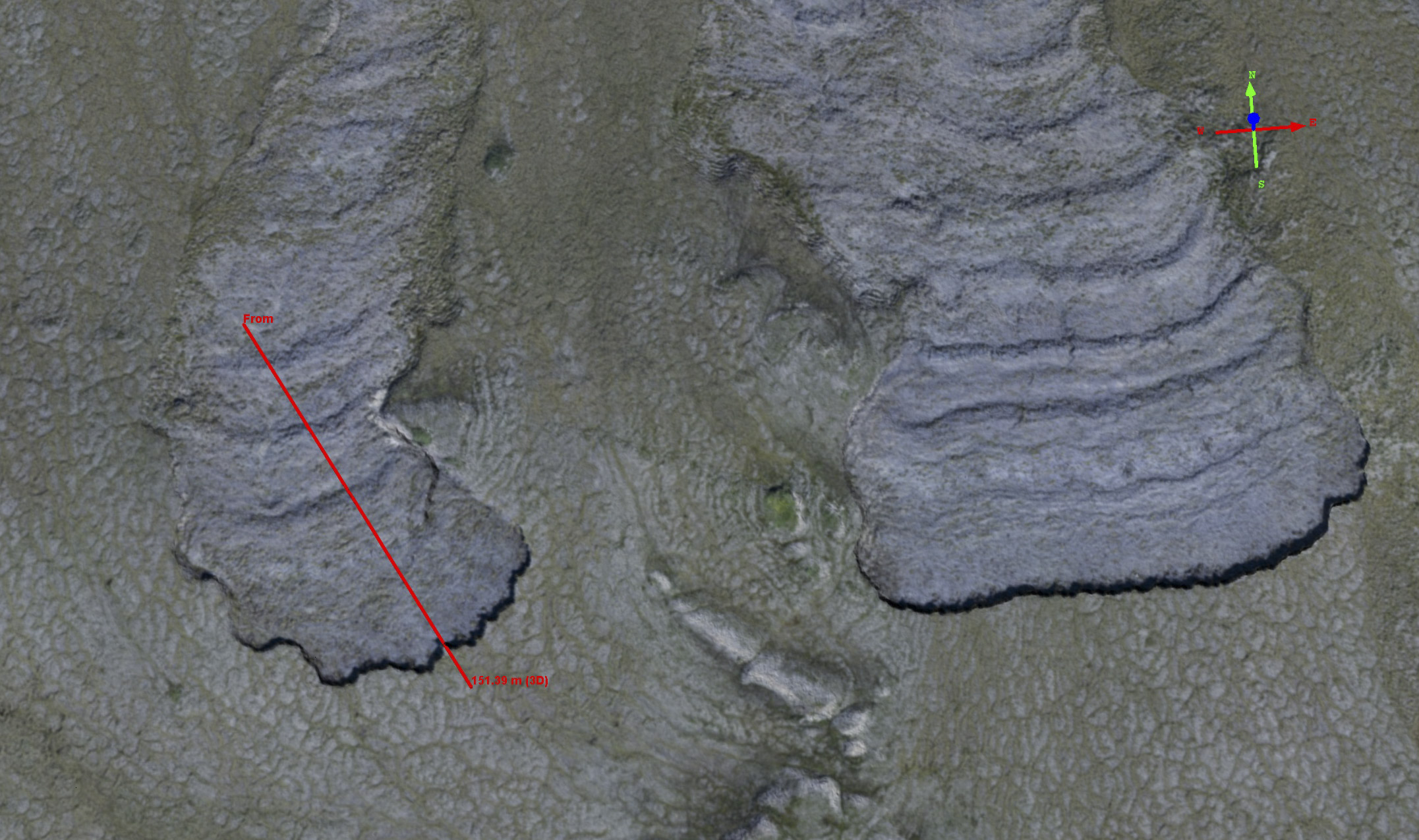
Here are those same two slumps again. Mouse-over to see the difference in topography, colored by magnitude of change. The drainage flow towards the top of the photo. Note that the topographic disturbances at the headwalls do not propagate very far downhill.
Here is the difference in elevation between 2014-2016. Note there is about 40 meters of headwall migration, extending about 1.5 meters into the surface.
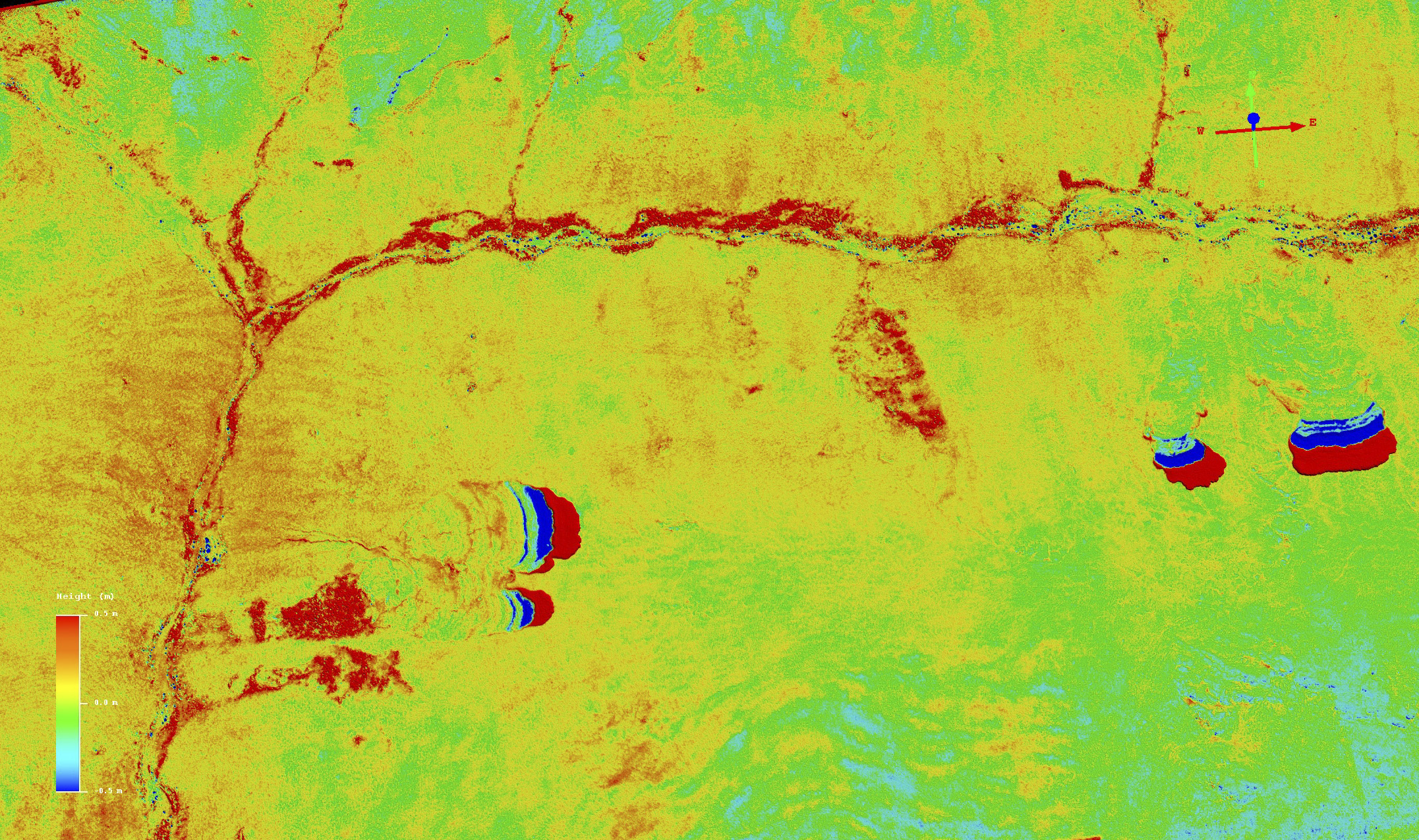
Here is the difference in topography between 2014-2016, colored by magnitude of change. Mouse-over to see the orthomosaic. Note that the headwalls of the slumps stand out well beyond the noise level of 10-20 cm. Also note you can see several new slumps in early stages before failure, just to the right of center flowing into the upper stream. At left, the reddish area on slopes of the stream above the main slump at first seems like noise. But careful examination reveals a close association with surface features, suggesting that the entire slopes may be migrating downhill into the stream bed.
The other project was to acquire oblique imagery from the side of the aircraft to compare with similar photos taken 60 years earlier, with the goal of understanding the increases in vegetation over time. You can read about the acquisitions here and see a few comparison photos below.
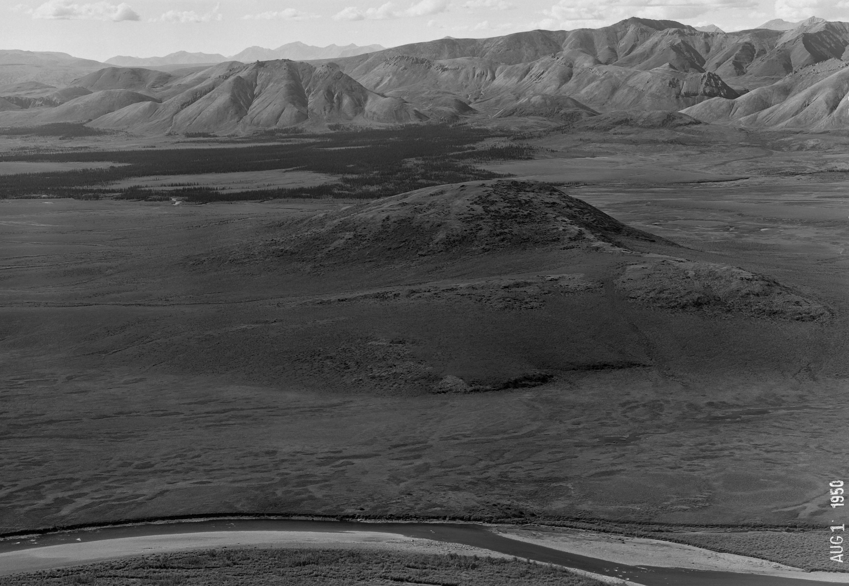
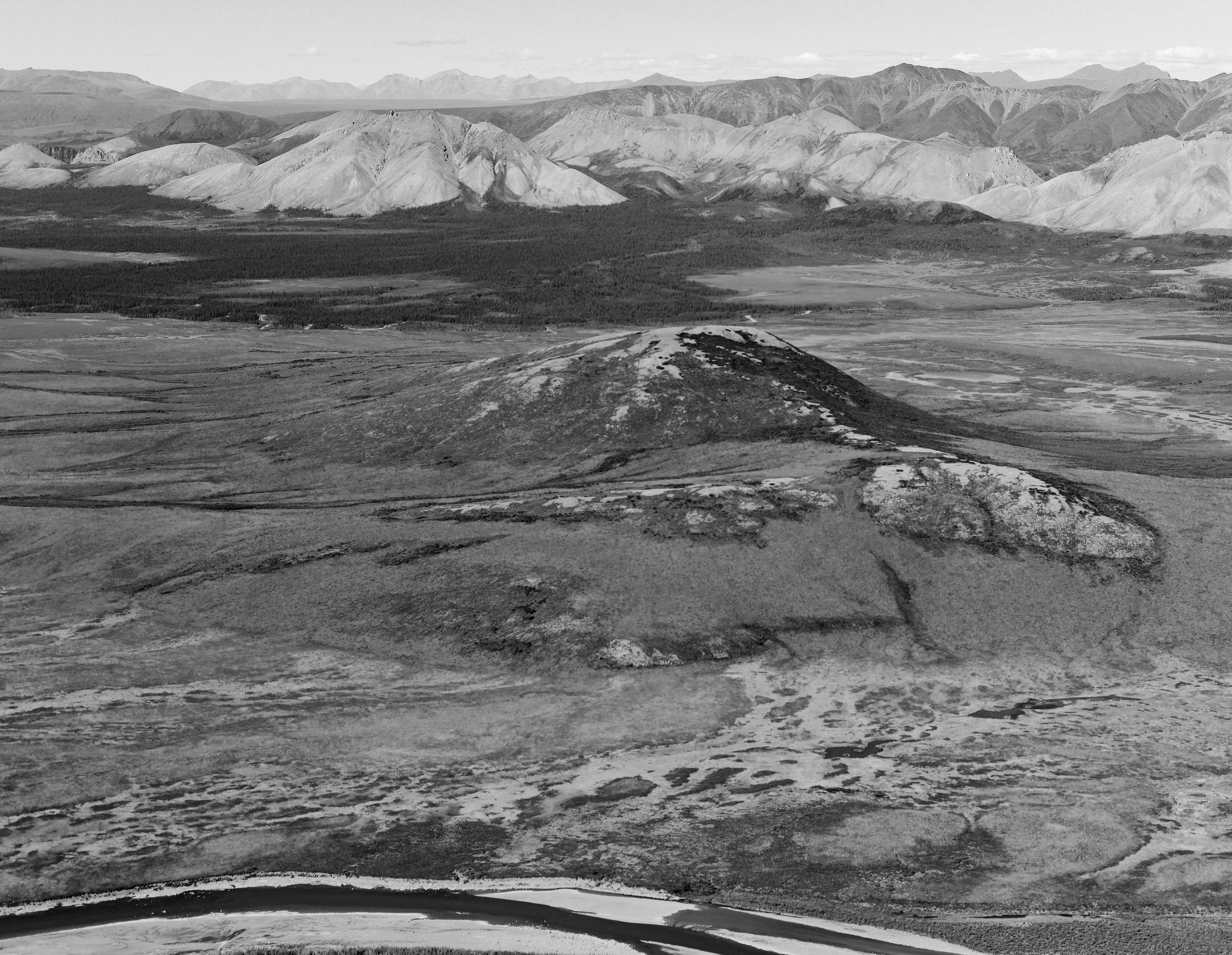
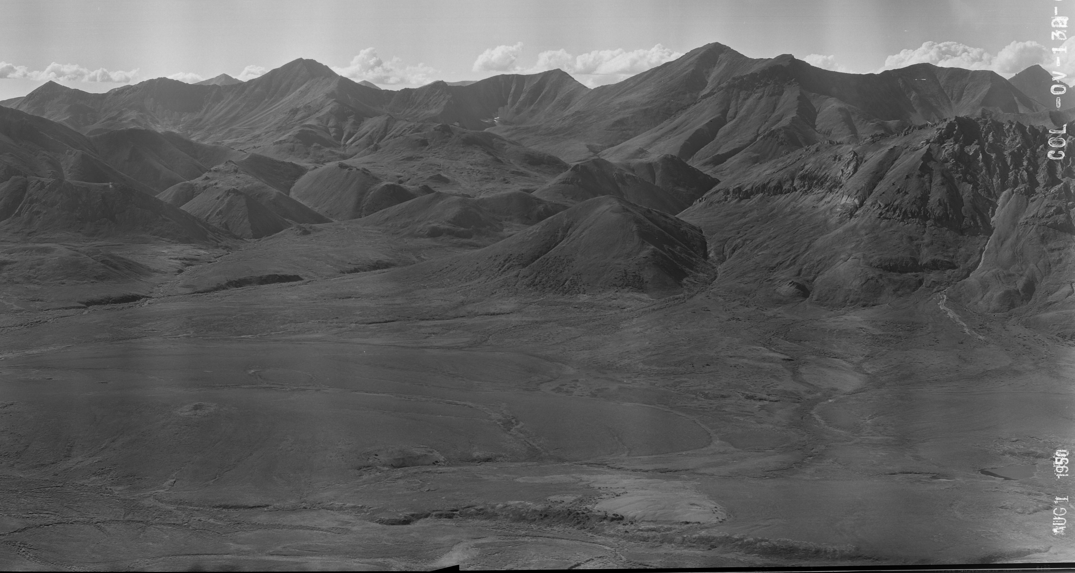
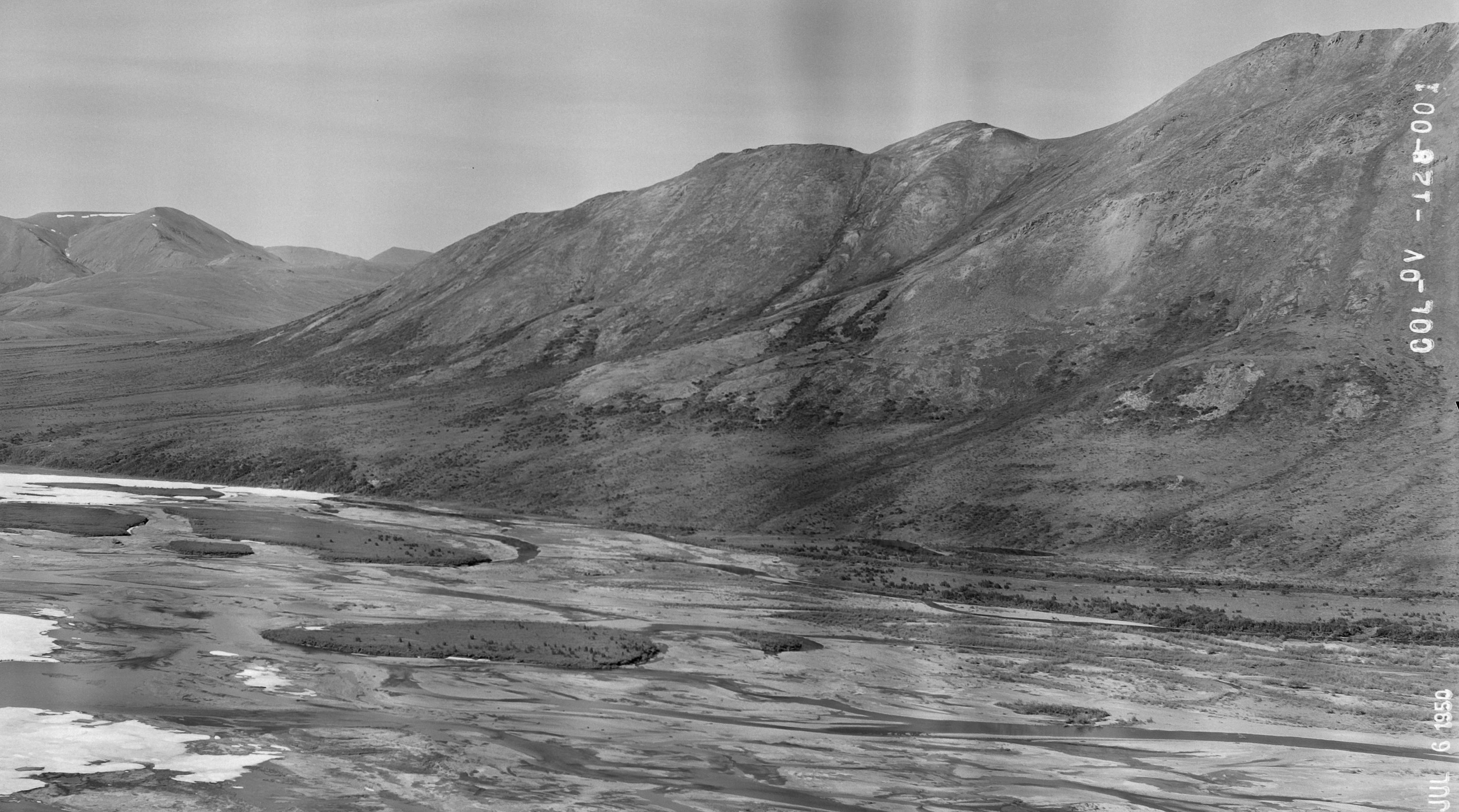
An image pair; all pairs shown here have the old image first. Careful examination shows the forest in the background has expanded, as have shrubs in the drainages in the foreground. The overall muddy look of the old photos is caused by them not using a red or yellow filter to block some of the blue ambient light. Even shooting in jpg, we can selecting edit colors to visually separate land cover.
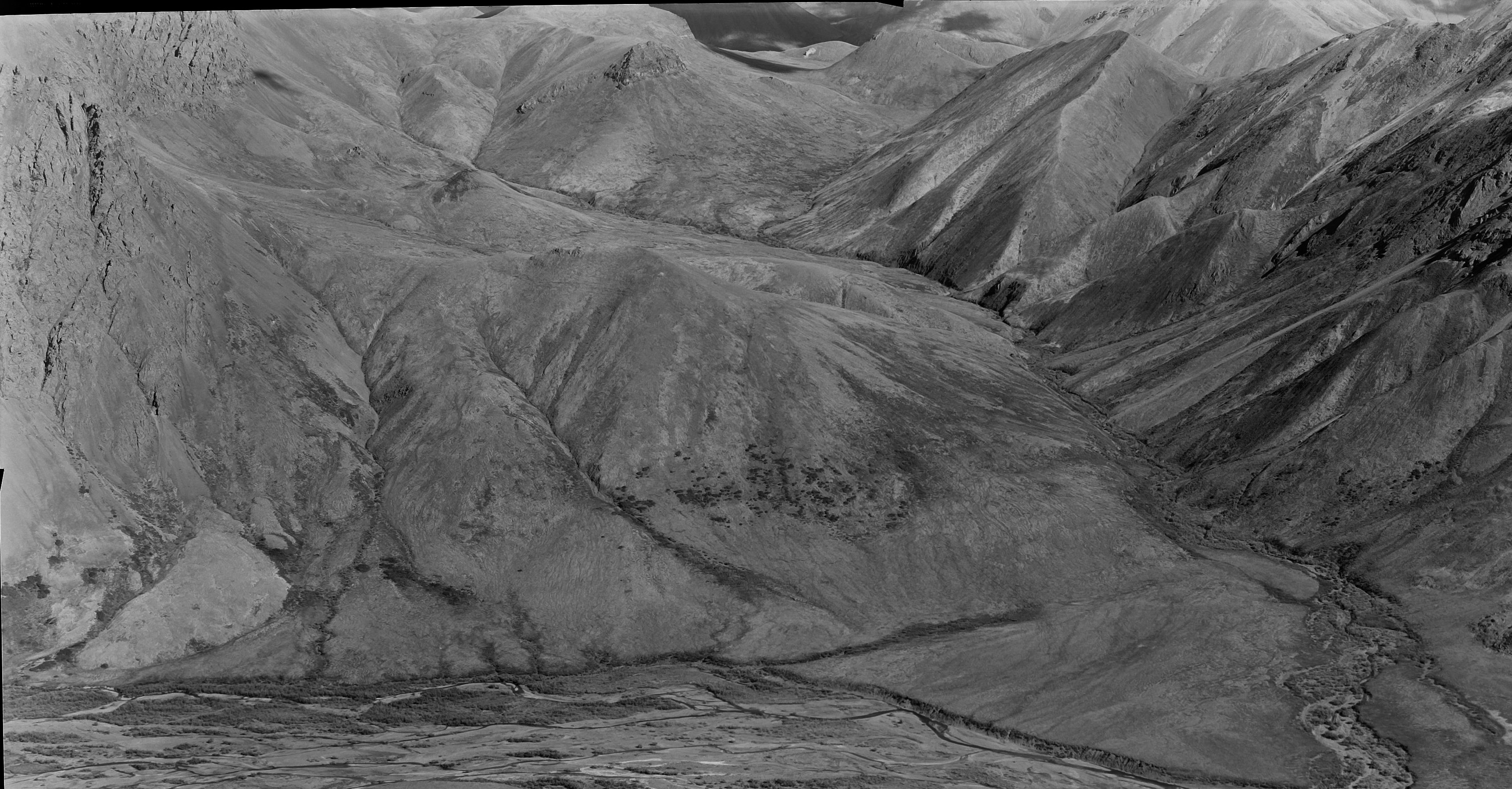
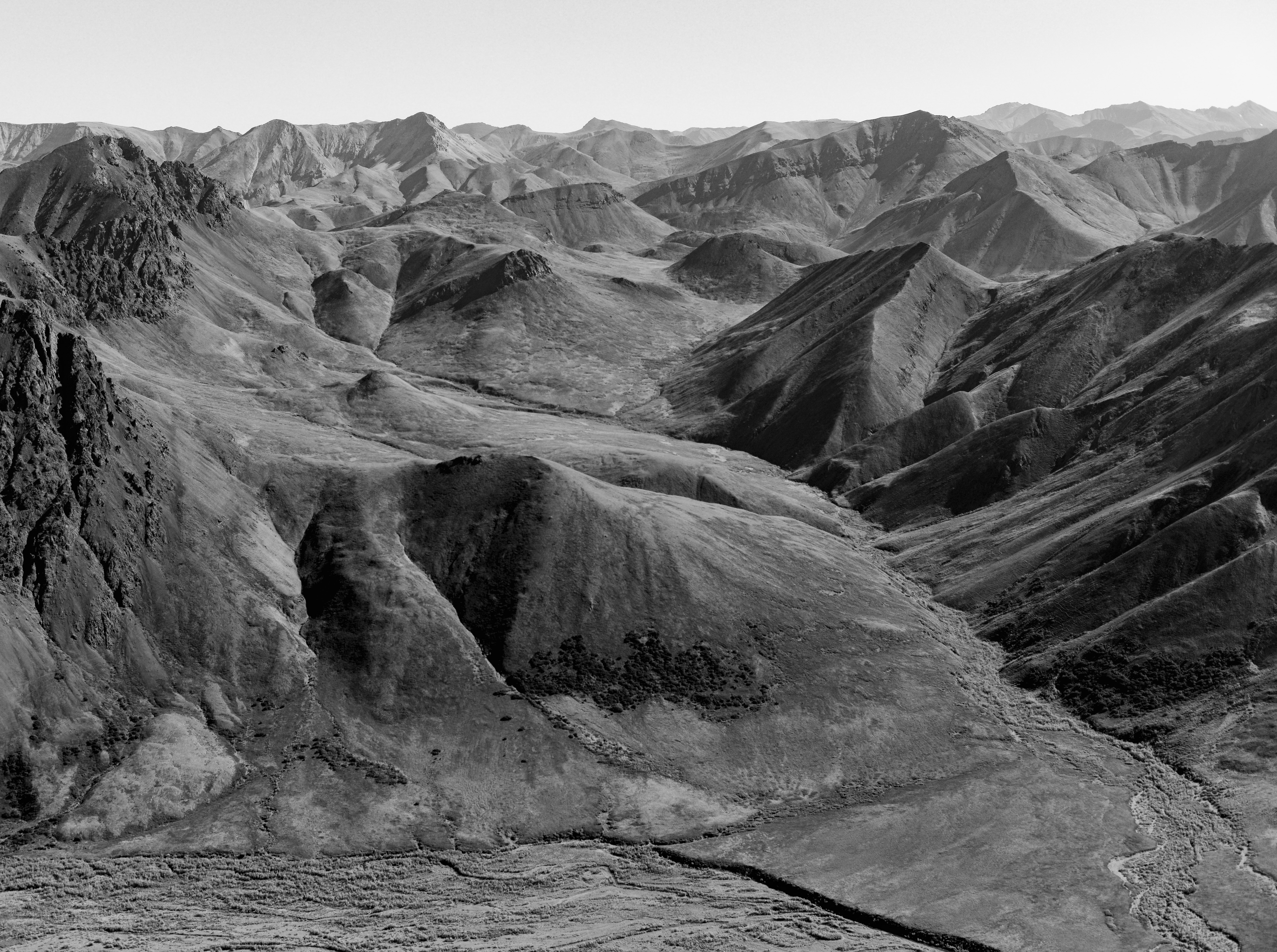
Deeper into the mountains, vegetation grows more slowly, but even here you can clearly see the shrubs at the base of the hill near center have expanded considerably.
It will take careful study to document scientifically, but even a quick glance here can detect many changes.
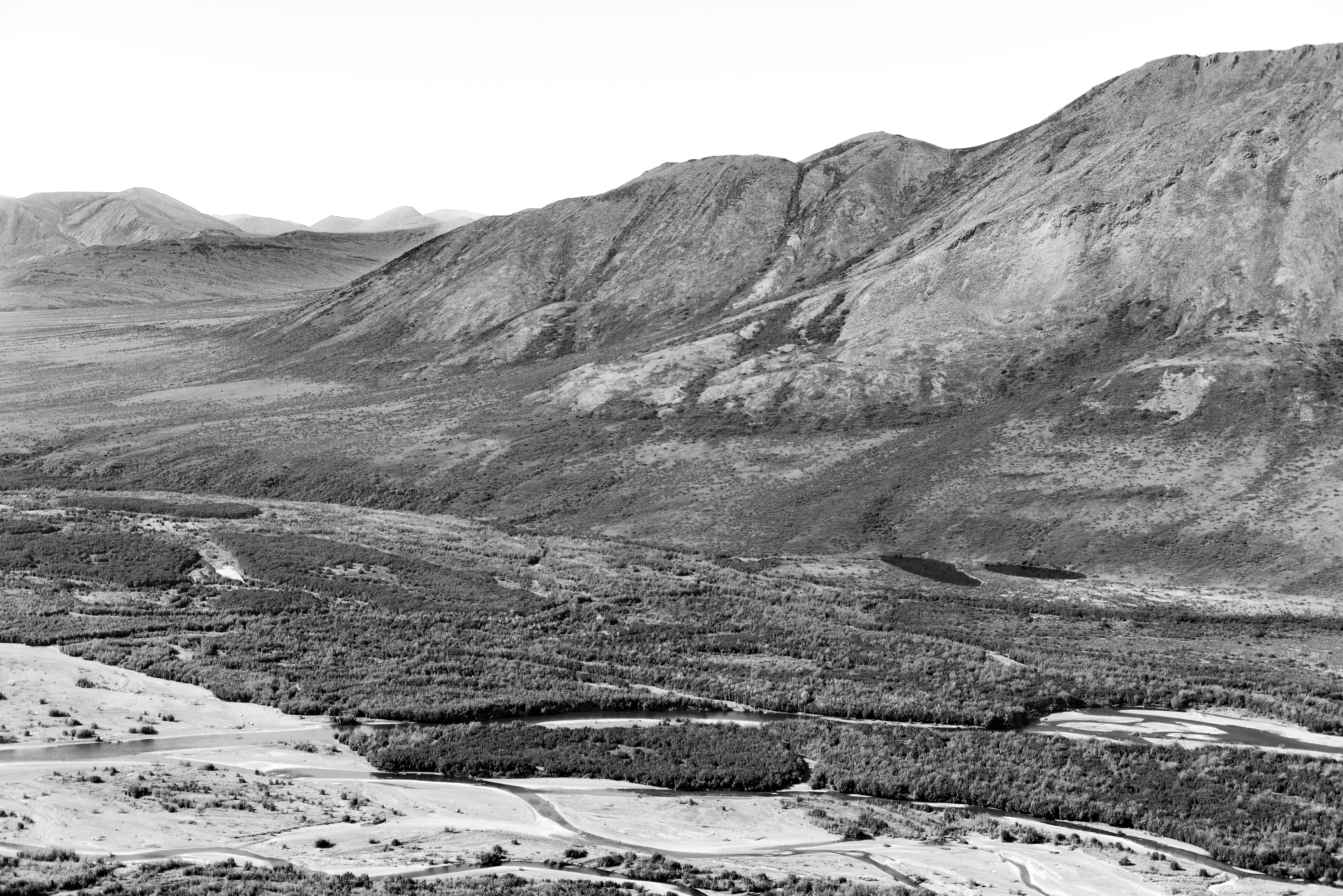
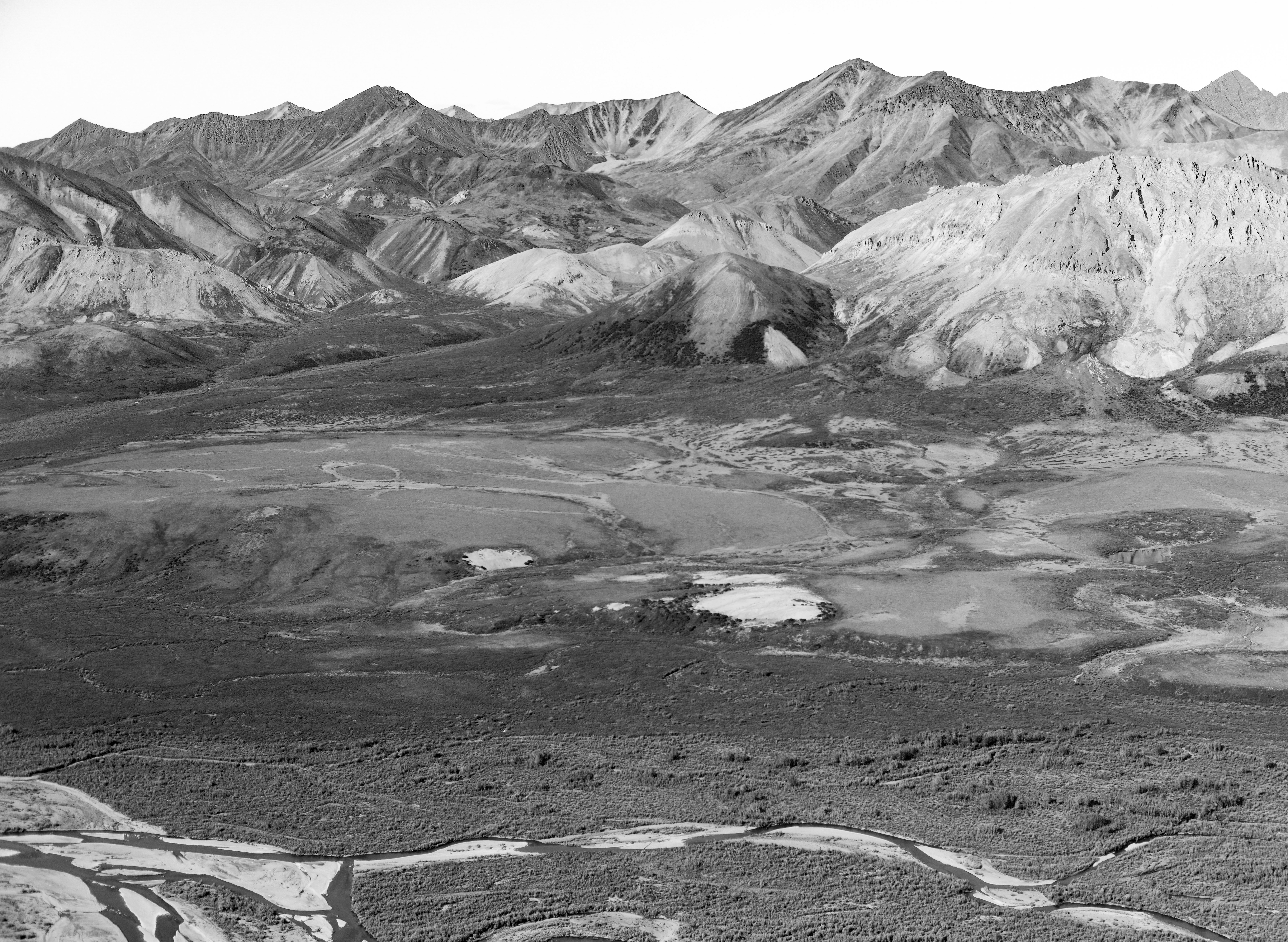
Though I’ve only spent a few hours sorting through these images, what quickly becomes apparent is that the largest changes have occurred in the river floodplains. Here you can still identify the original islands of trees in the old photo, now completely engulfed by new vegetation.
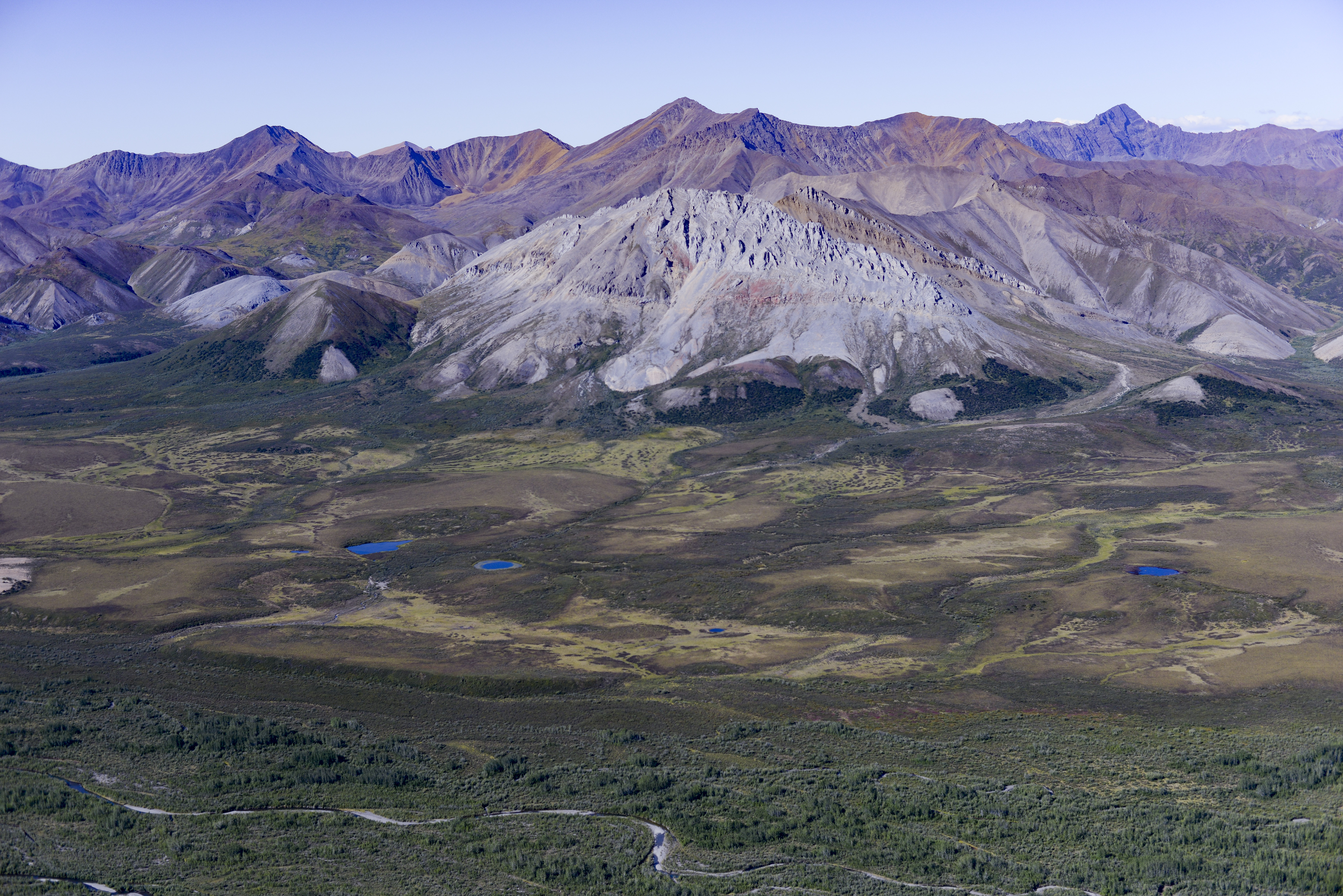
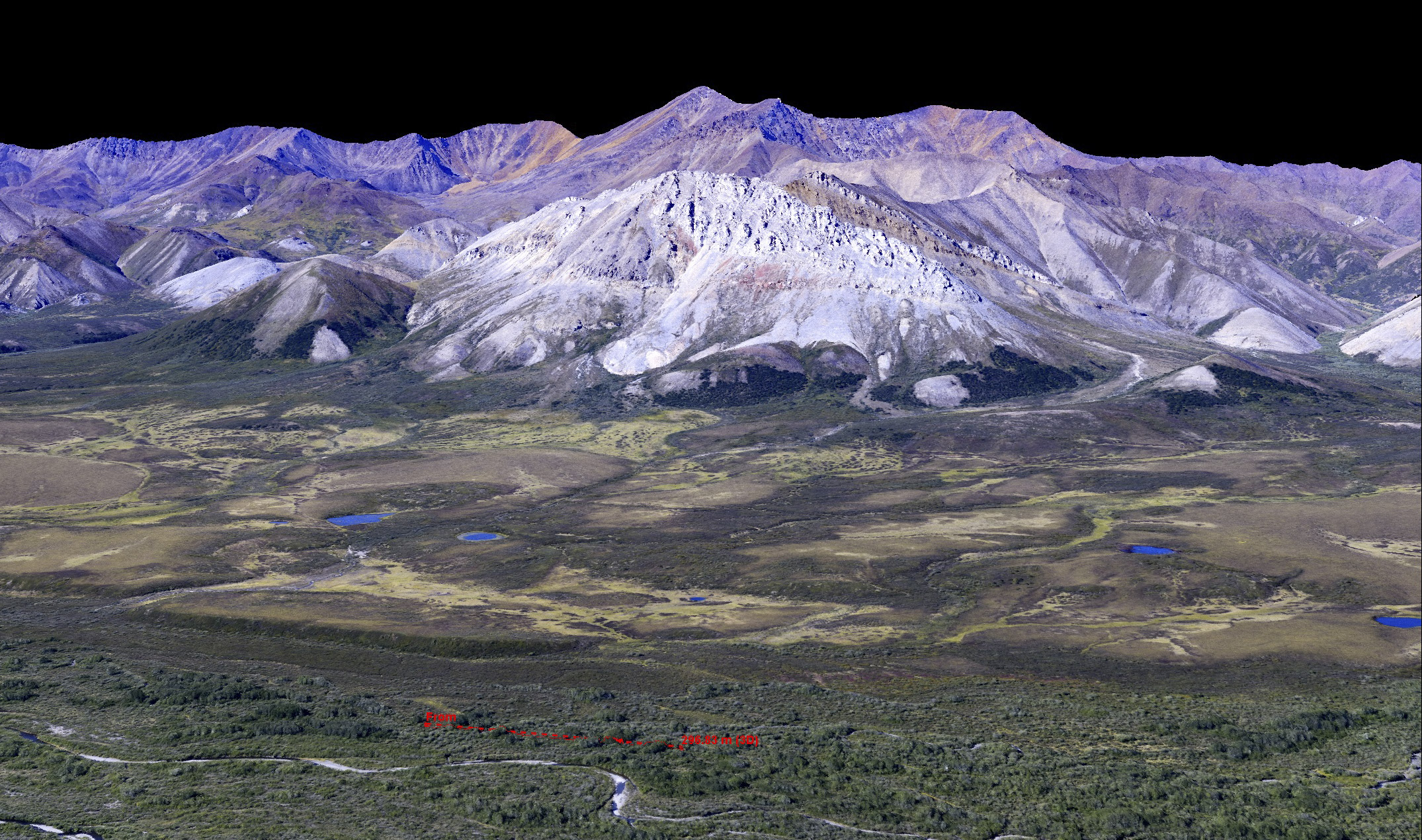
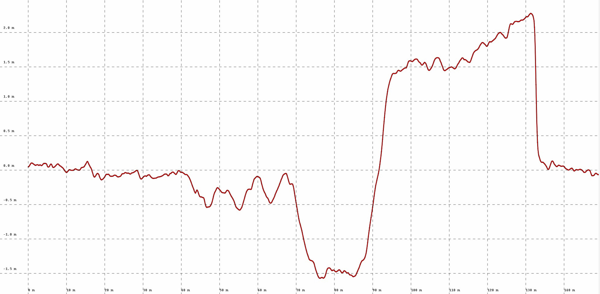
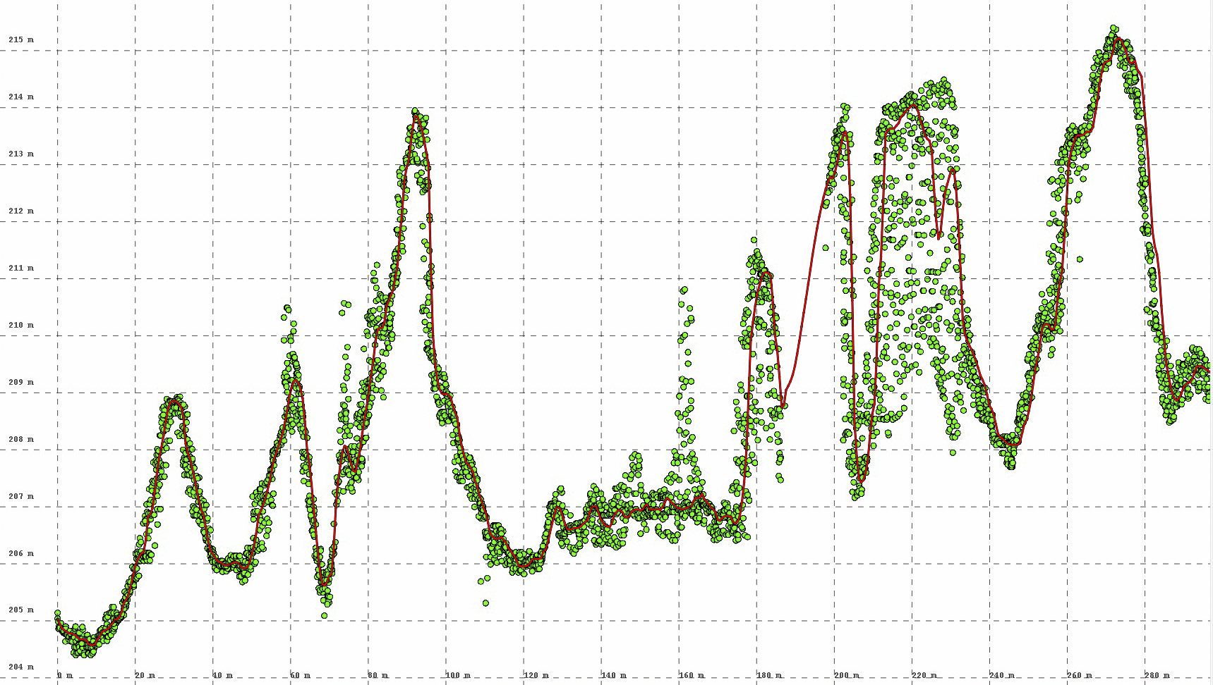
This image pair represents the future of this sort of study. At top one of the images we took last month. At bottom is a 3D synthetic reconstruction of that photo creating by photogrammetrically processing a bunch of these photos into a DEM and orthomosaic. Using these data, we can directly measure the height of this vegetation, as shown by the red transect above and the corresponding plot below. This method of using oblique images is not as accurate as our standard methods of using overlapping strips of vertical photos, but the main point here is that in the future when using such blocks we can synthetically reconstruct the exact perspectives of the old photos to facilitate comparisons, and presumably map the old data onto the new.
Here is a top view created from the data shown above. Using such a view, we can create a vegetation map, quantifying the spatial extent of change. The potential for fodar in facilitating botanical science has barely been tapped, and has the potential to revolutionize the way we measure and model changes in biomass due to climate change.