
A First Look at the Denali Park DEM
Earlier this summer we acquired data from about 5000 square kilometers of Denali National Park and Preserve, about 1/5 of its area, and we now we have some preliminary results to share.
The acquisitions took 9 flying days spread over about 3 weeks. Weather was a constant challenge – besides being next to the biggest mountain in the State that also separates two climatic zones, thunderheads were building up and getting in our way by noon almost every day. Even launching at 5AM, it was usually not possible to get a full day of mapping in. In any case, we got the job done and you can read the full story behind the acquisitions here.
Since then we have photographically processed the 39,000 photos that the map is composed of and processed them into a preliminary, low resolution DEM and orthomosaic. Low resolution here means 3 meters, as the final resolution will be about 25 centimeters. As a sign of the times, in 2008 when I paid commercially for a lidar acquisition of an area almost this size in the Brooks Range, 3 meters was considered very high resolution. That effort took four years and did not come with a color orthomosaic.
The primary purpose of this initial map is to do some preliminary testing to ensure that everything will continue go smoothly with the final processing at full resolution. Thus far all checks look great. Spatial coverage is complete, and there were only a few small gaps amounting to less the 0.1% of the total area, caused mainly by having to fly lower than planned to avoid clouds. Considering the huge variations both day-to-day and from peak-to-valley in sunlight and white balance, the orthomosaic is remarkably consistent in color. So full processing is already underway and hopefully will be finished within a month or so. Below are some screenshots of the data thus far, as well as some comparisons to other data sets.
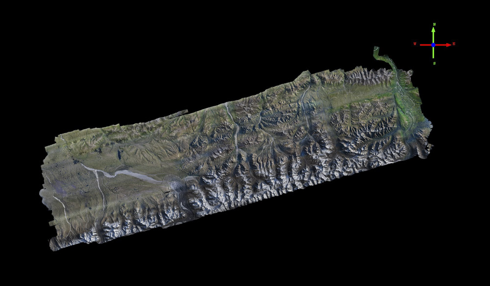
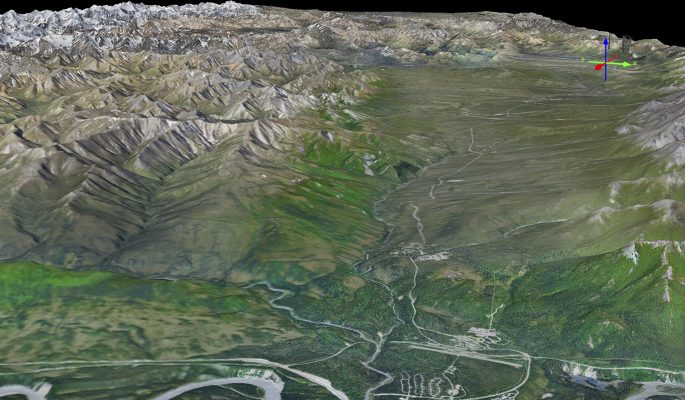
Here is an overview of the map, about 5000 square kilometers. The highway is on the right and Kantishna on the upper left. Mouse-over to see the topography colored by elevation.
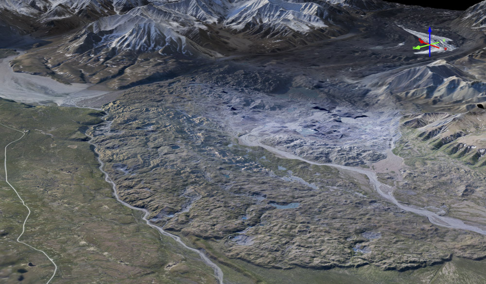
Here’s the terminus of Peters Glacier, or at least a series of terminal moraines from it. No doubt there is still a lot of ice buried under all that dirt and rock. Mouse-over to see the topography colored by elevation.
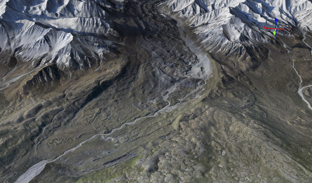
Here’s the terminus of Muldrow Glacier. Surging glaciers like these tend to leave a lot of junk behind. Mouse-over to see the topography colored by elevation. That’s a river on its left and the park road on the far left.
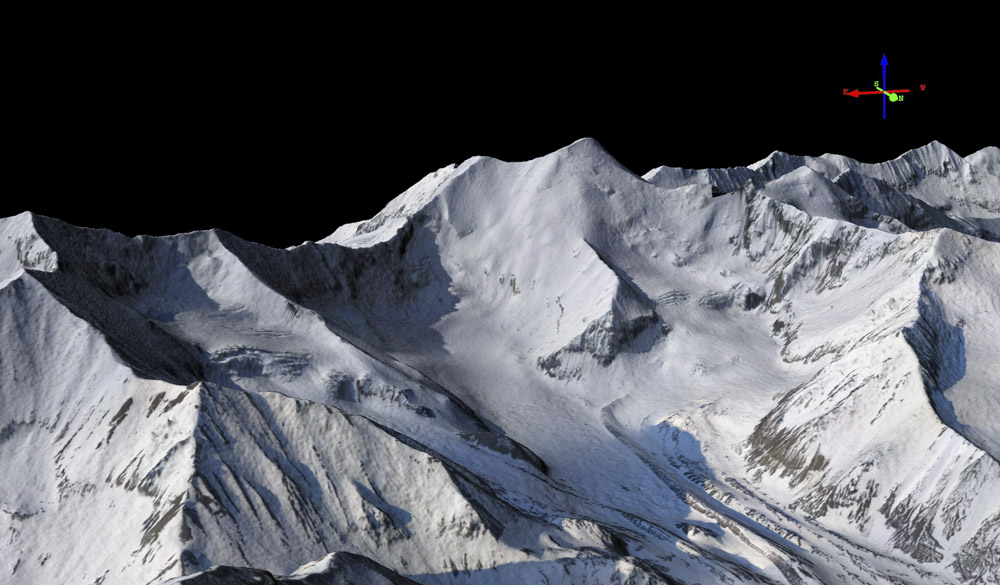
Scott Peak, a popular aviation waypoint. Mouse-over to see the topography as shaded relief.
To do some preliminary checking on geolocation accuracy and precision, I compared our DEM to one created in 2010 by airborne insar. That DEM has a posting of 5 meters, somewhat coarser than ours (and much coarser than our final one). The point here wasn’t to get wrapped around the axle about minor differences, just to make sure there were no blunders, especially considering that our data is much more accurate than the insar. That’s not really a knock against the insar, it’s an amazing technique which can measure this topography from 30,000′ through a cloud cover. But their stated vertical accuracy is 3 meters when slopes are less than 10 degrees, and in the much steeper mountains like here they back off from that spec considerably. For example, these same data show the top of Denali to be over 20 meters lower than it actually is, causing a stir and some ground surveys that confirmed the insar was wrong. By contrast, we found our ground measurements to be within a few inches of our fodar maps on peaks of similar ruggedness. But in any case, there is a lot of useful information to be gained by comparison of the two data sets and below I show just a few quick and dirty analyses.
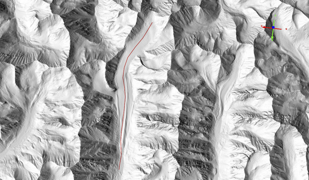
This is the 2010 insar data shown as a shaded relief image. Mouse-over to see our 2016 data. Flicker between them and note how little motion you can see in the mountains — this is an excellent sign that our data are meeting our standard specs and that the final data will be exactly what we were hoping for. Look a little closer at the glaciated areas to see them get lower over six years; the red line is a centerline transect of one of the glaciers.
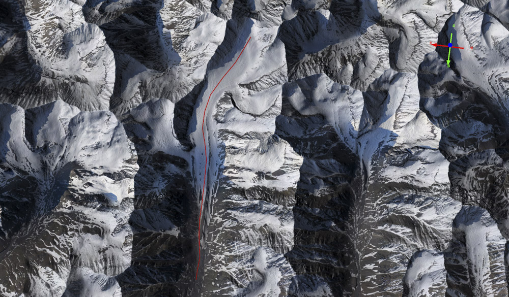
Here is the orthomosaic draped over the same 2016 shaded relief, to get a better sense of where the glaciers are.
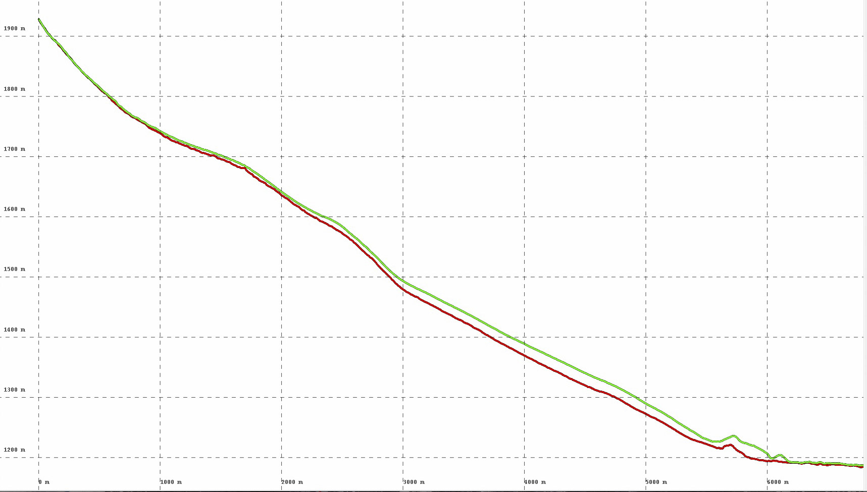
Here are the elevations extracted from the 2016 fodar data (red) and the 2010 insar data (green), from the red transect seen in the previous images. You can see that the difference between them is confined largely to the glaciated surface.
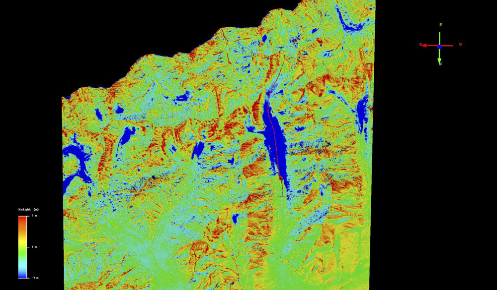
Here I subtracted the 2010 data from our 2016 data and colored the differences from +7 m to -7m. The red line is the same in the previous figures, showing the massive wastage of that glacier sticks out clearly from the noise, as do changes in many of the other glaciers. Overall, the differences are around zero elsewhere. There is a slight spatial shift between the two data sets on the order of about 5-10 m, that creates an apparent vertical difference (seen as color here); the spatial spec on the insar is 12.5 m horizontal accuracy so an offset like that is not surprising. This is not enough, however, to explain all of the red changes seen here — some of this is due to snow thickness that is on the north facing slopes, as the insar was acquired in late July when the slopes were likely snow-free, whereas the fodar in early June.
![]()
Here is the same transect, now shown as the difference in elevation between the two DEMs. The max difference is about 22 meters, or almost 4 meters per year, which seems reasonable enough. At the top of the glacier and beyond the moraines, elevations are about equal. The large excursion with the vertical line through it seems at first like some sort of noise, but close inspection of the transect (below) shows that it happened to cross over a medial moraine and back over another ice tongue with comparable ablation rates.
![]()
The red arrow is at the same location as the vertical line in the previous plot, where another blob of ice melted. The moraine in between the two ice tongues insulates the ice beneath and can allow it to persist there for centuries.
The Park entrance and road leading into it. We’ve now mapped the road three times at 10 cm and have some really cool results to show in a future blog, related to landslides and road failures.