The First Fodar Map of Denali
On Sunday, 8 April 2018, we used fodar to map Denali, the tallest mountain in North America. This blog analyzes the quality of that map and its significance. The methods and discussion are meant for mapping specialists interested in accuracy and precision, so non-specialists can stick to the abstract, background, and visualizations in between them without missing much. Click here to learn about the personal side of that acquisition. Click here to learn how you can get involved with making more maps of Denali.
Abstract
On Sunday, 8 April 2018, we mapped the tallest mountain in North America, Denali, using fodar from a manned aircraft. The density of the point cloud within about a kilometer of the peak was roughly 35 points per square meter, but ranged from 0 to 100 ppsm throughout the 5 km x 15 km area mapped, and I processed these data into an orthomosaic and digital elevation model (DEM) at 25 cm and 50 cm posting, respectively. I found the peak elevation to be 6190.07 m (20308.6 feet). To assess the data’s accuracy and precision, I split the acquired data into two independent chunks, each with its own non-overlapping GNSS solution, to produce two independent DEMs of the peak area; the peaks in these two independent DEMs have elevations of 6190.02 m and 6190.10 m, or within +/- 0.04 m of each other. Examination of 5,000,000 pixels in common between these two DEMs show that 95% of the elevation difference is within 60 cm, with the largest scatter caused by spatial biasing of the craggy outcrops (~30-60 cm) and the lowest scatter in flat glacierized areas (~0-30 cm). This scatter is a reflection of both accuracy and precision, and on par with the 30 cm (1 foot) accuracy and precision values we have found through many other projects. These maps were processed with no ground control, using only data acquired within the airplane. Our measurement is 71 feet higher than the last airborne measurement made in 2013 by the State’s ifsar program; this value was later discredited as it became known that all such measurements made in Alaska’s mountainous regions were suspect at similar levels of uncertainty. The most widely accepted published value for Denali’s peak elevation is 6190.50 m (20,310 feet) based on a GPS measurement on the peak in 2015. The 43 cm difference between that measurement and ours can easily be explained by dynamic changes to the snow cornice covering the actual rock, which was measured to be at least 13 feet thick in 2015; these dynamic changes could easily exceed a meter in elevation in a single storm, thus both of these values are likely correct and no trend should be construed as to a reduction in height. The fodar DEM also covers Denali’s North summit, which we found to be 5929.08 m (19,452.36 feet), or 18 feet lower than the USGS map value of 19,470 feet; note however that the fodar data are relative to the NGVD88 Geoid 12B datum, whereas the USGS map values are relative to the NAVD29 datum, so these two values cannot be directly compared without an appropriate transformation (which seems not to exist in Alaska) so it remains unclear whether this new value is higher or lower than the original. This map is only our first attempt at mapping Denali and it has served as a successful proof of concept. We only acquired these data 6 days ago and therefore the hasty analyses and results presented in this blog should therefore be considered preliminary, as more rigor is needed before the results are finalized. So think of this blog not as a final report but more as a proposal to demonstrate that fodar is a powerful tool capable of accurately measuring any topography at high resolution, low cost, and accuracy second-to-none and that this tool could be used to definitively determine the height of all of Alaska’s mountain peaks as well as changes in high altitude glaciers and snow packs which cannot be measured by any other technique, either due to technical limitations or cost.
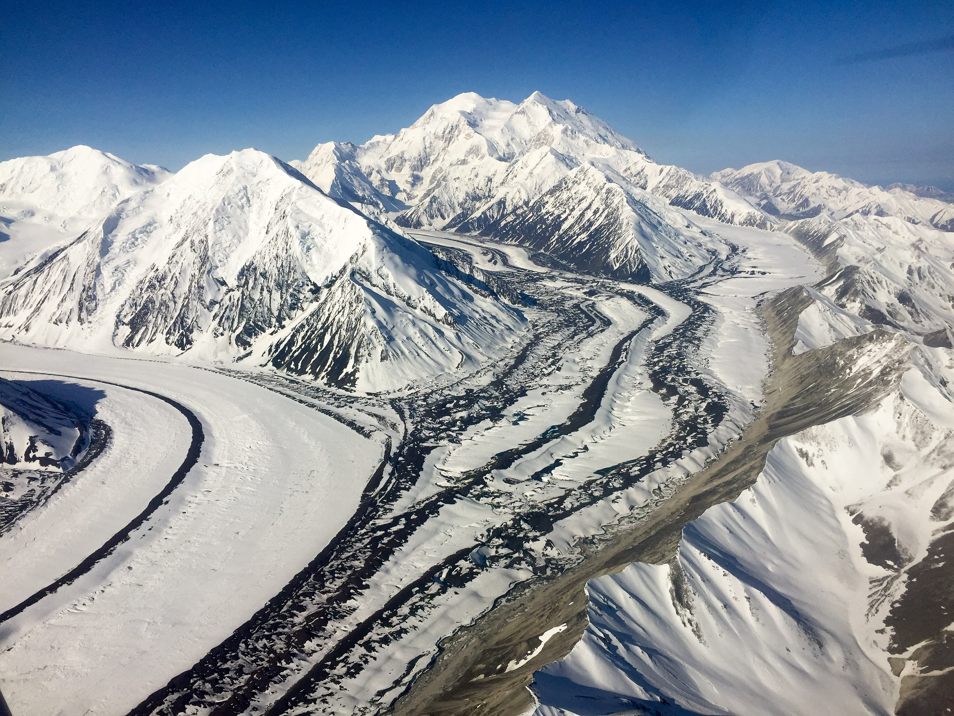
Denali on a clear day in 2016, taken from about 10,000 feet while I was mapping the Park’s lower elevation glaciers.
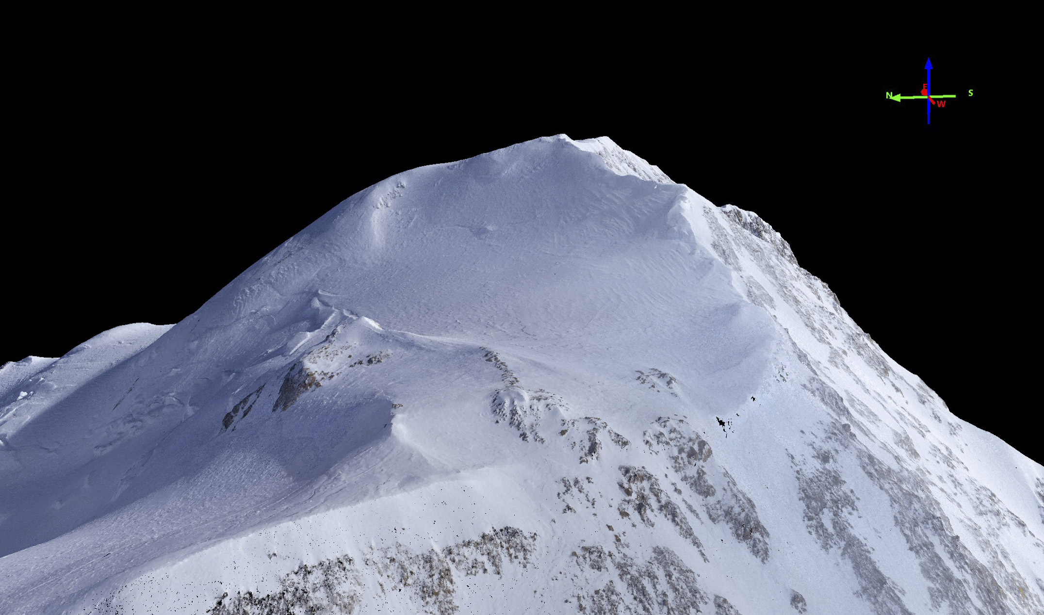
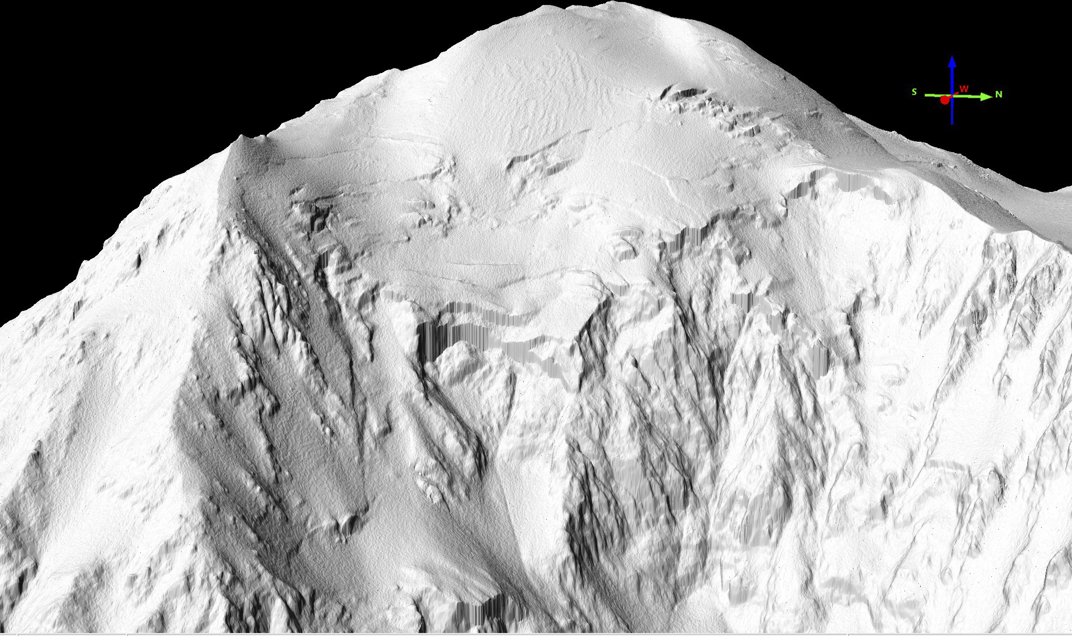
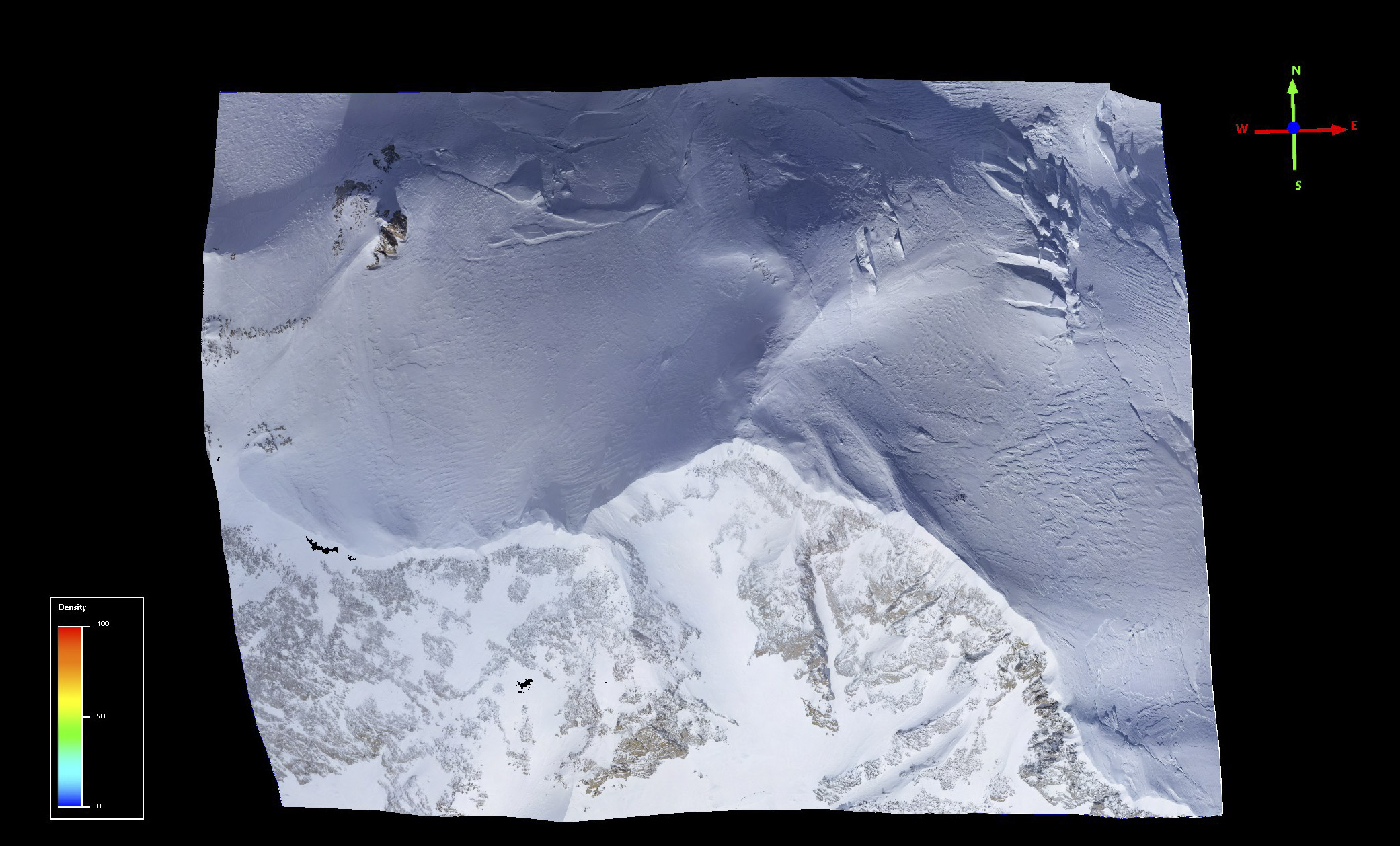
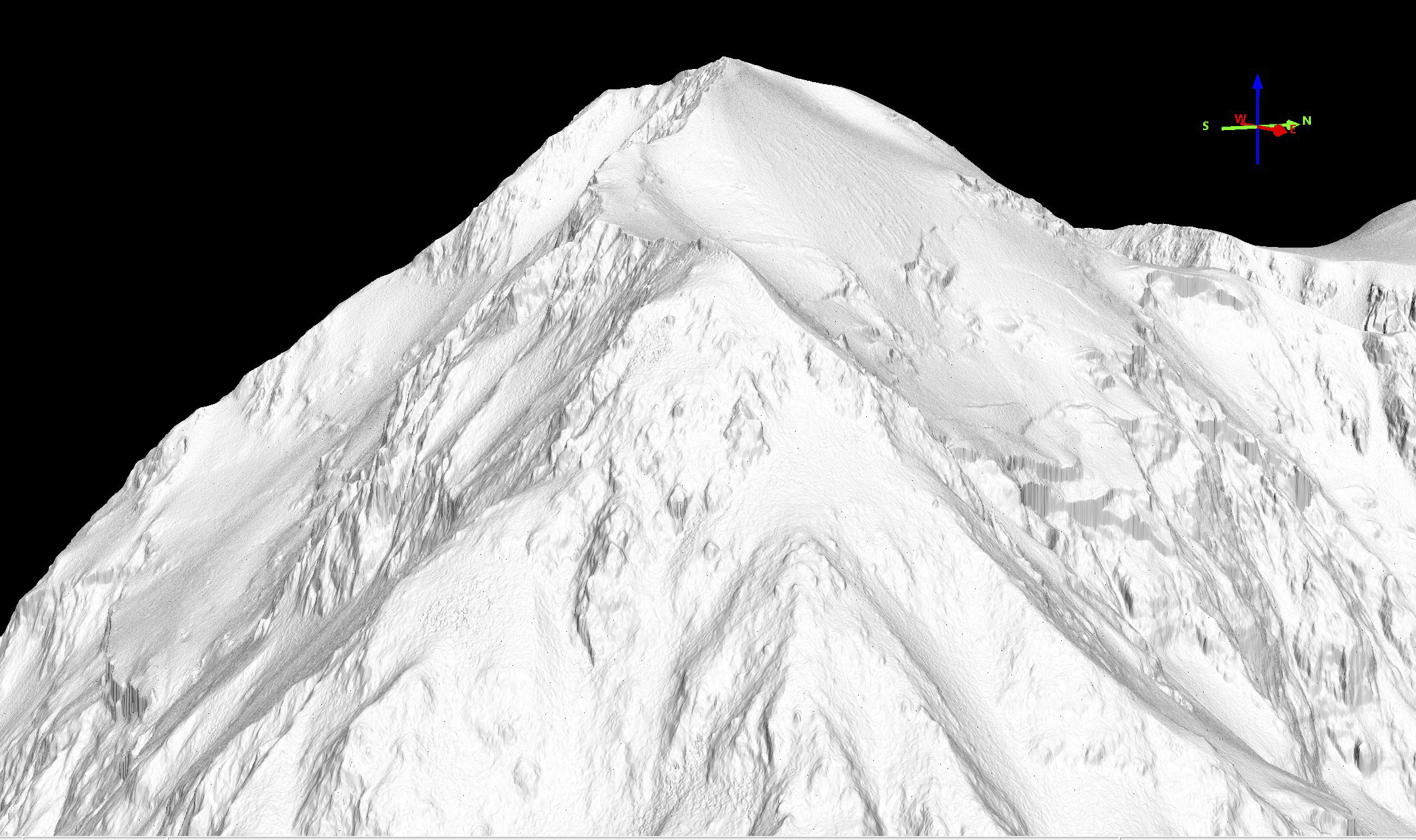
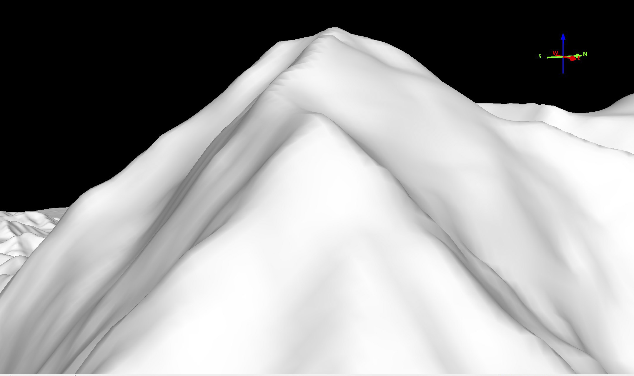
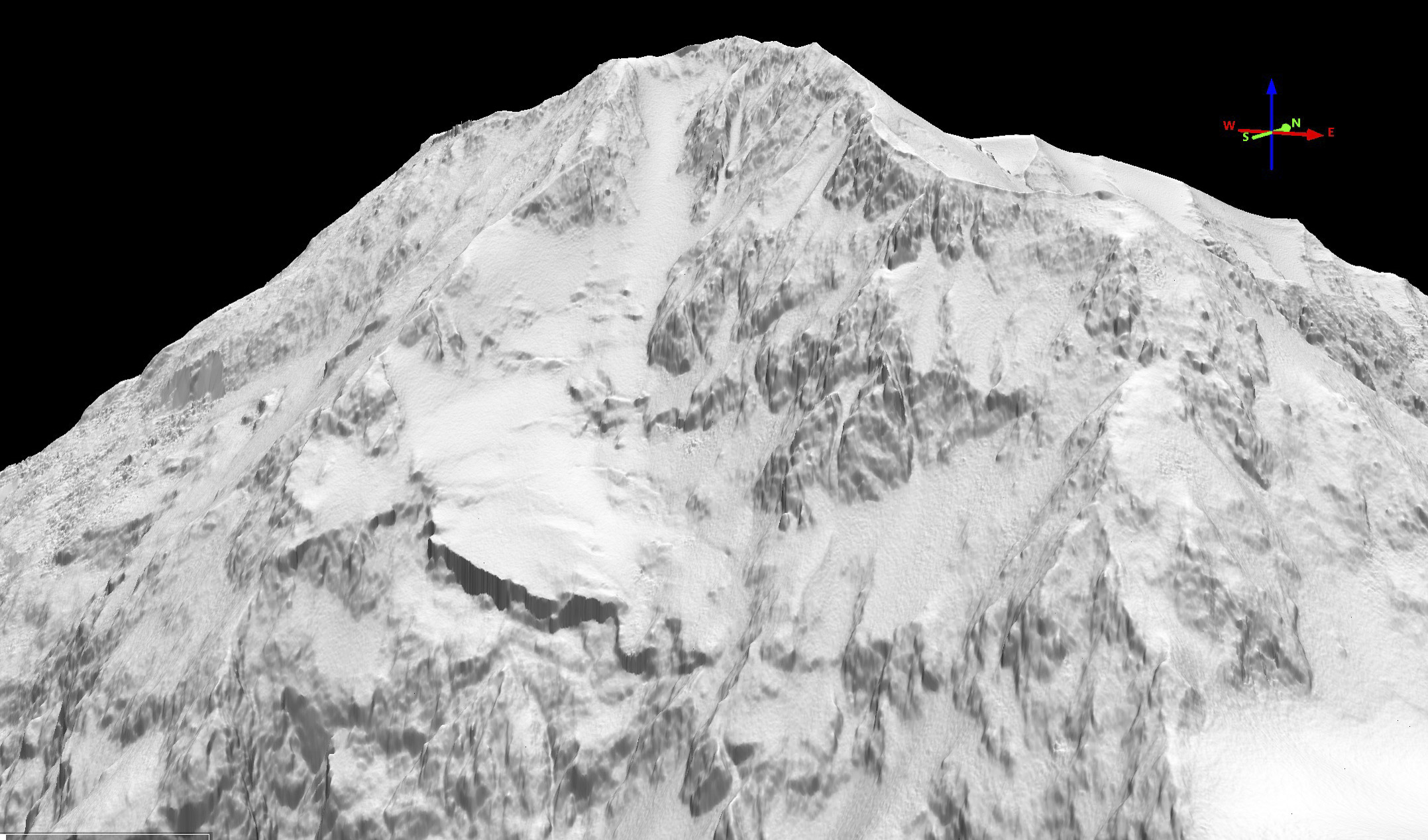
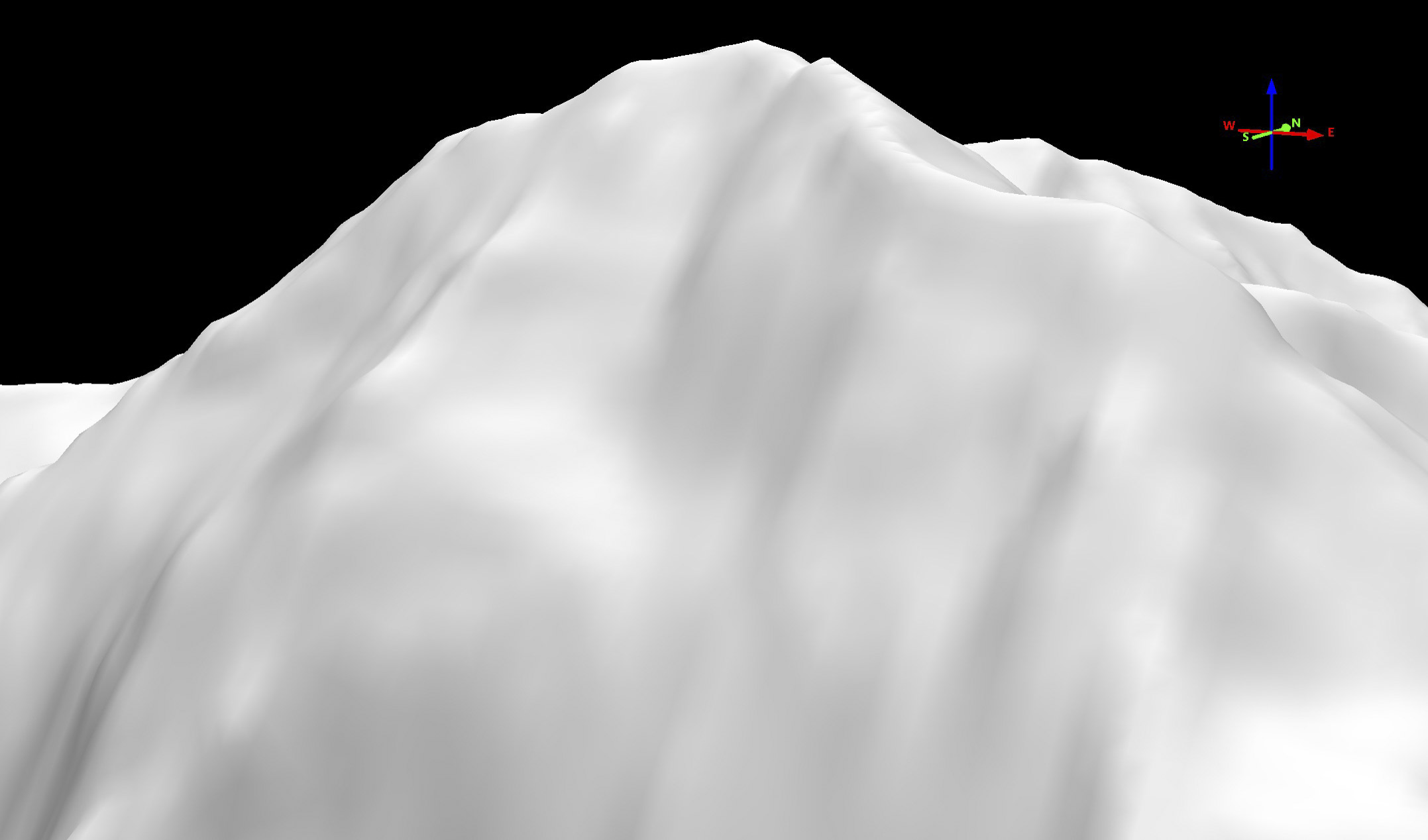
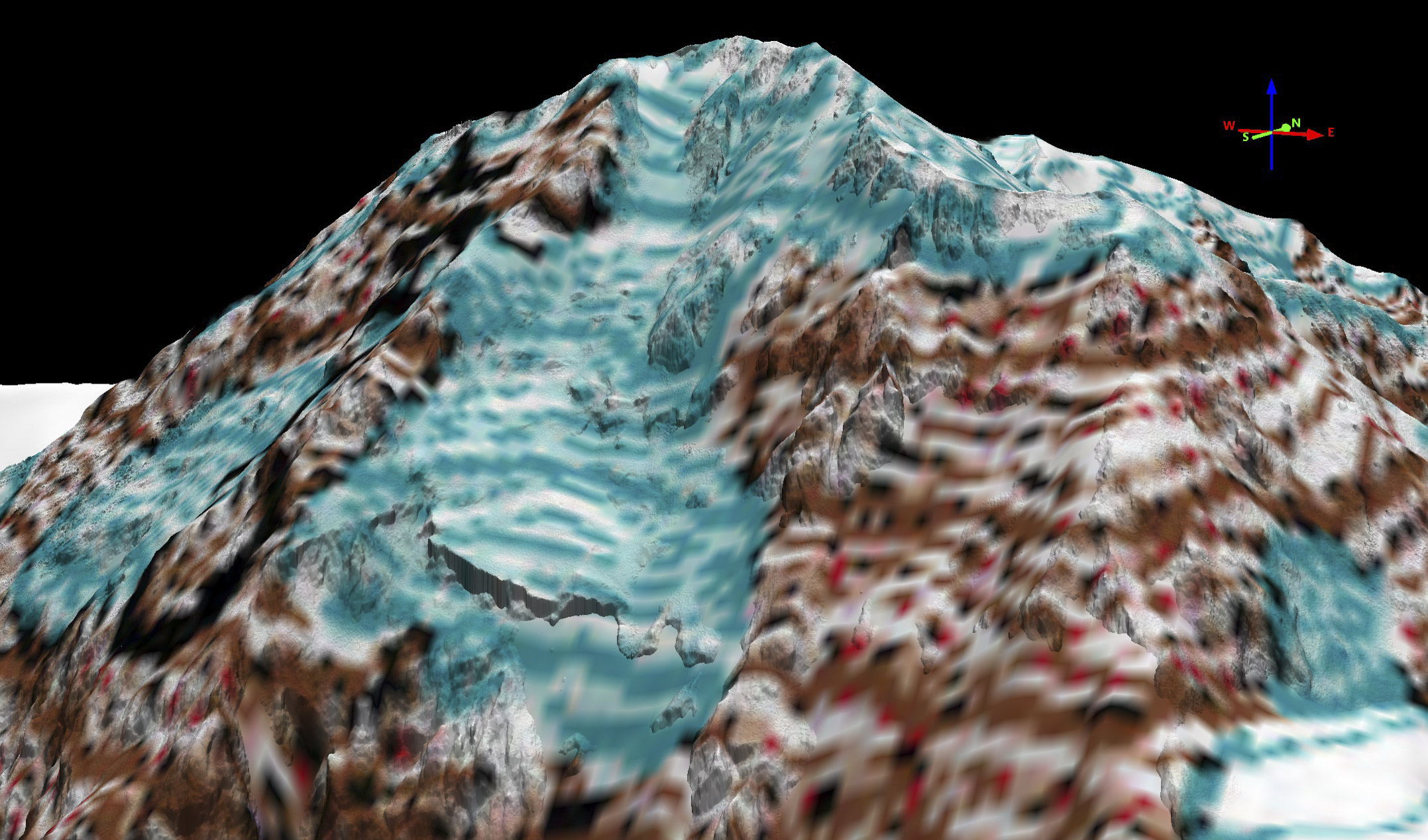
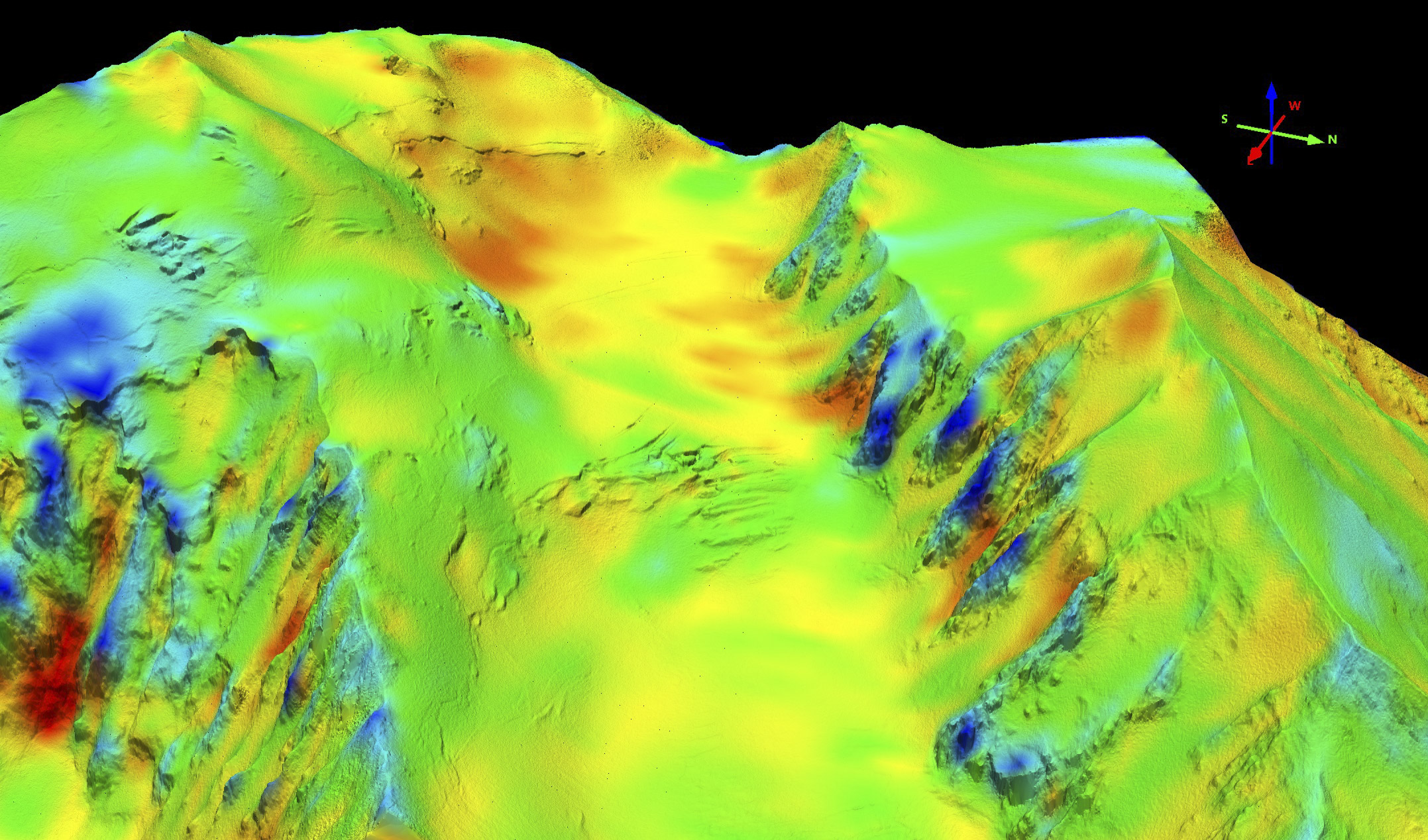
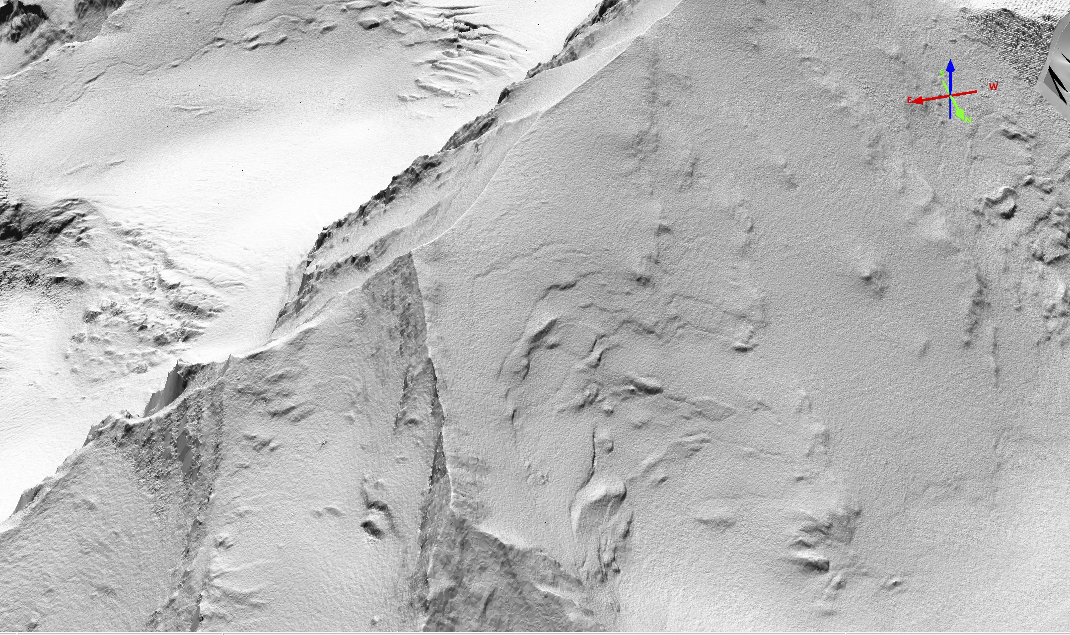
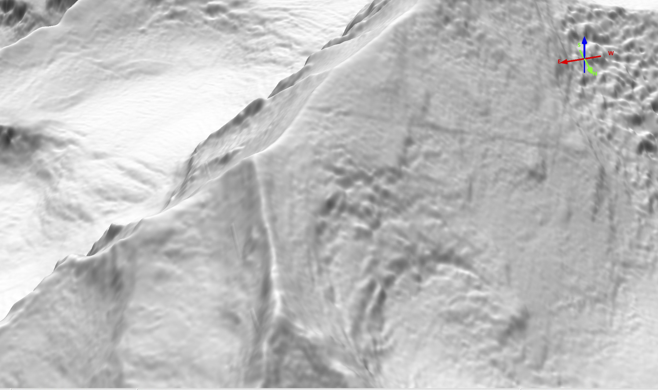
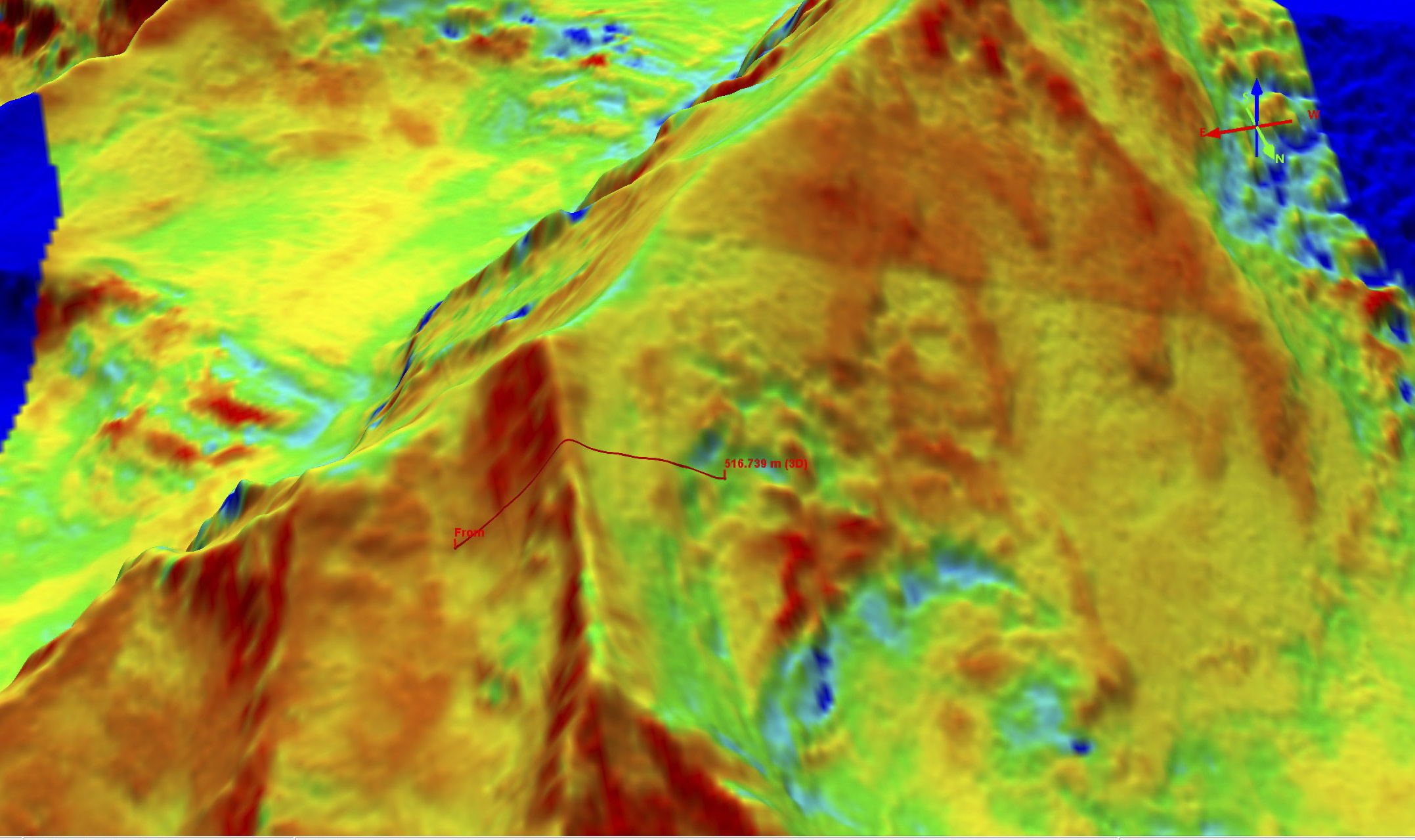
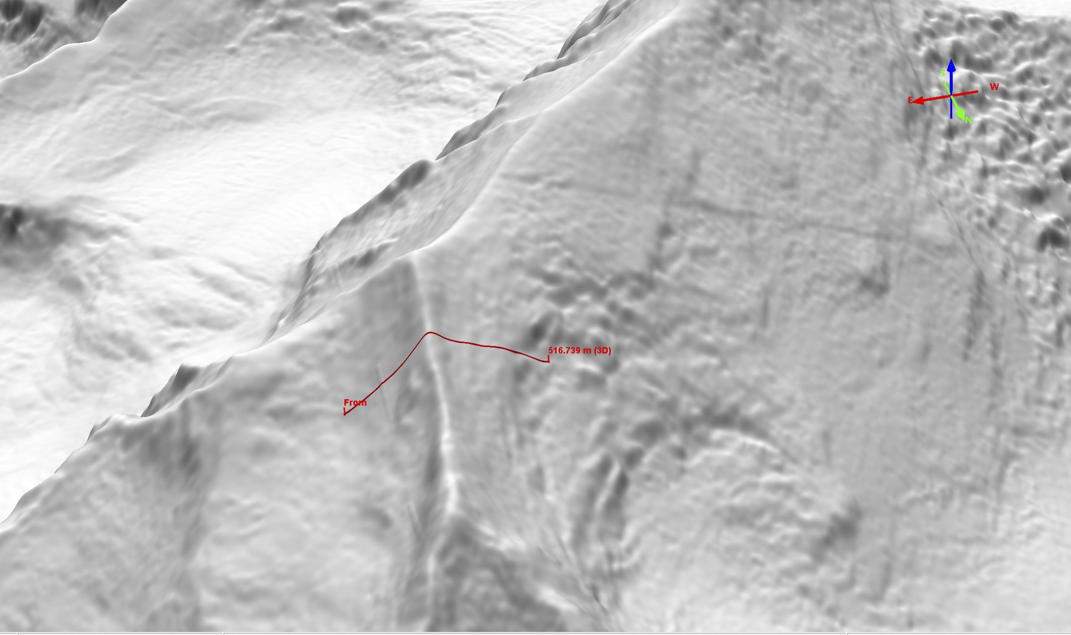
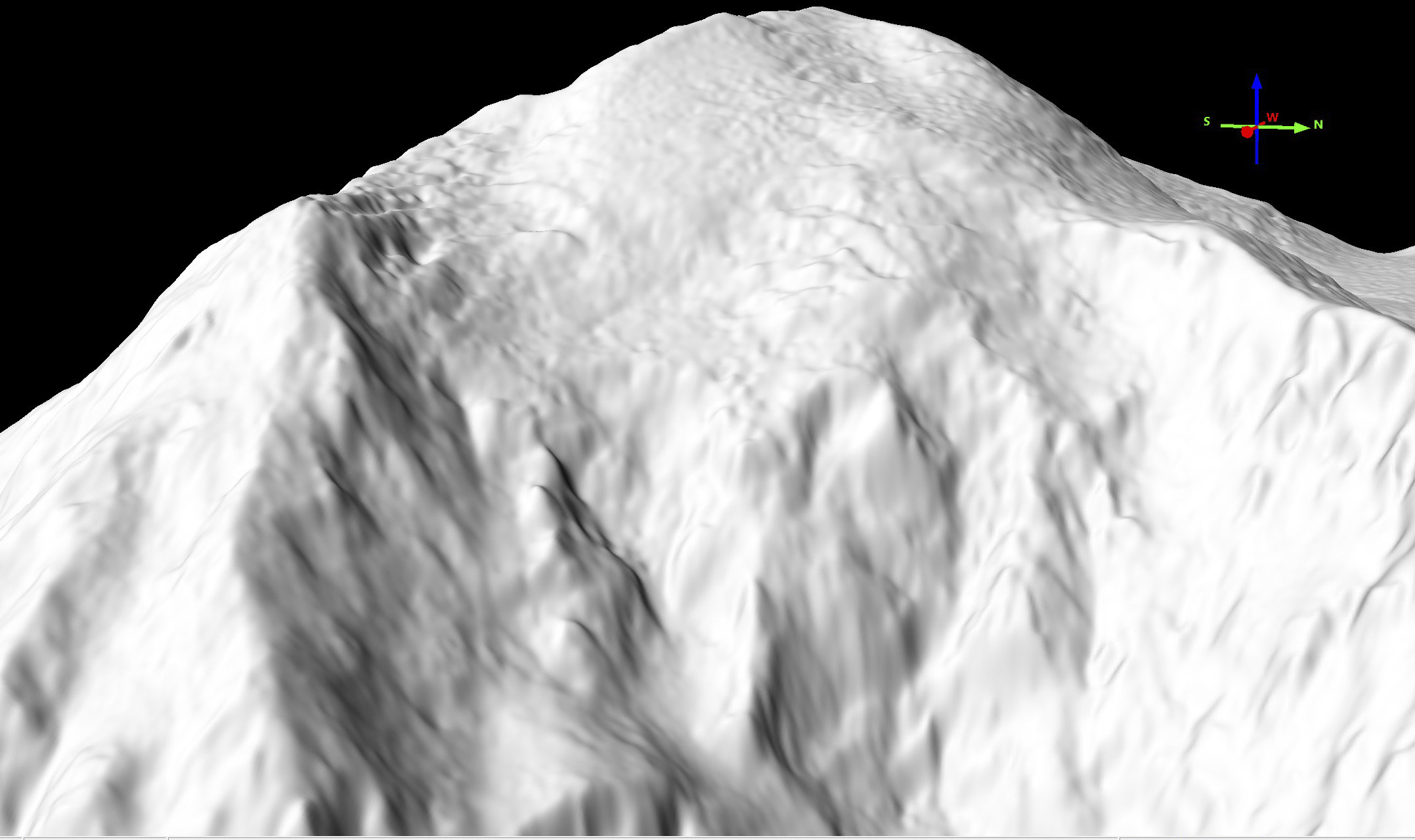
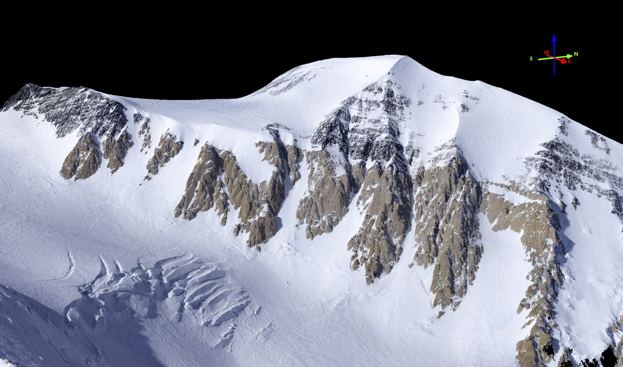
Here is Denali’s west face, visualized from the fodar point cloud.
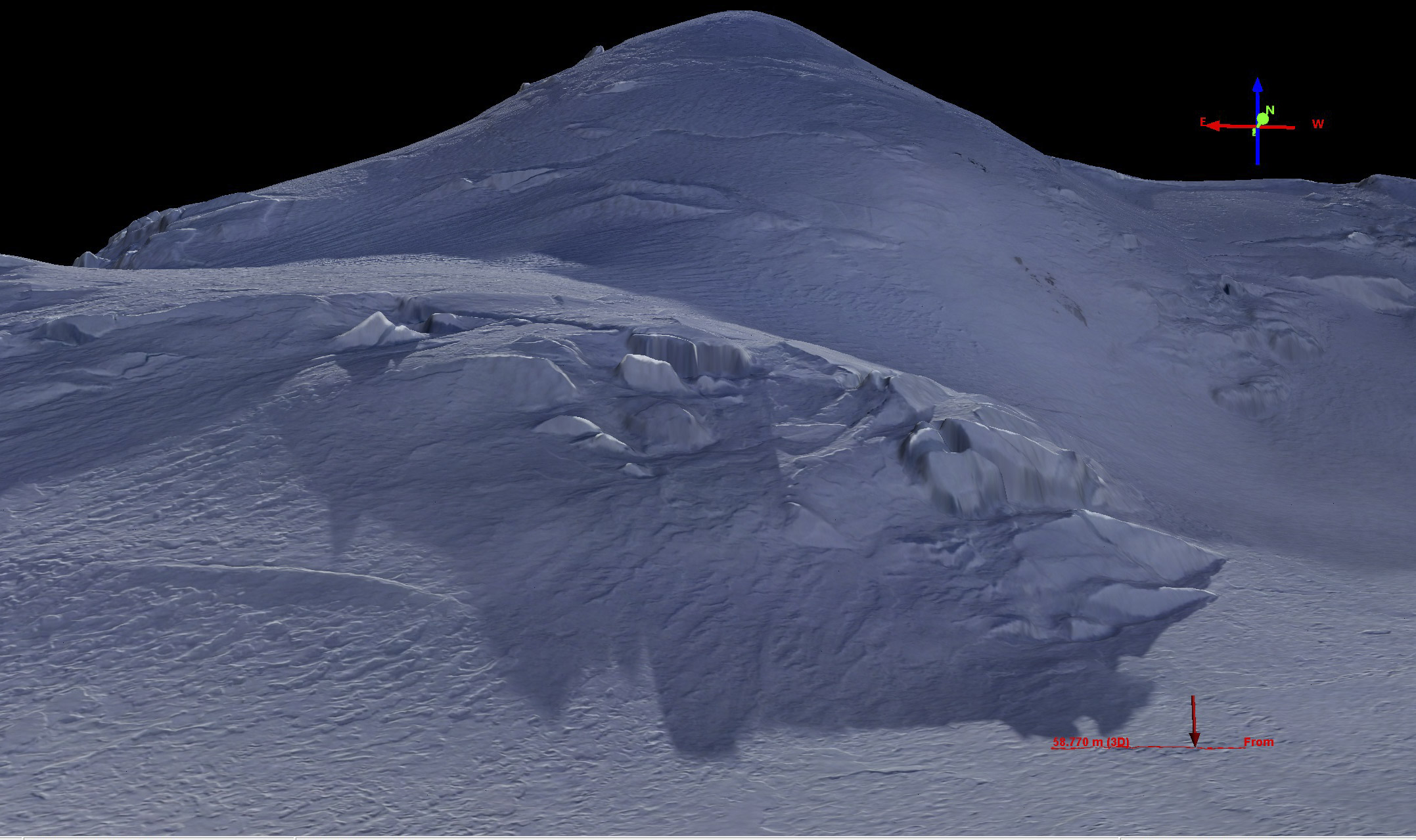
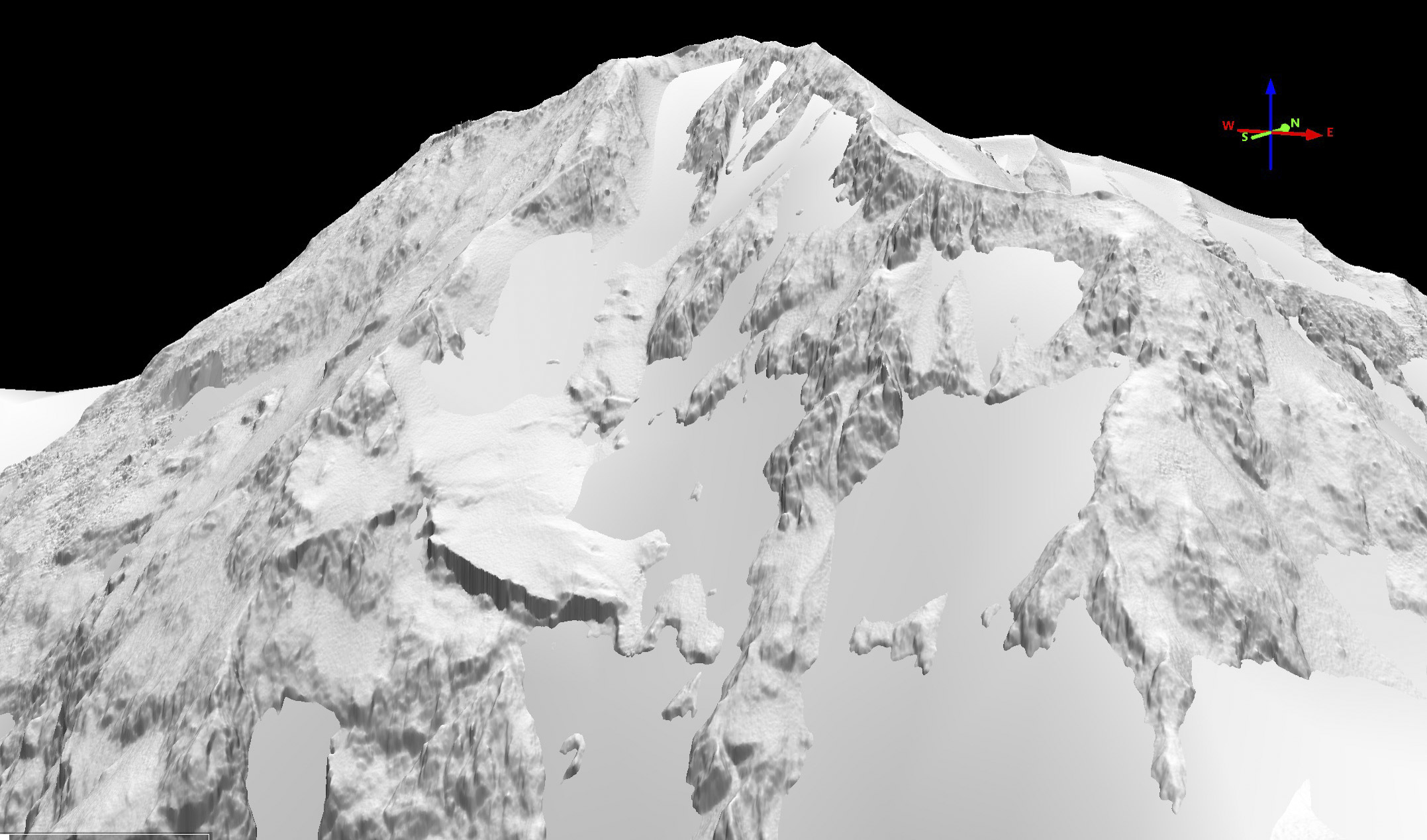
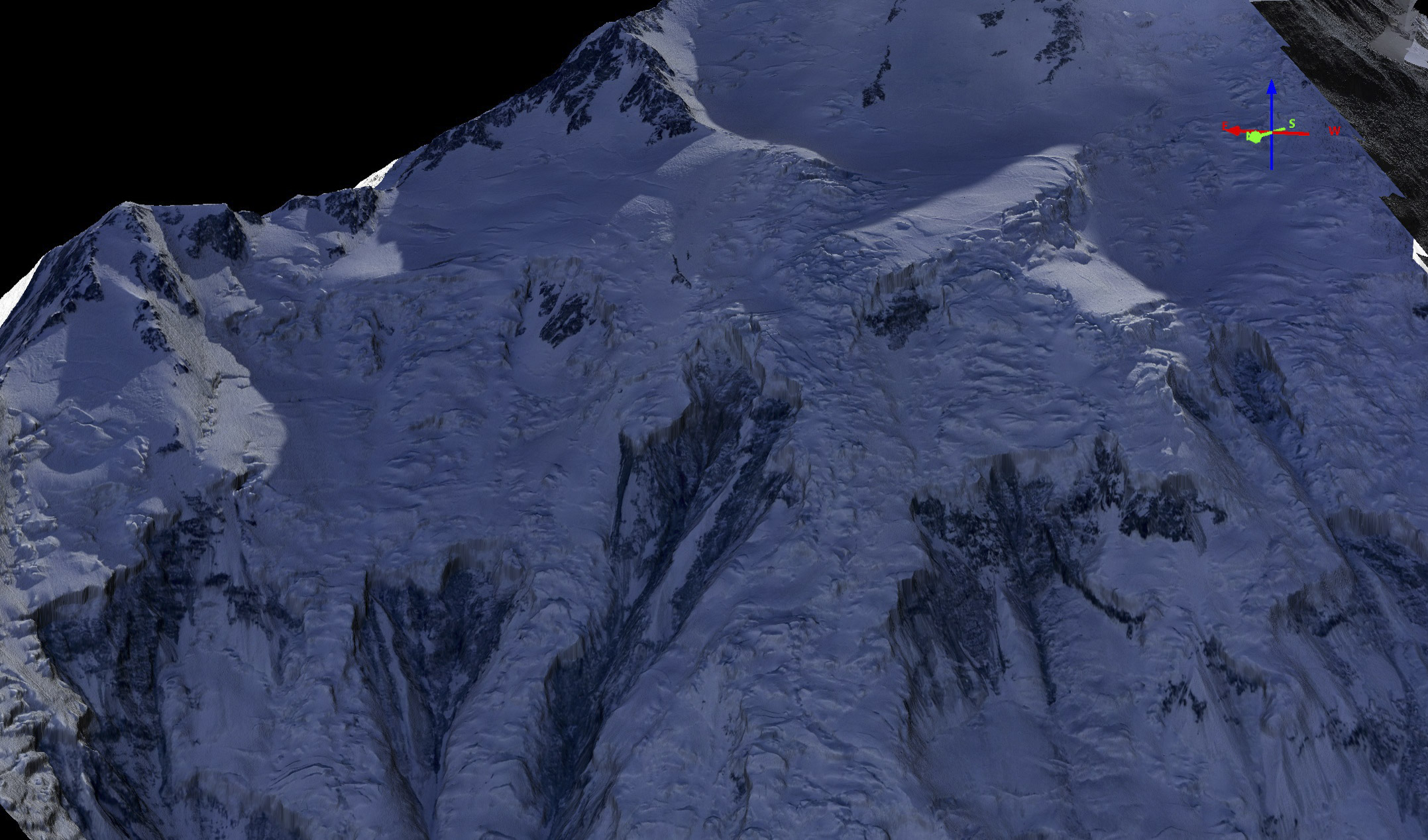
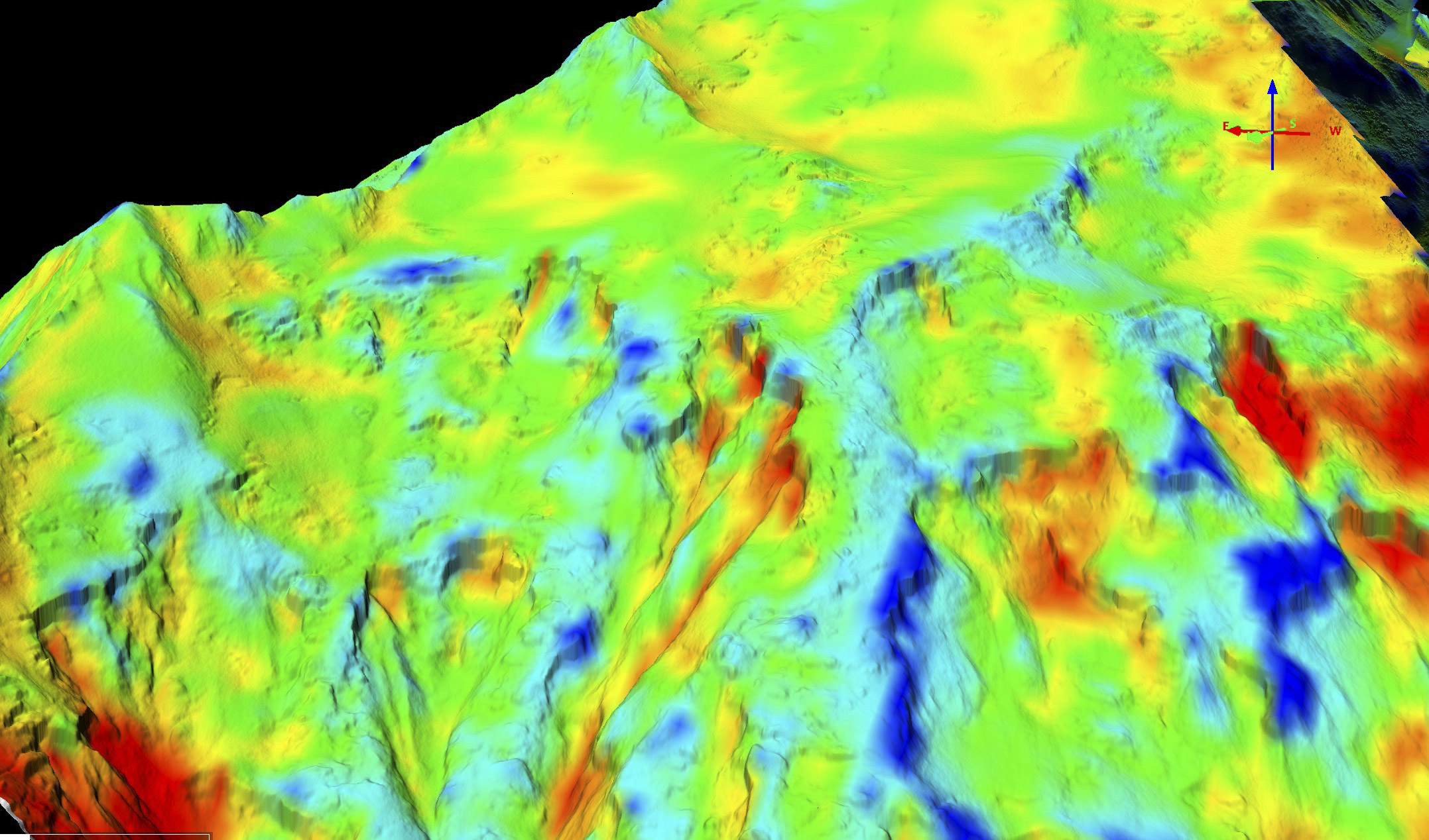
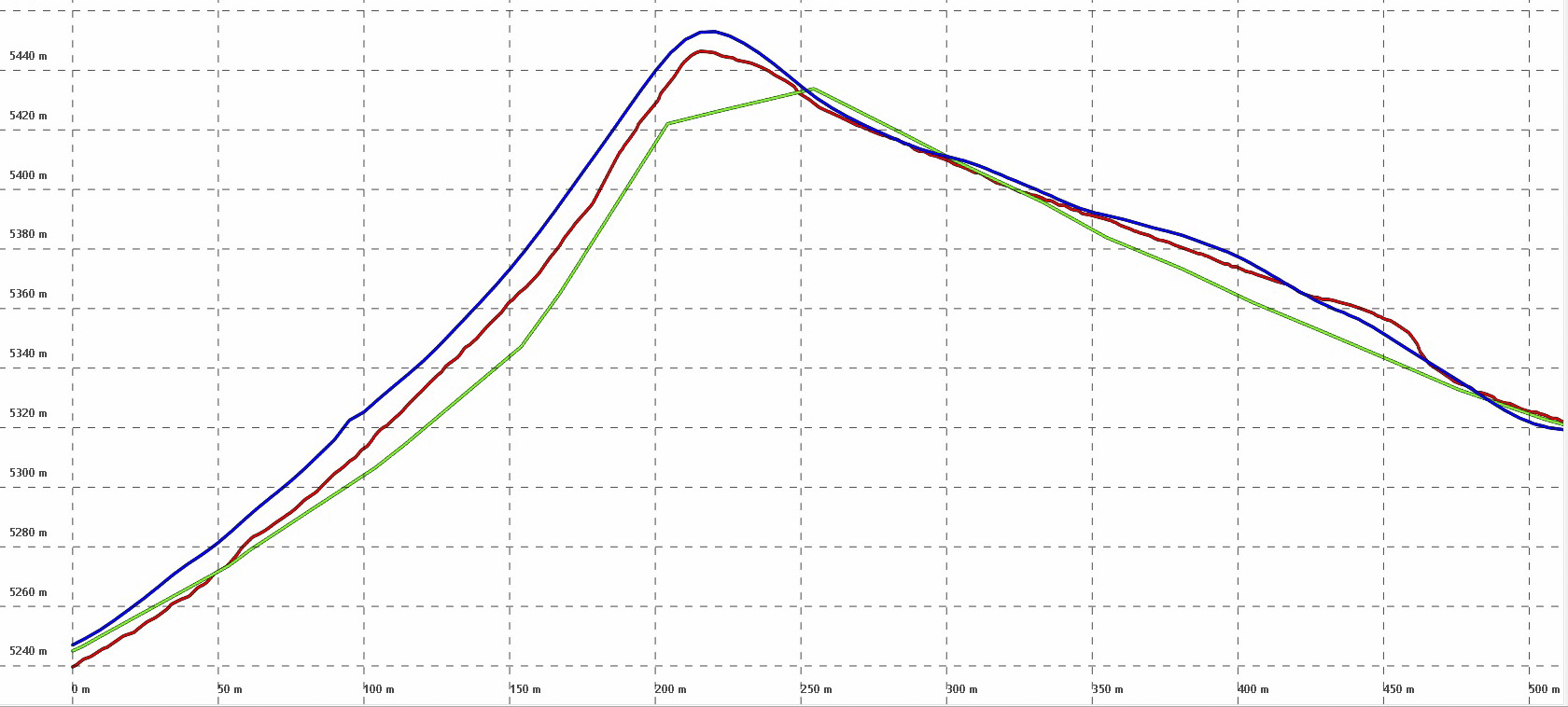
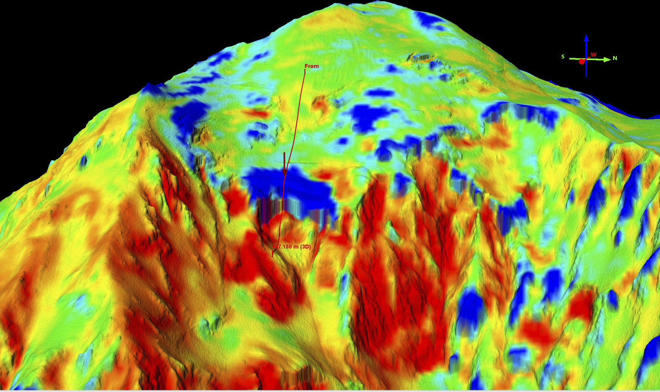
Not only can we measure changes to it’s large glaciers, we can measure changes to its smallest snow drifts. Notice the transect at right, running over a small sastrugi. Our measurements clearly resolve the size and shape of this sastrugi, as shown in the elevation profile below. It is only about 60 cm tall, but is clearly resolved in topography, along with variations within that sastrugi on the 10 cm level. Now consider that this sastrugi is one of probably millions on that mountain that were measured with that precision and you have a good idea of how awesome this new fodar map of Denali is. That is, we didn’t just measure the peak elevation of Denali, we measured it’s topography down to the point of measuring the shape of each individual snow drift — had there been any climbing teams on the mountain, their tents and even their bodies would have become part of this map.
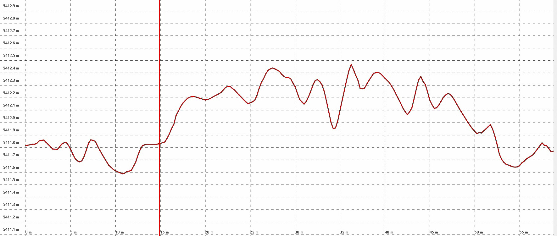
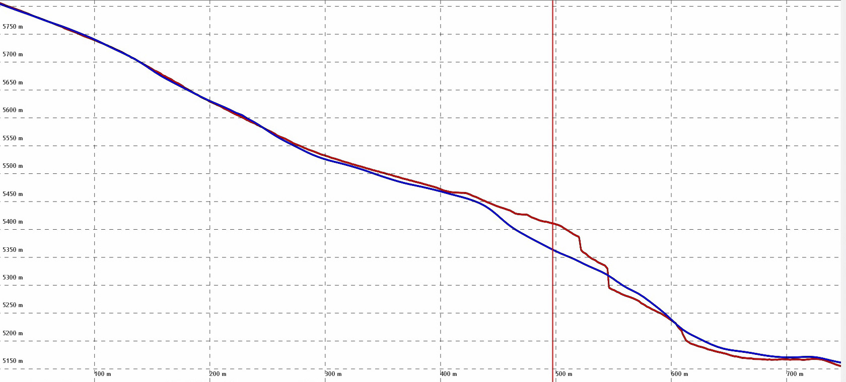
Here is an elevation profile of the sastrugi in the previous image. The horizontal ticks are spaced 10 cm apart, the vertical ones 5 m apart. Careful comparison of profiles like this to the orthoimage indicate the variations seen here are real, not noise.
This movie was made using the high resolution fodar point cloud described below.
Here is the 50 cm DEM with 25 cm orthomosaic from our 8 April 18 acquisition shown in Cesium. If you dont have a mouse with a scroll wheel (for panning and tilting and zooming), you can use the icons in the upper right corner to fly yourself around. Here I have embedded the Denali data into a globe without other terrain or imagery, just to make the Denali data easy to find.
Background
Denali is the tallest mountain in North America. According to Wikipedia it is also the tallest land-based mountain on Earth — that is, it has a vertical rise from surrounding terrain of 5500 m (about 18,000 feet), which is about 2000 m (about 6500 feet) more than Mt Everest, which sits in a massif of very large mountains. The first thorough mapping effort of the mountain was led by Bradford Washburn based on vertical photos from the early 1950s, which determined a peak elevation of 20,320 feet. This elevation remained largely unchallenged until 2013, when a second map funded by the State using airborne insar map determined an elevation of 20,237 feet, or 83 feet lower than this USGS map value. This value was challenged two years later by a field campaign sponsored by the USGS and NGS to make a direct GPS measurement on the summit. This value, 20,310 feet (6190.5 m) was then accepted as the official US value. While measurements of the peak are valuable and interesting, they tell only part of the story that Denali’s topography has yet to offer…
Denali is also covered by glaciers and snow fields, who’s dynamics go largely unmeasured and even unnoticed due to the extreme challenges in observation, as no operational and affordable technique has been previously identified to make such measurements. Recent studies have found that high mountain snow packs are increasing over time, but it is both suicidal and economically infeasible to survey such snow fields regularly on the ground, and we have essentially no information of the impact of this on high-mountain glacier dynamics. Plus nearly all of the tallest peaks in Alaska are covered by glaciers, so the elevations of these peaks are changing over time. The changes we need to observe require a vertical resolution of centimeters to decimeters, not meters to tens of meters. Satellites have value here, but lack the resolution and accuracy needed to track and understand these changes. The two previous airborne maps made of Denali are insufficient to measure temporal changes at time-scales, spatial resolution, and accuracy of interest to us. The original USGS topo maps made in the 1950s were excellent for their time, but they have a stated error of about half a contour interval, or about +/- 50 feet and it is widely known that accuracy over snow fields can be worse due to lack of contrast. I don’t know the published accuracy value for the airborne insar, but based on the 73 foot error found on Denali’s peak (and our analysis below) it seems reasonable to assume it also has an accuracy of roughly +/- 50 feet. Further, the digitized USGS paper contour maps have roughly a 50 m posting and the InSAR has a 5 m posting, and coarse values like these can have a large impact on topographic error due to spatial biasing: the fact that crenelations and ridges on the scale of decimeters to meters cannot be resolved adequately by pixels 10 times their size.
Our work on Denali last weekend was our first attempt to see if fodar could fill this observational gap. Fodar is a photogrammetric process for determining the shape and color of the earth’s surface from the air using a small-format camera. It is a subset of photogrammetry in that it is specific to making topographic maps from the air using inexpensive cameras that were not purpose built for photogrammetry. Fodar is what is driving the drone revolution right now — for only $1000-$2000 USD, nearly anyone can buy the hardware and software required to make decent topographic maps from a drone. I began developing our system in 2009, long before this drone craze began. At that time, I integrated a mirror-less lidar with a Nikon camera to provide an absolute scale reference, but by 2012 the new breed of photogrammetric software was becoming mature so my lidar became obsolete. By 2013, my system had been reduced simply to a Nikon D800 prosumer DSLR, a survey-grade GPS with roof-mounted antenna, and some custom electronics to ensure precise timing between the camera shutter and the GPS event input. This system produced DEMs with a geolocational accuracy of better than 30 cm with no ground control and a repeatibility of better than 10-20 cm in most cases, and because it was used in a manned aircraft we could map a thousand square kilometers a day in good weather, with ground sample distances of 5-25 cm. This system and its capabilities was fully described in this paper, which is further described by this blog, with many applications found here and here and here. While the componentry and techniques have continually improved since 2013, the basics remain the same.
This study is not our first measurement in steep mountain terrain. Several years ago, we mapped the five tallest peaks in the US Arctic several times each to resolve some discrepancies in the USGS maps as to their order in elevation. This work is described thoroughly in this paper and in this blog with lots of visualizations. Based on this work, we found that fodar was suitable for mapping steep mountain topography and that our peak measurements had an accuracy of better than 20 cm, utilizing no ground control, based on the scatter in our several fodar maps of each peak, the comparisons to GPS placed on the summits, and the comparisons to lidar maps. None of these peaks exceeded 9000 feet (2743 m) in elevation. So the current study of Denali is our attempt to validate that fodar operated from a small, light aircraft can be used operationally to map all of the high elevation glaciers, snow fields, and peaks in Alaska.
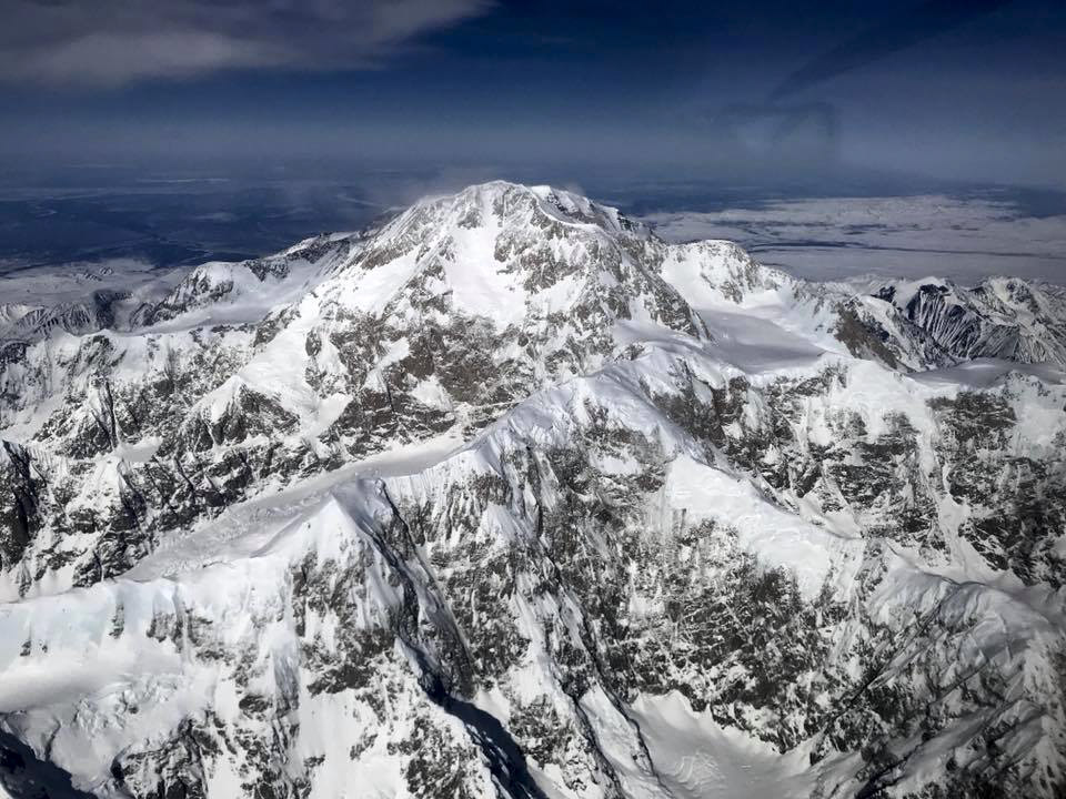
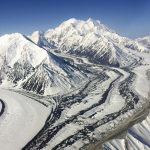
Denali on 10 April 2018, taken from about 23,000 feet, just before we mapped it.
Acquisition Methods
Here I describe only those aspects of the methods that were not covered fully in our previous papers and blogs. For this work, I did all of the mission planning, flying, equipment operating, and processing myself, as usual; though for this project I also had a safety pilot and our 12 year old son in the plane.
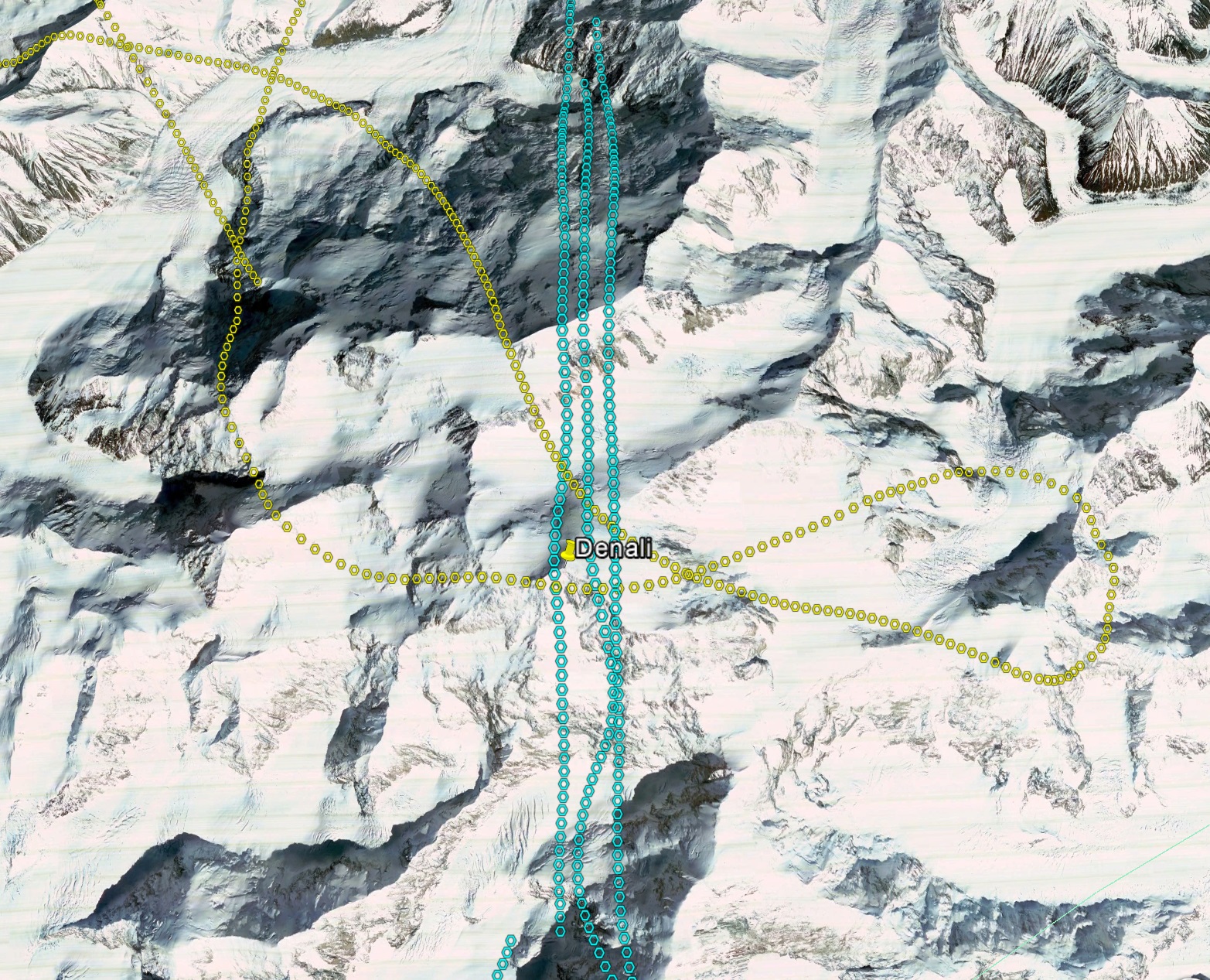
Planning to map Denali had unique challenges due to its extreme changes in relief over short distances. That is, in a single flight line covering the peak, the mountain changes elevation by more than 3000 m. To ensure that each adjacent flight line has sufficient side lap, I used TopoFlight Mission Planner, which I’ve been using for almost 10 years now. TopoFlight ingests a DEM, raster imagery, and vector outlines to allow the user to visualize the impact of flight line spacing on sidelap coverage and adjust plans as desired. Without a mission planning tool that takes topography into account when spacing flights, it would be very difficult to ensure proper coverage without a lot extra flying. In this case, I planned four blocks of five flight lines each, with the four blocks arranged on the eight cardinal directions. I have found that the accuracy of the photogrammetric solution is dependent on the number of lines up until about 5 flight lines, though the changes are minor after 2 flight lines and the increased number largely overcomes pilot errors and challenges. I planned the four blocks like this for several reasons. Most importantly, wind dynamics over this mountain can be life threatening in a small airplane, so given that any single block would yield enough data for this pilot project, we could simply choose the block that had the most favorable wind interactions. If we were able to complete all four blocks, the resulting map would have covered the entire mountain to below 10,000′. Finally, by mapping at least two of the blocks, I could process those blocks completely independently of each other (including their GNSS solutions) such that I could compare two or more independent DEMs of the peak made on the same day to arrive at excellent error statistics.
To ensure maximum coverage of the peak, I planned the lines at 21,500′, giving just under 1200′ of clearance to the summit. For a first attempt, this is the lowest conceivable distance I would fly over the peak to avoid turbulence and downdrafts. In more normal planning, one would specify the desired GSD and let TopoFlight determine the most suitable flying altitude, but in this circumstance I, as a pilot, dictated the altitude I was comfortable at and let Topoflight determine the GSD. Within TopoFlight I used the original USGS NED DEM processed to 50 meters posting. For each block, I ran the first line through the summit, then asked TopoFlight to space lines out left and right from there with 60% sidelap. TopoFlight immediately shows the sidelap graphically. If it was insufficient at the peak, I manually moved the lines closer so that photos from at least 4 of the five lines covered the peak to ensure maximum coverage there. While the lines were planned at 21,500′, my intention was to fly them at 23,000′ and only descend lower if conditions were perfect. Flying higher creates more overlap, but this is not an issue, as well as lower spatial resolution. In this case, I could examine each photo location to determine its GSD using TopoFlight, which was about 15 cm near the peak in this case and sufficient for my purposes.
Flying at 23,000 feet also presented new workflow challenges in the air. I normally fly fodar mission in either a Cessna 170B or a Cessna 206. The 206 is turbocharged and was the only choice here. Because all of my work to date has been conducted in VFR conditions below 18,000′, I never had need for an IFR license previously, thus I needed to take a safety pilot with such a license. Both of us, and our 12 year old passenger, required supplemental oxygen for the bulk of the trip due to the altitude. The capacity of our oxygen bottle turned out to be the limiting factor in our acquisition, though weather began deteriorating about this same time. As it was, we only completed 5 lines: 3 on the North-South block and 2 partial ones on the East-West block. Had we more oxygen, we likely could have complete two full blocks, perhaps even more that day. But as this mission was largely a shakedown of operations over Denali as a proof-of-concept, it was exactly these sort of challenges that we were trying to identify and improve for future operational use. In any case, the 3 plus 2 lines were enough to both create an accurate map, as well as create two independent partial maps to constrain the accuracy of the map using all of the data combined.
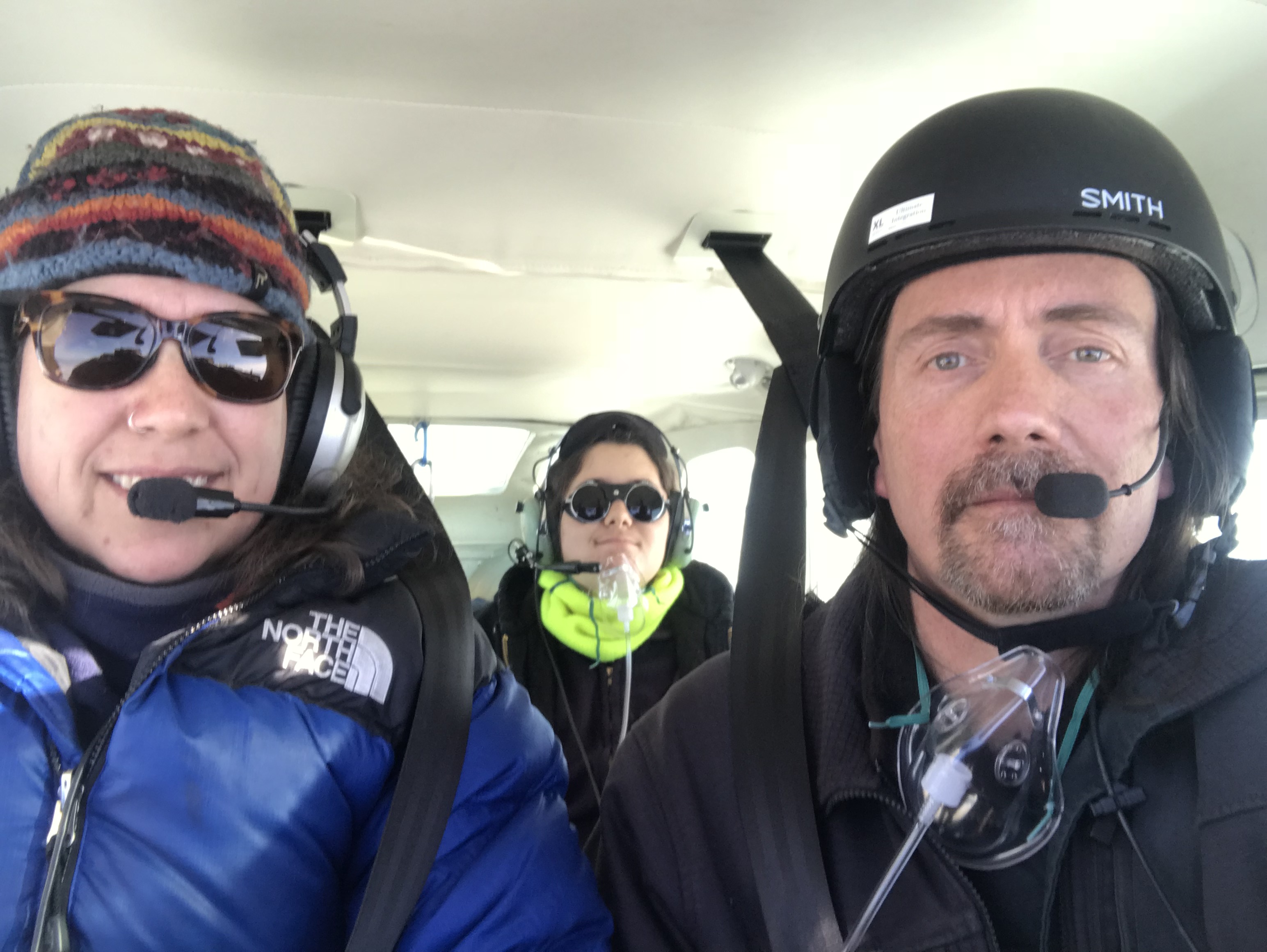
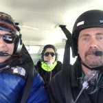
The flight crew on the day of the mapping, below the altitude at which supplemental oxygen is required. Click here to learn more about the mapping mission itself.
Processing Methods
GPS processing was done using Novatel’s Grafnav software. This software is an excellent package geared towards getting the most from post-processed data and my testing has shown that is superior to other such packages. It will process data from any manufacturer, including my custom receiver. I processed these data using the PPP method. Grafnav facilitates this through use of a wizard that automatically does nearly everything from downloading all of the precise files needed to processing to final result, but also allows the user to do everything manually or tinker with settings in between. I processed the data in two separate solutions, with no overlapping data, such that the first three lines were contained within one solution and the last two lines were contained in the other solution. The solution was reduced from antenna position to camera position at the time each photo was taken. I processed the solutions directly into NAD83(2011) NGVD88 Geoid 12B, and these values were used to create the exterior orientations for the photo locations used in the photogrammetric bundle adjustment. Based on comparison of forward and reverse solutions, the positional accuracy of the antenna appears to be better than 5 cm, which is on the same order as the uncertainty when reducing that to the camera position.
I processed the photos photogrammetrically using Agisoft’s Photoscan. I have been using Photoscan since it was in beta more than 5 years ago and have yet to find a superior package in terms of accuracy, speed or user friendliness. In most circumstances, once all of the input files are prepared, user input to processing can be accomplished in less than an hour. I run Photoscan on the most powerful server computers I can build at the time of purchase, currently with 512 GB RAM, 4 high-end graphics cards, and gobs of fast cores. With this software/hardware combination, I can turn tens of thousands of photos into DEMs in a matter of days. For this Denali project, less than 500 photos were acquired, so processing occurred in a matter of hours and was completed by Monday evening following the Sunday acquisition.
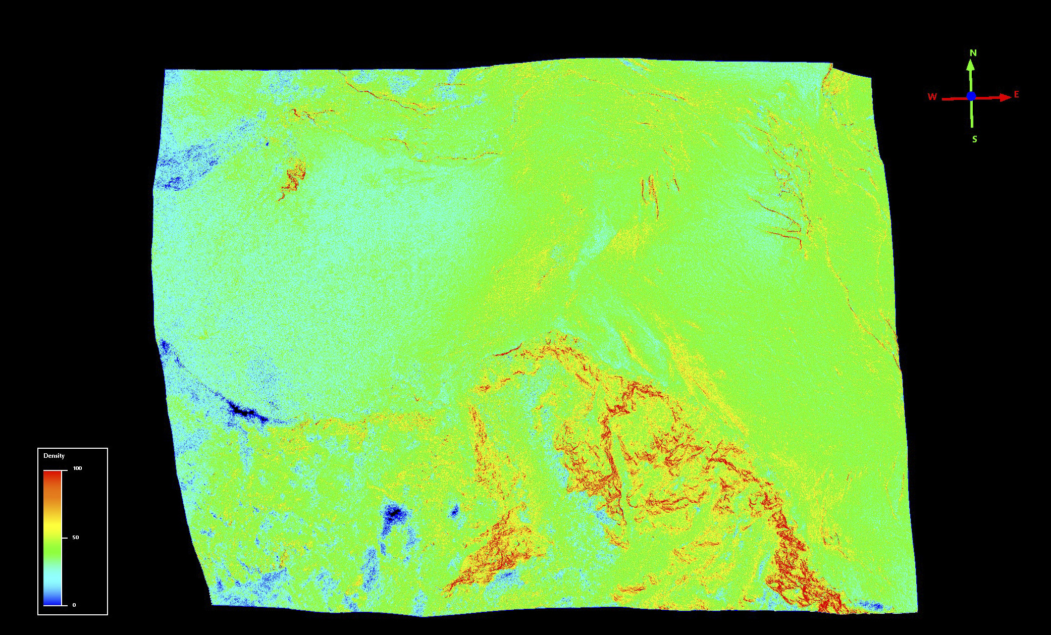
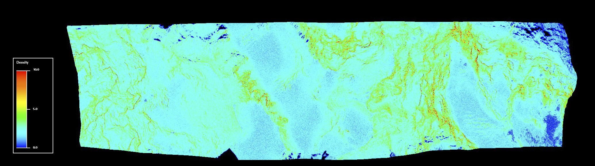
I built several dense point clouds to examine the data in different ways. With such extreme changes in distance-to-ground, ground sample distance also varied widely, from about 15 cm to about 100 cm. So I processed a 3 km2 area around the peak at Agisoft’s UltraHigh resolution, which uses the native GSD and does little filtering of the resulting cloud. The result was a point density that varied from 0 to over 100 points per square meter (ppsm), with the bulk peak area of about 35 ppsm. The highest density was found, as expected, in the areas of high fine contrast, namely the rocky crags and outcrops with lots of vertical relief. The average ppsm suggested a DEM of 20 cm posting. I also processed the entire data set at Agisoft’s High dense cloud setting, resulting in a point cloud with a density of 0 to 30 ppsm, with the bulk of area in the 3-4 ppsm range, again with crags having the highest density and the glacierized valley floors with the lowest density. I processed this into a DEM with 50 cm posting and an orthomosaic at 25 cm posting. Thus the glaciers were oversampled, but this really does not matter — you can divide a flat surface up into as many pixels as you like and though you are not gaining new information neither are you degrading information. On the craggy outcrops where point density is higher, posting at glacier resolution would actually degrade information substantially. And in the end if these details matter to your application, you should just work in the native point cloud where resolution can vary unhindered by a uniform grid. The peak elevations between the two point clouds was the same to within 4 cm. Given that the 20 cm DEM has substantially more topographic noise because it cannot spatially average photographic pixel noise and given that resolution is mostly applicable only to the summit area, I did not process the entire area to 20 cm. [Note: I couldn’t resist processing the entire data set to the highest resolution, which had a mean point density of 11 ppsm but for the same reasons above I processed into a 25 cm DEM to preserve as much detail as possible where it existed.]
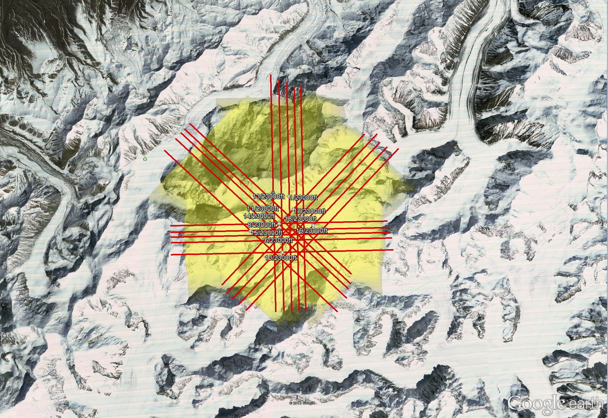
The lines I planned in TopoFlight the night before. Any one of these four blocks would have been sufficient to make an excellent map of the peak; by mapping any two of those blocks, we could have two independent maps made on the same day so that we could assess our accuracy and precision.
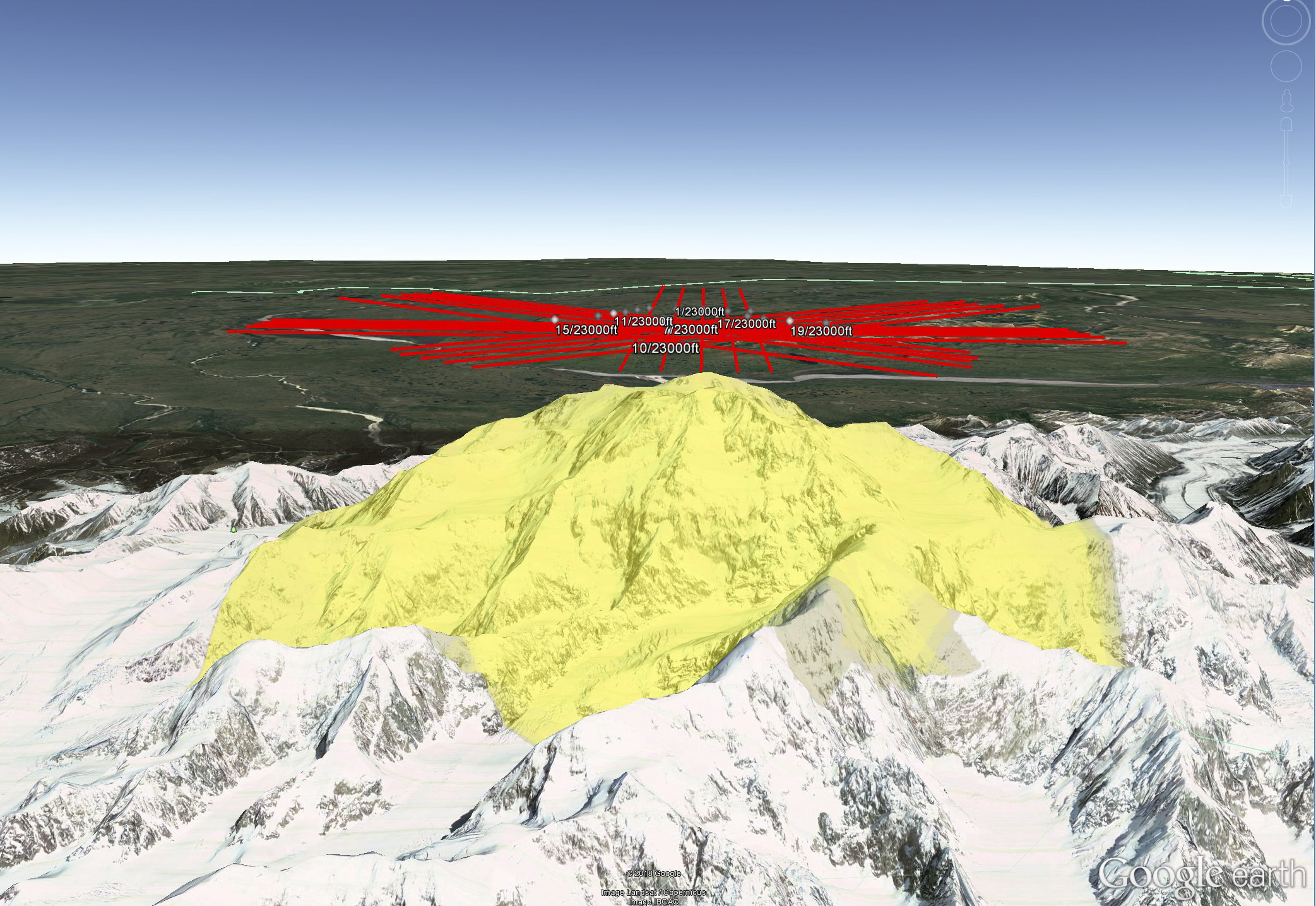
TopoFlight allows for export to Google Earth, which is useful in visualizing the lines in 3D. Here I am assessing my clearance and escape routes, as well data coverage shown in yellow.
These are our actual flight lines and photo positions, as calculated by Grafnav. I split the data into two parts and processed each independently, as denoted by the colors; the last yellow line just barely captured the peak.
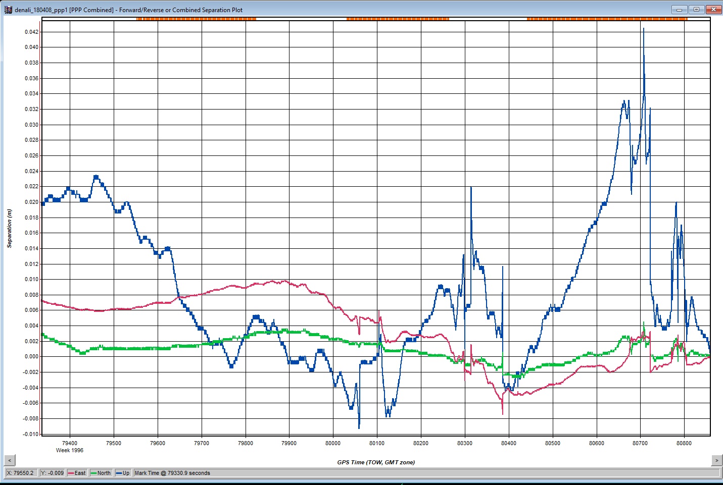
The combined separation plot from Grafnav for the partial DEM utilizing the first three lines flown. The full range of difference (vertical scale) is 5 cm, time is on the horizontal axis, with photo events in red at top; the blue line is vertical difference and the red and green are horizontal.
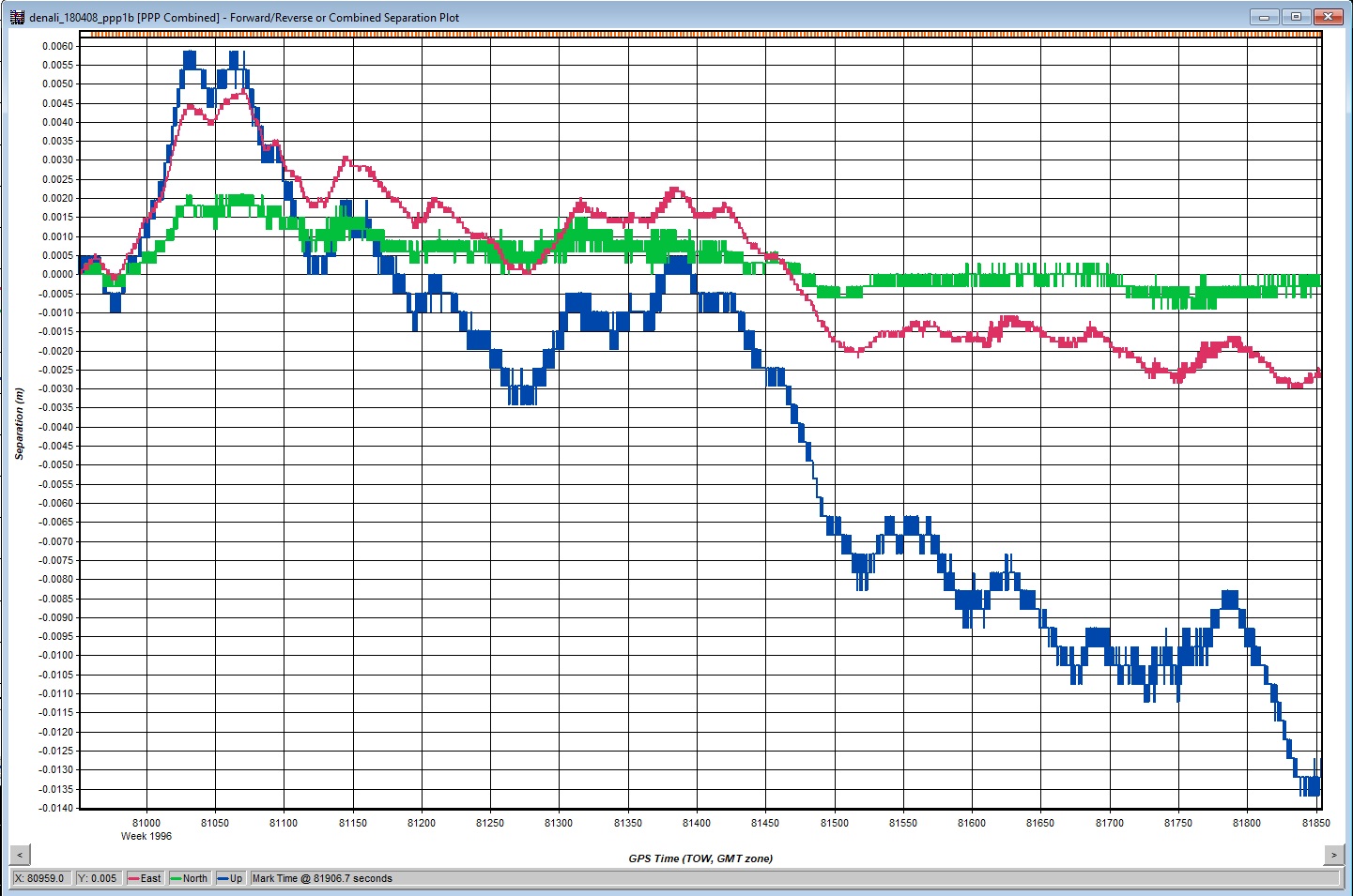
The same as the previous image, for the last two lines; the full scale here is about 2 cm.
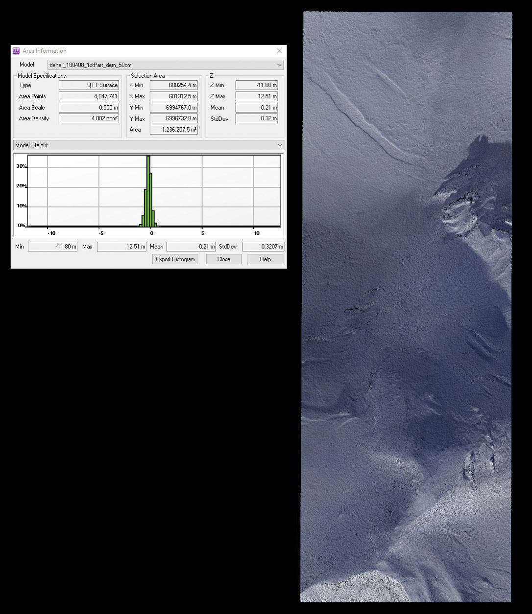
Map Accuracy and Precision
I took two approaches to validating map accuracy and precision: in this section I will describe comparisons of my own data to my own data as I think these are most valuable and in the Results section I will compare my data to previous work. As I describe fully here, I think map-to-map comparisons are the only way to truly validate a map.
Though our attempt to make two or more independent maps did not go as well as planned, we did still acquire enough data to achieve our goal. As I mentioned previously, two overlapping lines is the minimum requirement for accurate mapping. I use the two pass method for nearly all of my road and river work (that is, one line up and one line back), and this method works great as long as the target is within the overlapping area of the two lines; the area with no overlap can have substantial edge artifacts. However, adding a 3rd or 4th line to these can substantially tighten up the solution as the outer edges of the inner two lines of photos get constrained by overlap from the inner edges of the new outer lines. Mostly what is getting cured here are spatially-correlated errors, where a small group of photos is not able to get fully aligned in the bundle adjustment and could be 10-30 cm misfit spatially or vertically. This error can still be found in the middle of blocks of multiple lines, so multiple lines is not a cure, just a reduction; I find this occurring most often in flat areas where the error potential well has a flat bottom, in steep terrain it is not as noticeable. With that in mind, the DEMs made from 2 lines and 3 lines here will yield a conservative error result — that is, DEMs made from 5 lines each would be expected to be more accurate, so we expect to find a larger misfit when comparing these 2 and 3 line DEMs, and this larger misfit serves as our uncertainty for the DEM made from the combined data and is thus conservative.
That being said, the results were excellent. I used Quick Terrain Modeler to visualize the results and perform these basic analyses. QTM is an excellent tool for manipulating point clouds and DEMs in 3D, as well as performing most of the basic analyses and operations needed for validation tasks like these. It subtracts two DEMs, shifts them in X, Y, Z, analyzes them for point density and a dozen other spatial properties, extracts transects and make measurements, and much more. There is also a free viewer that does much of the coolest stuff.
The peak heights derived from the two DEMs were 6190.10 m and 6190.02 m: only 8 cm apart! This comparison is outstanding given both the weakness of the photogrammetric solutions in each DEM and the fact that no ground control was used at any point in the solutions. Technically, this 8 cm would be considered a measure of precision, or repeatibility. However, each DEM was created using powerful, real-world air control in the form of the post-processed airborne GNSS solution used to derive the exterior orientation of the photos. This air control exerts a stronger control on the bundle adjustment than would an equivalent number of ground control points, because each air control point controls 36 million pixels (that is, one photo) directly. I have conducted dozens of repeat measurements at this point, and I have always found that the accuracy of the data is on the order of 30 cm in X, Y, Z when no ground control is used, and that results get more accurate in steeper terrain likely due to the positive influence of scale variations on the bundle adjustment itself; I describe these analyses and methods in some detail here. The only systematic bias in common to both of these DEMs is the relationship between the GPS antenna and the camera within the airplane, and we know that these are controlled to better than 10 cm even on windy days requiring substantial yaw.
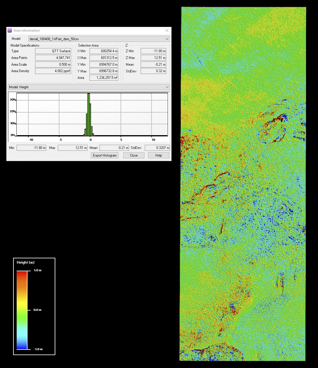
I performed a similar analysis on broad areas of overlap between the two DEMs. I selected about 5 million pixels covering about 1 km2 for this comparison, so the results are clearly in the statistically significant range and it is also worth noting that no other map of Denali has ever compared more than a handful points to serve as validation. I selected several different areas of data with about the same size and got roughly the same numbers: the 2 line map is about 20 cm lower than the 3 line map and that 95% of the points show the same elevation to within about 60 cm. The 20 cm accuracy value is commonly found in my fodar data, and in this case is likely driven purely by the GNSS solution. The 60 cm precision value is much higher than we normally find, by a factor of 3, and I suspect most of this is due to the weakness of the photogrammetric solutions caused by the minimal flight lines, combined with spatial biasing caused by 50 cm pixels representing crags of smaller dimension. That is, there are so many rocky crags here that are not fully resolved by even 50 cm pixels that slight differences in how the individual pixels of each map lie over those crags causes an increased amount of apparent error that has nothing to do with the acquisition technique. I tested this by selecting smaller, mostly flat areas within this larger area and could indeed reduce the standard deviation of misfit to 15 cm or less. So in this context, we might expect the peak to have increased accuracy (that is, less spatial biasing) because it is on a smooth slope that is resolvable at 50 cm posting, explaining the 8 cm spread in values. Given the realities of the data we have to work with, some care and more subjectivity was needed to pick an area with a fair representation of the precision errors; the best I can say is that I was aware of this in not trying to cherry pick the data too hard for to minimize the error values. Hopefully future acquisitions will have more complete maps that will eliminate this subjectivity.
Based on analysis of the two DEMs and their orthomosaics, I found that horizontal accuracy and precision was within a few pixels. Analysis of the difference DEM shows almost no correspondence to topography. The region selected crosses many ridges running in many directions — if the two data were laterally shifted to one another, we would see apparent changes in topography on either side of those ridges, but yet even with a +/- 1 m color stretch, this is not apparent. What is apparent are streaks of large difference around crags and crevasses — the fact that these orient in all directions further suggest that these are due to either spatial biasing or insufficient point density due to minimal overlap rather than a spatial misfit of the DEMs themselves. Analysis of the orthomosaics shows differences on the order of 1-3 pixels near the peak but sometimes up to several meters further away, but with no apparent directionality; the directionality is again confused by the DEM itself which is used to orthorectify the image and the two-line orthomosaic suffered by having insufficient overlap in such steep terrain. In every other comparison I have done between my own fodar data sets, horizontal accuracy has been within 1-3 pixels, with pixels only 10-20 cm large; therefore I believe the wider range I found here has more to do with the insufficient data within each of the two separated maps than the method itself, but this remains to be verified.
Thus while I would like to try this again in the future as a direct comparison of the entire mountain from 2 or more maps made the same day from full blocks of lines, what I’m using here is orders of magnitude better than any other mapping attempt and more than sufficient to make my point: there seems to be nothing unusual about data quality here and the final map likely has the same specs as nearly all other fodar maps that I have made, namely accurate to within about 30 cm and precise to within about 20 cm, for 95% of points. However, given the issues of spatial biasing, we should expect future map comparisons to show noise at the 95% level up to about 60 cm.
Results
The best map made from all available data collected on 8 April 2010 yields a peak elevation of 6190.11 m (20308.6 feet), just shy of the officially recognized peak elevation of 20,310 feet. That these values compare so closely speaks to the accuracy of my fodar system, which utilized no ground control. The difference between them likely speaks to the dynamic nature of cornice covered peaks in Alaska — these are dynamically changing shape with each new storm. In our work determining the highest peaks in the Brooks Range, we found that one “peak” change position by over 15 m even though the peak elevation changed by only 15 cm, because the peak ‘area’ was located along a long, nearly flat, cornice ridge and every windstorm changed the shape of that ridge. Previous direct measurements on Denali’s peak during the 2015 GPS campaign showed that the cornice was at least 4 meters deep, but they could not tell if they probed to rock or ice. Looking alongside the peak with the fodar data, I measured the cornice to be 21 m thick; whether concealed rock protuberances exist beneath the cornice are still unknown, but it seems that Denali could get 10-20 m lower due snow and ice melt.
The fodar map indicates an elevation of 5929.08 m (19,452.36 feet) for the north summit, or 18 feet lower than the USGS map value of 19,470 feet. Note however that the fodar data are relative to the NGVD88 Geoid 12B datum, whereas the USGS map values are relative to the NAVD29 datum, so these two values cannot be directly compared without an appropriate transformation (which seems not to exist in Alaska) so it remains unclear whether this new value is higher or lower than the original.
Please note again that these results are preliminary. None of them are intended at this point to be used in an official way, their value at this point is to demonstrate the power and utility of fodar. That is, while I believe these are accurate to the centimeter, my enthusiasm must still be tempered by further rigor.
Discussion: Comparison to previous maps
I compared the fodar DEM to the USGS DEM and found some things I expected and some things I did not. Spatial biasing in the 50 m USGS pixels is much stronger than my 50 cm pixels, as expected, and the visual clarity and detail present is much more impressive at 50 cm resolution. What I found most unexpected was how little change there appeared to be in the glaciers, typically less than 10 m. Of course this must be balanced against some remaining geolocation and datum issues (I manually shifted the USGS DEM to best fit the fodar DEM, as there is no datum conversion for NAVD29) and the spatial biasing must be considered, but for whatever reasons I had expected to see greater change. Regardless, given the tools and techniques available to the photogrammetrists of the 1950s, the USGS DEM was a remarkable achievement and corresponds well with the fodar DEM.
I also compared my fodar map with the ifsar map made in 2013. I know a lot about insar but I admit I know very little about the airborne system they used here in 2013 — I’ve never read any reports or papers on it, I’ve never worked with the data before, I know nothing about the specs or accuracy, etc. — so my comments should be taken as just what they are: the result of about 3 hours working with these data to see how it compares with my fodar. I grabbed the data from here, an excellent site where you can find not only insar of nearly the entire state but also much of my fodar data (unfortunately put under the heading of “SfM”) but I could not find much in the way of metadata (in my 10 minute search), so again everything I say about this comparison should not be taken too seriously, this is all back of the digital envelope work. The ifsar came projected in Albers Conic, which I reprojected into the UTM 5 that my data are in; I assume the vertical datum was NAVD88 Geoid12B, but I don’t know that for sure. In any case, the reprojected data were about 9 m off to the south and about 9 m lower than my fodar. Chances are this was a blunder on my part somewhere, but I throw that out there as it bears investigation, though it may well be real considering the 73 foot error on the peak; that is, being an average of 30 feet lower is actually an improvement. Perhaps more importantly though, what I’m finding are spatial variations and artifacts which I did not expect to see at all. That is, I tried to manually best fit a shift of the ifsar to my data, but when I line up a few ridges here a few others there get misaligned. The magnitude of the difference is also larger than I expected, on the order of meters to tens of meters. I suspect much of this variation can be attributed to changes in snow depth, which is a signal we are looking for: I don’t know the date of this acquisition, but I suspect it was summer when snow was at a minimum and at its wettest (to limit ifsar microwave penetration), so compared to my winter map we should expect 10 m differences in places. However, much of the difference is clearly not due to snow depth, especially as many of these differences are the wrong sign for snow. Spatial biasing is likely an important and unavoidable source of variation too, but there is something else going on that seems to me to be significant enough that it bears further investigation as it is large enough and strange enough that it makes direct comparisons of the data for change detection difficult. The insar DEM is a great product, however, it was a real treat to download too much accidentally and fly around on it for a while in QTM, but once I realized sorting out these issues was more than an evening’s project I decided to move on.
Here are the terrain profiles from the red transect in the previous figure for the USGS NED (green, 50 m) insar (blue, 5 m), and the fodar (red, 0.5 m) DEMs. Horizontal ticks are 20 m. I manually shifted both the USGS and insar DEMs for a best fit (noting this was a 10 minute project for each, done by eye, so not a rigorous effort). You can see that the peaks for the fodar and insar are reasonably well aligned, as is the face on the right, but there is simply no way to align these two profiles to match without causing similar problems on other ridges, the dataset seem to have variations on the order of meters to tens of meters; much of this could be explain by differences in resolution and much of it by variations in snow depth. In terms of validation, this is why I like to make two maps on the same day — it eliminates the temporal variations and the variations caused by differences in technique; hopefully a similar study was done with the insar at some point.


Here is the terrain profile from the red line in the previous figure, with fodar in red and insar in blue. The vertical red line here is placed over a glacier that is not present in the insar data; as a glaciologist, I find it hard to believe that 50 m thick glacier appeared there within 5 years. The horizontal tick marks here are 50 meters. While the correspondence appears great further upslope, note how the red and blue lines weave higher and lower than each other, on the order of 1-10 m. My analysis above (and the many analyses you can find here) suggest that my fodar data is precise at the low decimeter level (usually within 20 cm), so my conclusion is that this 1-10 m precision error must be coming from the insar, though noting once again that all the analyses here are preliminary and based on first looks at the data sets.
Discussion: Fodar technology compared to alternatives
We flew this mission on a Sunday, but had not really considered doing it until the evening before. We also brought our 12 year old son on the trip as part of a fun family outing in a small, single-engine bush plane. Yet we achieved the outstanding results described above. Not in any way to minimize their efforts, but compare this to the months of planning, time, and risk taken by the 2015 GPS team to acquire a single measurement on the peak and I think you would agree that fodar is a much better deal all around. While that single GPS point may have an accuracy of 2-3 cm compared to 10-20 cm with fodar, is that extra accuracy worth the expense considering that the topography being measured changes on the order of a meter due to a single storm? Further, waiting out bad weather on the mountain could be life threatening, whereas waiting out bad flying weather can be quite enjoyable and productive. The point is that we have demonstrated that with a half day of flying we can map the entire massif above about 8000′ with enough accuracy and resolution to measure all of the dynamical changes of interest, and that is something that field work will never be able to compete with. That being said, there are still plenty of good reasons for cryospheric field work, but measuring topography simply isn’t one of them any more in my opinion.
Similarly, compare fodar to lidar for this application. The north face of Denali descends over 3000 m vertically in about 3000 m horizontally. Even million dollar lidars would struggle to get reflections from snow and ice flying at the minimum altitude ATC will allow (23,000 feet, of 850 m higher), and even if they could get reflections the point density would likely be in the range of several meters per point. Fodar, by contrast, has no range limitations — the same $3000 camera can map just as well from 300 m to 3000 m or more (as we’ve seen here), the difference only being GSD. Further, fodar systems are lightweight and their cameras can utilize small 5″ diameter holes that are already in the airplane’s belly, allowing them to be used in a wide variety of small, inexpensive aircraft (as we’ve seen here). By contrast, most lidar are flown in either twin engine or turbine engine aircraft that cost 10x as much. That’s not to say that fodar is better than lidar in all applications, just that it should valued as a powerful tool that can outperform lidar in many circumstances, and will almost always outperform lidar in terms of cost to both client and vendor.
Comparing fodar to ifsar is a bit of mixed bag, as they are very different tools for very different applications. There is no doubt that ifsar can cover more ground more quickly, as it is able to fly at 30,000′ or more and image through the cloud cover, and that is an awesome capability with loads of applications. However, the downsides are numerous for glacier studies. The resolution is only 5 m compared to our 20 cm, a factor of 625x worse. Ifsar produces an intensity image at 2.5 m posting, but has no color information. As has been shown, ifsar clearly has issues in the mountains in terms of accuracy, which appears to be on the order of +/- 50 feet. Ifsar microwaves also penetrate the surface of dry snow and ice, so its not really clear what they are measuring. And this style of airborne ifsar is hugely expensive, I don’t know the total cost but I believe it is on the order of $100M to map Alaska, and I doubt we could do repeat mapping of any size location in Alaska for less than $1M, though that’s just a guess. I threw down the challenge several years ago that I could map all of Alaska for $5M, but nobody took me up on it; I still stand behind that. In any case, the ifsar mapping of the State has already been funded and acquired, but it seems to me the mountains need to be done again with a more accurate technology. And for change detection they need to be done again. And again…
Discussion: The future of fodar
Fodar is clearly here to stay. Much like the desktop publishing revolution in the 19080s, fodar is topographic mapping for the rest of us. Anyone with a few thousand dollars can make great topographic maps with off-the-shelf drones these days, and indeed this has already turned into a billion dollar industry. Whether done from a drone or a manned aircraft, however, fodar is still photogrammetry, and in this context it is lidar and ifsar that are the upstart newcomers. That is, fodar is not an experimental technology, fodar works because photogrammetry works, the basic math is identical, it is only the massive and inexpensive computing and imaging power that distinguishes fodar from the photogrammetry that dominated topographic map making for nearly a century. Just like lidar, the accuracy and precision of fodar depends on how you go about it, so asking which is more accurate is a poorly posed questions. That is, saying something was measured by ‘lidar’ or ‘fodar’ is like saying something was measured by ‘GPS’, GPS quality varies from the few meter accuracy I can get from my watch to the millimeter accuracy I can get from my base station, so the statements are meaningless in terms of accuracy unless accompanied by an accuracy spec. In any case, fodar will survive because photogrammetry will survive. This does not mean that fodar will replace lidar and insar, but that it will likely steadily gain in popularity even once the explosive drone fodar growth slows down, because this explosive growth has whet the public’s appetites for affordable, repeat topographic measurements — an enormous new demand now exists, and most of the new people making those demands cannot afford the high end technology and are happy to live with what few limitations fodar has. Insar will always have the advantage of seeing through clouds and lidar will always have an advantage in seeing through vegetation, but as the fodar industry matures the magnitude of these advantages will decline. For example, I do tons of fodar work related to forests and vegetation, it just takes developing and refining new techniques, the same way that lidar did 20 years ago, and I can do probably 80% of the forestry work that lidar claims dominance over today. And in Alaska, we have so few maps as it is, that we cannot afford to be choosy about whether we are measuring the tundra vegetation surface or the tundra soil surface 10-20 cm beneath it, because the only other maps can’t resolve anything close to this or are way out of date. And cost matters. Even if lidar could do a better job at measuring Denali (which I do not believe it can), who can afford to do that for a hobby when the minimum buy-in cost is $500k? In contrast, I and many others can afford to map with fodar as a hobby, and that introduces a whole new dynamic. I know some professional land surveyors that are cringing right now about that dynamic, but I think those that feel that way aren’t seeing the big picture. While it is true that many fodar enthusiasts do not understand the difference between datums and projections, those enthusiasts are who are driving down the price and simplicity of those tools — tools which open up entire watersheds of new projects for surveyors to help the public. Consider this Denali project and the difference between the 2015 field survey which yielded a single measurement for several man-months of effort and the week it took me to acquire, process and publish a map of the entire mountain at similar accuracy. Some professional land surveyors have already seen this light — they can accomplish more work for less effort by letting someone else make their maps, such that their time and expertise can be focused on validation of lots of data rather than time-consuming expensive creation of a little data in the field. I have tried to do what I can to demonstrate the limits of what fodar can do, but at this point I’m running out of terrain challenges — I’ve mapped tons of mountains, tons of flat areas, the entire west coast of Alaska, and all sorts of terrain and vegetation in between. With Denali complete, I think we are entering the stage of maturity where it is simply time to start knocking out massive projects operationally. I know where I’m headed next.
Conclusions
We mapped Denali, the tallest mountain in North America, using fodar and found a peak elevation of 6190.07 m (20308.6 feet), as measured in NAVD88 Geoid12B datum and I believe the error in this value to be within 30 cm (1 foot) based on comparisons of two independent maps we made of the peak on the same day. This value is within 1.4 feet of the current official value, as measured by a GPS survey on the summit itself. Our fodar method requires no ground control and from planning to production of the final map took about 48 hours to complete. We also acquired about 40 km2 of area surrounding the peak which we believe to be of similar accuracy and precision. Here we have demonstrated that fodar, that is the use of digital SLR cameras not purpose built for photogrammetry, is a powerful tool for measuring mountain topography, as well as changes to the glaciers and snow fields that reside there.
Visualizations
This is a video made in Quick Terrain Modeler of the 50 cm DEM with 25 cm orthomosaic.
Here is the 50 cm DEM with 25 cm orthomosaic shown in Cesium. Cesium is an excellent, online app that anyone can subscribe to for viewing and sharing their fodar data online. It has a simple wizard for upload and ingesting data and an easy means to embed the app into a web page like this. My only gripe about it is that it require use of a mouse with a scroll wheel for the most essential function of panning and tilting, but otherwise it is awesome and simple. If you dont have a mouse with a scroll wheel, you can use the icons in the upper right corner to fly yourself around. Here I have embedded the Denali data into a globe without other terrain or imagery, just to make the Denali data easy to find, but normally you could overlay any one of my global imagery and terrain layers with a button click in Cesium’s Composer app.
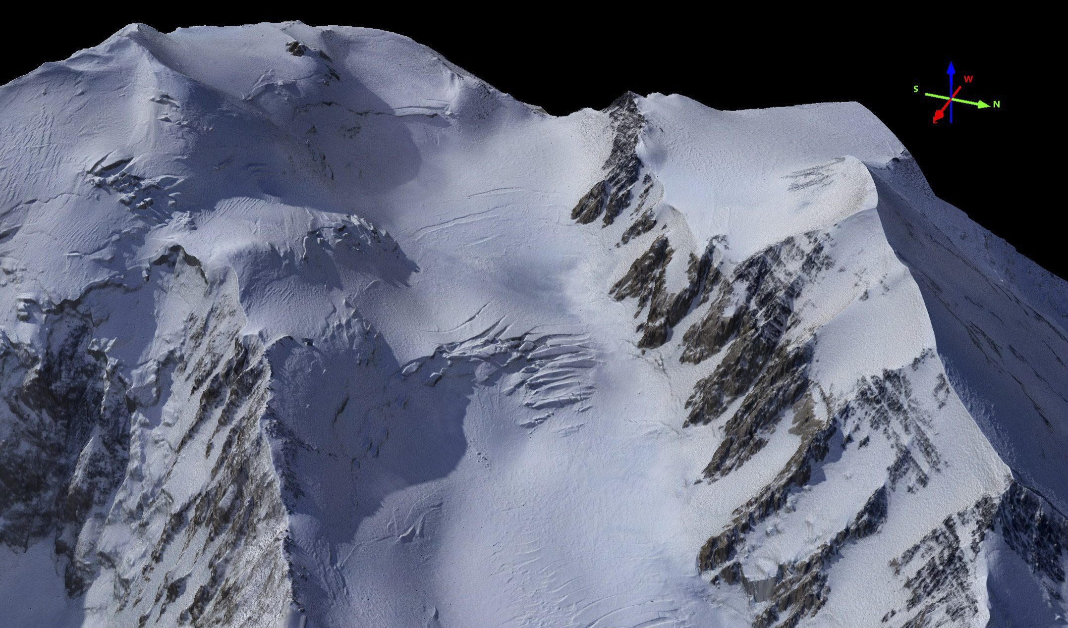
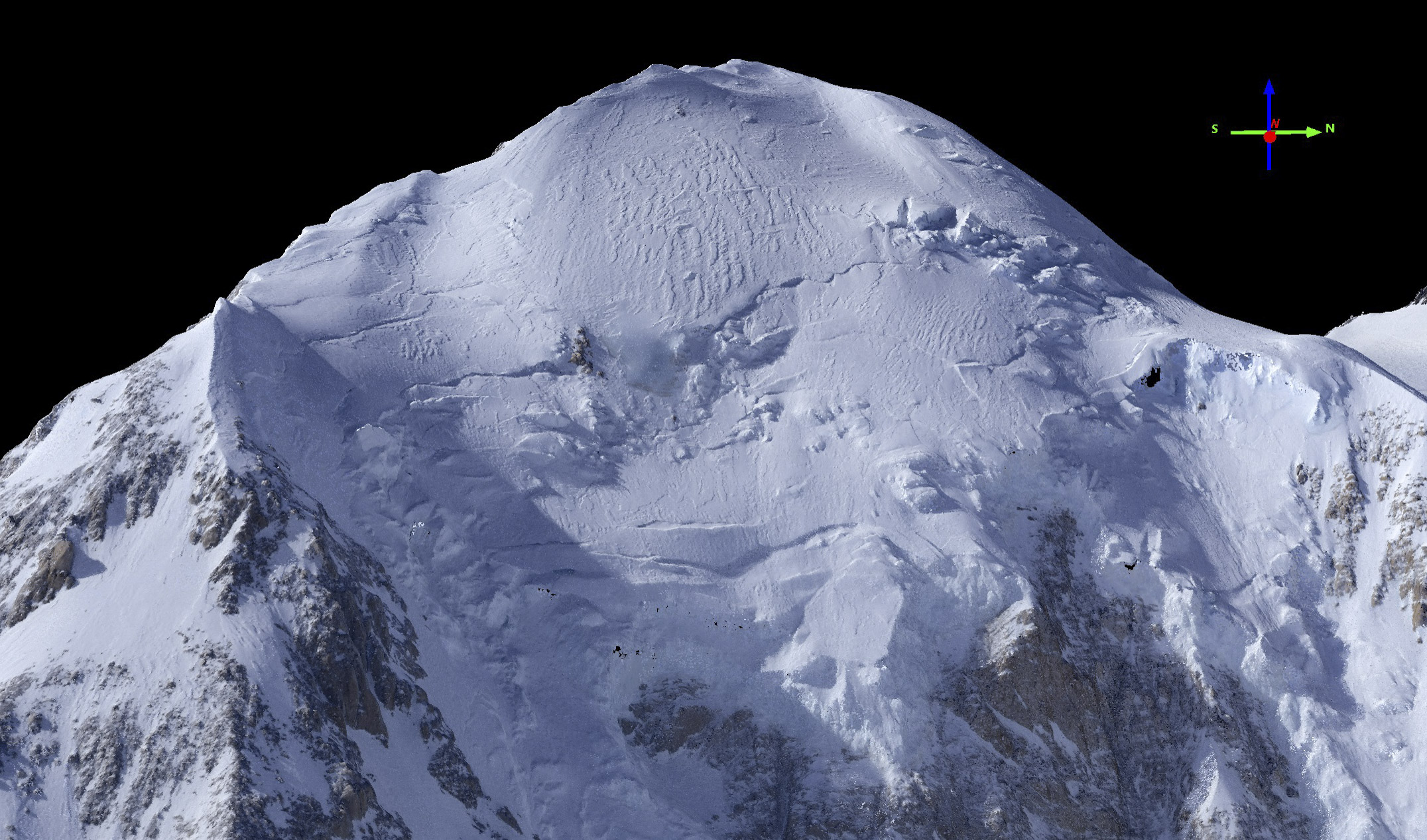
South Face.
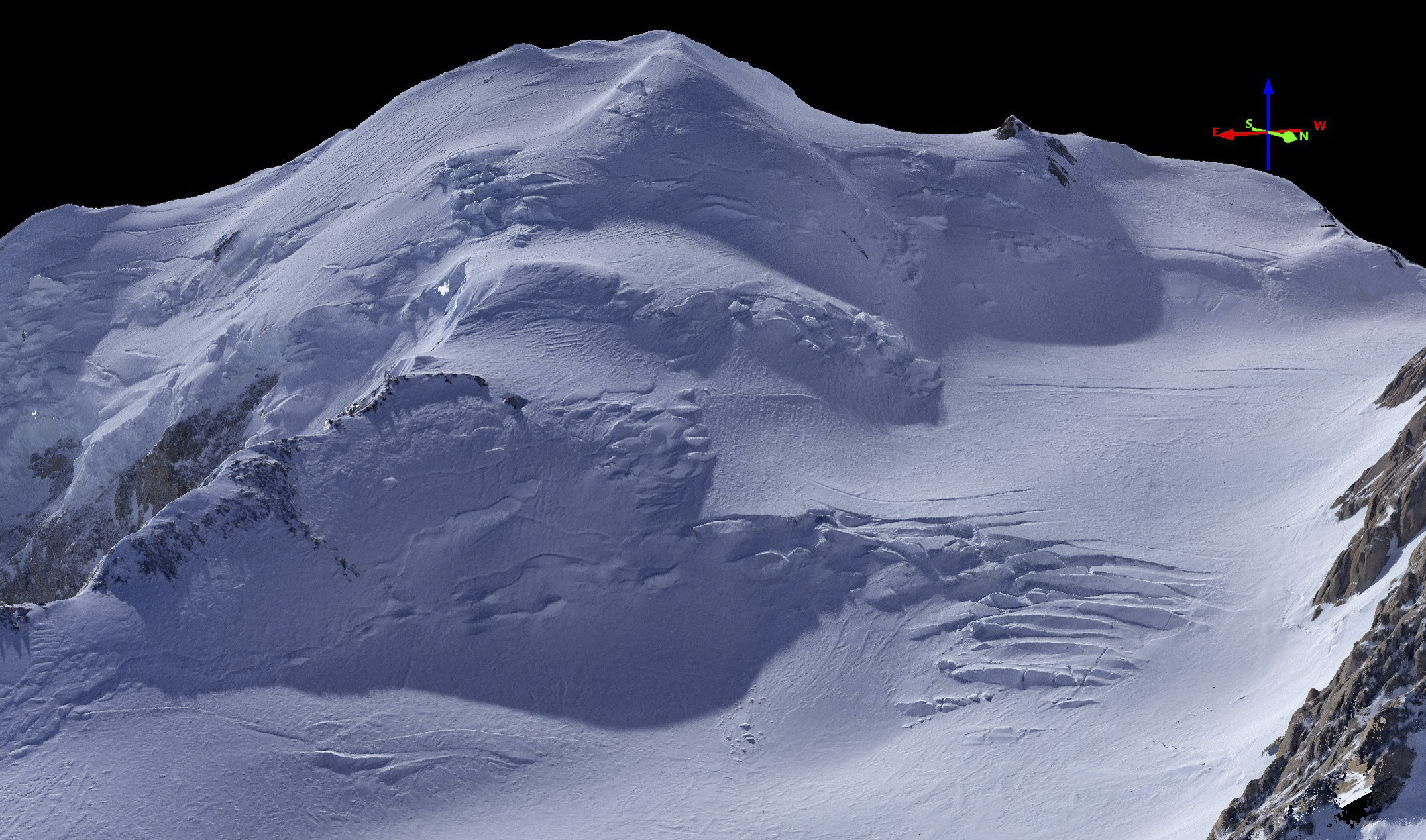
West Face.
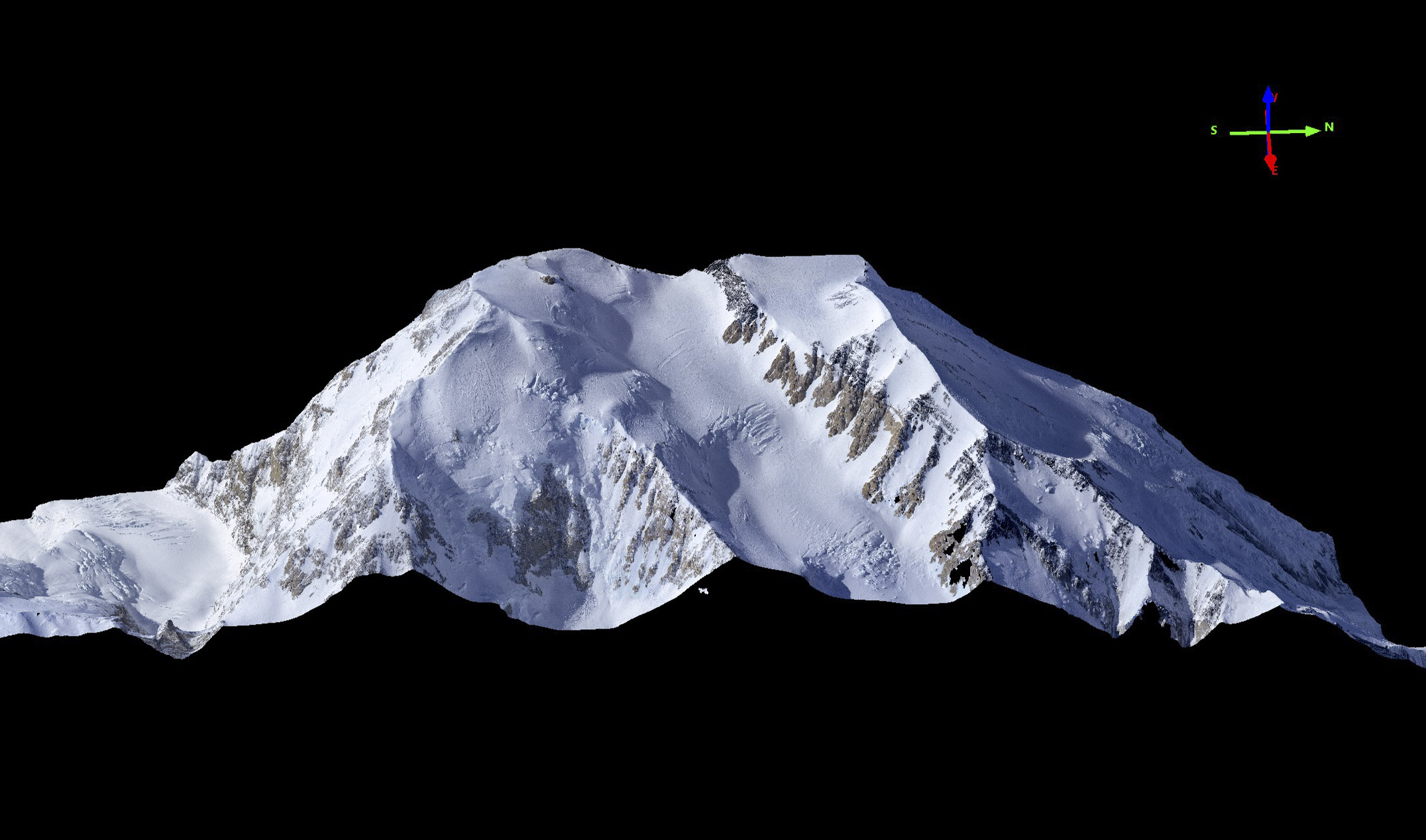
 East Face.
North face.
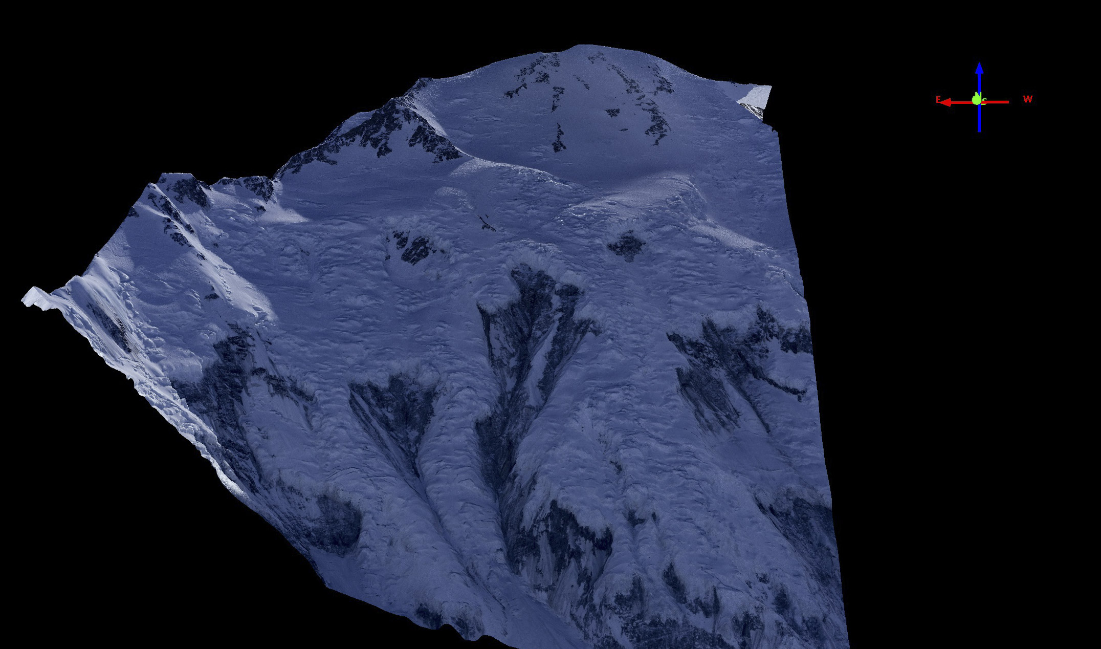
East side.
 North face of North Summit.
South-east face of North Summit.
Data Availability
To obtain a copy of the data for personal use, Like our Facebook page or add your name to our email list in the right sidebar (I never share these emails, the only emails you will get are my blogs, and you can unsubscribe any time). When the data are ready to be released, you will find out either via Facebook or a blog. I will provide a copy of the data that can be viewed in the free Quick Terrain Modeler viewer, so you can manipulate it in 3D on our local computer.
To obtain a copy of the data for commercial use, governmental use, or research use, please contact me directly at info@fairbanksfodar.com. There may be a fee associated with this data usage, depending on below.
If you are a TopoHero and would like to see full, unrestricted access to these data within the public domain, please contact me directly. The money I raise from this map will go towards funding my research on Denali and other high altitude glaciers.
Fodar Services
Fairbanks Fodar is happy to make maps anywhere in the world, particular as they relate to assisting underfunded scientists and land managers on issues related to climate change or development pressures. For example, we have recently been working in Botswana studying the impacts elephants are having on their habitats. We also offer turnkey hardware/software packages with training and support. Please contact me for details.
If you want to build your own fodar system, please help me help you by mentioning my name if you purchase any of the software below.