
Fodar Maps Ice Jams
After the horrendous flooding of the Yukon in 2013 caused by ice jams, I’ve been working on demonstrating the how fodar may help us understand ice jam dynamics, improve predictions of flooding, and determine the extents of water and ice damage to facilitate rescue and rebuilding efforts. I mapped various sections of the Yukon and Tanana River in 2014 and 2015, and the results at this point are indisputable — fodar can map the tiniest changes in river ice to reveal underlying dynamics in what otherwise seems like motionless, passive ice. Now if I just knew someone that studied ice jams that could put this tech to good use…
I think my very first contract for aerial photography was mapping the extent of bank damage along the Yukon River downstream of Eagle in 2009, when some devastating floods occurred. In any case, since then I’ve always been fascinating by ice jams and their dynamics.
Those are some big trees, but the floes are even bigger. I believe that here the ice actually was floating above tree level in places, and when the dam broke the ice just sank and squashed the trees.
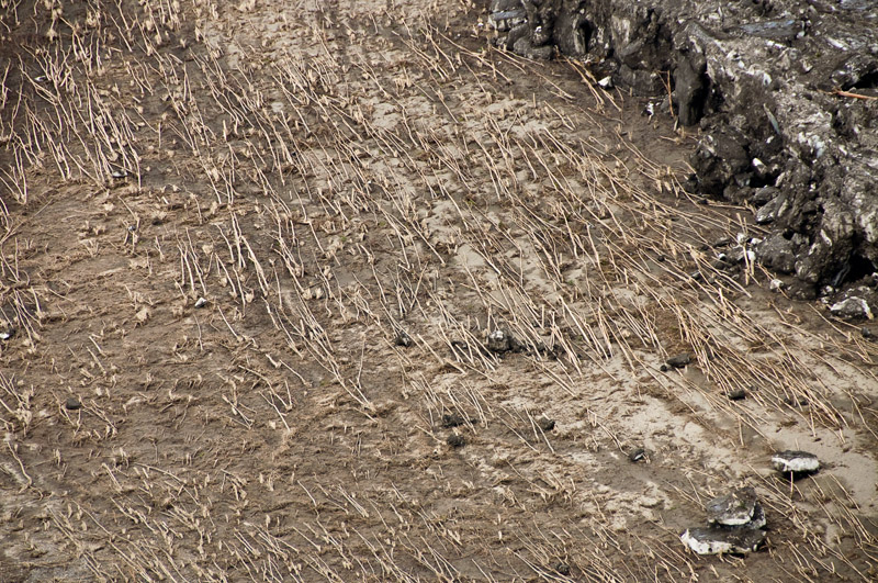
Here the trees look like match sticks. Note the ice to the upper right for scale. Massive.

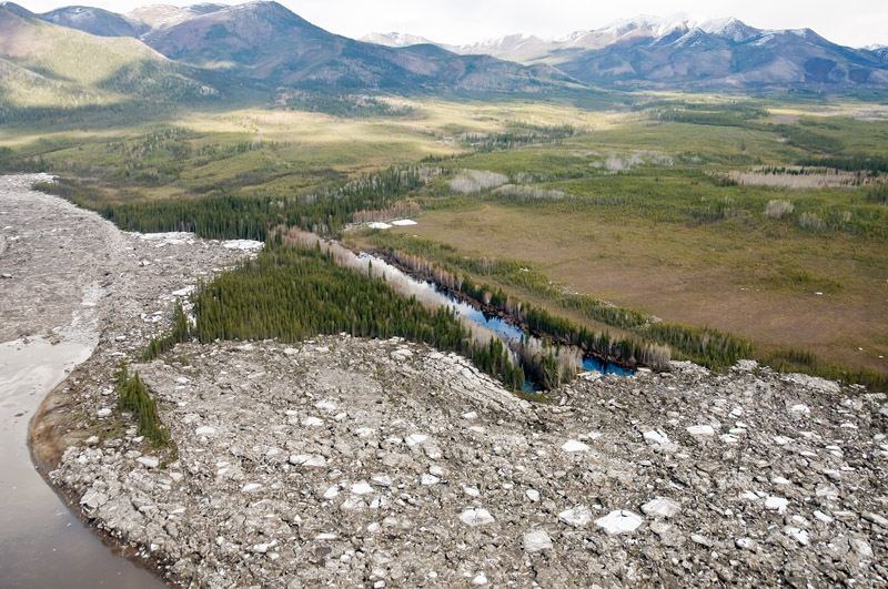
This unfortunately is the village of Eagle. If you look closely, you will see a few roofs interspersed between the ice floes.
It was 2014 before I mapped any river ice again, when I mapped parts of the Yukon between the bridge and Tanana several times. Fortunately for the residents, break up was mild and early that year. I made some preliminary maps in March to test things out, but by the time I returned from other field work in early May, breakup had already occurred. I mapped the river a few times after breakup to see if we could measure river discharge by tracking velocities of the moving ice floes, but as yet havent made the actual measurements. Should work though…
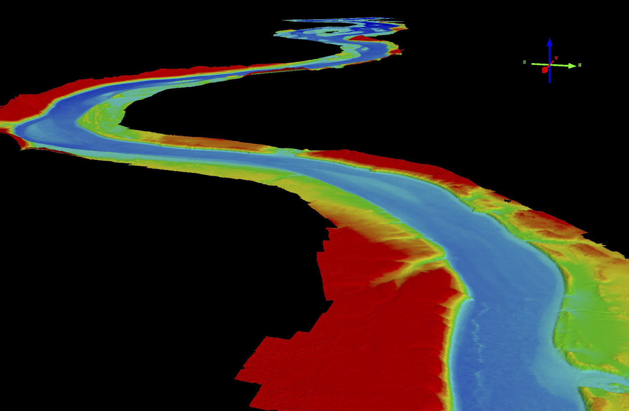
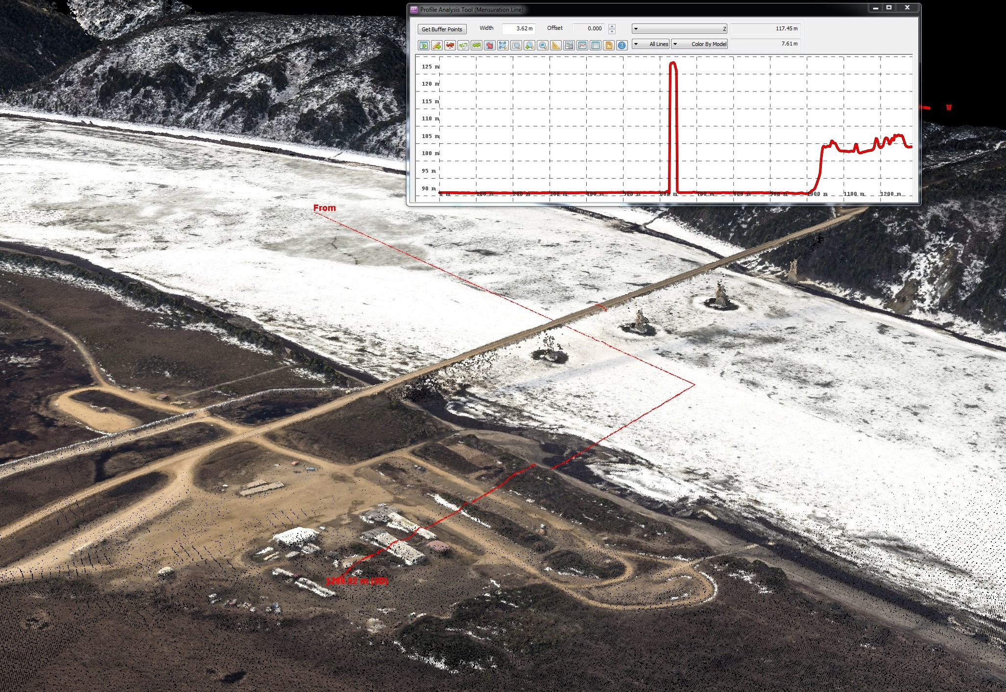 Here’s a point cloud at the Yukon River bridge crossing, demonstrating that we can pretty easily measure stage in comparison to the bridge height. Notice the map extends under the bridge, as it is a point cloud not a DEM. Note too you can’t see the top of the bridge piers so the road appears to be floating — this is due the road shading the piers from view as I flew over. Note the transect turns and comes up onto the truck stop, showing the land can be used as a relative gage height too at other locations.
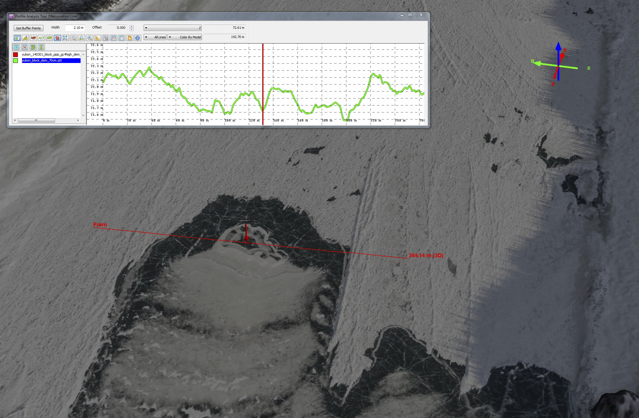
Here is something I spent a lot of time looking at. Mouse-over to see its topography. It sure looks like the river ice is moving over a hot spot or boil underneath it. You can see this from the bubbly ice that forms like rings downstream of it, and what appear to be shear margins alongside it. The center of the spot is roughly 50 cm lower than its surroundings. Who knows what weird things will turn up once you start looking for them at this level of detail?
Here is an oblique view of the topography of the Yukon River near that wierd thing. Mouse-over to see the image. I imagine the combination of the straight section of river with a bit of wind push (as evidenced by the windswept surface) is in part responsible for it.
By the time I returned to make more maps, the river had largely broken up. But I have a colleague that measures river discharge by measuring surface velocity of floating debris from pairs of satellite images then using those velocities to calculate discharge. We can do the same thing using air photos. Here you can see the large ice berg moving down the frame. What’s really happening is that I’m flying over it. By co-registering the surrounding landscape in each photo, we eliminate the apparent motion due to the airplane’s position and are left with moving ice. Because I know the time the image was taken to better than milliseconds, we should be able to get quite accurate surface velocities through feature tracking. The issue here is that it is nearly impossible to safely and accurately measure river discharge during breakup from the ground, yet this is often the peak discharge of the river for the year.
Given this was still largely a pet project, in 2015 I set my sights on the Tanana River, a bit closer to home, and tried to ensure I had a time-series going before breakup actually started. Fortunately again it was a pretty benign breakup all over. But the even better news was that we still measured some awesome dynamics, demonstrating that if we can measure such dynamics in a benign year, imagine what we can measure in a destructive year.
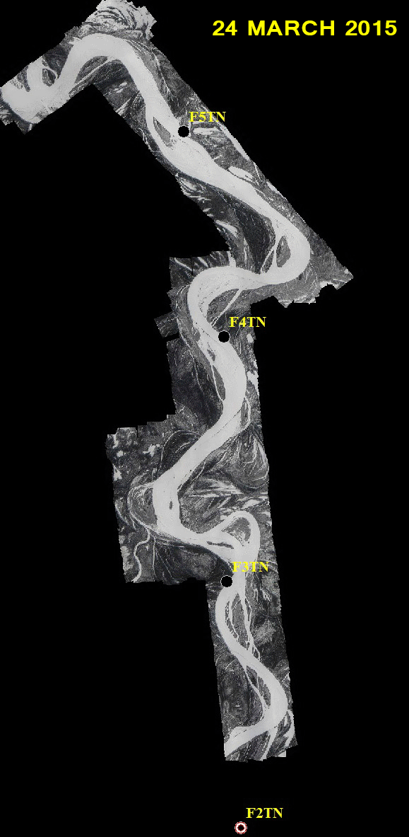
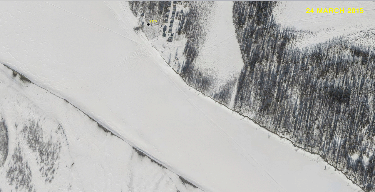
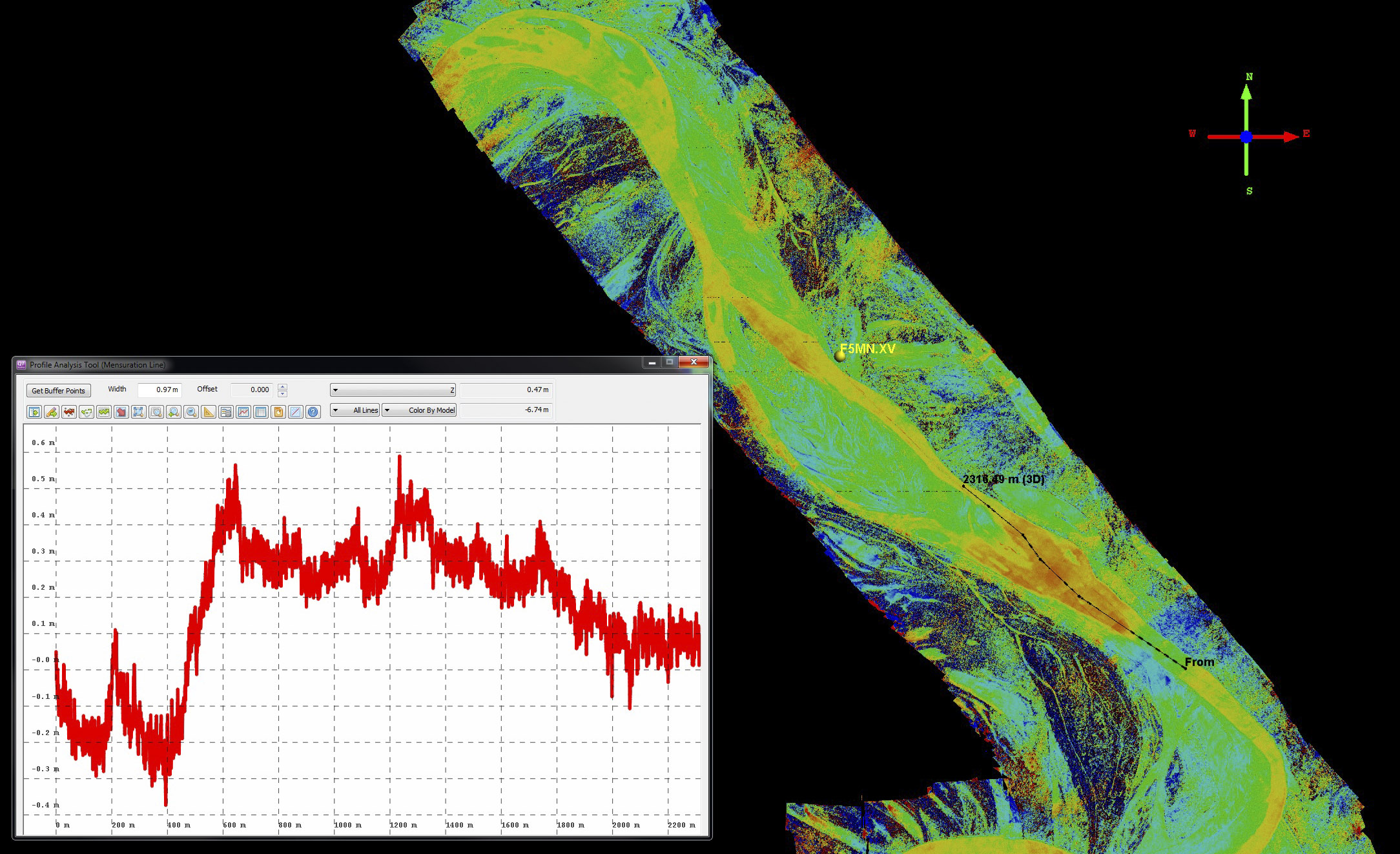
Here is the time-series from 2015 on Tanana River river near the bottom of Minto Flats. The labels refer to stations installed by Dr Carl Tape to study earthquakes and the earth’s interior, but he also has an interest in ice jams so we use them for reference. You can fly around the first acquisition in 3D by visiting Fodar Earth and flying just west of Fairbanks.
As we’ve come to expect with fodar, horizontal alignment of the maps was nearly perfect. I didnt do any horizontal co-registrations here (though it could probably use 5-10 cm); the apparent motion you see is largely due to the change in shadow length and direction. Vertical co-registration was also typical, or about +/- 30 cm, without any ground control; for the analysis below, I vertically co-registered the maps using snow free areas they had in common. I found a couple of things pretty cool about these images. When I made the late April measurements, there were broad sections of open water and I assumed the ice was free and moving. However, here you can see a snow machine trail is in nearly the exactly the same location throughout all 5 dates, even after what appear to be pancakes have formed in the ice. You can also see how stage rose by the end of April as small channels get activated by the higher water. This animated gif cycles through at different speeds for different purposes, click on it to see it full screen.
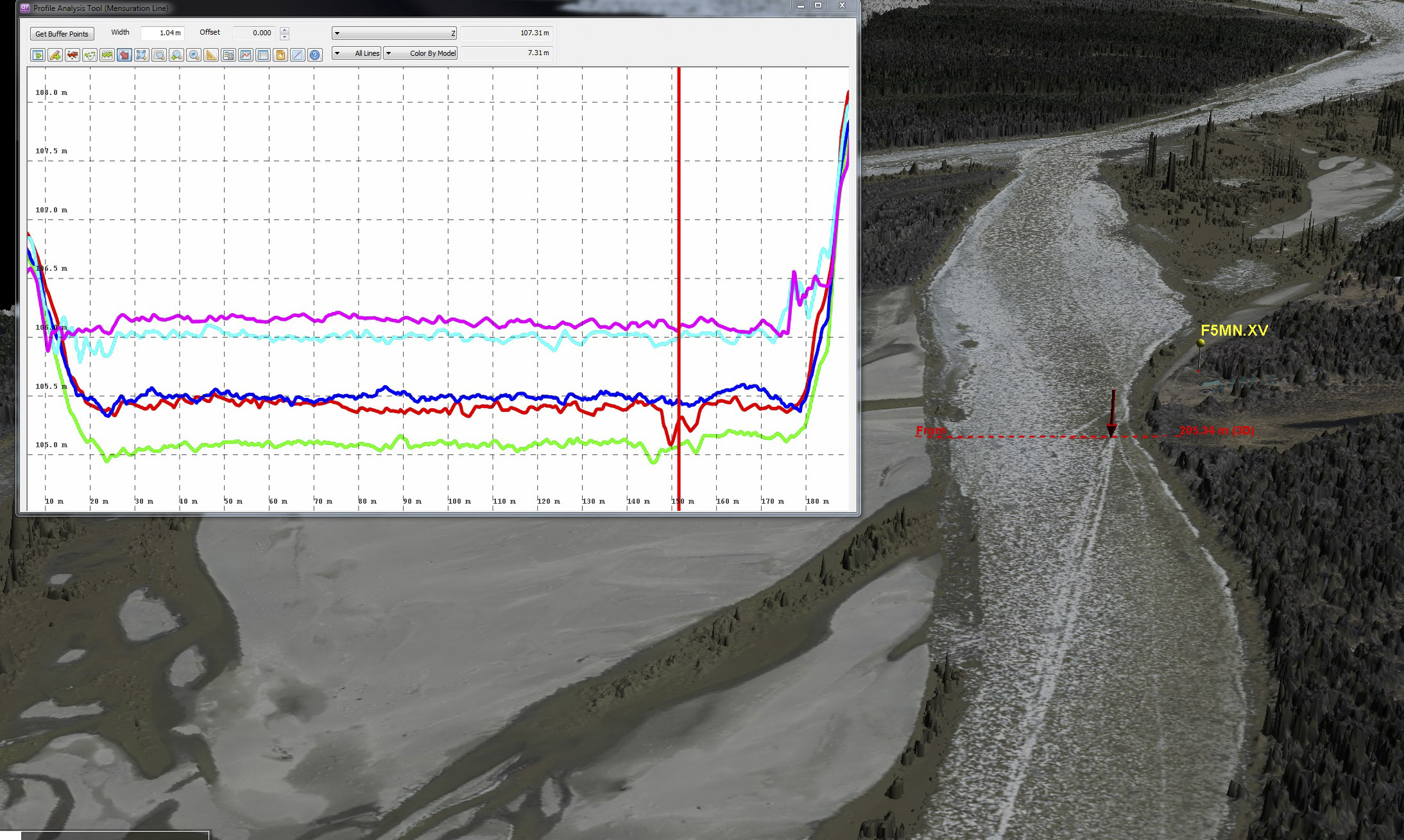
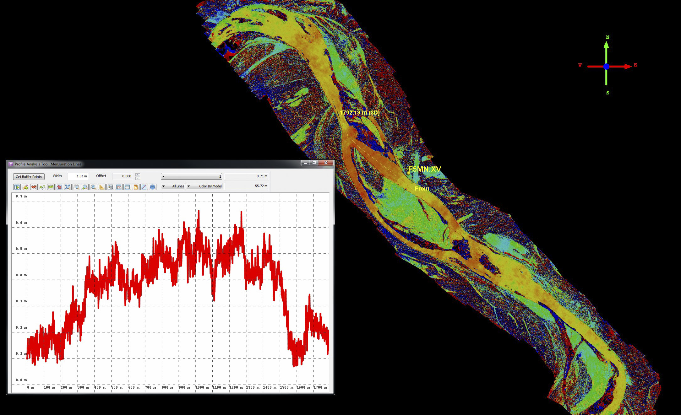
Here is a cross-profile show height change during the time-series, with 50 cm vertical ticks. The red trace is March 24 — you can clearly see the snow machine track depressing the snow by 30 cm or so here, indicated by the red pointer. The green trace is April 5, towards the end of snow melt. The snowmachine tracks are now quite muted, but still topographically present. The blue trace is 14 April. Here the bulk of snow melt has now completed, but the river height is coming up to offset it — things are starting to happen! But more on that below. The cyan and pink lines are 25 and 30 April respectively, revealing that river stage has come up about a meter since early April, as confirmed by the side channels filling with water. The spikes you can see in the muddy water are noise — fodar doesnt accurately measure the height of liquid water.
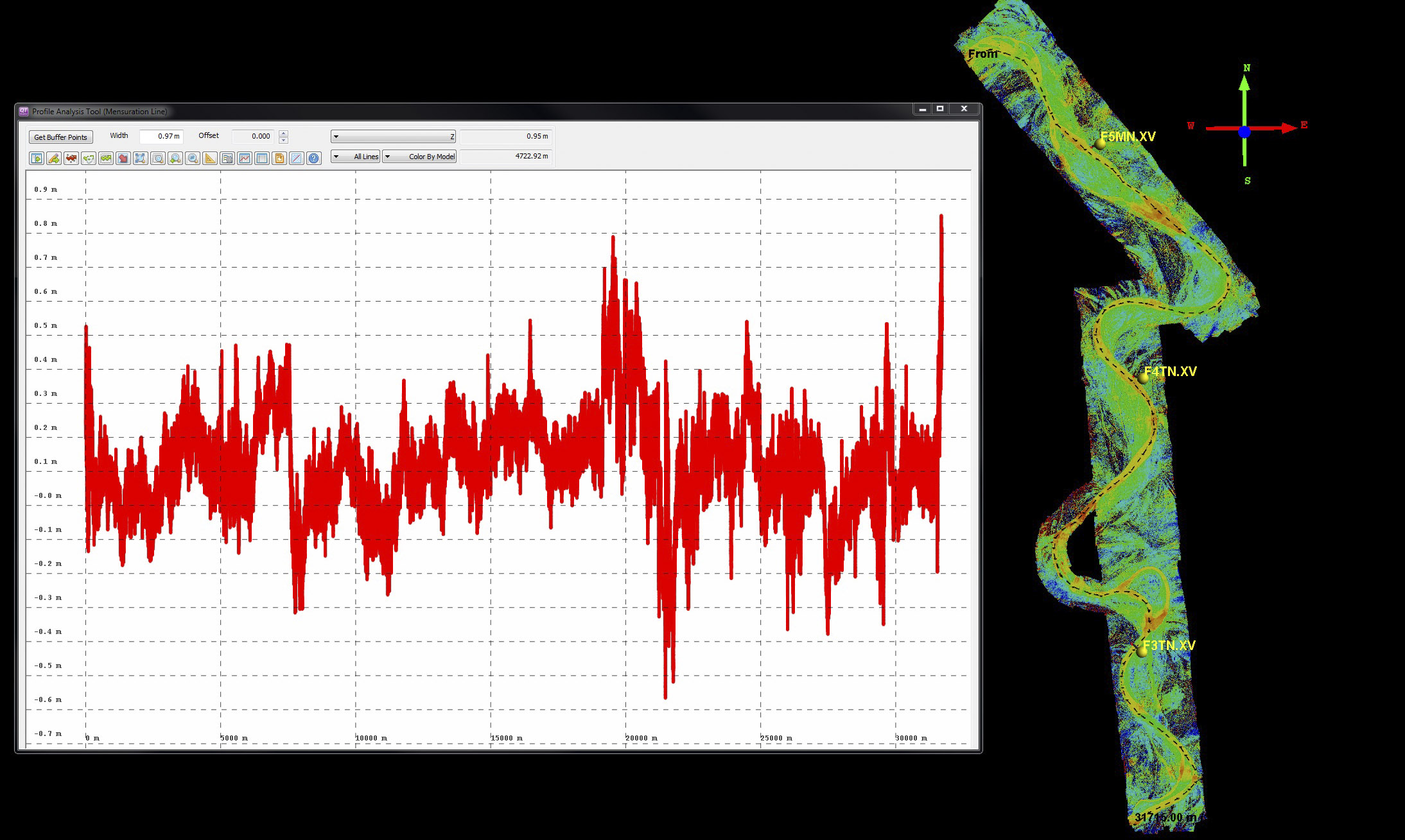
Here is a 30 km long river profile comparing the difference in height between 14 April and 24 March. The vertical ticks are 10 cm and the colors of the difference image range from – 75 cm (blue) to + 75 cm (red). Mouse-over to see the landscape at end of spring, and note that all the spatially coherent change (the yellow/red snake) is occurring in the river channel, surrounded by a green that represents little to no change. The mottled red/blues beyond that are forested areas, where spatial biasing caused by the tall skinny trees combined with tiny horizontal mis-registrations cause differences of +/- 15 m, but these can be ignored for the river ice story. What’s important here is that we are measuring a signal of ice-surface height-change from a few centimeters up to 50 cm. These are very subtle motions, and not too far above the noise level, but because they are confined exactly within the river channel, we know for sure that they are not noise or artifacts. The next several image pairs really drive this home. You can right click on the first image and open it in a new tab to see at fuller size.
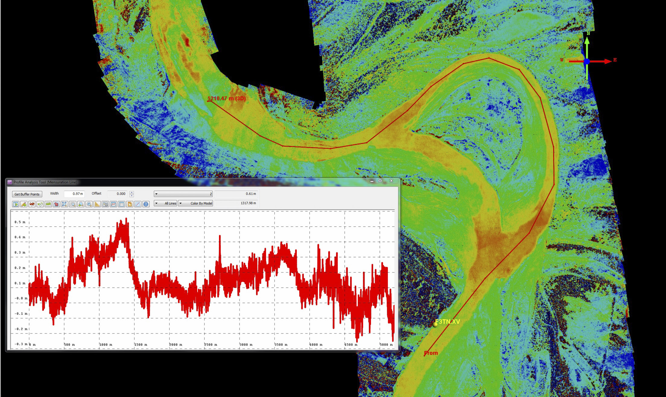
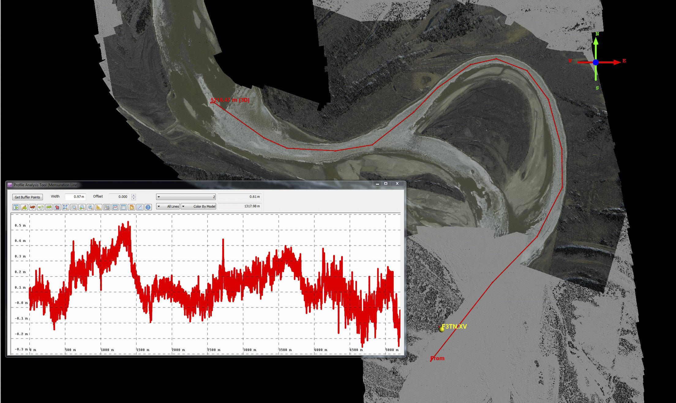
Here is a closeup of the same difference image (14 April minus 24 March) near site F3TN. The river flows north (up) in all of these images. Note that near 50 cm of rise occurs where the river splits into two braids, exactly where you would expect the ice to rise as it no longer fits in the channel it came from, causing the flowing water to push it up and out of the way. After the channels merge again and the single channel widens out, ice levels return to the same height. Mouse-over to see the 24 April image (note this map was not used to create the difference image, but it clearly shows the river boundaries; also note that this image does not have the same spatial coverage as the difference image and has 24 March beneath it). The yellows and reds indicating change align perfectly with the channel boundaries. Not only that, but some of the details of change seen within the river ice align with the ice breakup patterns two weeks later (as seen in the mouse-over image). For example, see how the tongue of ice on the 24 April image on the northern end of the transect corresponds with the difference image patterns. Similarly, see how some of the holes on the southern edge shore of the southern channel (without the transect) match between the difference image (made from 14 April and 24 March data) and the 24 April image. These holes are persistent features, as shown in the image pair below.
Here you can mouse-over the compare the April 24 image with the April 14 image. Note how patterns of snow and ice melt persist, particularly where open water can be seen in the later image.
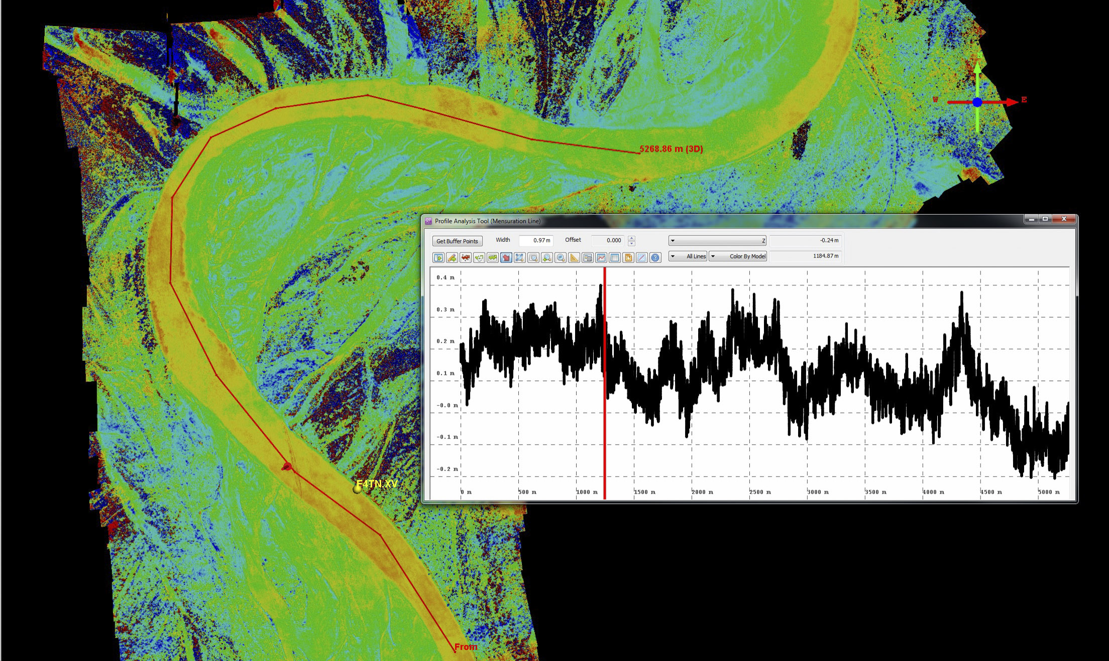 Here is the same 14 April minus 24 March difference image near station F4TN. Ice heights rise in the constrictions and bend, but lower again once they hit a straight section (end of profile) before rising once again in the next turn, exactly as I would imagine it should be (but these data are about the extent of my experience with river ice dynamics…). Mouse-over to see the 25 April image for reference. The pointer is placed next to a snow machine track that is about 15 cm high. Vertical ticks on the plot are 10 cm. Right click on the image and save it to a new tab to see at higher resolution.
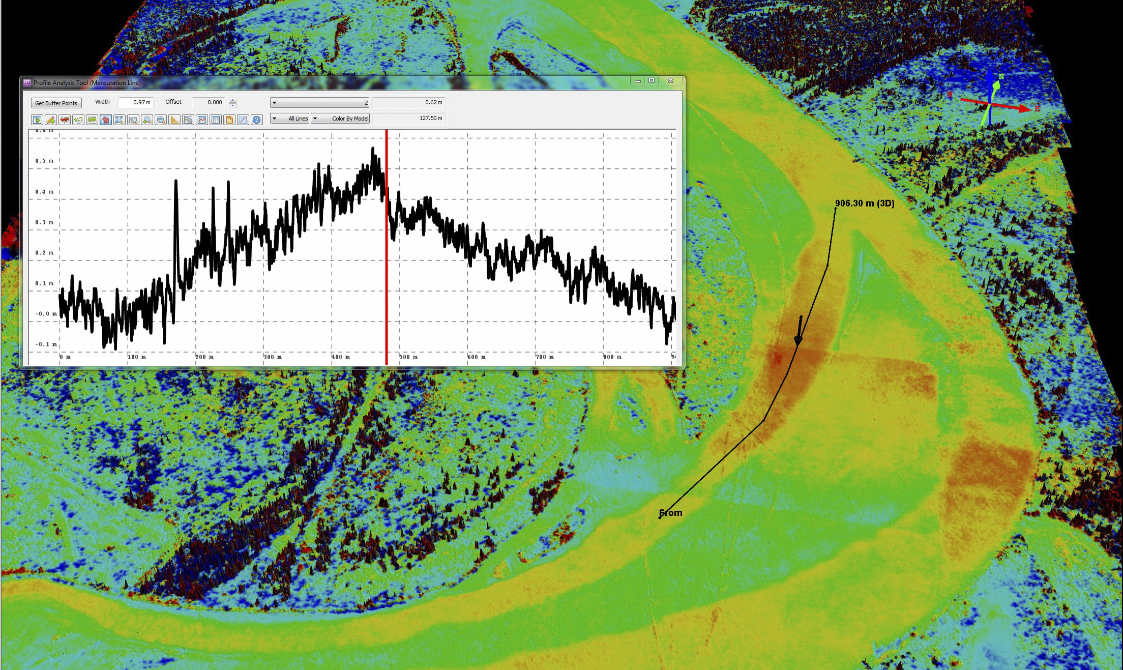 This pair show an example of the noise that can be caused when a photo or two are misaligned. The sharp red boundary at the location of the marker is the edge of a misaligned photo; you can see the lower boundary in blue beneath it as well as another photo in the channel at right. This happens sometimes. A little fiddling could improve it, but even so, this noise is on the 10-20 cm level, as seen in the plot (10 cm ticks) and does not interfere with the interpretation that something real is occurring in this bend.
A final example of the 14 April minus 24 March difference image. Clearly we caught the 14 April acquisition at the perfect time to capture some dynamics — snow melt was in full swing, river levels were coming up, but the river ice was still largely stuck in place, so something had to give. Here ice piles up against another bifurcation in the main channel. The straight stretch just before this shows no change between acquisitions.
Here is a difference image at the same location as above but using 30 April minus 25 April. The color scale is the same as before, -75 cm to +75 cm. The red-blue mottled noise is stronger near the river because more open water is present, which only generates noise. Here the ice seems to be freely floating on the water, though its not translating with it, as shown in some of the earlier images. The amplitude of height-change is roughly as before, about 50 cm, even though the water level itself has come up over a meter since the first acquisitions. Maybe its my imagination, but it seems like the biggest pile ups now are on the downstream end of islands where braids come together rather than the upstream end where they divide.
I think the essential point to keep in mind when looking at these data is that these are from a benign breakup, revealing change from a few centimeters to a few decimeters. During destructive breakups, the height changes can be a few meters to a few tens of meters — a factor of 100 more. So if we can measure these small changes so well, we should have no issue measuring larger ones, and hopefully making fodar time-series of both benign and destructive breakups will yield new insights into those dynamics that can aid prediction and thus human safety. As far as I know (which isnt much in this case), this time-series from the Tanana River is the first of its kind, so every new map is likely to yield new insights with a potential that seems unlimited. All we really need now is some interest from those who study river ice, as I’ve about reached the limit of my ‘expertise’ on the subject…