
Fodar – Botswana Style!
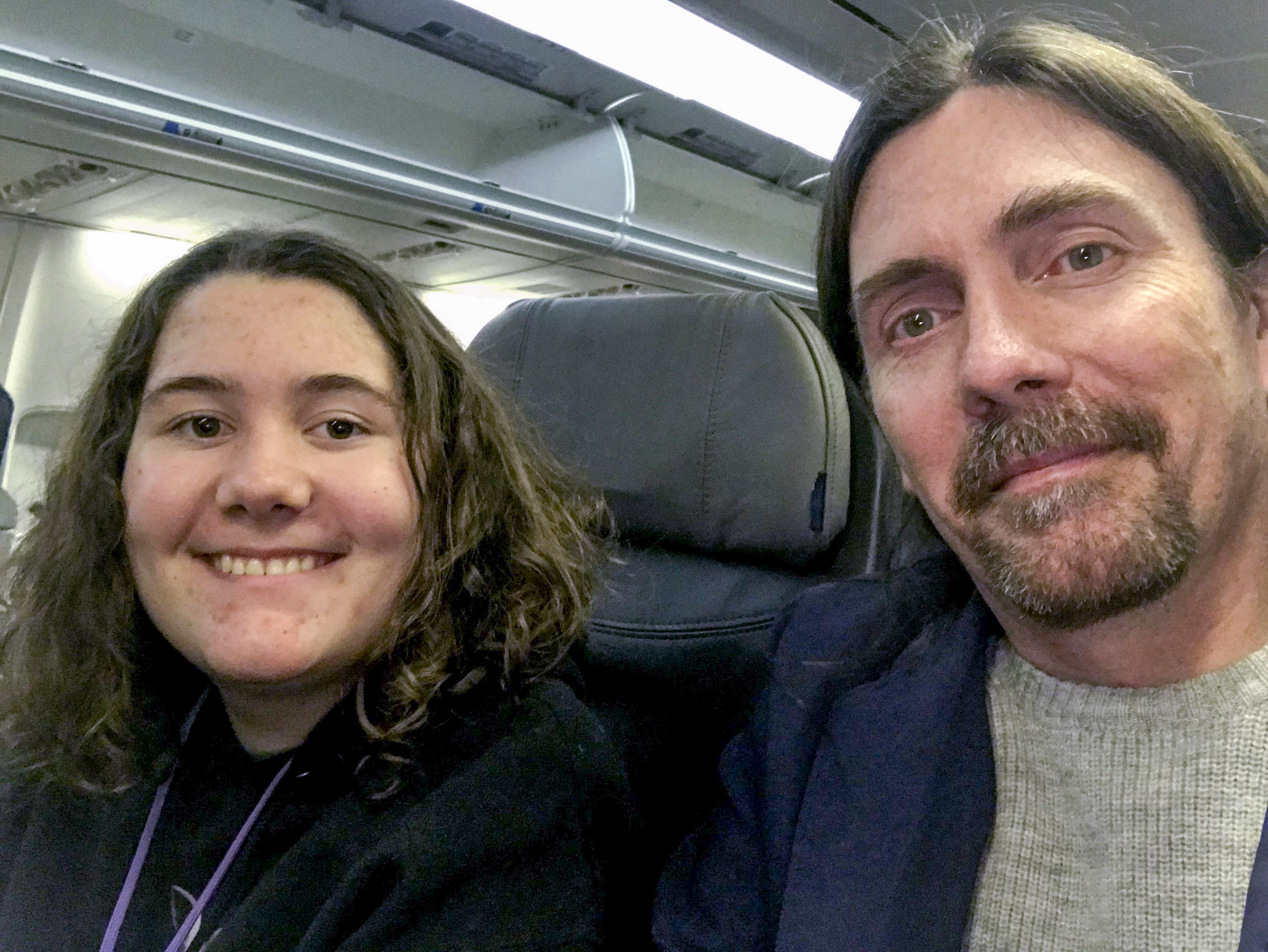
After a busy summer mapping in Alaska, I headed south, really far south — to Botswana!
This story begins one day last year while I was watching a documentary about the Okavango Delta and thinking about the cool fodar mapping possibilities there when out of the blue I received an email from the Okavango Research Institute (ORI), a branch of the University of Botswana, telling me how cool they thought it would be to do some fodar mapping there! Among many other things, these scientists study the the fate of the Okavango River, which begins deep within the Angolan highlands and flows over a thousand kilometers to reach Botswana, which would otherwise be mostly a comparatively barren desert. Once reaching this incredibly flat country, these waters spread into an alluvial fan known as the Okavango Delta, creating a huge swamp and explosion of plant growth that attracts probably the densest concentration of wildlife and tourists in southern Africa. And literally while I was watching a documentary describing this magical oasis and day-dreaming about mapping it, the scientists studying it reached out to me to see if fodar could remove some of the roadblocks to their research goals. This blog tells the tale of how that amazing coincidence led to the creation of the best maps ever made of the Okavango Delta. It also may serve as an introduction to understanding and working with these data for my colleagues in Botswana, hopefully stimulating even more ideas for how to put it to good use. For those that have followed the Fairbanks Fodar saga over the years, it may serve as some indication of where I’m headed in the future, which is hopefully to support the efforts of underfunded scientists, land managers and citizens around the world in their efforts towards ensuring the best possible legacy for future generations through responsible management of public lands. And finally for those new to fodar or Botswana, simply browsing through the images and movies may give you a taste of what all the fuss is about.
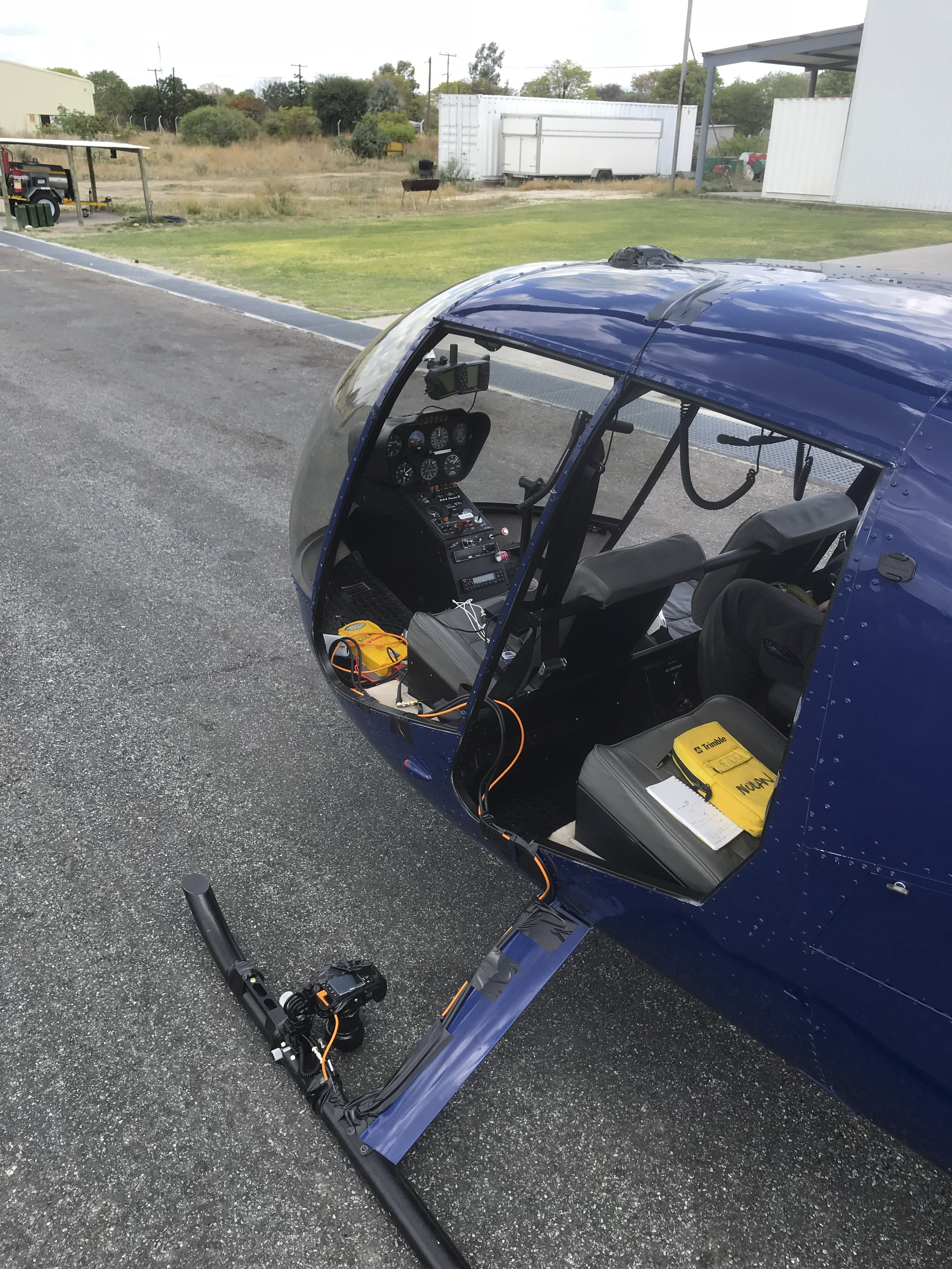
It took over a year between that initial contact and us actually going down there. The first step was to identify the potential needs for the high-resolution, high-accuracy, low-cost maps that fodar can create. One such need was simply a current topographic map and associated orthophoto of the area for use a GIS base map by all researchers and land managers, such as for habitat mapping or numerically modeling flood extents and behavior. But the real power of fodar is topographic change detection — with a system like this in their hands, they could map the topographic changes caused by the annual floods, measure habitat change caused by elephants, predict and mitigate human-wildlife conflicts, etc. The possibilities seemed endless. However, the differences in time zone (11 hours), language, culture, infrastructure, ecology, and economy posed formidable challenges to putting concrete plans together, and from my experience it is hard for people to recognize the possibilities for the data until they see their backyard mapped in 3D. The biggest logistical challenge was perhaps simply sorting out aircraft from so far away. The institute had no aircraft of its own and none of the local commercial fixed-wing operators showed any interest in being involved, or indeed even responded to my inquiries. I started thinking that perhaps fate was not on our side and that the major goal of this first trip would simply be knocking on hangar doors to see if I could sort out an aircraft in person, when I decided to email the local helicopter company, Helicopter Horizons. The owner responded to me almost instantly and said his fleet of R44s and Jet Rangers were available and up to the task. I had never tried my system out on a helicopter before, but given that this seemed to be our only option, it seemed worth a try. The challenges were not trivial — how to mount the camera looking downwards, how to protect the camera from vibration and the elements, how to mount the antenna on the roof, how to keep the system powered on batteries alone, how to run the cables, etc. But after a few frantic weeks of system redesign and testing on my home-made helicopter-simulator (aka my pickup truck on a bumpy road), Turner and I packed our bags and headed to Africa!
NOTE: To get the most out of the rest of this blog, you will need a computer with a mouse, as most of the data figures compare two images using a mouse-over, such that you can flicker between them using your mouse, and that only seems to work once on phones and tablets (that is, no flicker, just one image flip when you tap the image); plus the bigger your screen is, the more detail you will see. Further, the interactive 3D fly-throughs require a mouse with a scroll wheel, as clicking-and-dragging the scroll wheel is what causes rotation of the scene. Also, I noticed sometimes the movies don’t work from my iPhone, but always work on my computers. Fortunately I’m better at mapping than html…
It was a long trip getting there, but within 24 hours of arrival we had made our first maps! Here’s a sneak peak…
Here is a fly-over of the fodar data we acquired at Maun Airport in Botswana, taking us from outer space and landing at the Helicopter Horizons hangar. An important point here is that fodar projects are scalable — this is actually a small project and I have mapped thousands of square kilometers like this in Alaska, so mapping the entire Okavango Delta (or all of Botswana for that matter) is not limited by the technology, only interest and funding. Here we are looking at the fodar point cloud.
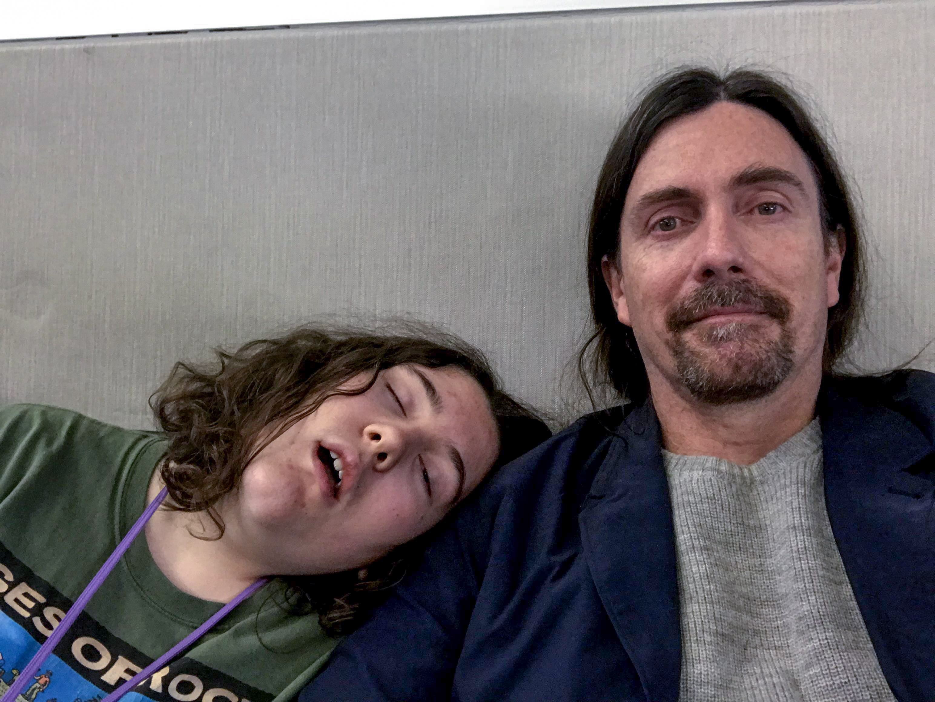
In total it took about 60 hours to get there, including an overnight layover at JFK. Our base for the trip was the city of Maun, where ORI is located. Maun is also the primary jumping-off point for the Delta for tourists on safari, though most people only see the airport on their way through. Because of this tourist traffic Maun Airport is the busiest airport in Botswana and I would say likely as busy as Fairbanks International; later our pilot Barry aptly put it: “Maun is a drinking town with a safari problem”. Our first task on arrival was to find the rental car I reserved on line. After dragging our bags across the street, up some stairs, and through an alley we found the office only to discover it closed at 1PM on Saturdays, despite accepting my reservation starting at 3PM. Not that it was a big issue, but it was this sort of thing that makes you wonder what the future would hold for low-budget, high-tech mapping in the middle of nowhere… But we eventually made it to our hotel, met up briefly with our colleagues, confirmed with the helicopter company that we were planning to meet early the next morning, and then collapsed into bed.
We’re headed to Botswana!
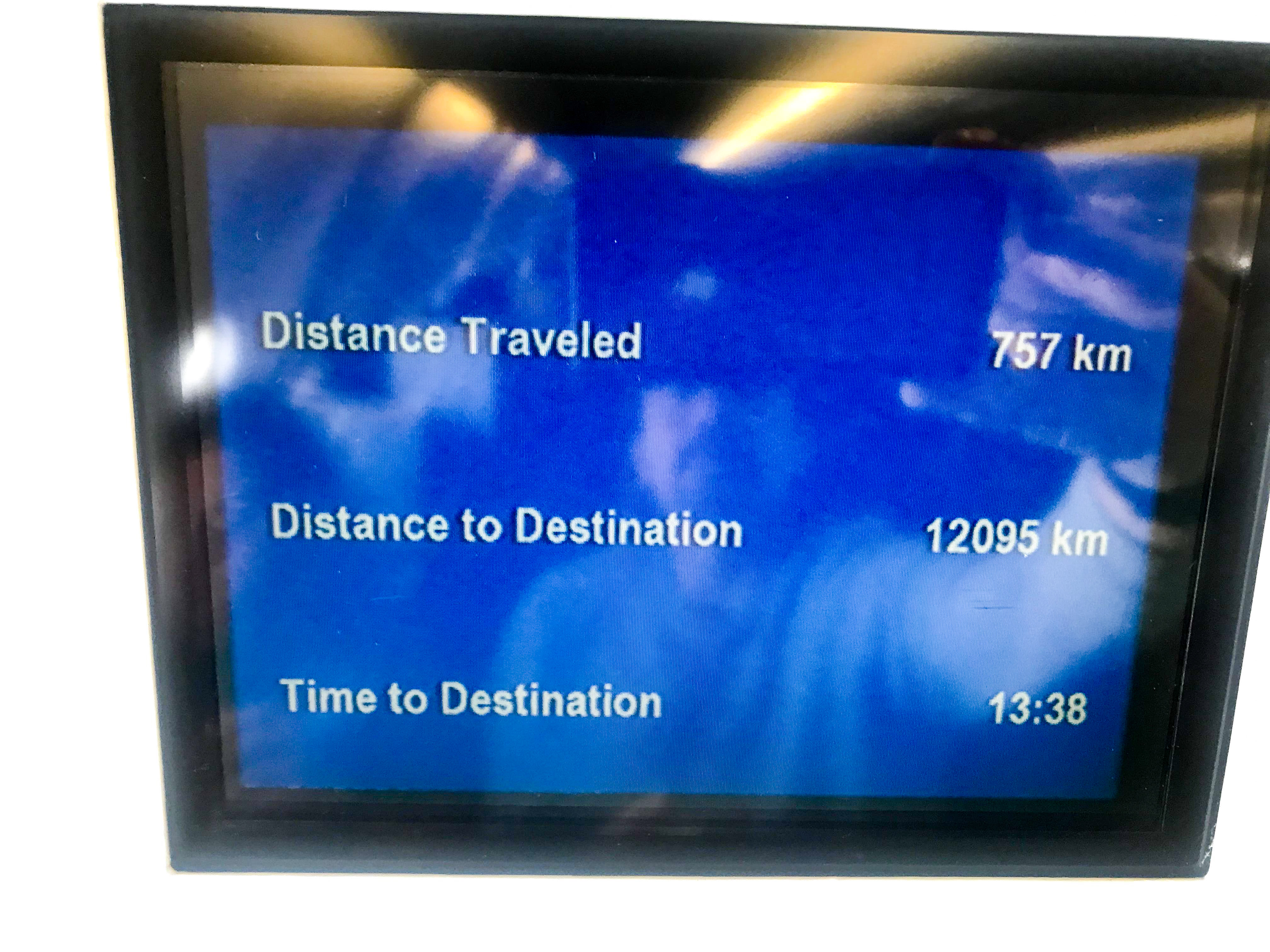
This was just one flight, it was a long trip…
There was a lot of this…
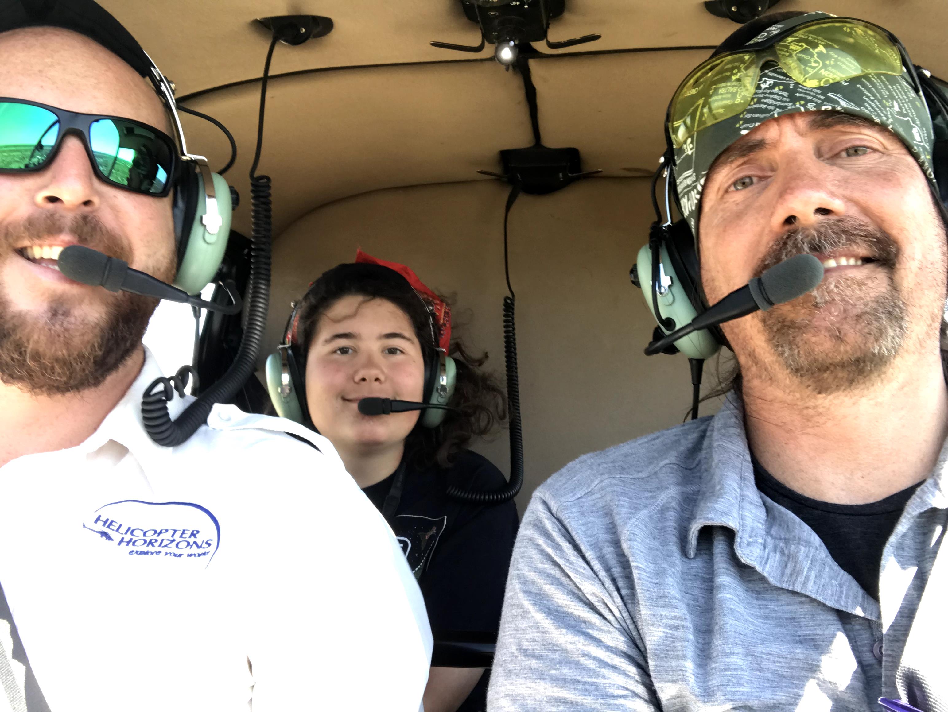
We found our way to the hangar early on Sunday and got straight to work sorting out a plan. Each helicopter is a little different and, having never done fodar with a helicopter before, there was some learning curve. Our pilot, Barry, was especially helpful in getting us sorted. In the end, it took less than two hours of scratching my head and rummaging through the bag of adapters and clamps I brought before we had everything attached and functional. So after a quick lunch, we headed out to try to make history…
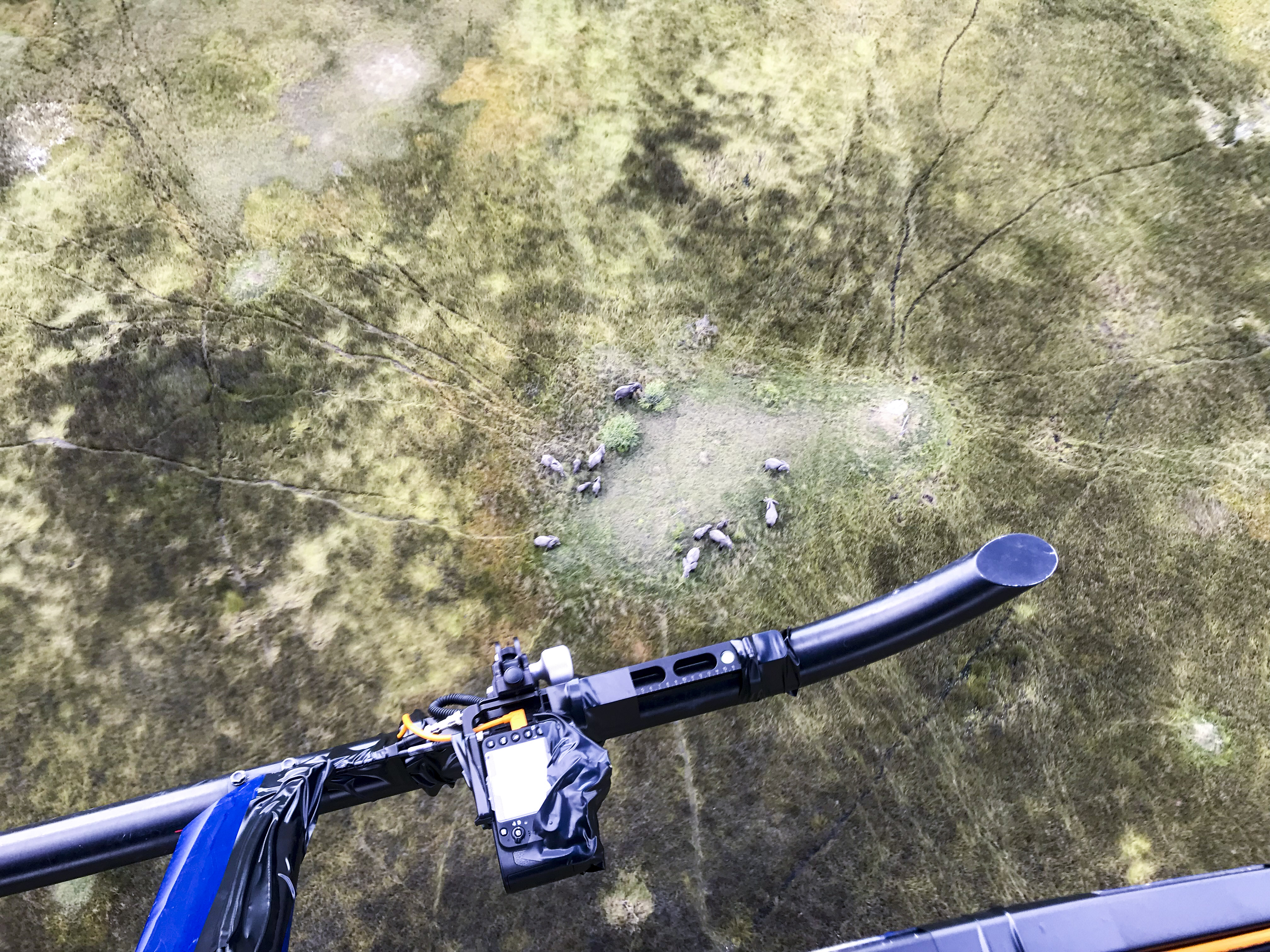
The next two hours were mind blowing. Not only did the system work flawlessly, the wildlife lived up to its reputation. Just minutes outside of town, we saw herds of elephants, zebra, buffalo, giraffe, hippos, and more. It was like stepping onto the set of the Lion King. Or at least flying over it. While I have nothing against helicopters, my mind is always wrapped around airplanes and so in general I was not enthusiastic about the switch or having to do first flight tests in the field rather than at home. But those concerns soon melted away as we hovered above hippos, followed masses of Cape Buffalo on the run, and looked down on giraffes stripping the leaves off acacia trees. The terrain itself was fabulous. It reminded me of the Tanana and Minto flats near our home, just flat swampy terrain with subtle differences in height causing major shifts in vegetation types. Our flight only last about two hours, but it made a permanent impression. When we got back to our hotel to pass out from jet lag, heat, and overall exhaustion, Turner told me that when he turns 18 he wants to move to Botswana to be a helicopter pilot. We couldn’t ask for a better first day in Botswana!
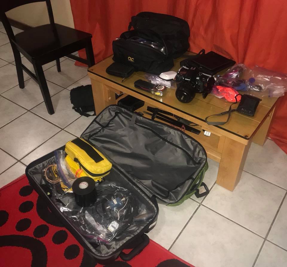
The entire system fit into one of my two checked bags — I didn’t even need to pay excess bag fees! Try that with lidar…
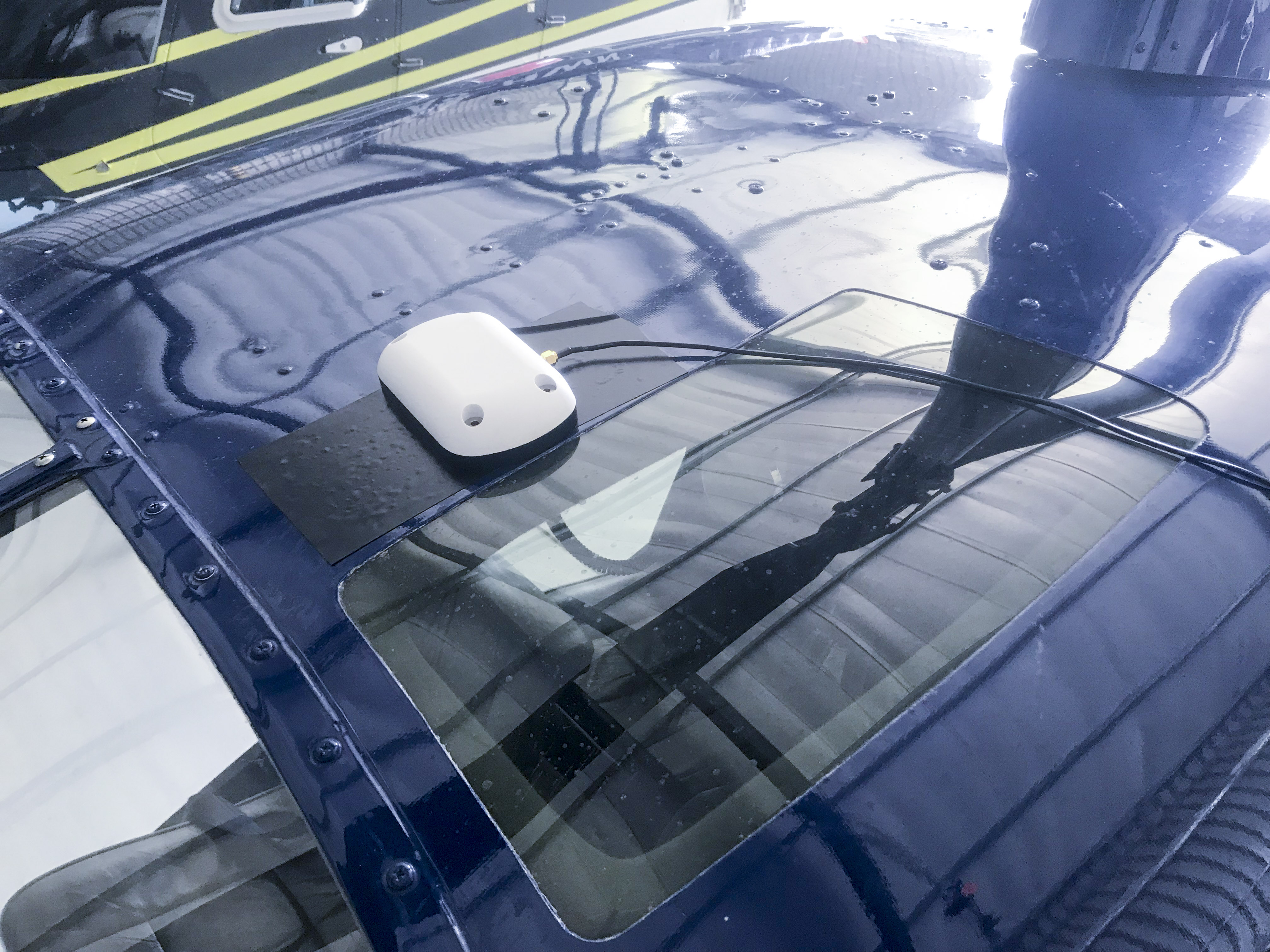
One challenge was figuring out how to mount the GPS antenna to the helicopter. I ended up using some high quality tape.
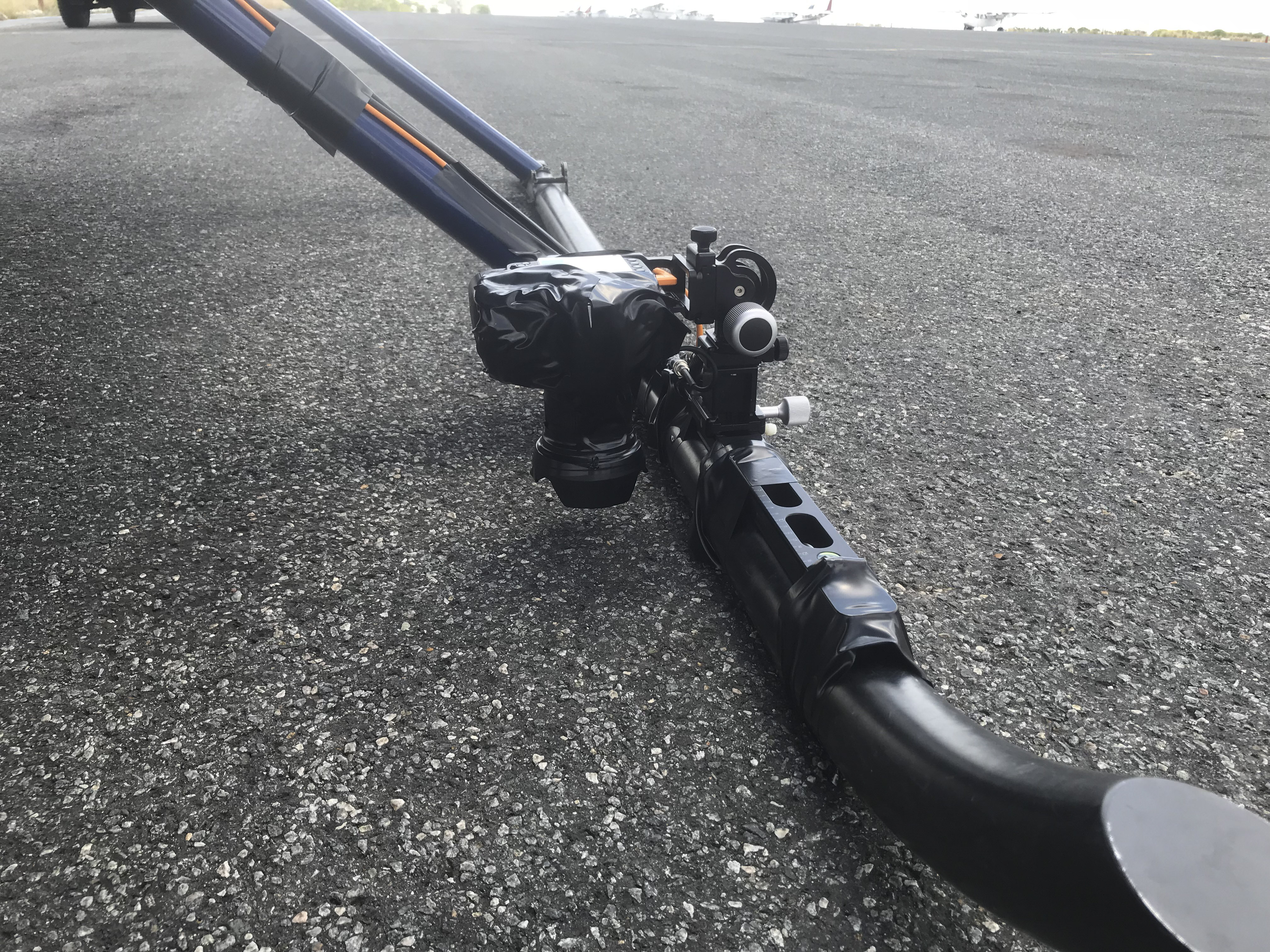
I mounted the camera directly to the skid. A little bouncy down there, but seemed to work out fine…
Fodar — Botswana style!
The camera did fine. Unfortunately it left me with only my iphone for pretty pictures.
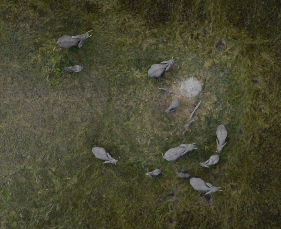
This is a crop from the mapping camera. These elephants are now part of the map (shown later)!
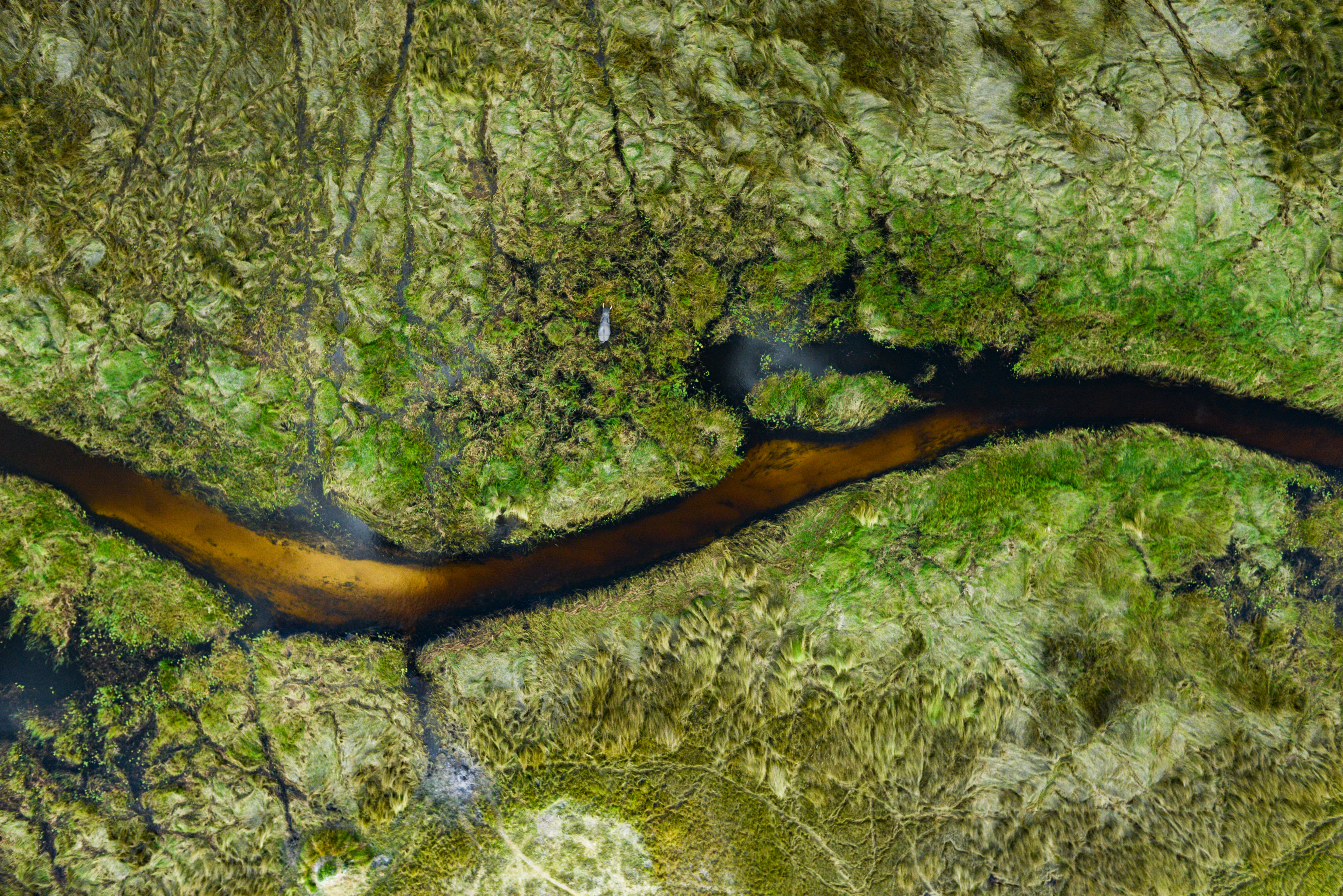
A lone tusker sloshes through the swamp (and he too was captured topographically for all eternity).
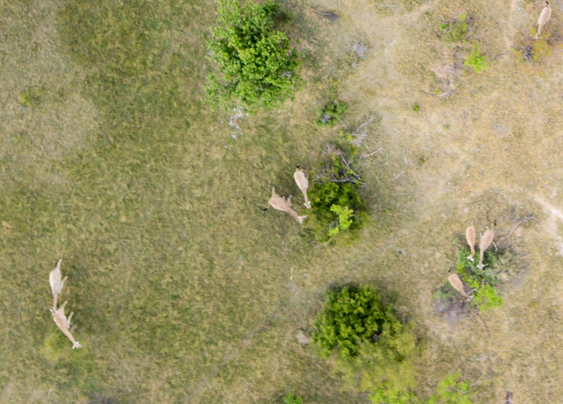
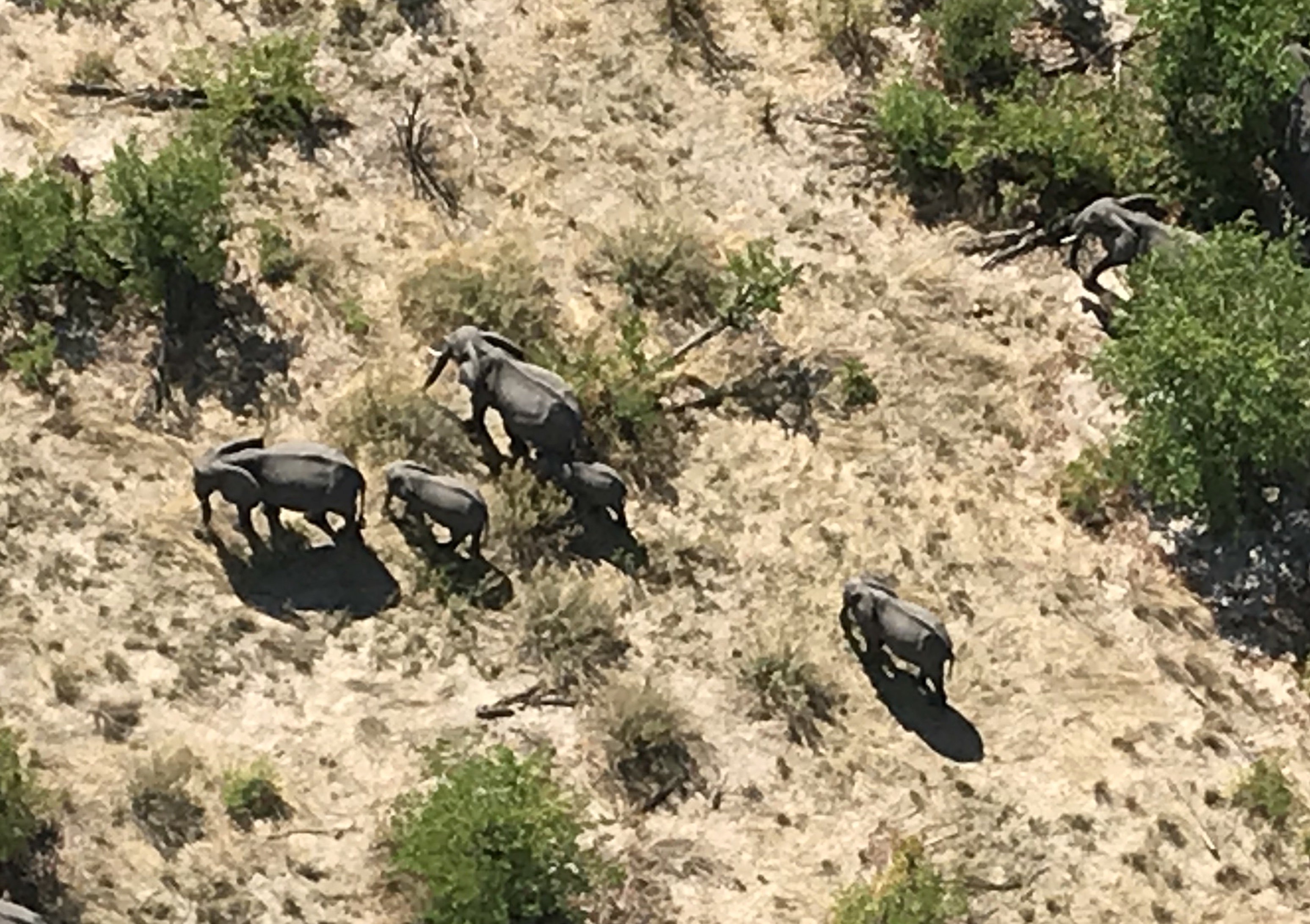 There are lots of elephants in Botswana.
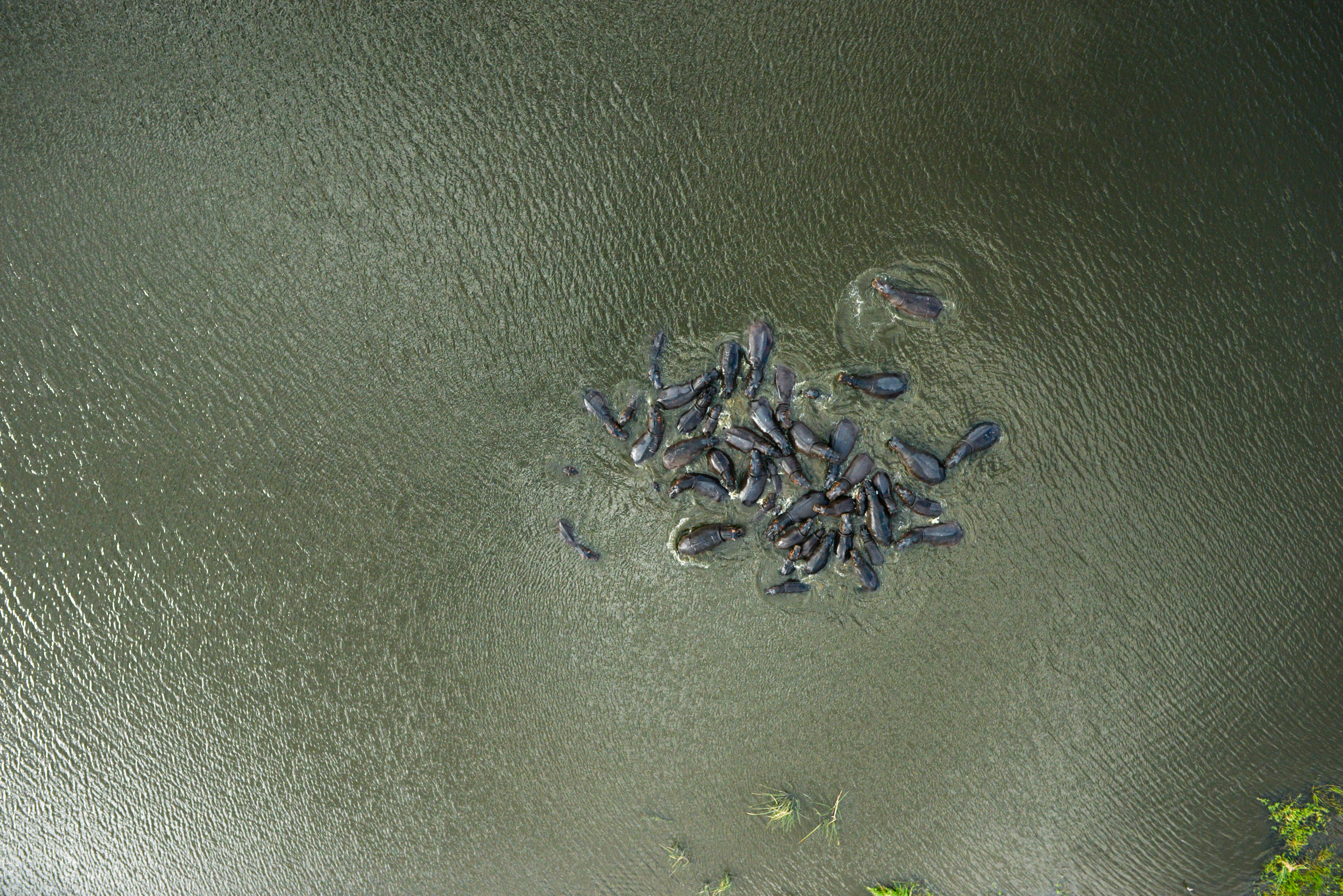 A pod of hippos posed for us.
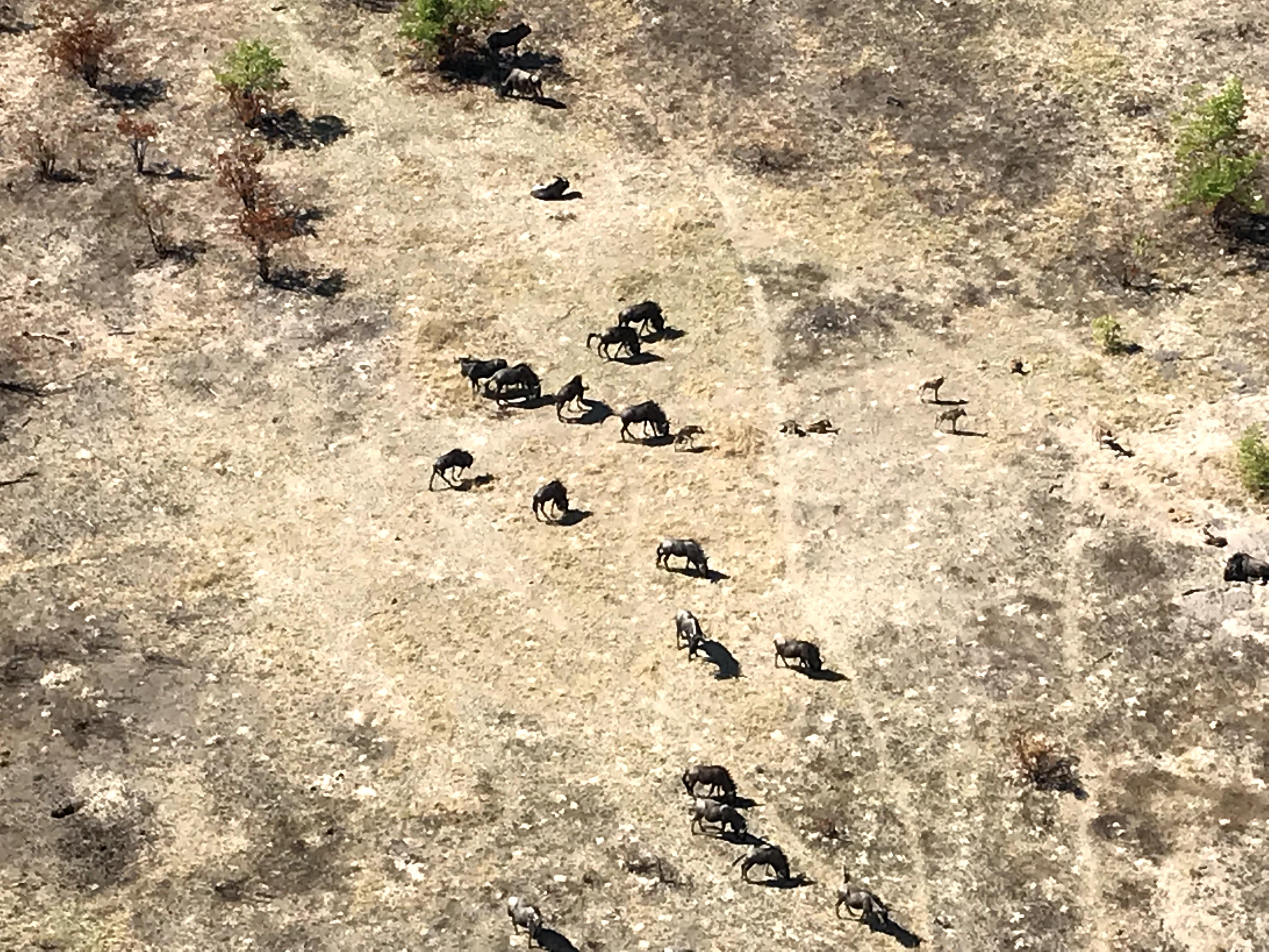 Wildebeest. They always seem kind of angry…
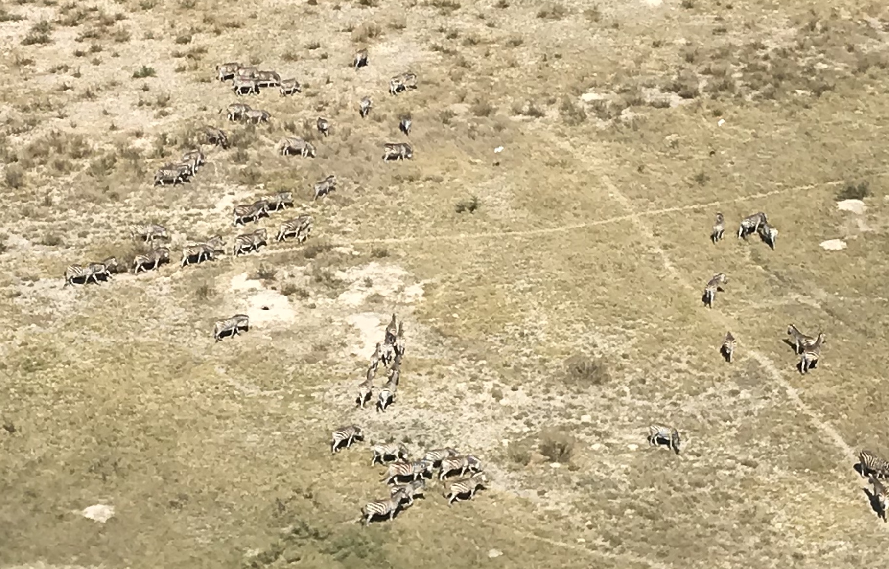 Everybody loves zebras.
A herd of Cape Buffalo playing follow the leader.
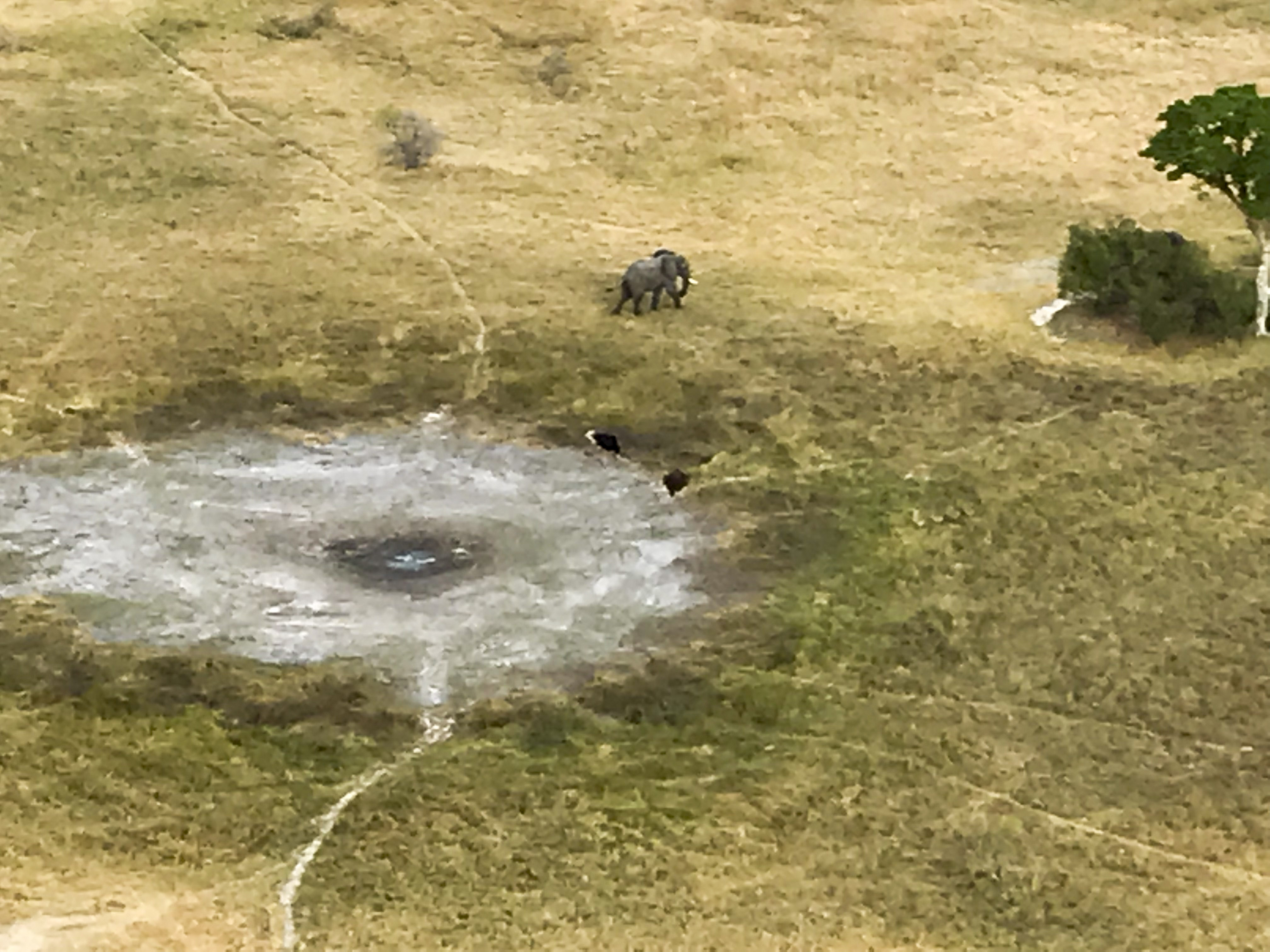
An elephant and pair of ostrich with chicks share what remains of a watering hole. These holes play a critical role in wildlife ecology here.
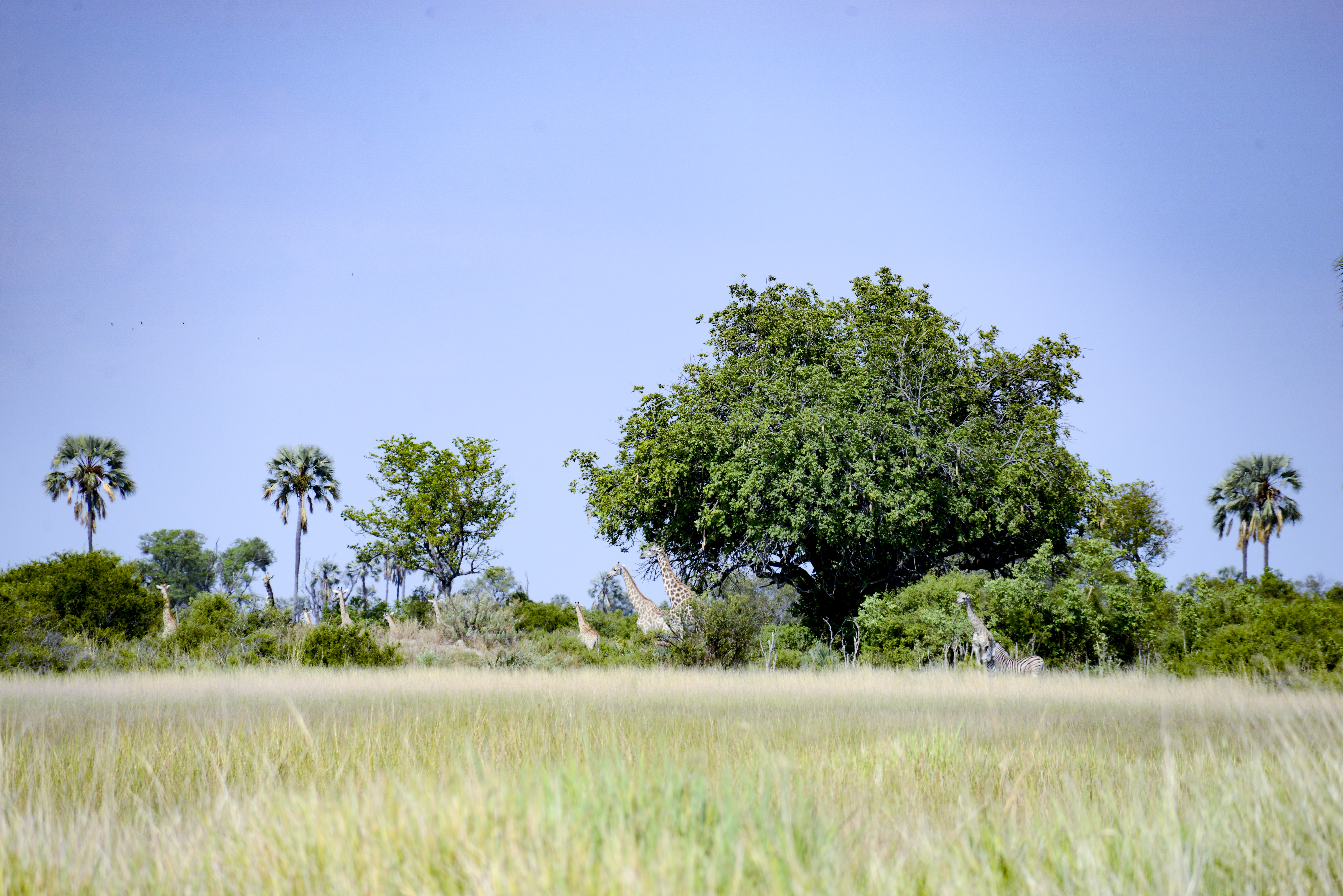
Giraffe munching on acacia trees. With fodar, we can (and did) compare the height of the giraffes to the height of the trees.
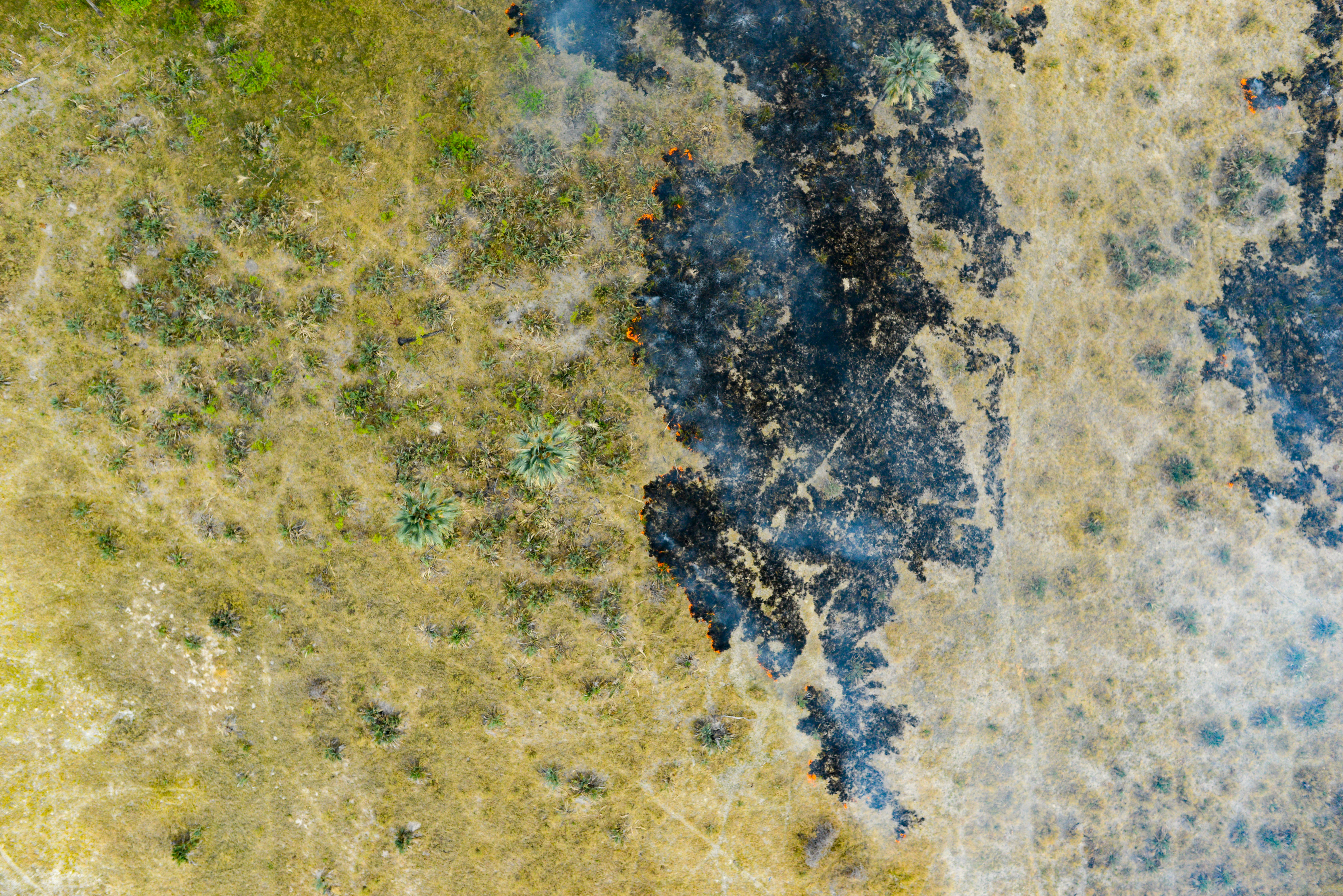
Fires are common here, caused either by cigarettes or lightening. With fodar we can map the extent of these fires and track their vegetation dynamics over time at incredibly high resolution.
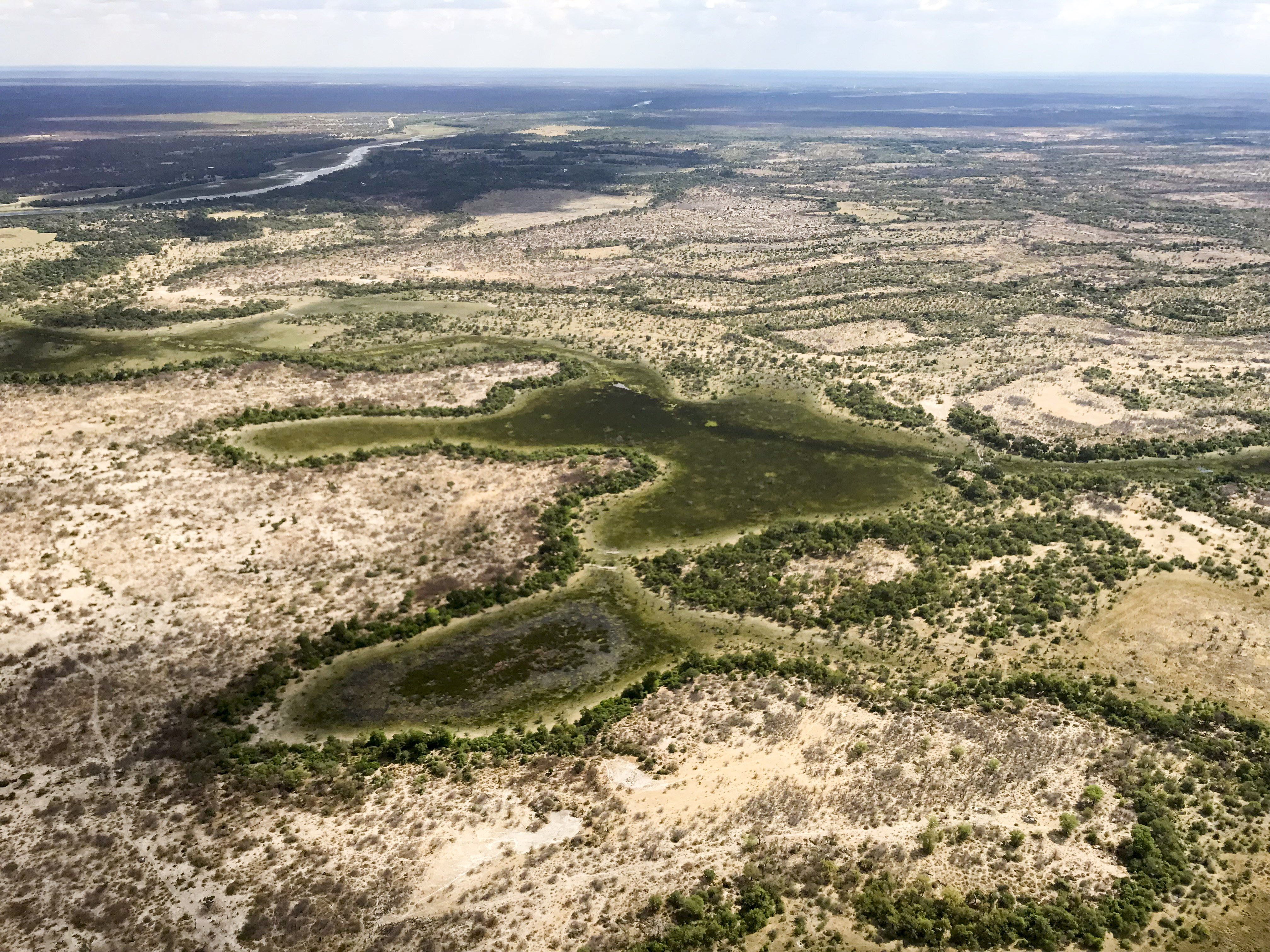
The Okavango Delta is really flat, and reminds me quite a bit of the flats near Fairbanks. Only a technique as accurate and inexpensive as fodar could map the entire Delta with the resolution required for the most pressing science questions.
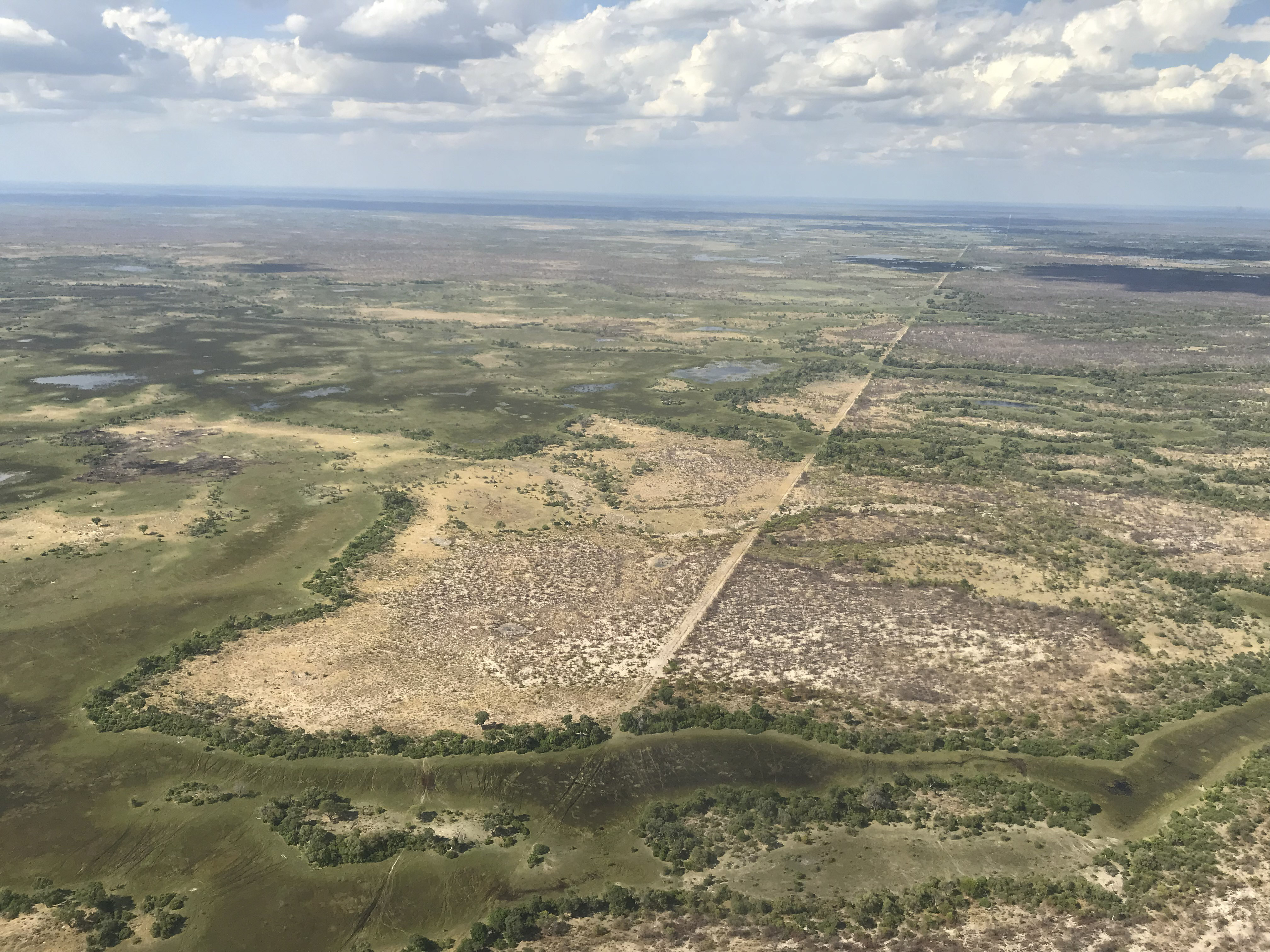
Enormously long fences have been installed in Botswana since the 1950s, nominally to keep cattle safe from disease and predation, but they also limit movement and migration of the wildlife. The biggest human-wildlife conflicts in Botswana seem to revolve around predation of domestic animals by the wildlife and keeping elephants from wiping out gardens and farms.
 All smiles after a trip like that.
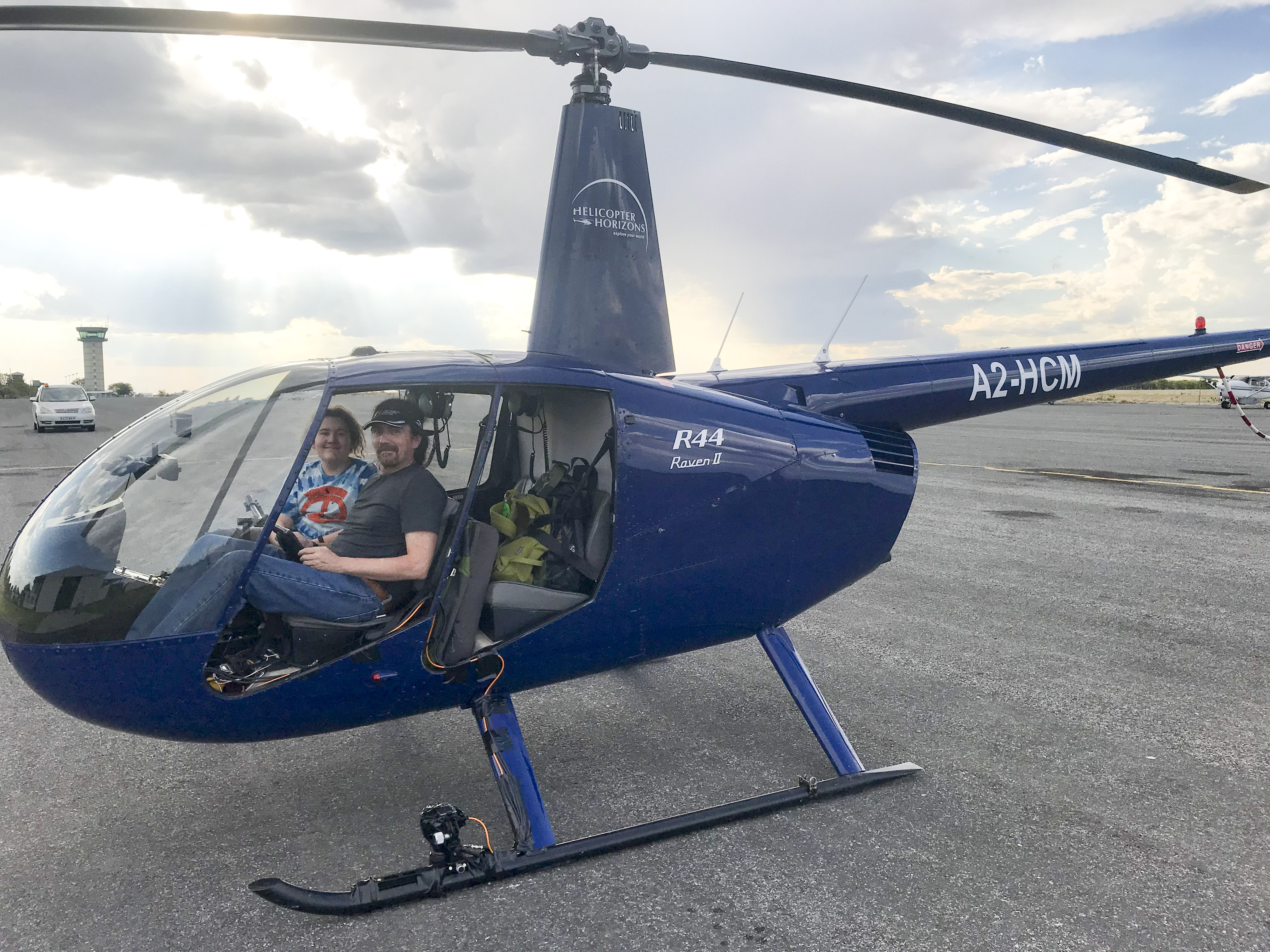
After we returned from our first trip, Turner told me that when he turns 18 he wants to move to Maun and become a helicopter pilot for Helicopter Horizons. Here he is getting a feel for the job…
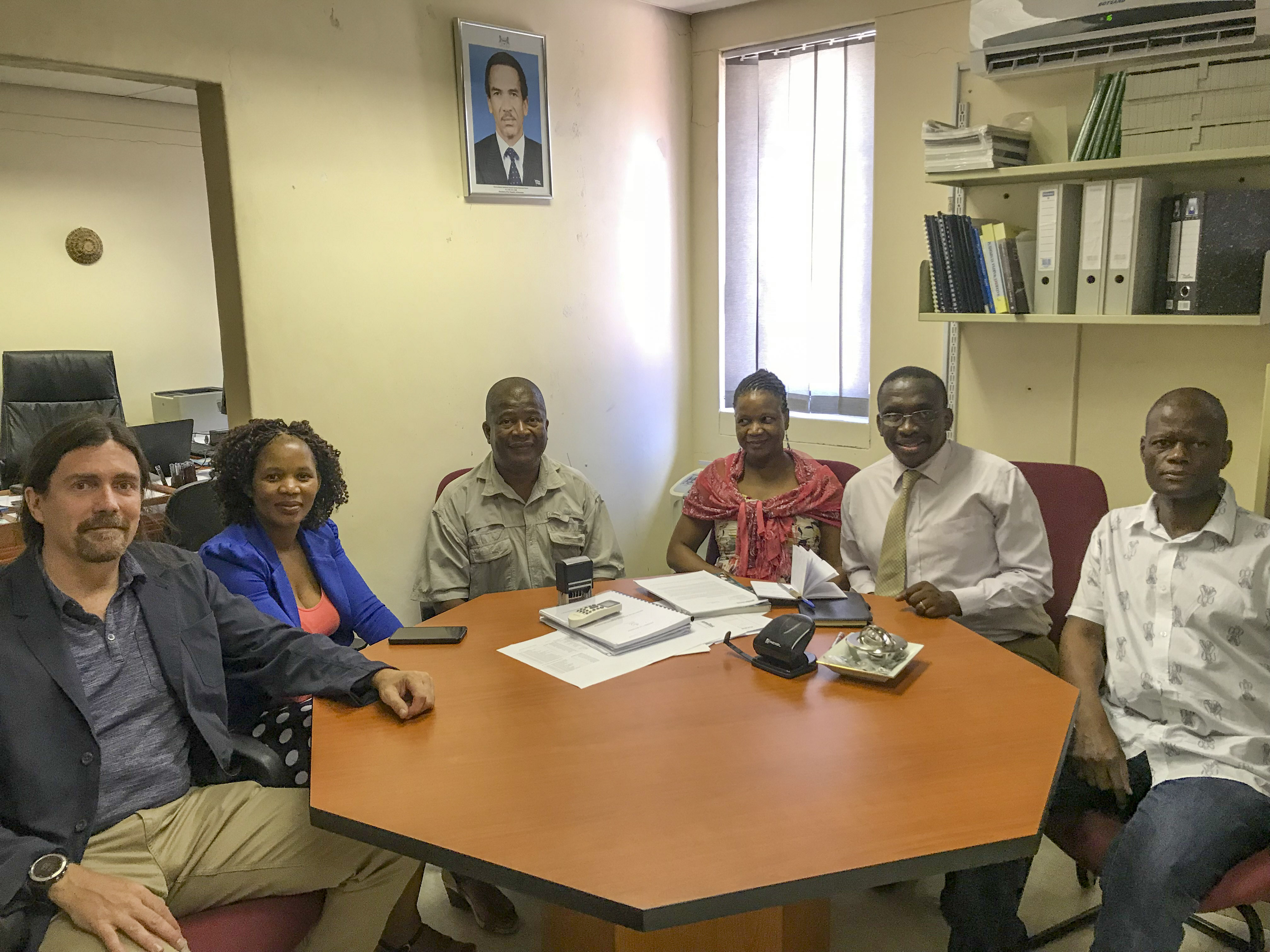
The next morning our host at ORI, Masego Dhliwayo, picked us up at the hotel and took us to ORI where we had a full day of meetings and talks planned. In the meantime overnight I had managed to process a bunch of the data, including a map of ORI itself, so I could include it in my talk to the Institute to give some local context for the data. The talk was well received and was followed by several hours of meetings over tea and biscuits with not only ORI researchers, but many from other government agencies and some private companies. By late afternoon, Turner and I were once again exhausted by the day’s activities and jet lag. Our breakfasts and dinners thus far consisted mostly of fresh banana bread and jam which we bought at the market in front of the hotel, as we were too tired to go out to eat. And after several more days of bread and jam and showing off locally-made data to a wide variety of people in need of it, we headed off into the bush to give ourselves an education in Botswana ecology.
 I got to sit at the adult table!
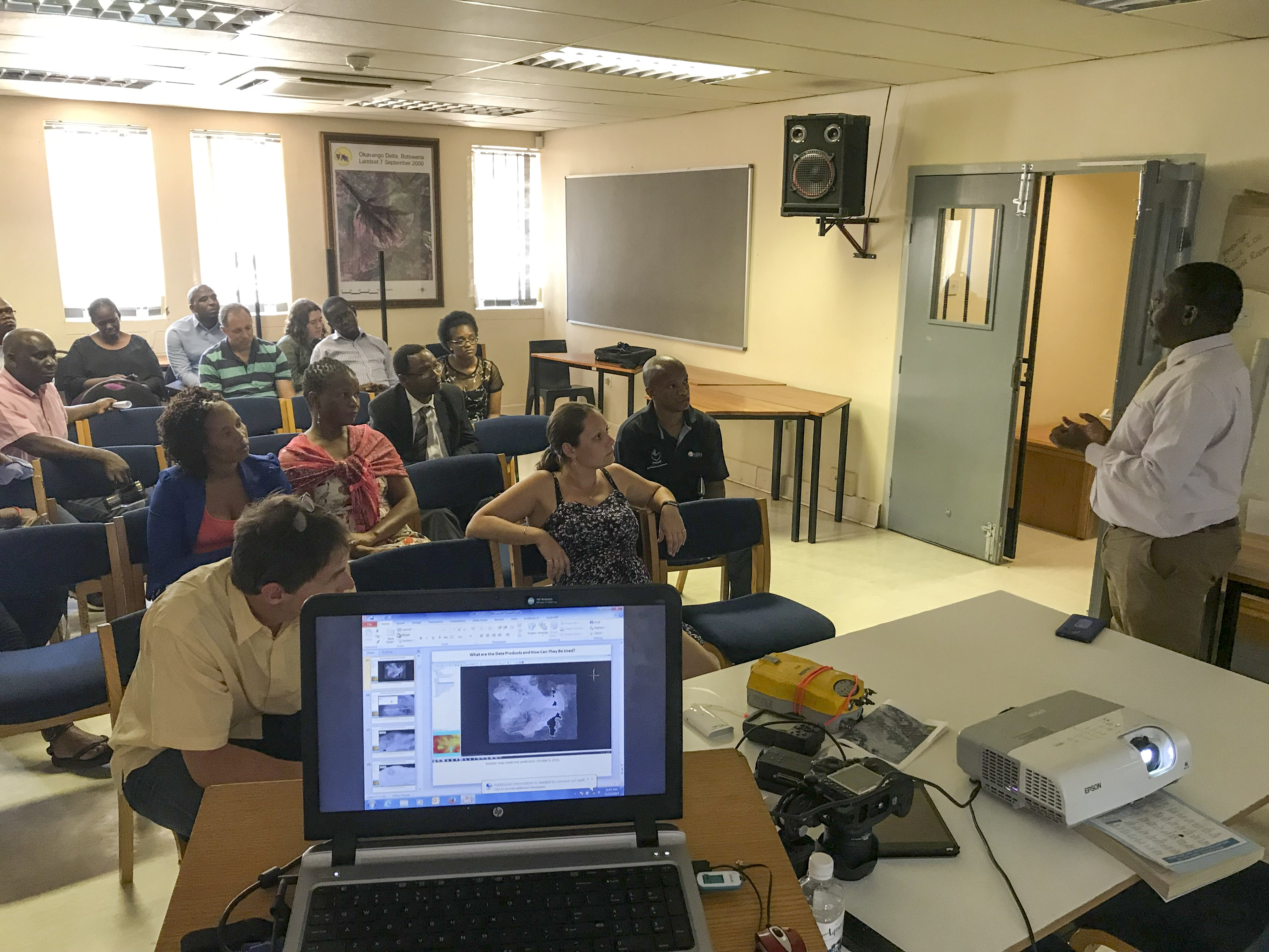 I gave several talks during my stay, this one at the Institute. Questions lasted for hours afterwards, giving me a chance to remember to get a photo…
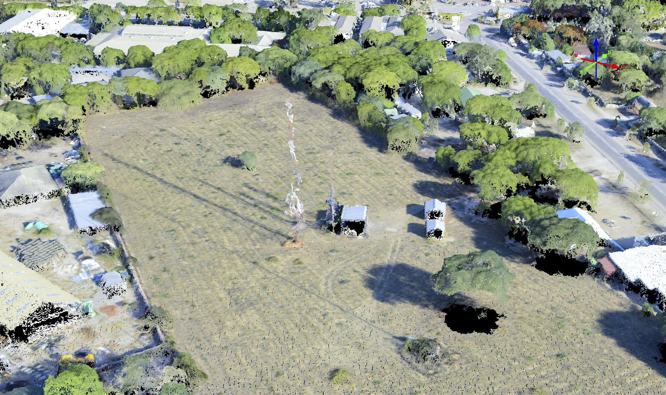
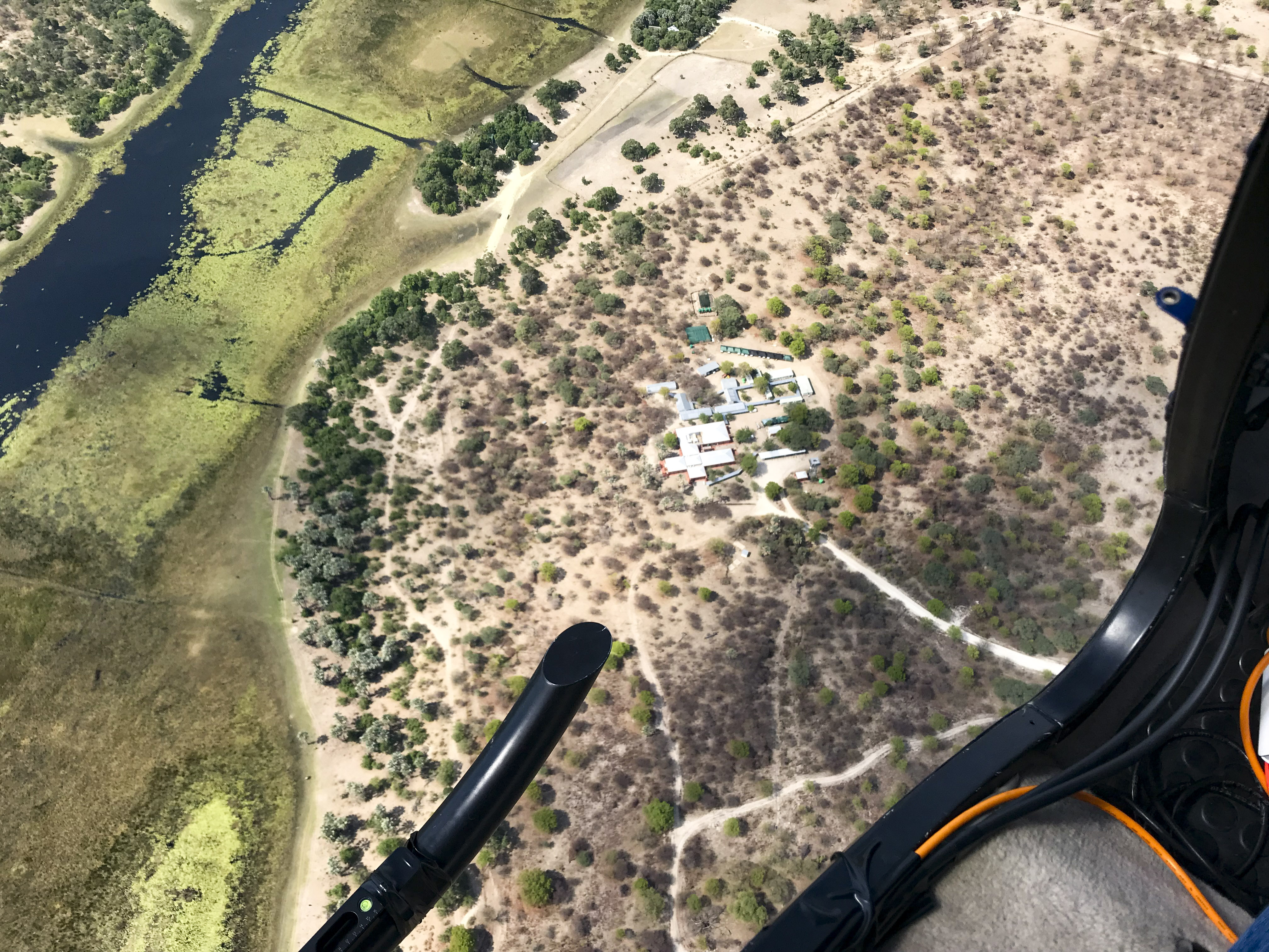 Here is the Okavango Research Institute (ORI) from the air. I used this photo in my talk.
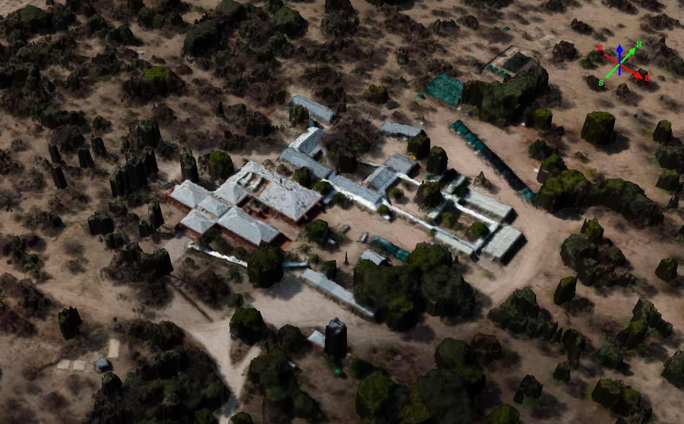
This is ORI as seen by fodar data. I acquired this on Sunday, our first full day in Botswana, and processed it over night in time for my first talk on Monday. It was hastily made with a sleep-deprived brain so it’s a little crappy, but it made the point. Hover your mouse over the image to see a shaded relief of the elevation data.
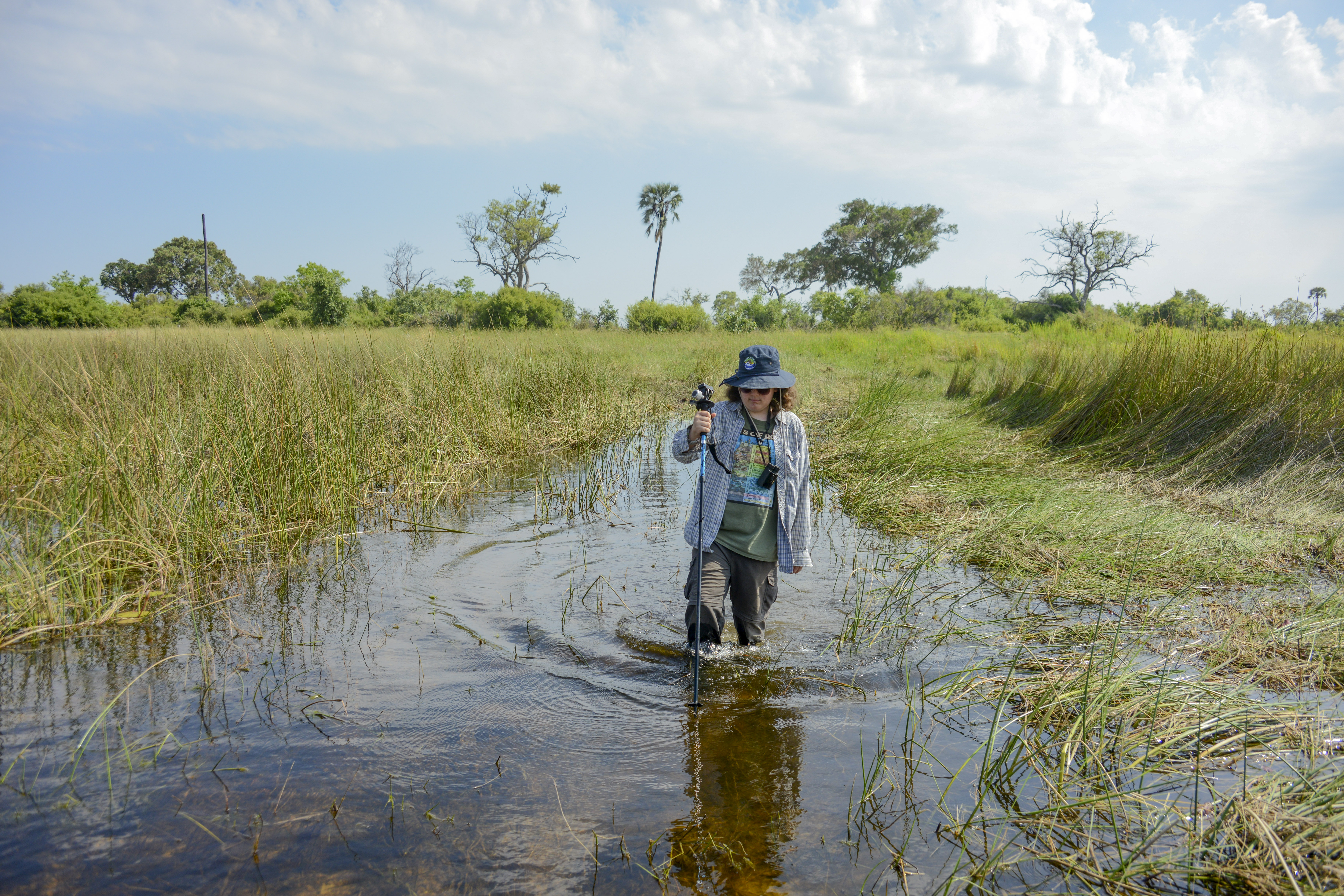
The goal of our safari was to get a crash course in Botswana’s ecology, especially as related to our mapping efforts. I’ve been an earth scientist for 25 years, but having never been to Africa let alone Botswana, I did not feel I spoke the local scientific language well enough. Nobody at ORI really had the time or interest to give me that education, so I started looking into commercial safaris to fill the gap. The Delta and its surroundings are divided into National Parks and private concessions. The concessions are leased to commercial operators who typical build lodges there and no one is allowed to travel through their lands or camp there without their permission. I started looking into renting a vehicle, finding a knowledgeable guide, and seeking out permissions, but quickly realized it was a daunting task with no financial advantage over the alternative, which was simply to go on a commercial safari tour. I hooked into Deserts and Deltas, who had lodges in all of the locations we discussed mapping over the past year. They, like all lodges, are staffed with perhaps the most well trained guides in the world, each of them having to graduate from a four year program. Each guide we had there was first rate and I was unable to stump them on any question. It was just as I had hoped — we essentially had private tutors from sunrise to sunset giving us a first class education in the local ecology as well as the issues and threats to that ecology that fodar might be able to help address scientifically. It also gave me a chance to live in and walk on the terrain that we were mapping, all of which proved invaluable to my understanding of the landscape dynamics and its issues, and in my mind was the equivalent of a year’s worth of undergraduate education. Plus it was simply an amazing experience, for which no amount of documentaries and books can prepare you fully.
[pdfviewer width=”800px” height=”400px” beta=”false”]https://fairbanksfodar.com/wp-content/uploads/2018/01/Botswana_web.pdf[/pdfviewer]
I wanted to post a blog on my personal site with some photos from our safari, but I spent way too much time creating this science blog, so I stole a powerpoint presentation from my son and turned it into a PDF, so this link may change at some point…
With our safari over and our brains full of ecology, we returned to Maun to get as much instrument testing done as possible — we had already proven the system would function, now it was time to test accuracy and suitability for real world applications. In the meantime several of our new colleagues had come up with some new questions they could answer only with fodar. This last point is important in science — we tend to ask only those questions we think we can answer, so when a new tool appears it can be a mind-expanding process that allows us to contemplate deeper or bigger questions that previously we had to put aside. It is similar at the societal level too — our history books tend to credit most of civilizations greatest accomplishments to individual leaders, but really those accomplishments emerged from the technological soup that existed at the time, whether it was the road building technology of the Romans or theoretical physics of the 20th century. With the power of fodar, all kinds of new projects were possible. And elephant habitat dynamics bubbled up to the top of the list of the most pressing and suitable projects that fodar could help with.
I think there are few symbols more emblematic of human stupidity than the killing of elephants and rhinos solely to make knick-knacks out of their ivory tusks. The demand is so high for this ivory from wealthy countries, that it is hard to fault locals from poor countries for catering to that demand, most of us can hardly imagine the bleak choices they have to make through no fault of their own. The correct solution is of course to eliminate the demand, but as supply decreases due to massive poaching, demand seems to be actually increasing as the super-rich across the world see this ivory as yet another status symbol to show off with. So the default solution has become to eliminate poaching, because elephants and rhinos will be extinct before the educational and legal efforts to stem demand will actually work, if they ever do. Botswana was fortunate to have never been truly colonized by a European power, such that when they achieved their full independence 50 years ago their local tribal cultural and governmental systems were still largely intact and their national government did not descend into the chaos that so many other African nations did. So in comparison, Botswana is an island of sanity and stability surrounded by such chaos. As a result, the local need for poaching revenue is low and the government has enough peace of mind to turn its attention to anti-poaching efforts, which they implement with swift and lethal authority. As a result, poaching rates in Botswana are the lowest in southern Africa, and the elephants have figured this out too. As example, while at Chobe Game Lodge near the Namibian and Zambian border, we came across an elephant that had died of natural causes several weeks earlier, and there it still lay with its ivory still attached. I understand that it’s unclear what the rates of elephant refugee immigration are, but I think that the current consensus is that this rate of influx is currently balanced by infant and youngster mortality. This mortality rate is in part dependent on water availability, as the youngs’ need for hydration are more critical than for the adults and thus make them more susceptible to predation. Artificial watering holes are being installed throughout southern Africa for a variety of reasons, in part to provide some stability to wildlife populations during future droughts, but apparently little research has been done on the impacts of these watering holes. For example, if they lead to an increase in elephant population growth, how large of a population can Botswana support before it adversely impacts other species? Addressing this means looking at the local scale of individual watering holes, natural and man-made, to understand how elephants impact the ecology surrounding those holes. For example, they mostly eat grasses, but when these are scarce they will eat leaves, and when those are scarce they will knock trees over to eat the leaves out of reach, and they will eat the tops of shrubs which keep them from getting larger, etc. That is, elephants exert an enormous influence on the physical structure of the plant life, and can change a high canopy forest into a shrub lands, forcing all of the forest creatures to move elsewhere or die. At least that’s my understanding of it all as a glaciologist…
Fodar can help address these questions. With it we can map the size, shape, and species of trees, and perhaps more importantly we can track this over time to quantitatively measure the impacts of elephants on their habitats. We can also map the locations and volumetric capacity of the watering holes used by elephants such that we can model climate change impacts on water availability and model elephant migration routes and viability based on the location and capacity of these holes. We might even be able to use such information for planning locations to install new man-made watering holes. So with our remaining few days in Botswana my main goal was to test the system for these purposes in some locations of interest to determine the suitability for these purposes so that later I could work with ORI researchers to apply for the research permits and funding needed for dedicated researchs project. Thus my goals for our last week in Maun were 1) to determine the accuracy level of the system here so that we could devise and implement any tweaks for actual work, 2) to determine if there were new any issues with more remote work, 3) to assess the use of helicopters for large-scale projects, and 4) create a blog like this that demonstrates the viability and power of fodar in Botswana to support science and conservation on a wide variety of topics.
To accomplish the first task, I mapped the Maun airport on two different days and compared these maps to each other. Traditional accuracy tests usually take the form of comparing topographic measurements made on the ground (ground control points, or GCPs) to airborne data. However, such ground surveys are expensive, as they take a lot of labor and equipment, and are almost always insufficient for the task given realistic budgets. For example, a large survey might collect 100 GCPs, which are then compared to billions of airborne measurements — a huge undersampling — and measuring those 100 GCPs might cost more than another full fodar acquisition. Not that such GCPs are useless, they are just not sufficient for the task. In my opinion the only real way to assess accuracy is to make two maps and subtract one from the other — the answer should be zero at every pixel if nothing on the ground has changed, thus any non-zero values are a direct measurement of the repeatibility of the system. And given that the measurements are independent of each other, that repeatibility usually reflects the accuracy as well, though here is where a few GCPs come in especially handy. I do this repeatibility testing all the time in Alaska, and the answer is usually in the 10 cm range, which is superior to all other airborne methods, especially when considering the cost is 10x-100x cheaper than the alternatives.
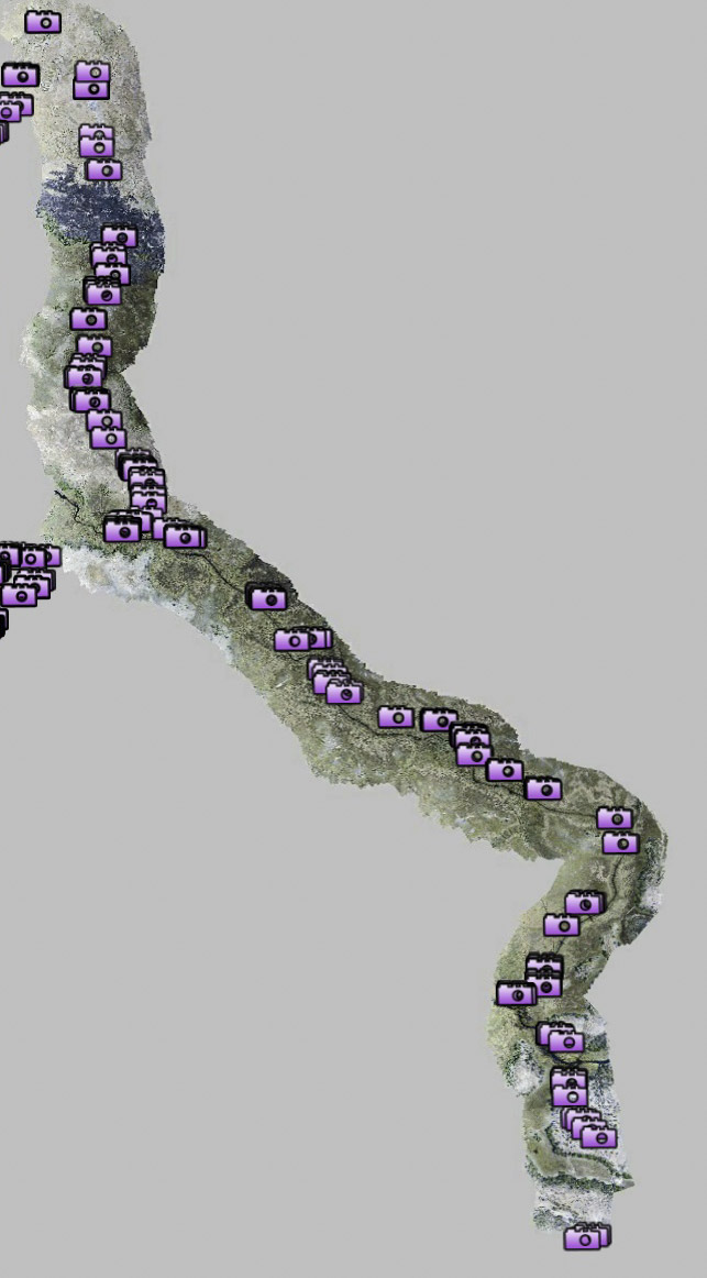
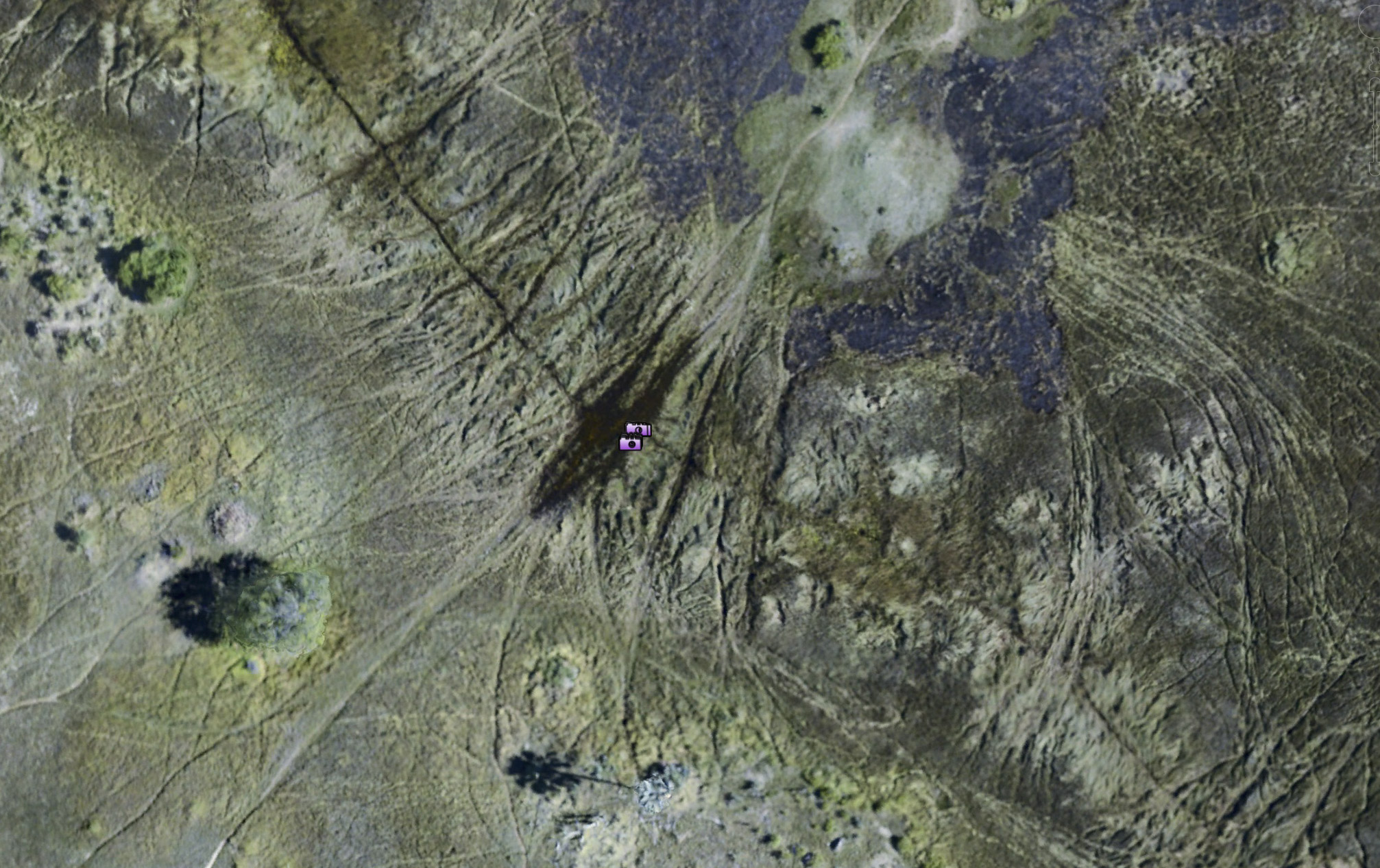
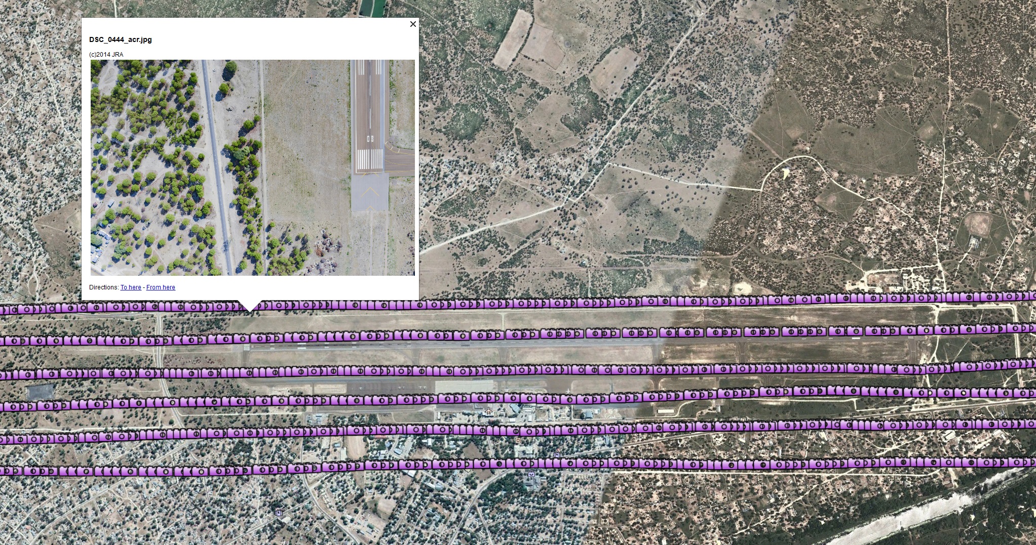 Here is a simple introduction into the fodar photogrammetric process. After planning flight lines that account for the resolution and terrain we will map, we navigate along those flight lines and take vertical photos looking downward at the terrain as we move along. In this example, we flew 5 flight lines over the Maun Aiport and each of the purple camera icons represents the position of the plane when the photo was taken. One of these photos is shown as a thumbnail. Flying height determines resolution. In this case, we flew about 1000′ above ground level and captured images with about 7 cm resolution (technically known as ground sample distance, or GSD). These data get processed into an image mosaic with 7 cm pixel size (aka posting size) and a Digital Elevation Model (DEM) with 14 cm posting. The transect data shown later were flown about twice as high to cover more area, resulting in a 15 cm GSD and an image mosaics and DEM with 15 cm and 30 cm posting respectively.
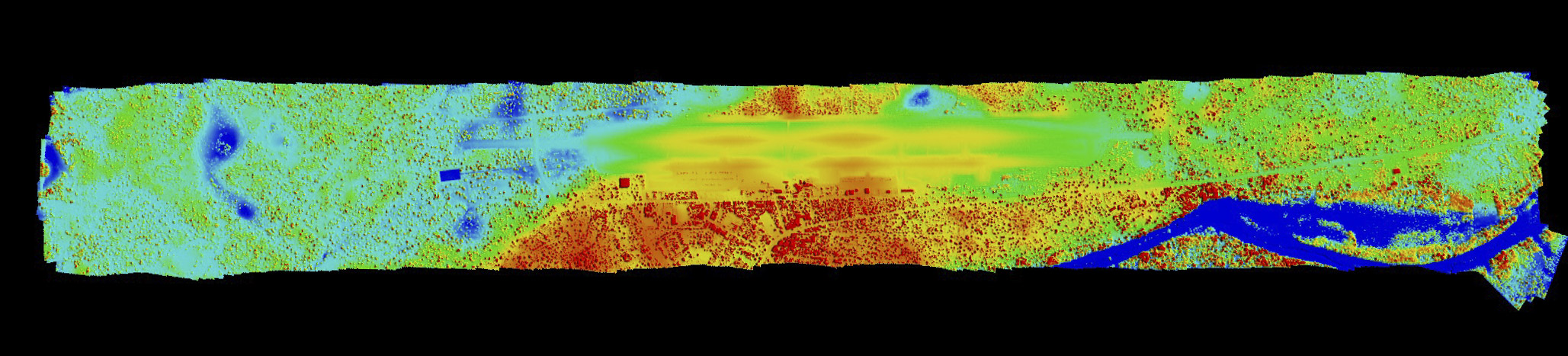
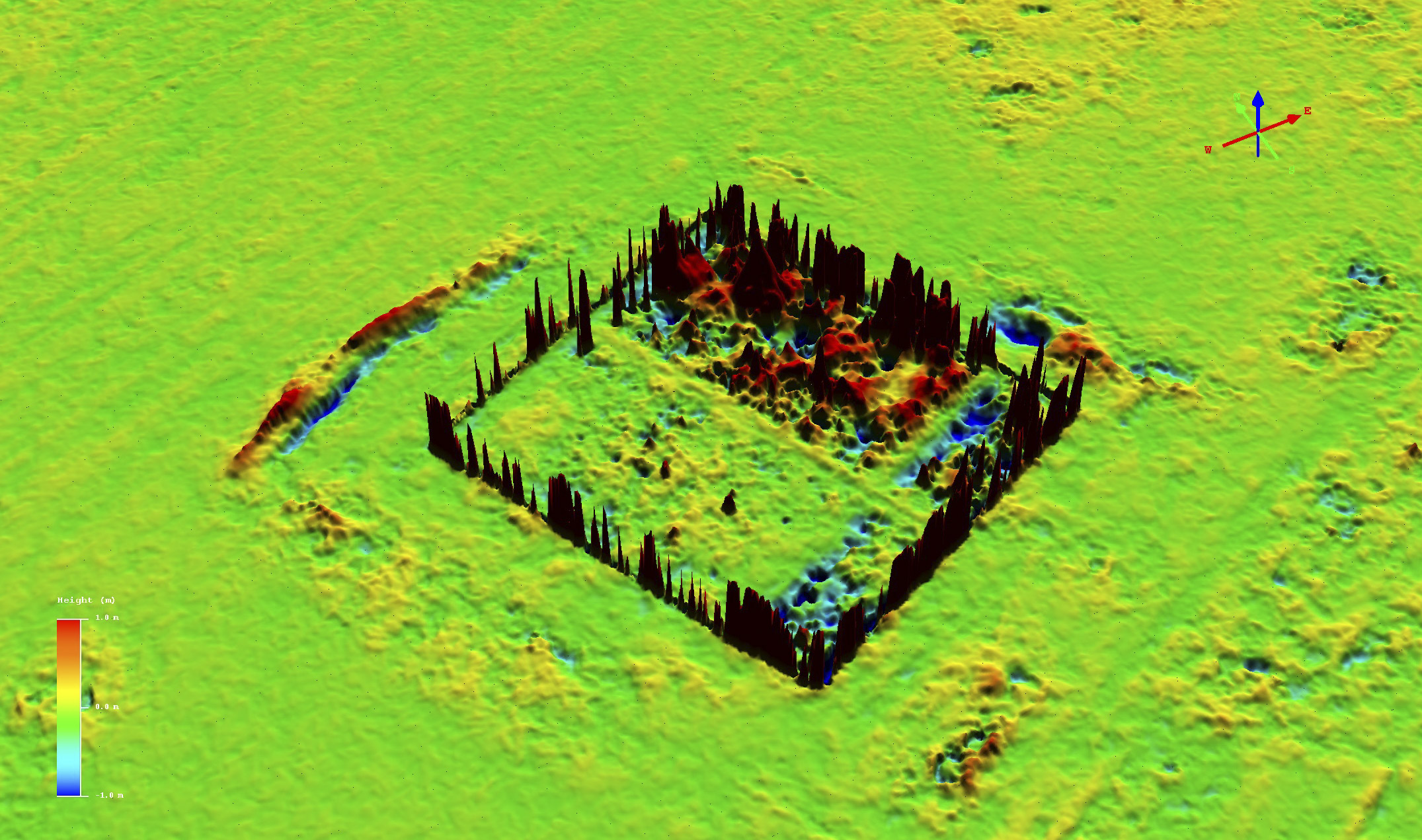
Here is one of the airport maps, shown as the image mosaic on top and the digital elevation model (DEM) colored by height (red is high, blue is low) on bottom. The image below is the same, except here you can compare the two directly by hovering your mouse over the image mosaic to see the DEM. The important point here is that image mosaic is visually seamless and the DEM shows no large-scale errors, like warps, tilts or curls as is often found in lower quality map products. For example, if a ramp were present (that is, the data were erroneously tilted east to west), you would see the colors change like a rainbow across the width of the DEM. I’ll describe in detail what’s going on with the elongated red bullseyes on the runway a bit later, but for now I’ll just say that these are actual lumps in the runway that appear in both the maps we made.
Hover your mouse over this image to compare it to the colorized DEM.
Before diving into an quantitative accuracy analysis, let’s give the data a good visual inspection. Videos are a great way to see if the data ‘look real’ and get a sense of what sort of measurements will be possible.
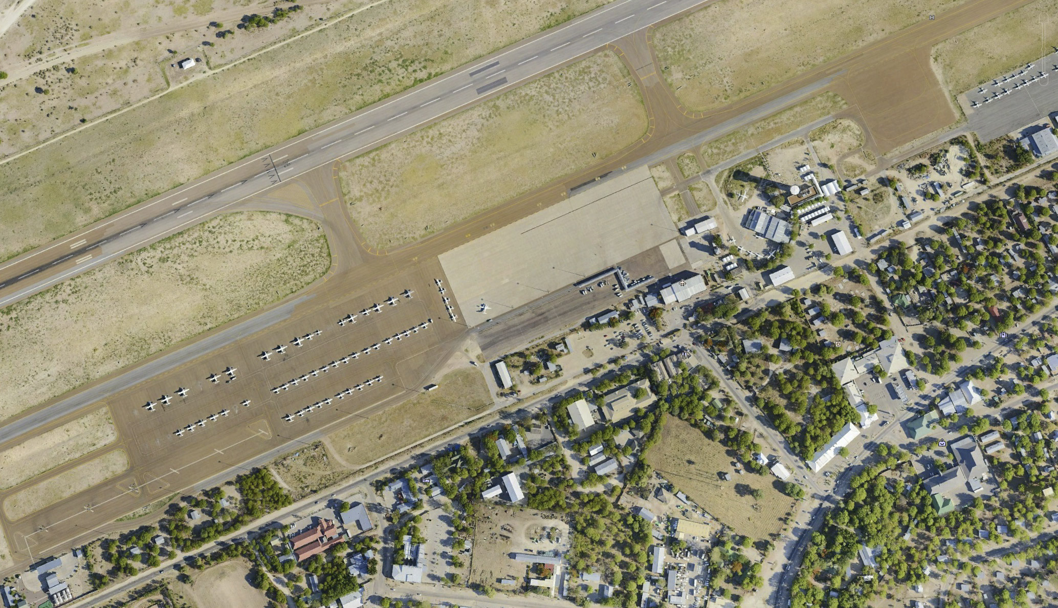
Here is a fly-over of the Tandurei restaurant across the street from the airport, a favorite hangout of Maun pilots. An important point here is that you can clearly see the trees — their size, shape and even species if you’re into that sort of thing. Any change to these trees over time would be easily captured in a repeat map, and the changes in size and shape could thus be measured by comparing them. This is the Thamalakane River, just south of the airport. The important point here is that fodar is captures river height. It is a slow moving, narrow river with lots of lily pads and other flat aquatic vegetation which provides enough contrast for fodar to work well. This means that we can make measurements of the fluctuations in water heights within the Delta or in watering holes; even if all of the water body surface is not covered, it seems like there will always be enough floating vegetation around the edges to make some measurement, and if not the surface of the land at the water’s edge will do the serve the same purpose. The linear water feature crossing the river is essentially a cow-crossing highway; these features are made throughout the Delta by elephants, buffalo, and hippos.
So those videos should give some indication of what fodar can do, its data quality (in this case simply Does it look real?), and what sorts of applications it has to your interests. If you are going to work with fodar data, it’s worth understanding a few concepts, in particular what orthorectification means and what the difference between a point cloud and DEM is. The next few figure and captions give an overview of this, so you can skip it if you know it or google it for more depth. I’ll also spend some time after this discussing data quality, both qualitatively and quantitatively. This will also include a discussion of noise — though the data are nearly perfect, if you are going to use these data it’s worth knowing its limitations and weaknesses. Note that the numbers on most of the plots are too small to read in this page, but you can right-click into a new tab or save them locally to see them more clearly.
Blunder checking with Google Earth. A quick and dirty test for blunders and coarse accuracy is to compare the position of the image mosaic to Google Earth. Mouse-over to see the Google Earth data. Note that the satellite data found in Google Earth is only coarsely orthorectified and geolocated; that is, my fodar is much more accurately rectified and located, so the minor position shifts seen here are not important. I describe the importance of orthorectification in the next figure, and how I know my data are much more accurately placed further a few figures later. The important point here is that my data are in about the right place and no major blunders in projections have occurred.
What is orthorectification? Seen here is a closeup of the old and new Air Traffic Control towers, left and right of center respectively, in Google Earth. Note how you can see the sides of these towers — this is because the satellite that took these photos was not directly overhead. If you think this through a bit, you can see if you tried to measure the horizontal distance between these two towers using Google Earth, the measurement would not be that accurate because the towers are leaning. The process of orthorectification corrects these distortions such that you can make accurate horizontal measurements of any feature in the orthorectified image. However, the accuracy of these measurements is completely dependent upon the topography used to correct this distortion. For example, if you do not know the height and shape of the tower, you cannot possibly eliminate the apparent lean. Thus we can tell that the topography used here was quite coarse, and probably had a resolution of hundreds of meters. By contrast, my fodar data has a resolution of 7 cm, so I know the height and shape of the tower nearly exactly. Mouse-over to see the the fodar orthomosaic of this same location. The important point here is that you do not see the sides of any of the buildings — this indicates essentially perfect orthorectification. In the future, any time someone hands you an image they claim to be orthorectified, your first instinct should be to look for the sides of buildings — how much of the side you see is an indication of how poorly the orthorectification process was. In the case of fodar, it is limited to 1-2 pixels (about 7-14 cm in this case), but this is not a feature of fodar but of rasterization of the real world. That is, the pixels at the edge of any building capture some of the roof and some of the ground and thus the elevation of these pixels is somewhere in between those values, and if the building is diagonal to the cardinal axes, this blurring of the edge can affect 2-3 pixels wide. So here, the orthorectification process fails a bit, and you can see this in the form of somewhat wavy building edges, but you have to look really close for that. The poor orthorectification in Google Earth is another reason why it and fodar can never match perfectly.
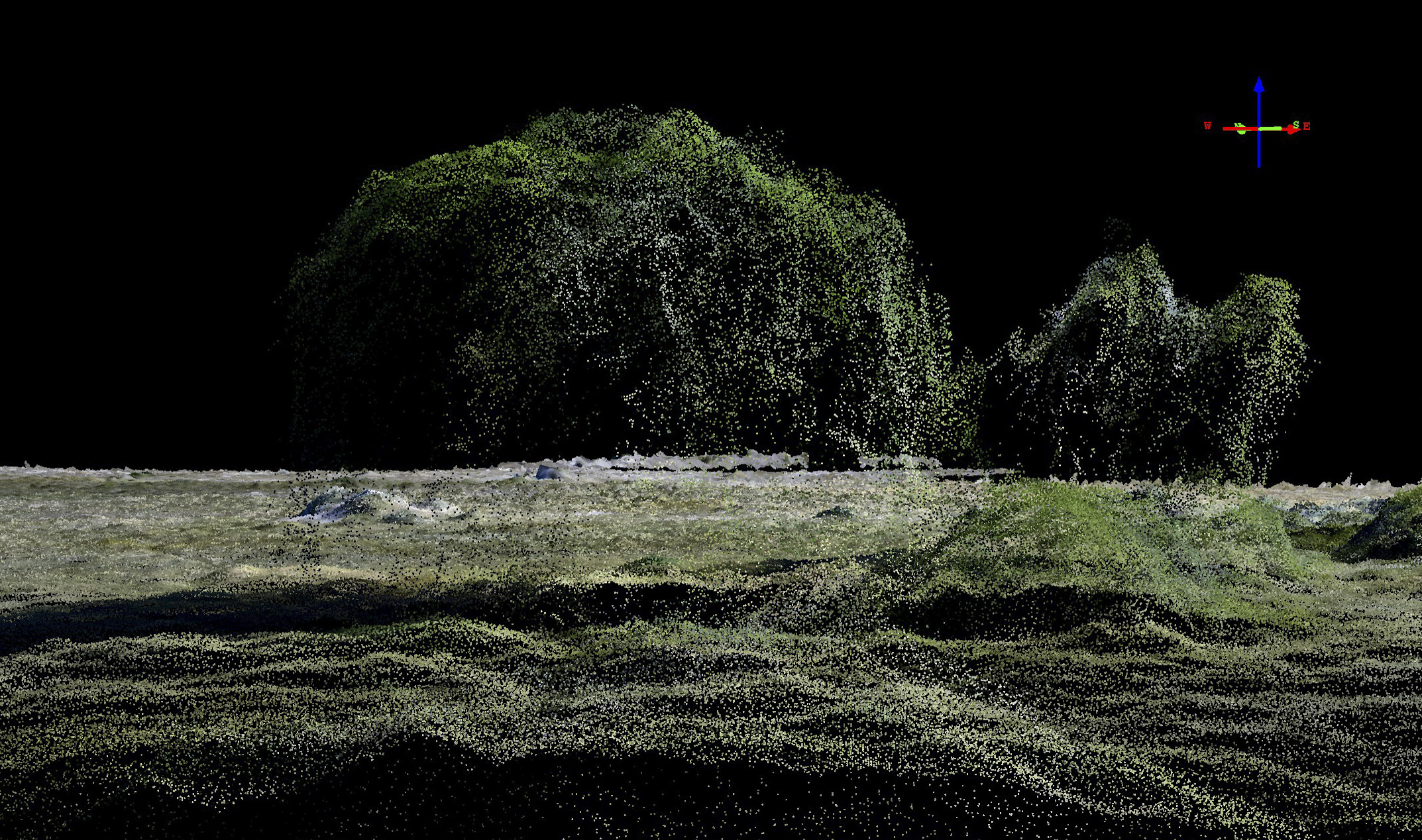
 What’s the difference between a point cloud and a DEM? The first step in creating a DEM and orthomosaic from the raw images is to create a point cloud, as seen here. Point clouds are simply a cloud of points, each with an X,Y,Z location and an RGB color. They are great, but often cumbersome to work with, so usually we convert these into a DEM, which is a raster product that is similar to an Excel spreadsheet, with rows and columns representing latitutde and longitude and each cell containing the elevation of that location. Imagine looking down on the point cloud and superimposing a spreadsheet grid on it, then averaging the elevation values of all of the points within each cell of the grid — this is an oversimplication of the DEM-creation process, but it gives the general idea. Like an orthoimage, the DEM shows only what you would see if you were looking straight down on the terrain; for this reason it is sometimes called a Digital Surface Model (DSM) or First Surface Model (FSM). Because of this spreadsheet-like composition, DEMs are unable to represent tree branches or airplane wings overhanging the ground, as that would require two elevation values in a single spreadsheet cell, which is not possible. Another way to think of it is to try to imagine what the orthomosaic would look like if it tried to capture multiple elevation colors, like the tree canopy and the forest floor beneath it — it simply wouldn’t work, and same for the DEM. I have tried to demonstrate that graphically with the above image pair creating using our Maun Airport fodar data. On top is the point cloud; mouse-over to see the DEM. You can see in the point cloud that the trees have branches overhanging the ground, but in the DEM the canopy seems to merge with the ground. Again, this has nothing to do with fodar, it is simply the difference between representing these data as a cloud of individual point or as raster image. The trees in the point cloud often have no points around their base because the camera did not have an angle to see under the canopy there, essentially the area with no points was shaded from view from the plane; we can see it now because we are much lower to the ground than the plane was; had we flown lower during acquisition, we could eliminate those bare spots. The radio tower seen here is also represented quite differently between the two methods, for the same reasons. The tower structure is difficult to map because it is shiny and featureless, except at the connections and at color changes; it gets even worse for metal light posts, which are both shiny and thin. However, as seen here, their shadows show up quite well, and this shadow can be used to pinpoint pole location with great accuracy. In terms of mapping utility cooridors or determining whether growing trees might encroach on power lines, because we can measure the height of the trees over time, we can compare this to height of the power lines (which presumably is not changing over time, or only very little) to determine where danger zones exist. The videos post above all use the point cloud version of the data because it is more realistic.
Here is another example of the difference between the point cloud and DEM created from the same data; mouse-over to see the orthoimage draped over the DEM. Seen first here is a point cloud visualization of part of the ramp. Note that you can see the ground under the wings of the airplanes. You can even see some of the points near the wings; those points represent a bit of error cause by the shiny featureless wings confusing the photogrammetric software. Note the high-tail plane in the upper left, the shadow is clearly separated from the tail and you can see under the tail. Now hover your mouse over the point cloud to see the same area as visualized using the DEM. Now all of the planes seem to merge with the ground because DEMs cannot represent two surface elevations at the same location. This difference between point clouds and DEMs has nothing to do with fodar, it is simply inherent to the data products themselves.
Yeah, but can I fly around on the data myself? Within this window, you can interactively fly through a snippet of the full fodar data from the Maun airport data to get a sense of what information can derived from it. This visualization is made using the fodar DEM, not the point cloud, so it is not as photo-realistic as the movies shown earlier, but this is the form of the data that we most often work with. Though this visualization is of an airport, you can easily imagine replacing airplanes with elephants, or city trees with those surrounding a watering hole. Eventually I will put the full data set online like this. The reason the airport appears to be on a large pedestal is because the topography of the rest of the world here is modeled as a spheroid, which is some 10s of meters off from actual elevation at this location. For 3D navigation, you will need a mouse. Click and drag the left mouse button to move spatial, use the scroll wheel to zoom, and click and drag the scroll wheel to rotate.
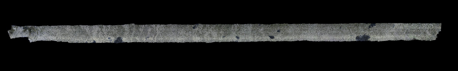
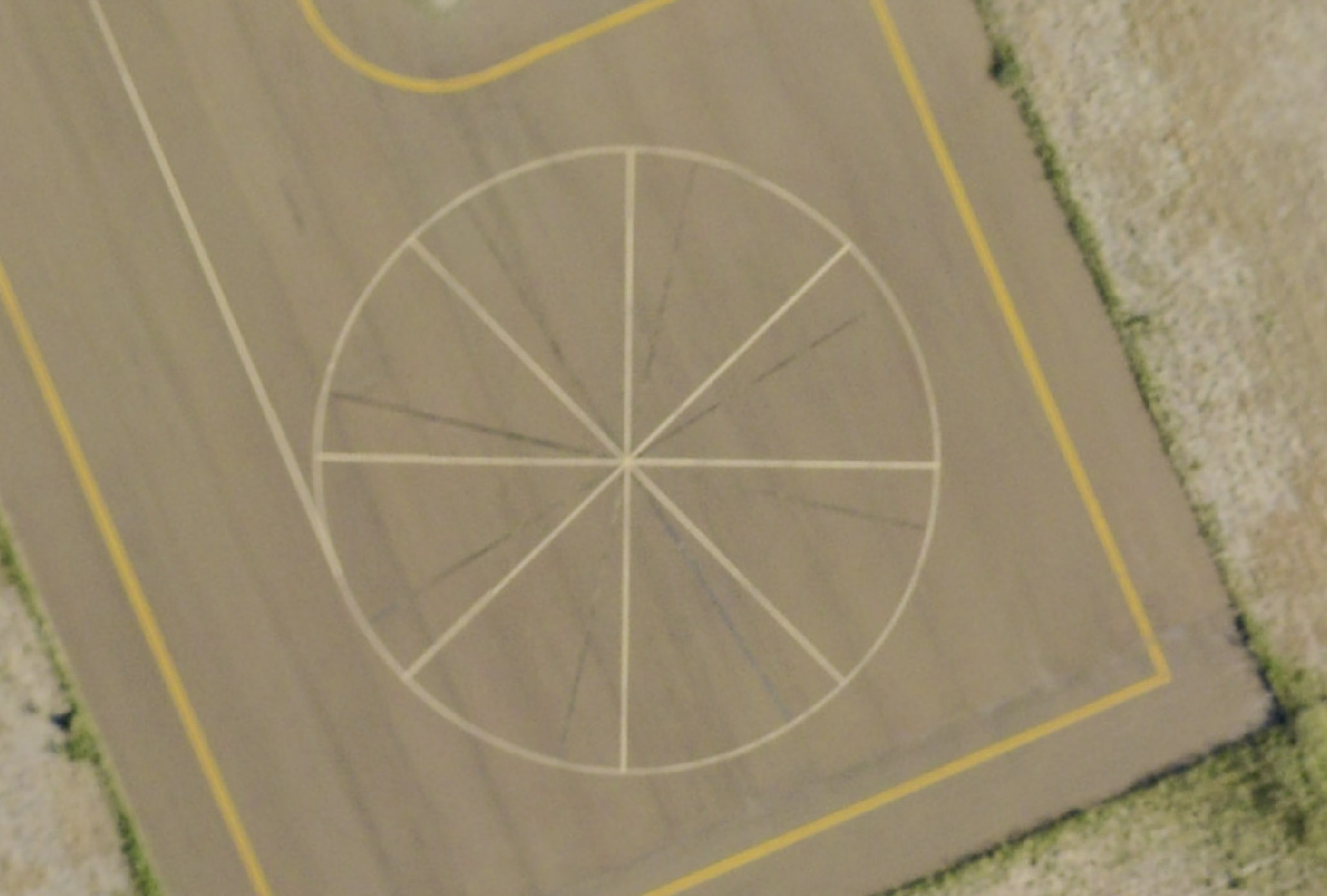
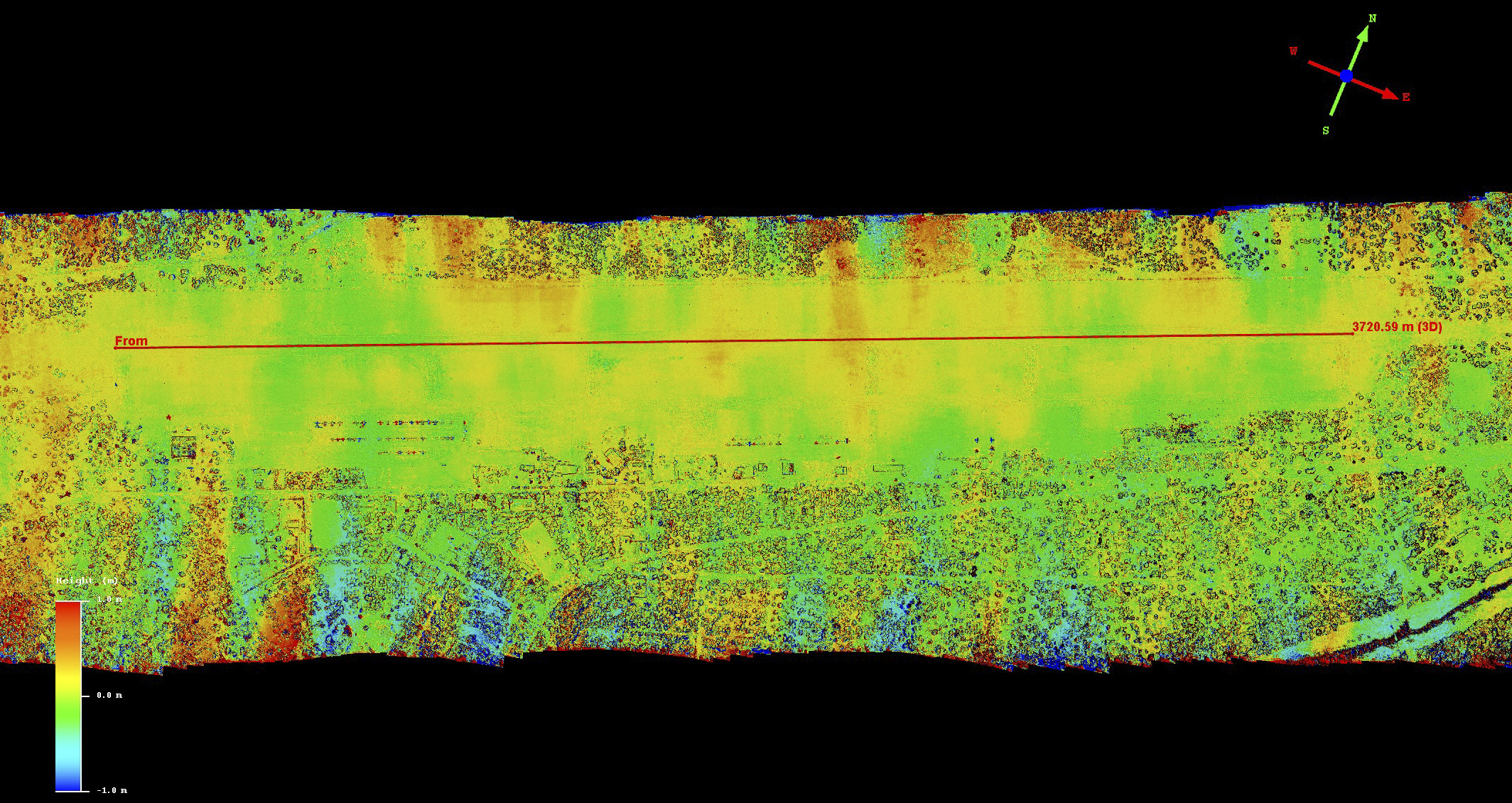
 Here is the runway, showing those lumps again. Mouse-over the colorized fodar DEM to see the orthomosaic. The red line is a transect over the runway through the features; the elevation data from this transect is shown below in a plot.
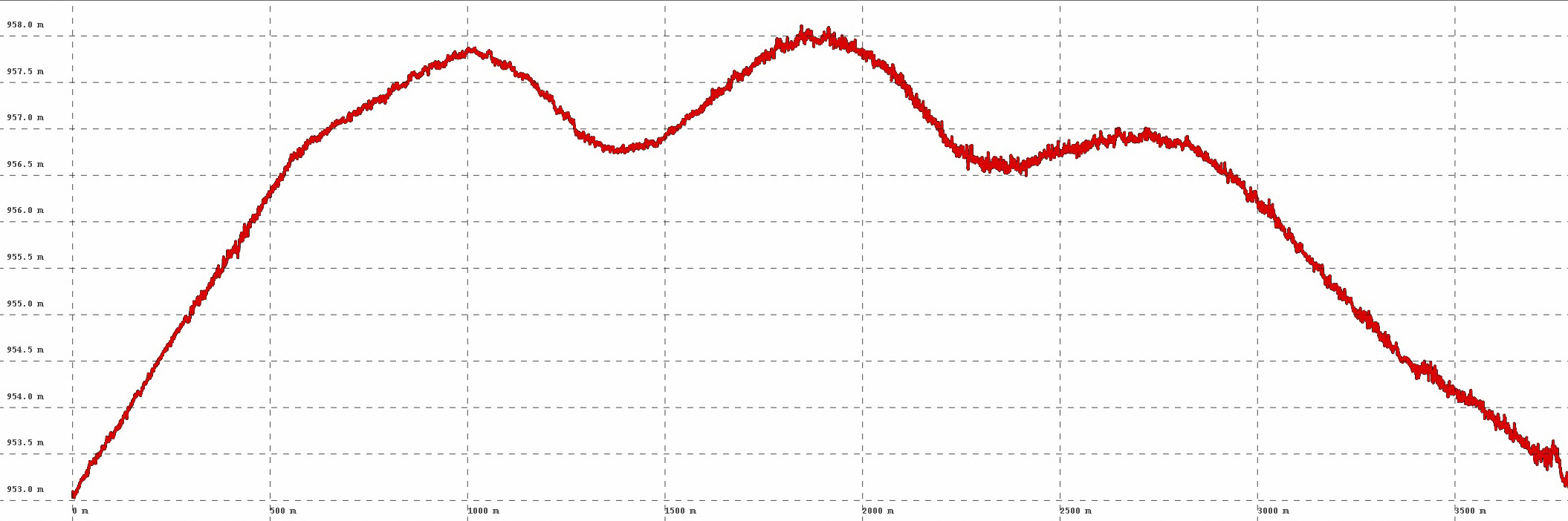
The runway is about 3800 meters long, and amplitude of these lumps is about 1-2 meters, set on an overall hummock 2-3 meters higher than the aprons; these features must be very familiar to the local pilots. I’ll show later that the second DEM shows these exact same features, so they are definitely real. Considering how flat the rest of Botswana is, it seems they picked one of the hilliest places to put an airport…
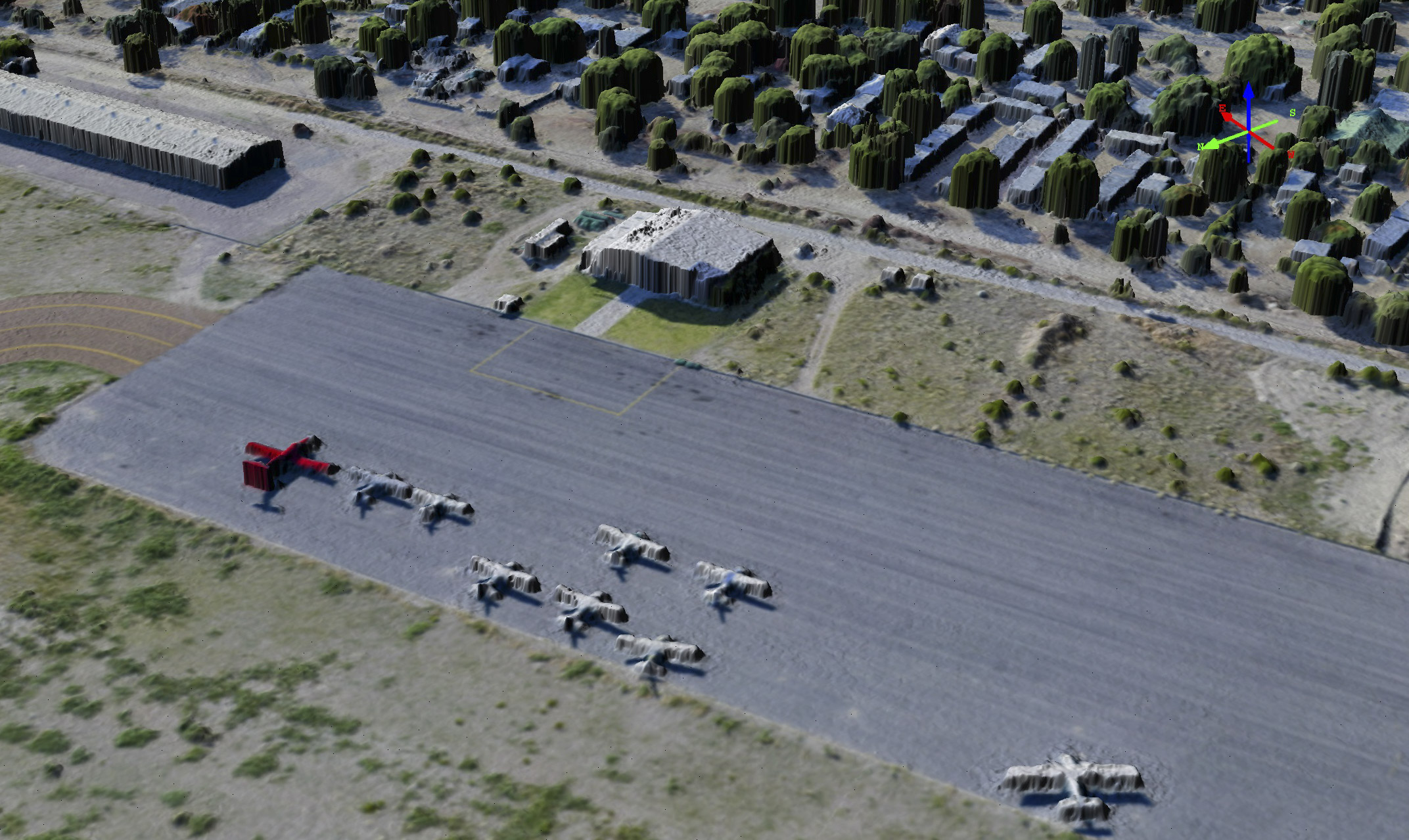
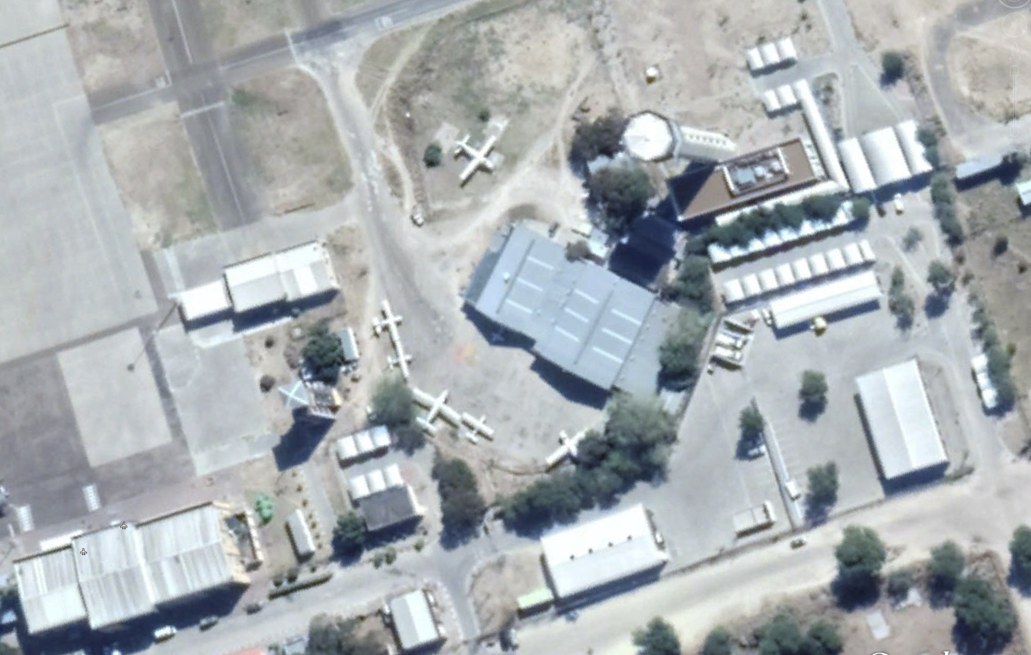
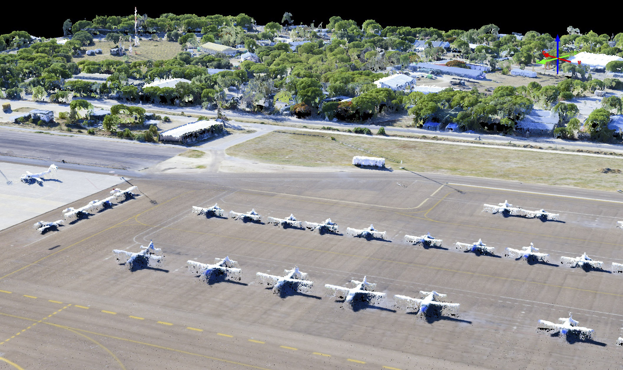
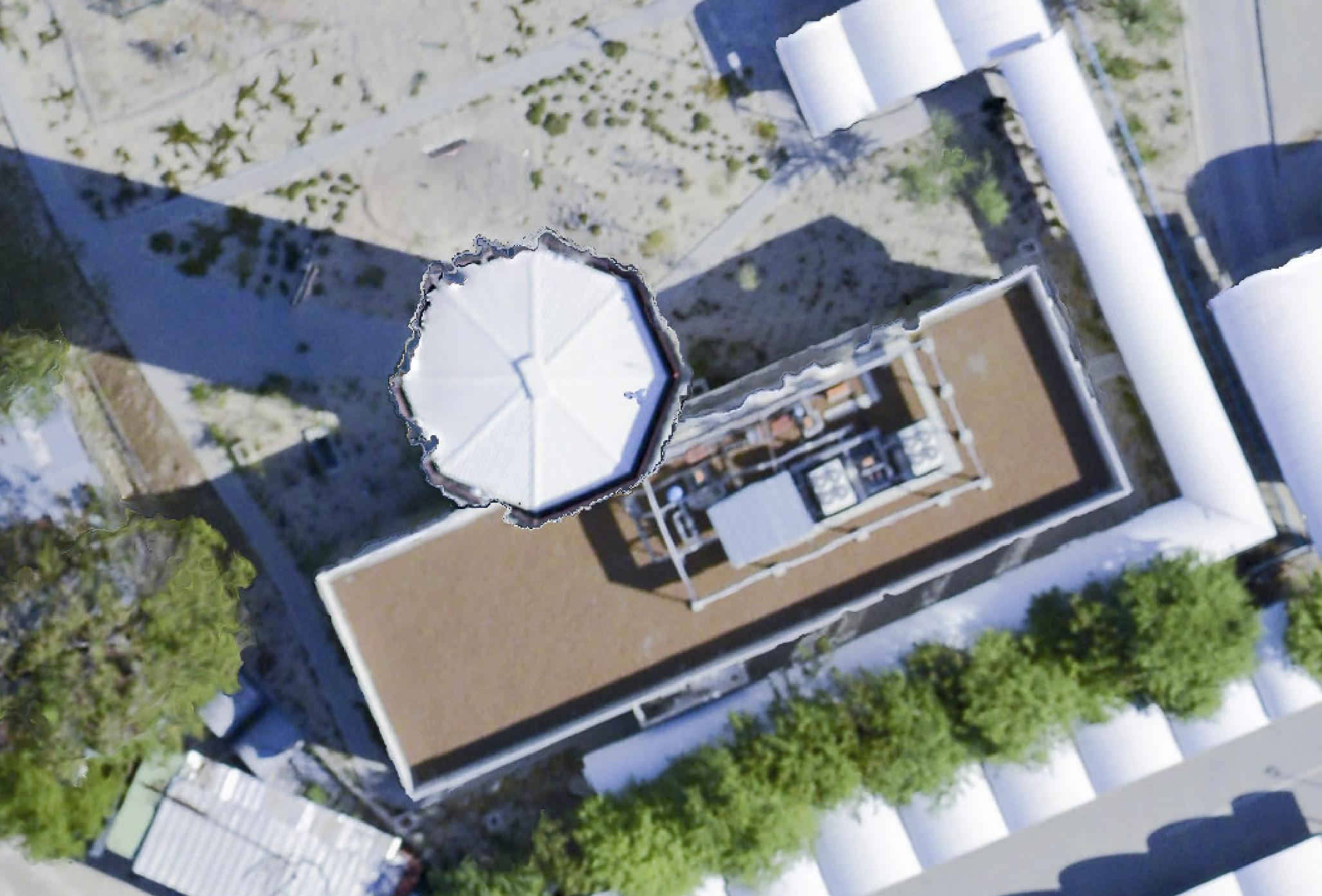
Here is the Helicopter Horizon hangar and some planes parked nearby. Mouse-over to see the fodar topography. The point here is that anything on the terrain becomes part of the map, whether its an airplane or an elephant.
What can we measure with fodar? Seen here is an example of the detail that gets captured with fodar over large areas. Clearly seen are hangars, buildings, trees, cars, and airplanes. Mouse-over to see the topography. The shape of these features can be extracted and analyzed, similar to what I showed earlier with the runways. The red line at upper left is a profile transect over the roof of the large hanger. The plot below shows its elevation profile; in this case it is a roof, but could do the same for a tree, mountain, or elephant.
Here is the shape of that hangar’s roofline. The vertical tick-marks are single meters, so this roof is about 8-9 meters higher than the ramp. Though in reality the roofs are smooth, special care needs to be taken during acquisition to capture them with full accuracy. The issue is that these are light-colored metal roofs that, when angled into the sun, have a very high exposure value that tends to limit the amount of contrast that can be extracted from them for photogrammetric measurement. That is, in the image they can look pure white. Considering that I wasn’t taking particular care to capture roofs, this map turns out pretty well overall and the shape can still clearly be seen. But just because these profiles seem believable doesn’t mean they are accurate, so next we will assess accuracy quantitatively.
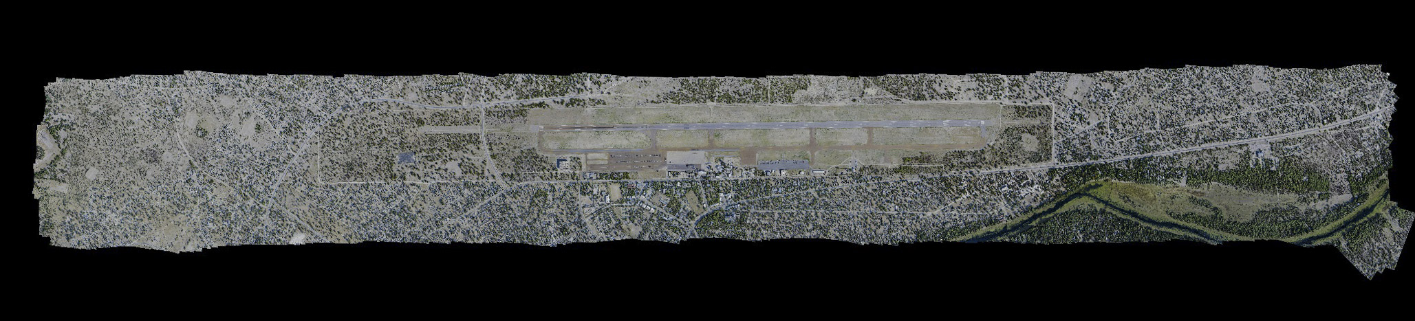
Here are the image mosaics from the two fodar acquisitions we made, on November 28th and 29th. There are slight differences in white balance, but otherwise both show identical features and align almost perfectly with each other. Comparison of these two images quantitatively tells us a lot about data accuracy. I’ve done this annually or more at my home airport and Fairbanks, and the results there consistently show pixel to sub-pixel alignment, or about 6 cm in that case. You can learn more about that work in this paper. The next several images compare these two orthomosaics made in Maun. This method of determining accuracy — comparing one map to another — is the only sensible test for accuracy in my mind. Remote sensing companies have a long and rich history of using alternative facts when it comes to accuracy, but there is no faking with this method — every pixel get compared to every pixel using the same technology. So there is no interpolation or extrapolation, there is no pointing fingers at another vendors, and there is simply no wiggle room — it is a straight up test of repeatibility: if you dont get the same answer when you measure it twice, then your data are not perfect. I start with assessing horizontal accuracy first because if the data are not aligned spatially, then a vertical comparison is not useful.
What is the horizontal accuracy of the data? Mouse-over to compare the alignment of the two maps I made here. Airports are perfect for this sort of thing because there are so many stripes on flat ground. You want to start out comparing flat ground, as sharp vertical rises like buildings can have orthorectification errors that can confound the horizontal accuracy assessment. Technically the comparison seen here is a test of repeatibility, or precision. But since the data are completely independent of each other and there are no biases that can spill over from one data set to the other, practically speaking this is also a measure of accuracy. In text books, the difference between precision and accuracy is usually demonstrated on a dart board — a tight grouping of darts indicates precision but the distance from the bullseye indicates accuracy. In the real world, we really dont know what the real answer is (that is, we dont have a bullseye to compare to), so we make due. I have consistently found that the accuracy of fodar is within 30 cm of any ground control with an accuracy of 1-2 cm, and in the 15 or so comparisons I made of this data, I found the horizontal offsets to be within that, and usually much better as seen here.
Mouse-over to compare the two mosaics at the north-east end of the runway. The November 28h acquisition is shown on top. If you look closely, you will see that it is sharper than the November 29th image. The reason is due to the helicopter used. On the first day, we used a helicopter that had just been dynamically balanced to reduce vibration for us, but unfortunately that helicopter was not available on the second day.
Here is a similar comparison at the other end of the runway, with basically the same results. The spatial offsets in alignment vary by up to about 2 pixels, or about 15 cm, throughout the mosaic. This is a bit worse than I find in Alaska, but there are some good reasons for this, and fortunately they can be controlled with some additional tweaking. So I see this as the worst case alignment, which is still superb, and I am confident it can be improved further.
Here is the new control tower, compared as before. Here you will see how orthorectification make buildings tricky for use in assessing horizontal precision. The waviness of the tower’s roof is in part caused by the thin railing surounding it, as it is thinner than the pixels imaging it. Both images clearly show the air condition units; the image quality on the 29th was a bit hit or miss, sometimes great, sometimes not, just due to the randomness of shutter timing compared with vibration. In any case, horizontal accuracy is a total pass, time to move on to vertical accuracy assessment.
As I mentioned, technically repeatibility is a measure of precision, not accuracy. Measuring accuracy implies you know the truth, such that you can compare some new measurement to that truth to determine accuracy. In the real world, there is a lot of alternate truth floating around, so it’s hard to really know what to believe. That’s why I like comparing my stuff to my stuff, because at least then I’ve eliminated most of those alternates. But in the end one important use of fodar in research and land management here is to use it within a GIS system. So these next few figures compare my fodar map of the airport to the official Maun property database. I do this qualitatively, just as demonstration of accuracy and suitability for this purpose; to use fodar for parcel boundary determination should only be done under the guidance of a professional surveyor licenced in Botswana. But we have to start somewhere.
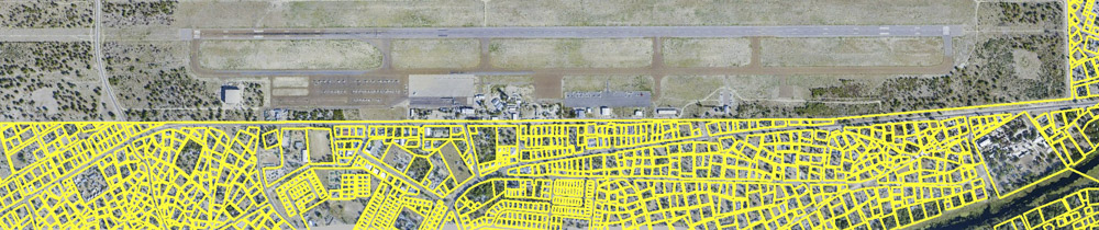
The yellow lines are property lines as depicted in the parcel database. Mouse-over to see the fodar orthomosaic.
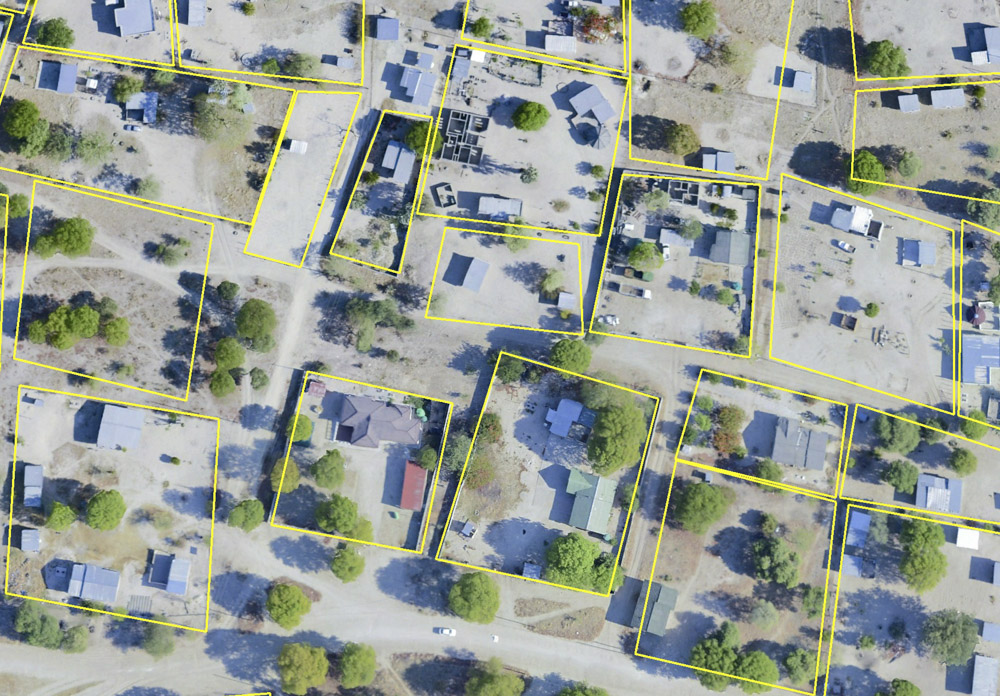
Here is a close-up of those parcel lines overlain onto my fodar orthomosaic. You can see they correspond quite while, down to the centimeter level or so. Mouse-over to see the Google Earth image and you will get a sense of the improvement in accuracy that fodar provides and why Google Earth cannot be used as a “truth” for remote sensing data, or at least not at the decimeter level of accuracy or better.
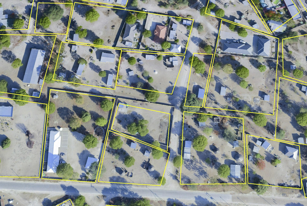
I do not know how the yellow lines were created, but I’m assuming it was from some mixture of ground surveying and aerial photography. It is clear to me in spot checking the correspondence, however, that the yellow lines are not entirely accurate. It’s not just a matter of being displaced, but the shape of some of the polygons themselves clearly do not represent the actual surface. See for example the polygon just below and to the left of center here — it is clearly the wrong shape, whereas most of the rest of the others nearby match almost exactly with the fences (mouse-over to eliminate the yellow lines). It could be that this particular fence was built after the yellow-line survey. Regardless, fodar clearly has the power to accurately call attention to discrepancies like this, and I believe with some formal validation it is sufficient to actually delineate the boundaries themselves without further field survey work — that is, fodar maps of urban areas could save Botswana considerable money and time in updating their property databases, as the field costs for mapping just the area seen here might cost more than mapping the entire airport block I’m using for demonstration here; at least this is what we have found in Alaska. Plus, time-series of fodar used for this purpose will make it even easier to keep that parcel boundary up-to-date.
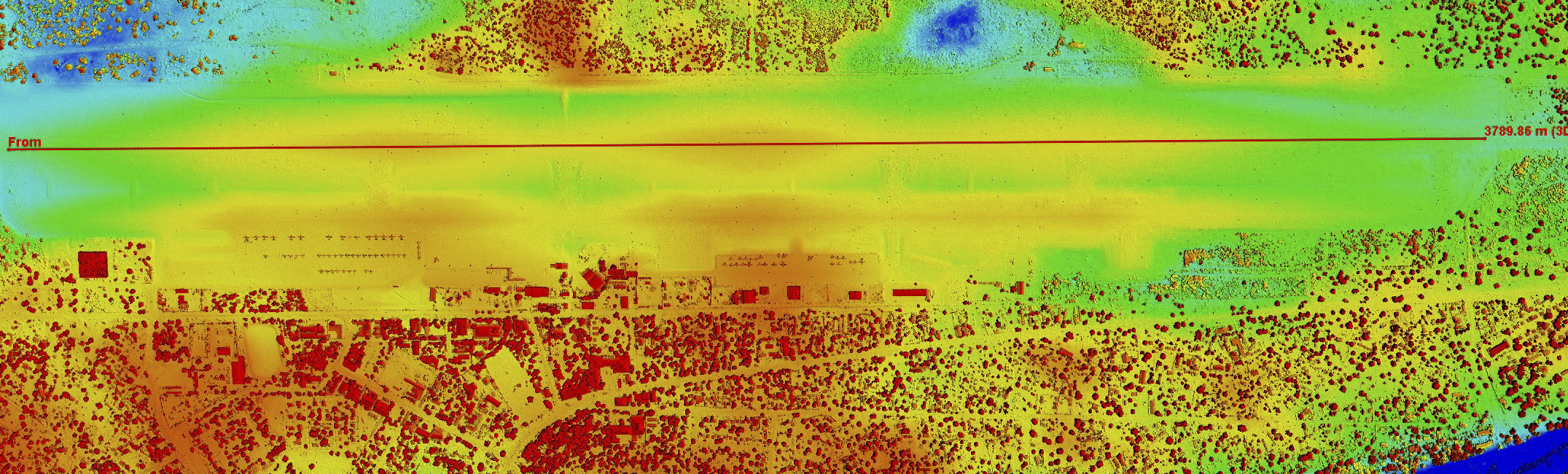
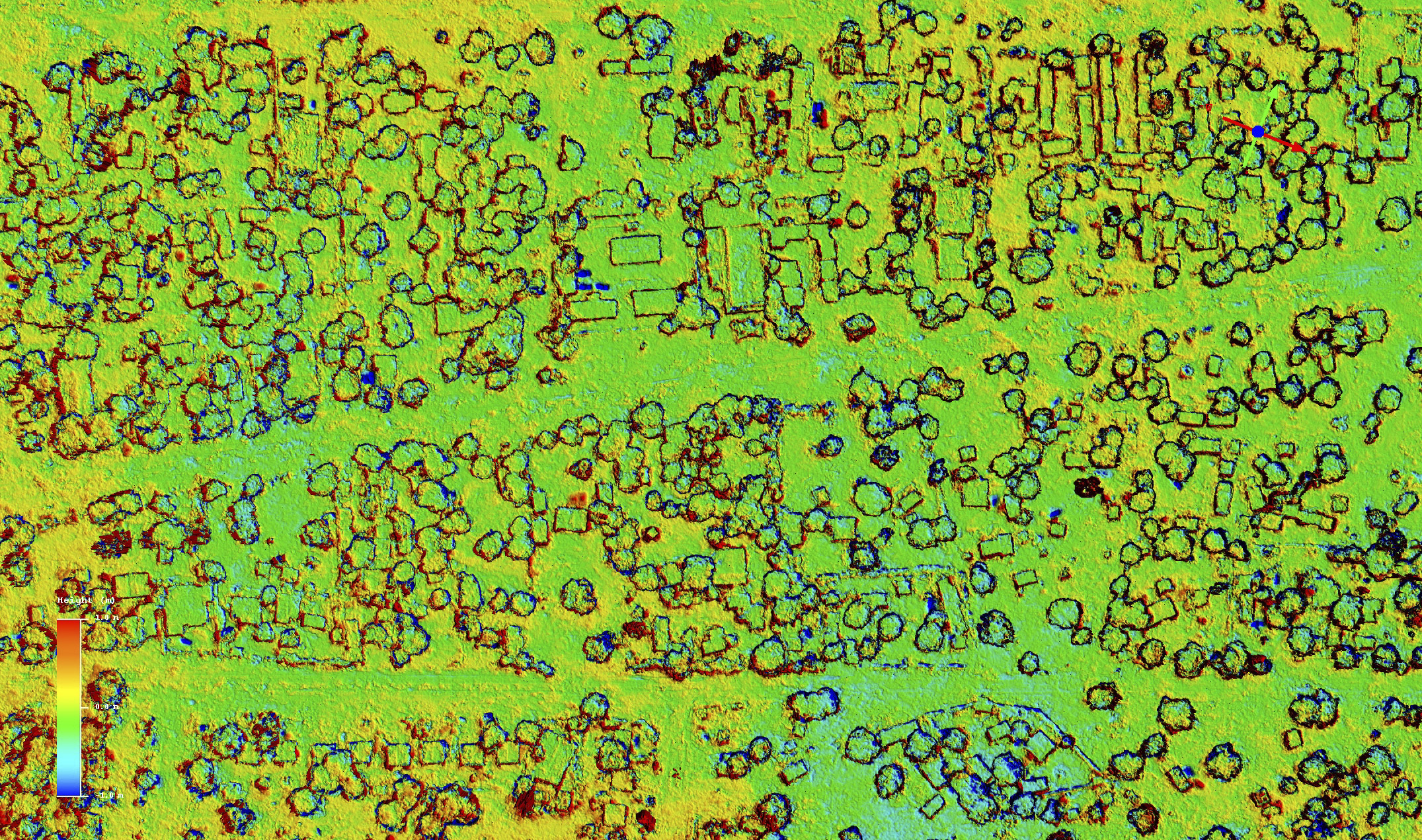
 What is the vertical accuracy of the data? Here is a difference DEM, created by subtracting the November 28th DEM from the November 29th DEM. Here red means a difference of +1 meter and blue means -1 meter, as denoted by the colorbar, with yellows and green ranging between about +/-35 cm respectively. This image is an important one as it is the real measure of the precision of these data — perfect data would be a solid color with no variations. The first thing to notice is that the majority of the area varies between yellow and green, indicating that the vertical precision of the data is roughly within +/-30 cm within the interior of the DEM, which is awesome. I did not crop this DEM, so you are looking at everything. This is important to note because the edges of the uncropped data will always be less accurate than the interior, because the outer photos are only constrained on one edge, causing increases in spatially correlated noise (the wavy color stripes). However, this is more noise than I’ve ever seen with fodar, and I’m certain it comes from the weaker airborne GPS solution that I had here, which is something that can be tweaked back into shape now that I know the scene there. Note too that it could be that one of these maps is perfect, a third acquisition would help sort out variations in data quality even further. But at first glance, these data really great — the vast majority of the difference is hovering around zero. We can look at this quantitatively in several ways.
 Here I’ve drawn a profile transect down the length of the runway on the difference DEM, similar to what I did earlier on one of the actual DEMs. Mouse-over to see the orthomosaic. The profile from this transect is shown below.
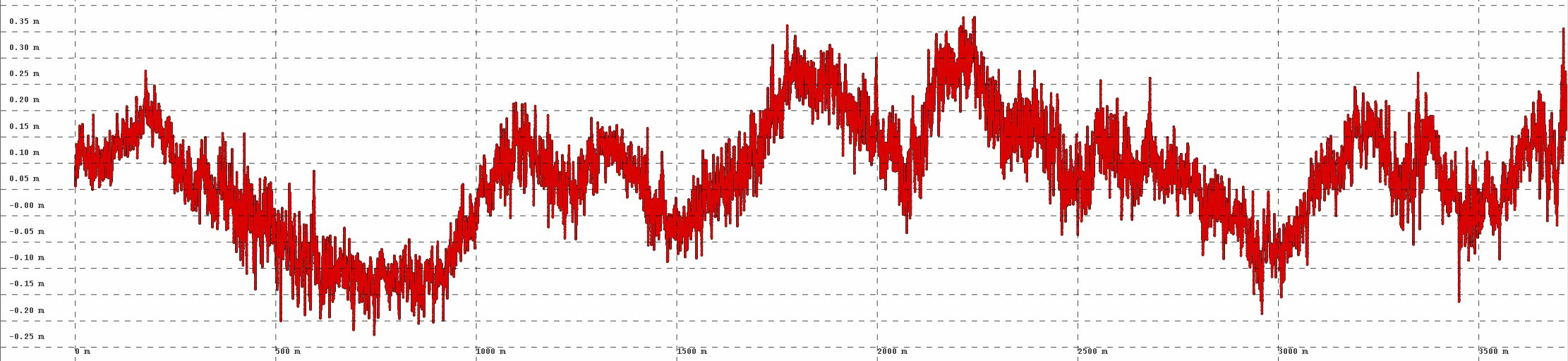
Here is the profile from the difference DEM along the runway. Compare this to the profile on the real DEM from earlier — rememember the 3-5 meter lumps? Those are gone now, meaning those lumps are nearly identical between the two independent acquisitions, meaning that they are real. Seen here are variations from -20 cm to +35 cm, a full range of about +/- 27 cm, with some high frequency, smaller amplitude noise; the horizontal grid lines are 5 cm apart. This is outstanding data quality. I believe it can be improved further, but given the hokey installation and lack of any refinement at all in technique, this result can only be accurately articulated as being totally fucking awesome. We can, however, quantify this awesomeness a bit better, as shown below.
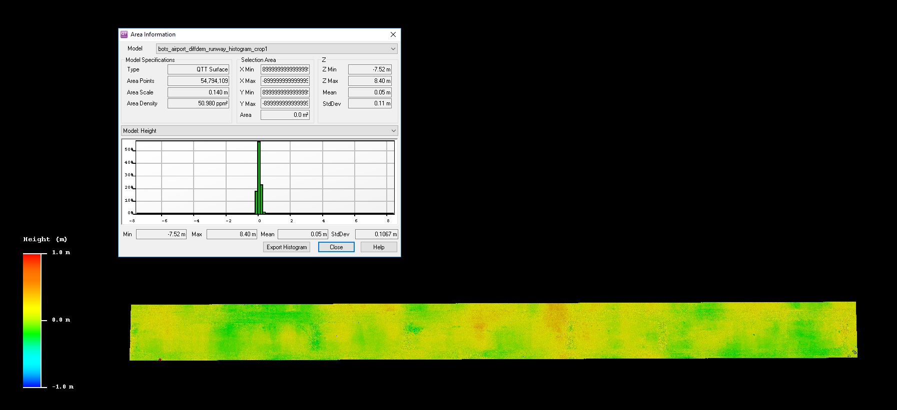
Here I’ve cropped out the runway and ramp area, eliminating most buildings, trees and airplanes for the analysis. Shown above it is a histogram of the elevation values of the difference DEM and some statistics, notably that the standard deviation of elevations here is 11 cm. That translates into roughly 95% of pixels being within +/- 22 cm of the mean. That’s spatially correlated error roughly the height of an average laptop screen, over an area 4000 m long by 300 m wide on pixels about the size of your thumb. Whether as a first result or final, that’s awesome, but with some tweaks to the acquisition techniques, it will certainly improve further. Regardless, I have shown with my work in Alaska that a precision like this can reveal changes in topography at the centimeter level, such as caused by snowfall, flood deposits, or termite mound construction.
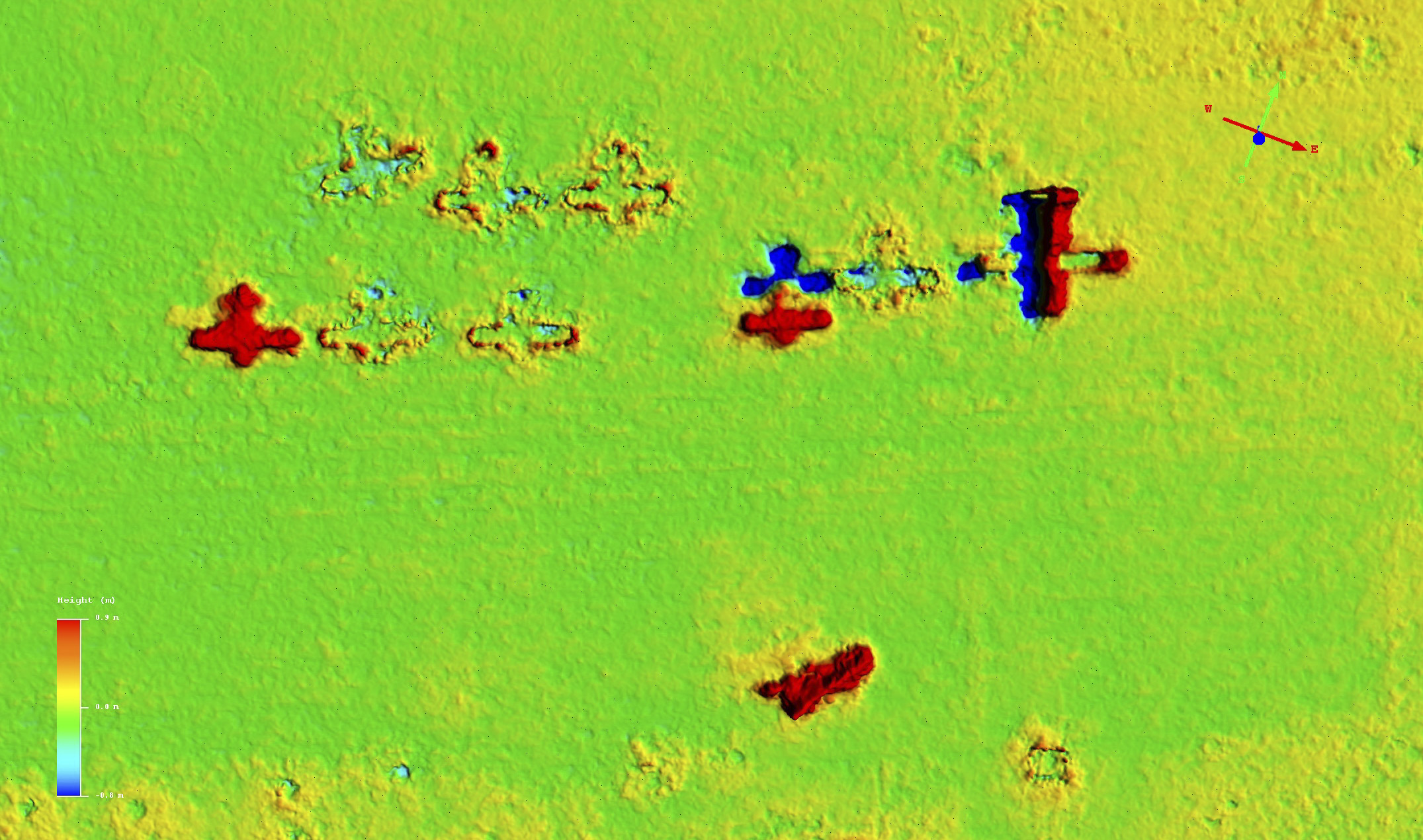
Change detection. The difference DEM can tell who has been out flying; mouse-over over to see one of the orthomosaics. Mouse-over to see the orthomosaic; color map ranges from +/- 1m. The plane on the far left and the helicopter at bottom were not parked there when we made our first map, thus when subtracting the two DEMs they show up as an apparent gain in elevation — anything that changes on the earth’s surface becomes part of a fodar map. Five planes on the left side did not move and show only edge noise outlining their bodies, as described below. At upper right is a large Pilatus that is used for air ambulance, and flown by our helicopter pilot Barry’s fiance Emily after we made our first map; you can see it was not exactly parked in the same location because half of it appears to have gained elevation and half lost elevation, because it was not in the same position in each map. Two planes to the left of the large Pilatus, an experimental Zenith, took off shortly after we made our first map here and fly over us while we were refueling in the field testing our remote acquisitions; it also did not repark in the same position. Airplanes, elephants, trees, buildings — any change in these features can be tracked and measured with fodar.
Examples of noise. This image captures many common sources of noise. Mouse-over to see the orthomosaic; color map ranges from +/- 1m. The ring of noise surrounding this hangar is common to all DEMs at this resolution. It is caused by the rasterization of a sharp break in topography (the roof edge) which cannot be modeled accurately by pixelization, because the pixels at the edge capture some roof and some ground and thus their elevation is somewhere in between. The edge pixels in each acquisition thus have slightly different elevations as they have slightly different proportions of roof and ground. When differencing DEMs of buildings, therefore, you get noise like this. As noise goes, this is outstanding, it’s only a pixel or two wide and more importantly it demonstrates that the two DEMs are nearly perfectly co-registered with each other, otherwise (just like the planes above) one side of the building would show elevation loss and the other elevation gain. The lumpy surface on the right side of the building is caused by the shiny metal roof not having enough constrast in one of the acquisition, so noise gets amplified there; this problem can be mitigated during acquisition, but in any case this is the worst roof I found and its is still pretty good. The large lump to the left of the building is caused by the building’s shadow, which moved during the course of acquisitions and got misinterpret as spatial parallax. This is common, but usually it only creates noise on the 5-10 cm level, whereas this is over a 1 m in places. No other buildings or features show anything close to this level of shadow from my inspection of the data, I imagine we happened to just catch the perfect amount of shadow movement, any movement more than this would have been ignored.
How accurately can we measure canopy height? One of the potential purposes of fodar is to measure changes in tree heights and shape over time that might be caused by elephants, fires, drought, or growth. Here is a great example of the level of accuracy we can expect. Mouse-over to see that most of these crudely circular features are trees; color map ranges from +/- 1m. As can be seen, the colors within those circles are mostly yellows and greens, indicating a noise level of 0-30 cm, and the circles themselves are edge noise as in the hangar example above. This is truly outstanding, especially for a DEM comparison, since a DEM will tend to flatten tree tops because the pixels are too coarse to captures their true shape. That is, presumably we would get an even better result from comparison of the point clouds.
The primary goal of this work at the airport was to test the precision and accuracy of the helicopter-based fodar system in Botswana. Conceivably it should be just as good as it is in Alaska, but use of helicopters and less robust GPS base station infrastructure could and did affect accuracy. The helicopter worked fine, but the quick and dirty set up did lead to some issues, which fortunately can be solved. The skids are not ideal for mounting the camera — they visibly shake and wobble in flight and lead to softer focus despite fast shutter speeds. Dynamically balancing the rotor and other moving parts led to a noticeable improvement in image clarity, but a vibration-isolated mount is really the way to go here. But one can hardly argue that the $5 I spent on hoseclamps and tape to attach the camera to the skid was not money well spent… Mounting the GPS antenna under the spinning rotor blades was unavoidable and likely led to occasional signal loss, though probably a bigger source of noise was trying to keep the helicopter level, as it’s all too easy to bank over when turning a helicopter. As far as I could tell, there is only a single GPS base station in Botswana that feeds into the global network; I personally inspected this installation and tried to work with some of the data, but I found it largely to be unfit for this work. As a result, when processing the aircraft GPS data I found solution noticeably poorer than my Alaskan data, but with some tricks I was able to get it pretty close, though here is where the biggest improvements in data quality will come from with some easily implemented tweaks to the acquisitions. Regardless, the final result from this hokey setup was still superb — horizontal and vertical precision and accuracy on the 10-20 cm level! This is more than sufficient for all of the scientific goals I have heard discussed.
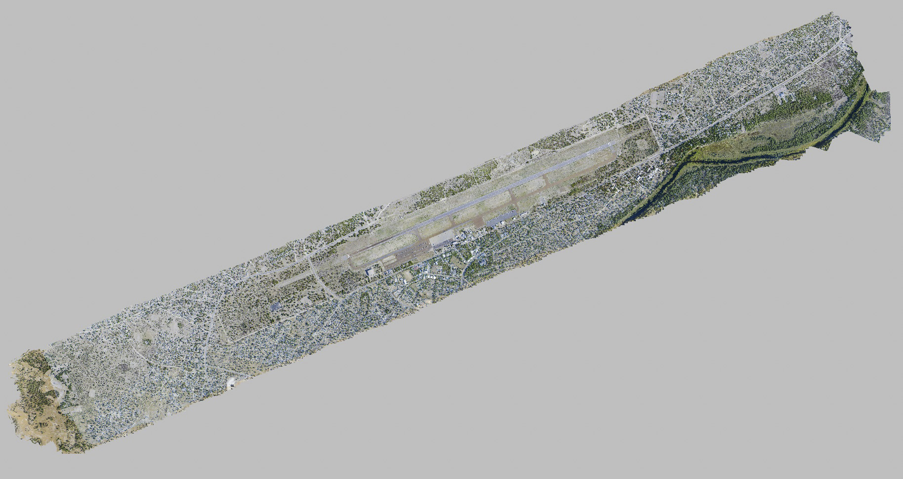
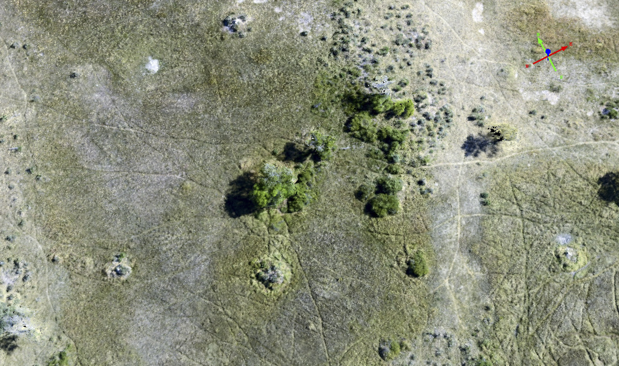
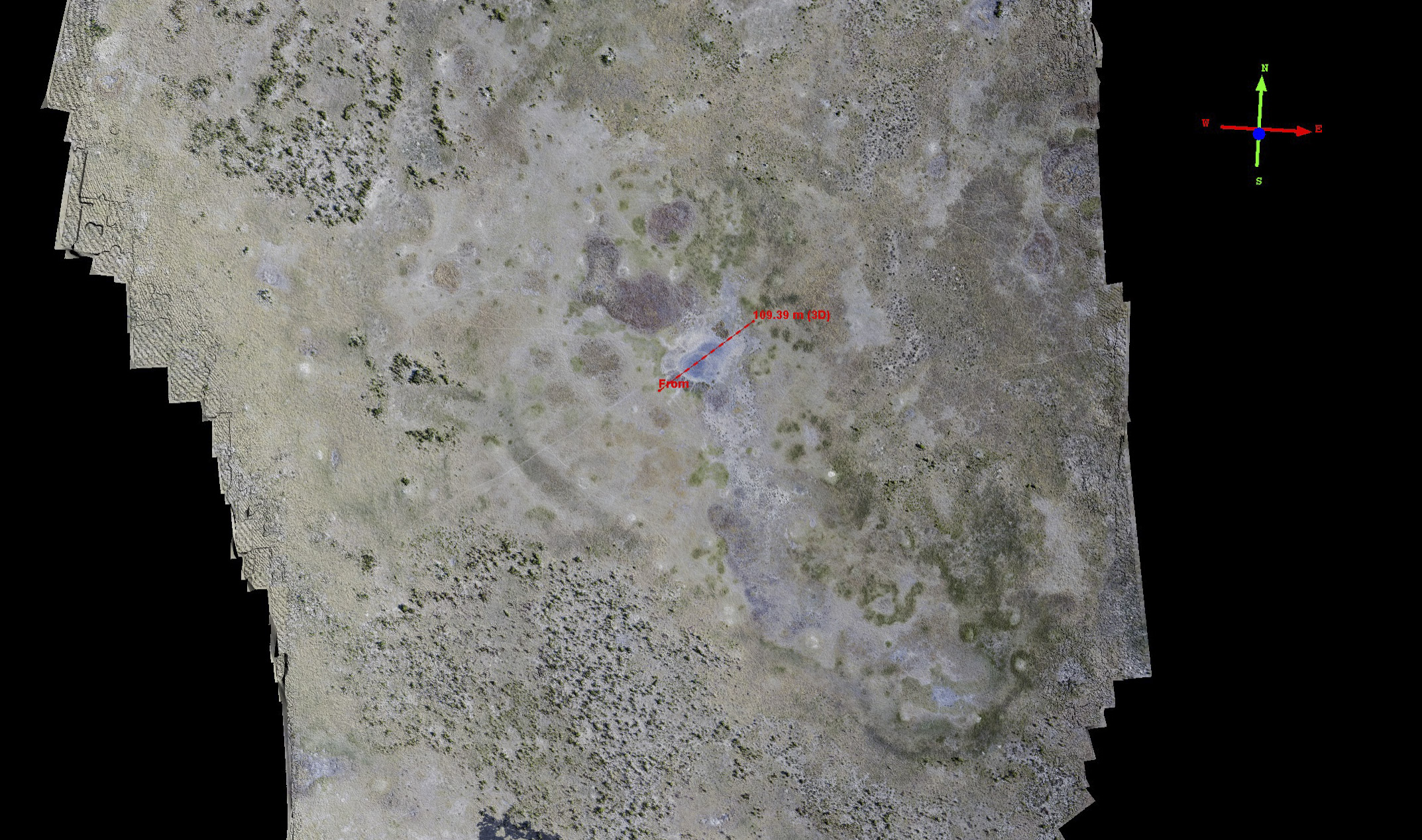
Our next set of experiments for our remaining time in Maun was to acquire some long transects, such as we might do for future research, to determine if there are any unforeseen technical issues and to have some sample data to work with to determine future research study plans. We chose to map the ‘highlands’ between the Okavango Delta and the Linyanti swamps, roughly between Xakanaxa and Selinda. Elephants migrate between these swamps, and this area is not affected by the seasonal flooding coming from Angolan rainwater, as the ground is several meters higher than the swamps. Thus the water found here comes only from the Botswanan rainy season and is stored in watering holes and pans. So we want to know whether fodar can map the shape of these pans in the dry season (when they are empty) so that we can determine their volumetric capacity, whether fodar can map the shape of the trees nearby to these pans so we can monitor the impacts that elephants are having on them, and whether we can use the maps for hydrological modeling, among many other potential purposes.
Overall these experiments worked out great. I found no new issues associated with mapping large blocks, other than solving the normal ones of flight planning for fuel and weather in different ways. I was unable to directly assess data accuracy since I only mapped them once, but none of the qualitative checks I made indicated any issues and visually the data look great, as shown below, and I have no reason to believe accuracy is any different than I demonstrated at the airport.
![]()
Here are our flight lines on the 28th of November, round trip from Maun.
![]()
A bit more detail on those lines. I creatively labeled the left block Transect A and the right one Transect B. Transect A is about 50 km long and B is about 25 km long. I had meant to acquire 4 lines on B, but we simply ran out of time and fuel (ie money) that day. The images were acquired at 15 cm GSD and the orthomosaic and DEM posted at 15 cm and 30 cm respectively.
![]()
Here is Transect A, rotated 90 degrees for convenience, with North to the left. The blue area to the left (North) is the start of the Linyanti swamp. No warps, curls or twists are present in the data, and visual inspection of it looks great. Mouse-over to see the orthomosaic.
![]()
This area between the major swamps is characterized by these ancient stream channels that appear now to be filled with sand. I don’t pretend to understand how they were formed, but they do appear to be old channels of some sort and they support a different vegetation assemblage than the surrounding area. What I found interesting about them while browsing through the data was that some of them are higher than the surrounding terrain and some lower. Mouse-over to see the colorized DEM; the color map stretches about 7m of total elevation change within this scene.
![]()
Here is an example transects over one of those old channels, the elevation profile is below. Mouse-over to see the DEM.
![]()
Here is the profile from the transect in the previous figure. The old channel is about 2-3 m higher than the surrounding terrain. Careful inspection of the data shows that most of the high frequency variations here match up with visual features in the orthomosaic, such as vegetation or soil color. Who knew? Is it useful? Probably to someone. The main point though is only superior data like fodar could pull out detail at this resolution and accuracy, and until we start mapping things with it we will not have the observations we need drive the theories needed for accurate prediction and hindcasting of the ecology here.
![]()
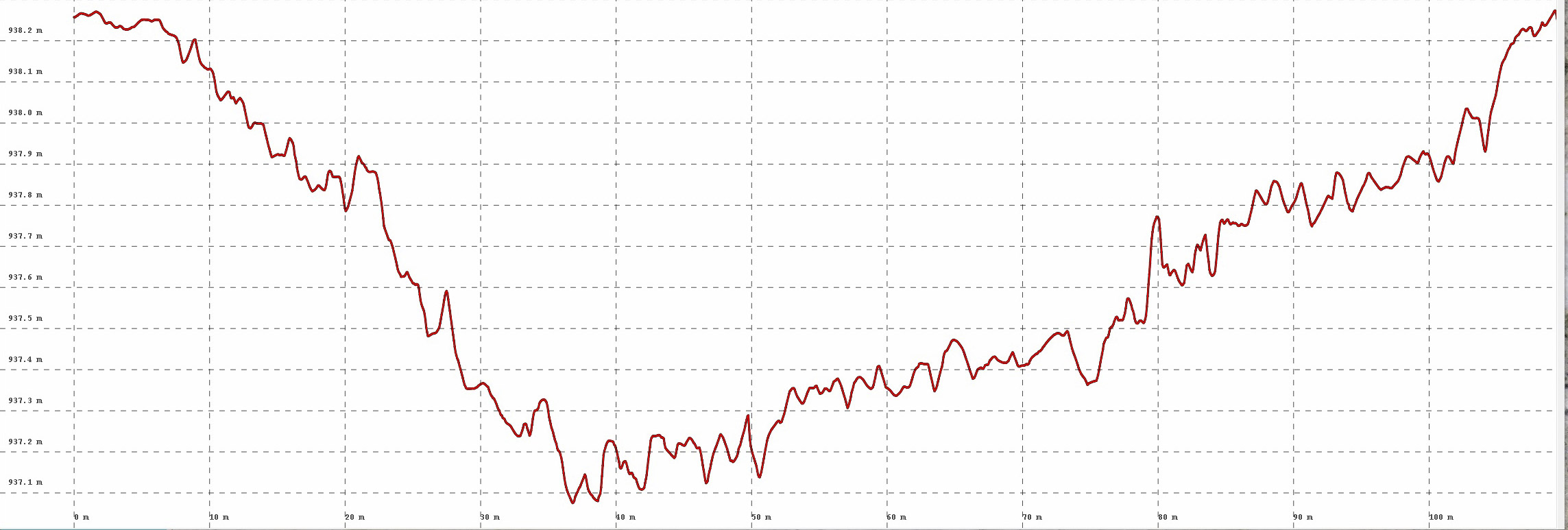
Here is another transect, this time cutting across two pans and a stream channel, with the elevation profile shown below. Mouse-over to see the DEM.
![]()
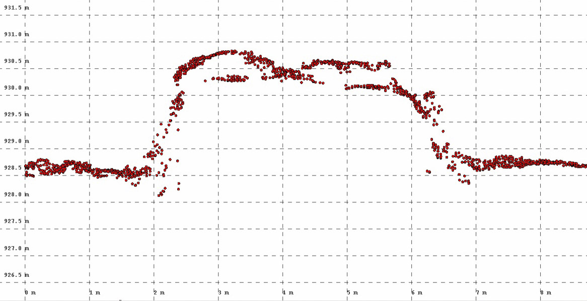
I looked at dozens of these watering holes and found nearly all of them to be about 1.5 m deep. It seems like that could not be coincident, but I haven’t really thought about the dynamics. Here you can see two of them. The red vertical line at left corresponds with the location of the red pushpin in the previous image. The swale near the middle of the plot corresponds with the old stream channel; note that this one is lower than surrounding terrain, whereas the one from the previous transect was higher. The horizontal and vertical grid lines are spaced 1 m and 100 m apart respectively. Though these are small pans, the DEM and the elevation profiles here indicate that their shape is captured well by fodar data and that we will be able to measure their volume.
![]()
This is the northern tip of the block near Selinda. Mouse-over to see the DEM. In the DEM you can clearly see how the unconstrained outer edges of the photos cause spatially-correlated noise to bleed inwards, especially the corners of the photos which show large and sharp changes in color (elevation). This noise is probably only on the order of 10-20 cm in the important inner part of the block, as we saw in the airport study above, but its important to know that it exists when planning a mission or working with uncropped data. This elevation noise has essentially no impact on the orthoimage of this nearly barren ground. The ground here has an elevational range of about 9 m, and the colorized DEM reveals wonderfully details insights into those variations.
![]()
Here I’ve drawn a transect across a piece of the swamp to reveal its topography numerically and give an example of data quality there. By making maps like this in dry season, we can use numerical models to fill these basins with water to determine their volumetric capacity, something not possible with current data sets from this region of Africa. The profile itself is shown below. I believe that the scars perpendicular to the main water channel are game trails, probably created during high water by elephants and hippos.
![]()
I placed the pushpin at the edge of the swamp, where you can see a change in vegetation. This vegetation change corresponds to an elevational change, as indicated by the vertical red line here. The horizontal and vertical grid lines are spaced 20 cm and 20 m apart respectively. Careful inspection of the higher frequency variations here using this method indicated to me that most of these variations are real, and on the centimeter level.
![]()
This is what we glaciologists call termitemoundogenesis. I’m not sure what real scientists call it. But the general idea is that termite create homes for themselves that can be several meters in diameter and several meters high. Seeds take root here and begin growing, despite the best efforts of the termites, who eventually abandon the mound and let the vegetation take over. This initial mound becomes an island during the floods, and gradually the vegetation starts creating soil, leading to more vegetation, more higher ground, more termite mounds, but somehow the process creates salty ground which kills the vegetation near the center of the island and pushes it outwards, which leads to the process repeating itself and creating larger and larger islands, which is what I believe we are seeing here. My understandings is that the majority of higher ground within the Delta was created with this process over some period of time. Not sure that’s millenia or centuries or years, but fodar maps today can snapshot that process for future comparisons, as these data only get more valuable over time.
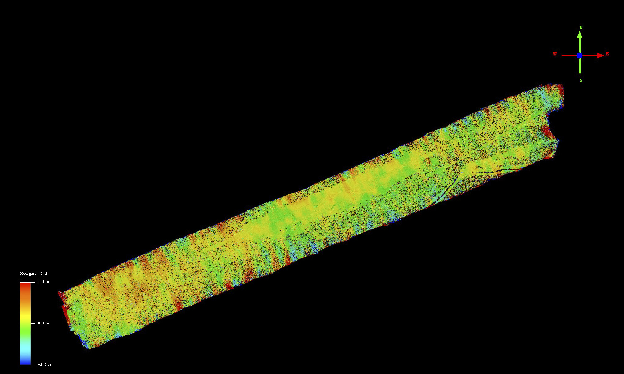
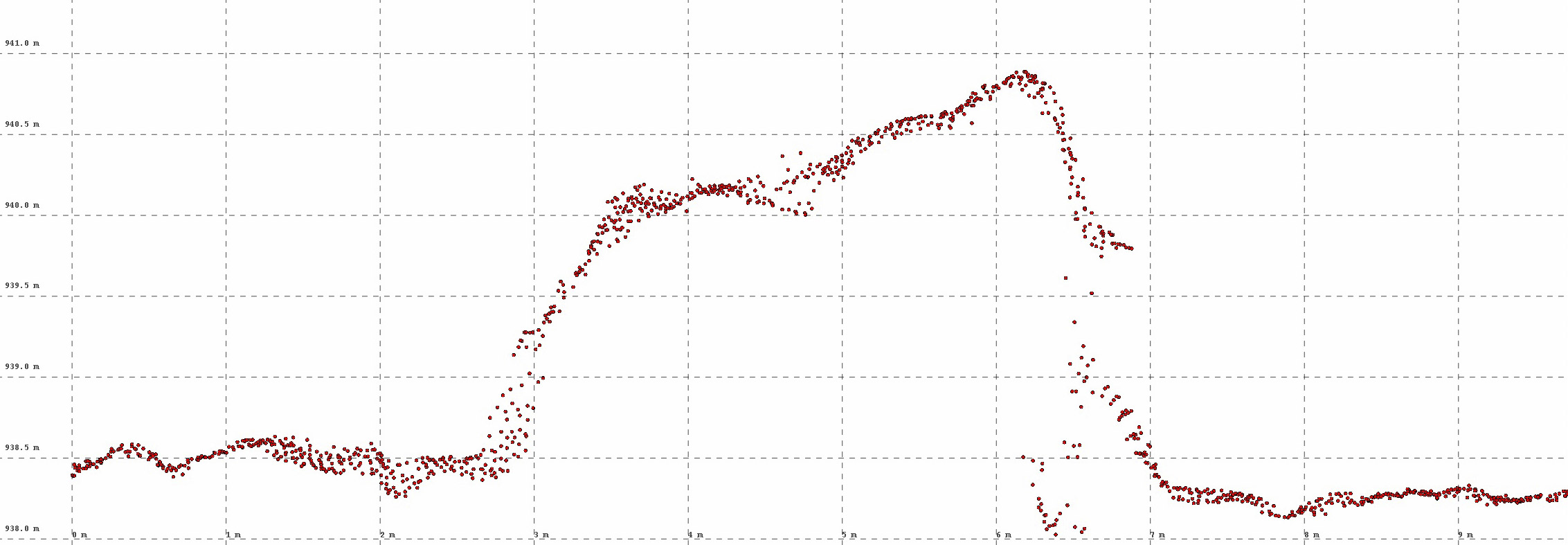
![]() Here is Transect B. Mouse-over to see the DEM. While there is a slope to the DEM (as denoted by the colors), careful inspection shows that this is not a ramp caused by an artifact of processing, but simply the terrain gradient leading down to the Delta in the south. After several hours of fooling with the data in 3D, I observed nothing suspicious in terms of data quality, though only using 2 flight lines to create this block did lead to a higher overall percentage of spatially-correlated noise.
Here is Transect B. Mouse-over to see the DEM. While there is a slope to the DEM (as denoted by the colors), careful inspection shows that this is not a ramp caused by an artifact of processing, but simply the terrain gradient leading down to the Delta in the south. After several hours of fooling with the data in 3D, I observed nothing suspicious in terms of data quality, though only using 2 flight lines to create this block did lead to a higher overall percentage of spatially-correlated noise.
![]()
Transect B was acquired later in the afternoon, when our clear blue skies gradually began turning over to partly cloudy, creating strong shadows. In this case, the two shadows seen here are from the same cloud but on different flight lines. Not that that really matters, I just thought it was cool. The important point is that the cloud did not affect the DEM, which can be seen by mousing over the orthomosaic.
![]()
Here is another cloud example, this time a bigger and darker one. Again, I could find no impact on DEM quality.
![]()
Transect B had numerous small water holes, almost all dry or nearly so. Here is one of them. The figure below shows the same pond, but zoomed closer in, and beneath that is the elevation profile.
![]()
Here is the same pond as above, zoomed in further. Mouse-over to see the DEM. Notice that with this color map, which stretches only 2 meters, you can see how the green-blue transition in the DEM matches perfectly with the vegetation transition in the orthoimage. Thus one could use either method for determining the pan’s shoreline. In any case, the basin’s shape is clearly being measured here.
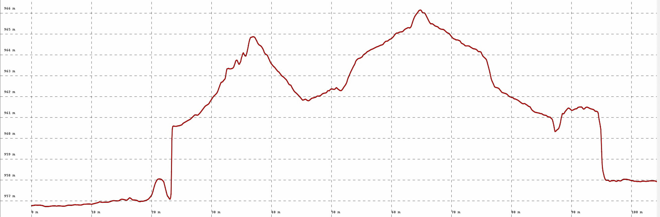
![]() Here is the elevation profile from the previous figures. The pan is about 1.5 m deep, about the same as almost all of them, with horizontal grid lines spaced 20 cm apart.
Here is the elevation profile from the previous figures. The pan is about 1.5 m deep, about the same as almost all of them, with horizontal grid lines spaced 20 cm apart.
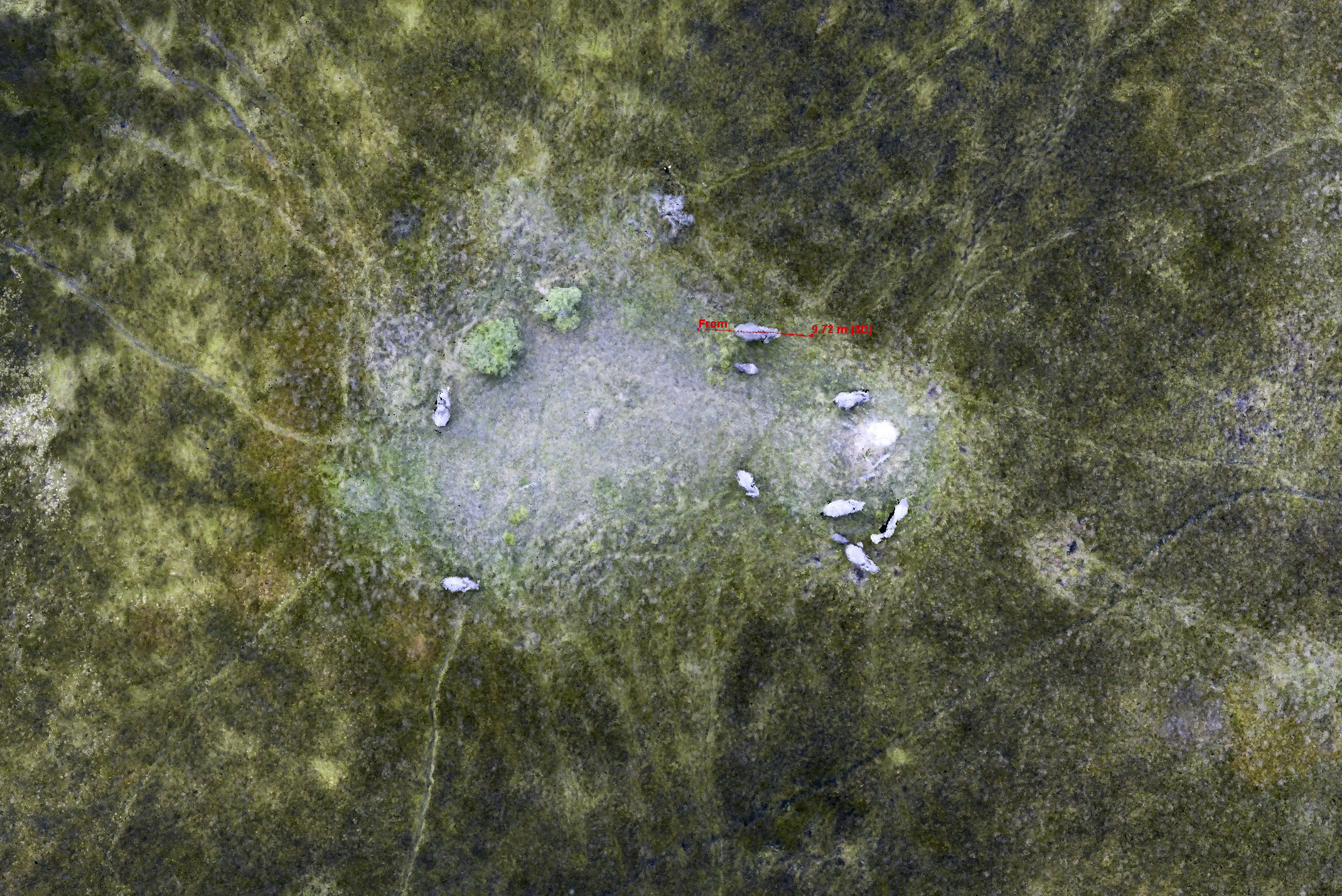
![]() Here is another pan. Mouse-over to see the DEM. At first I was not convinced that the feature in the center is real, it has the mottled appearence of water-induced noise, but I didnt see any water. I also noticed while flying over it that there was a red patch on the south side of it. I’m not sure what it is, but I noticed it inside several other pans — dead catfish? The elevation profile is below. Note the pushpin on the safari two-track road and that this road is clearly visible as topography within the DEM.
Here is another pan. Mouse-over to see the DEM. At first I was not convinced that the feature in the center is real, it has the mottled appearence of water-induced noise, but I didnt see any water. I also noticed while flying over it that there was a red patch on the south side of it. I’m not sure what it is, but I noticed it inside several other pans — dead catfish? The elevation profile is below. Note the pushpin on the safari two-track road and that this road is clearly visible as topography within the DEM.
![]()
Not only are we measure pan and road topography, but fodar can actually see the tire ruts on that road, as denoted by the red vertical line here, with the ruts having an amplitude of about 10-15 cm.
![]() Here is that same lake as above, this time focusing on the trees. The trees have strange shapes in a DEM, because DEMs cannot handle overhanging branches, there can only be a single elevation value for each pixel, so this has nothing to do with fodar. For tree structure investigation, working with the point cloud may be a better option, but for simply determining whether a tree has been pushed over or not, the DEM works fine. Mouse-over to see the DEM, and see below for the elevational profile.
Here is that same lake as above, this time focusing on the trees. The trees have strange shapes in a DEM, because DEMs cannot handle overhanging branches, there can only be a single elevation value for each pixel, so this has nothing to do with fodar. For tree structure investigation, working with the point cloud may be a better option, but for simply determining whether a tree has been pushed over or not, the DEM works fine. Mouse-over to see the DEM, and see below for the elevational profile.
![]()
Here is the profile of the two trees measured on either side of the pan, showing them to be 11-12 meters tall.
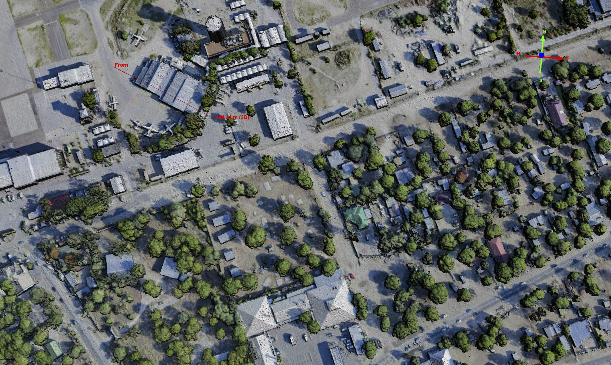
Using any airborne remote sensing data means being able to interpret what you see in those data for what they actually are on the ground, so I coupled my safari experiences and airborne transects so I could give that a try. Experienced African ecologists and earth scientists would likely immediately grasp what they are seeing from the data, but I thought it wouldn’t hurt to do some ground truthing of my own, if for no other reason than to become a better African earth scientist myself. Here I’m going to compare the mapping we did over the Boro River to a mokoro trip we took leaving from Boro village.
The movie below starts at village and mokoro dock and flies up the river to where we took a hike. This movie is made from the fodar point cloud.
Here you can fly around on part of the Boro River fodar DEM on your own. You can also turn my data layer on and off to compare to the Bing satellite layer, to see differences in time and quality. In the upper left, notice the Views and Assets tabs, fool around with those. For 3D navigation, you will need a mouse. Click and drag the left mouse button to move spatial, use the scroll wheel to zoom, and click and drag the scroll wheel to rotate.
Here is the orthomosaic I made for this stretch of the Boro River, starting at Boro village in the south, with geolocated photographs I took along the way shown as purple cameras.
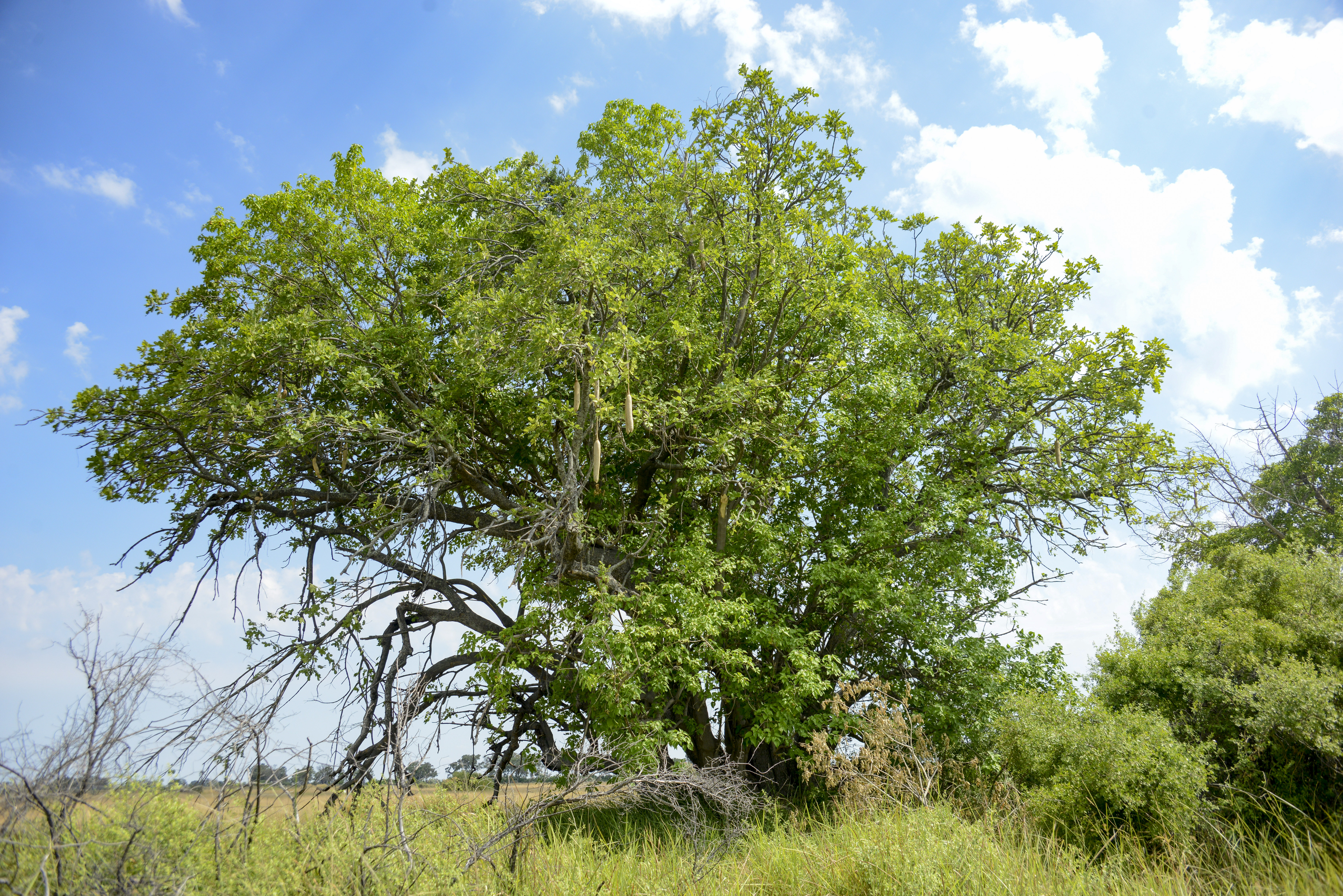
Here is a Sausage Tree from the ground.
 Here is that same Sausage Tree in a fodar point cloud, from about the same location and perspective.
 Here is that same Sausage Tree from above, at center. Mouse-over to see the colorized topography, noting that not only do the tree jump out but also more subtle features like game trails.
 Our hike from the river took us through some swampy areas.
 Not sure why we didn’t just walk around the puddles than through them. People are just like cattle I guess…
 Found a family of giraffe hanging out with zebra under another Sausage Tree.
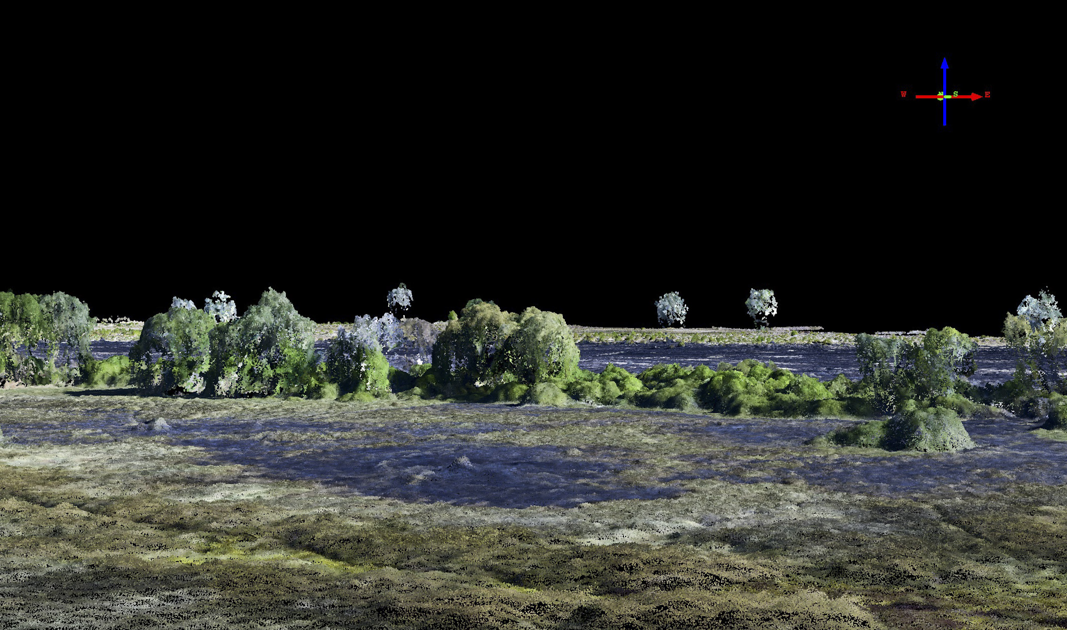
Here is that landscape in the fodar point cloud. Mouse-over to see the colorized terrain.
Here is that landscape in the fodar point cloud from above. Mouse-over to see the colorized terrain. Note the burn scar behind it.
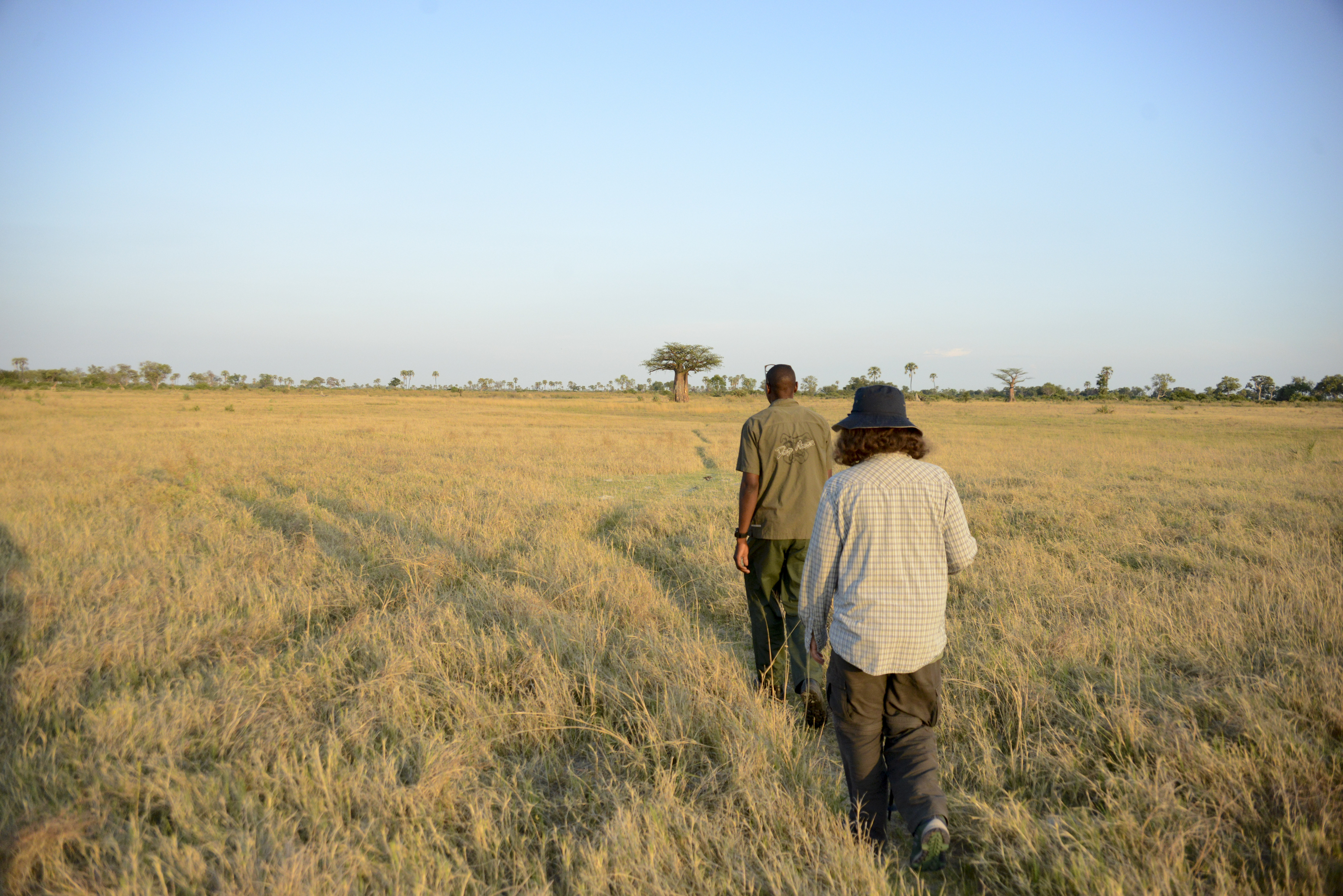 We found several baobob trees on our hike. This was the largest, set off on its own. Note the elephant trail we are walking on.
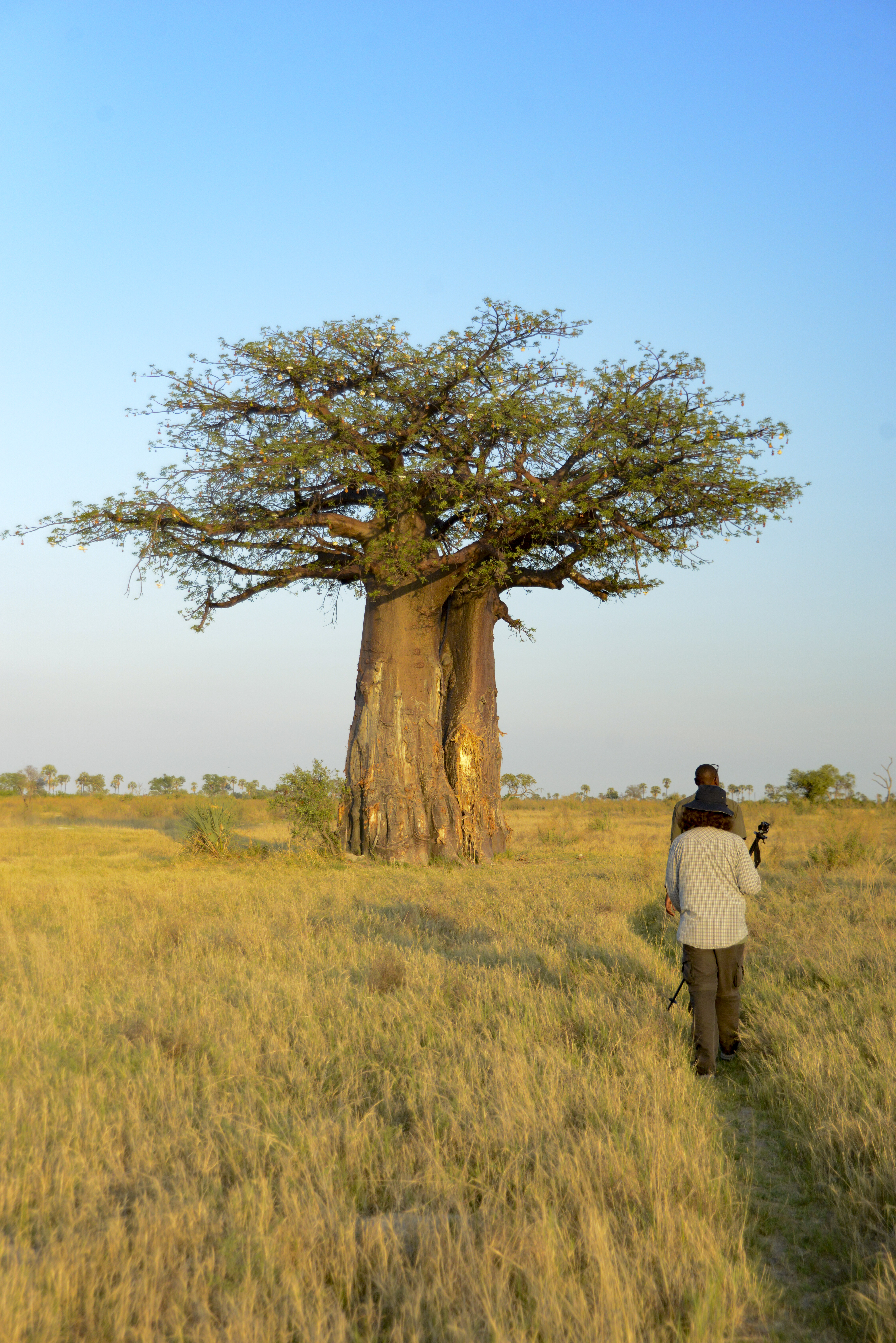 It was a magnificent tree, and in bloom. Apparently the elephants like to rub up against it, but I think they’d have a hard time knocking this one over.
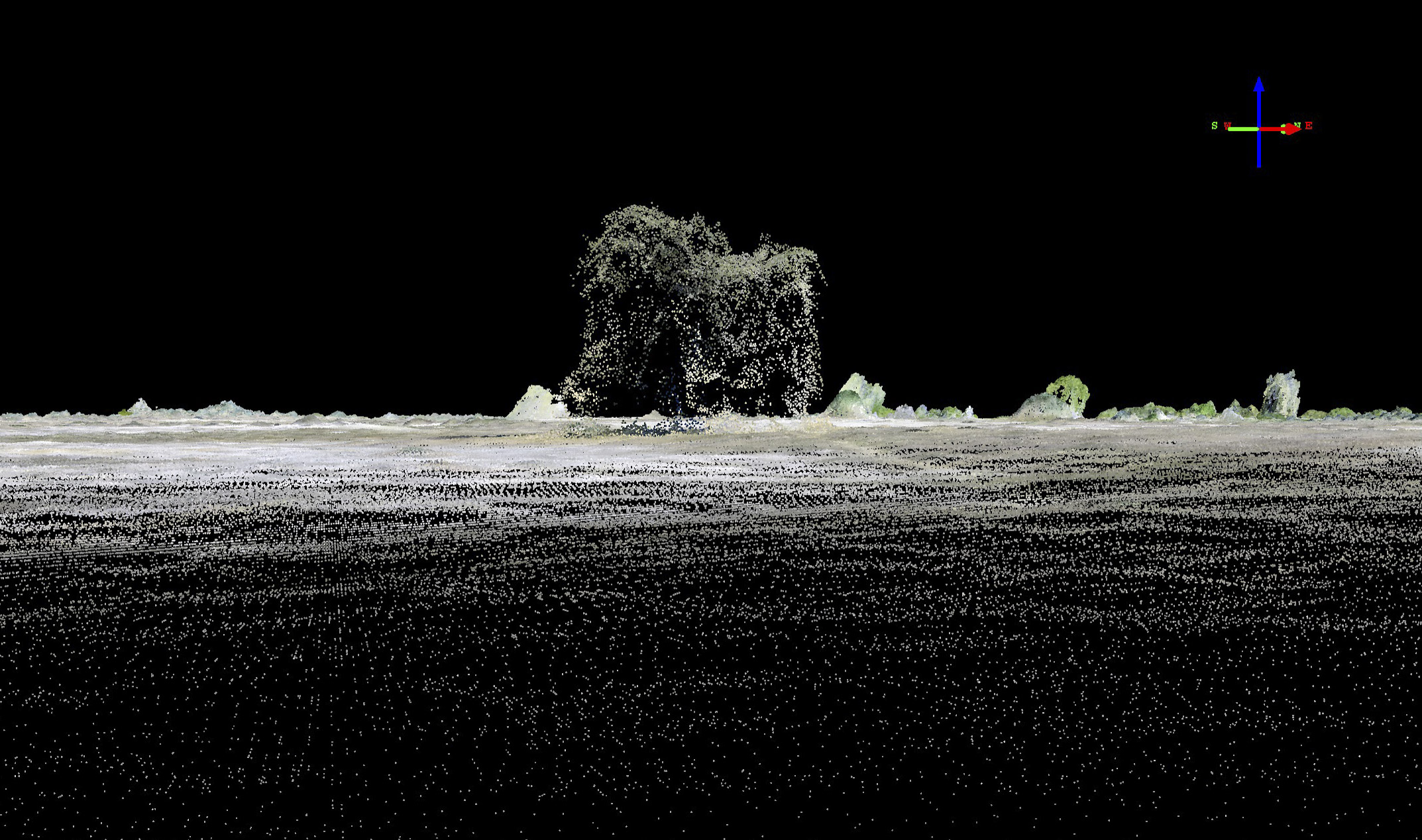
Here is that baobob in the fodar point cloud.
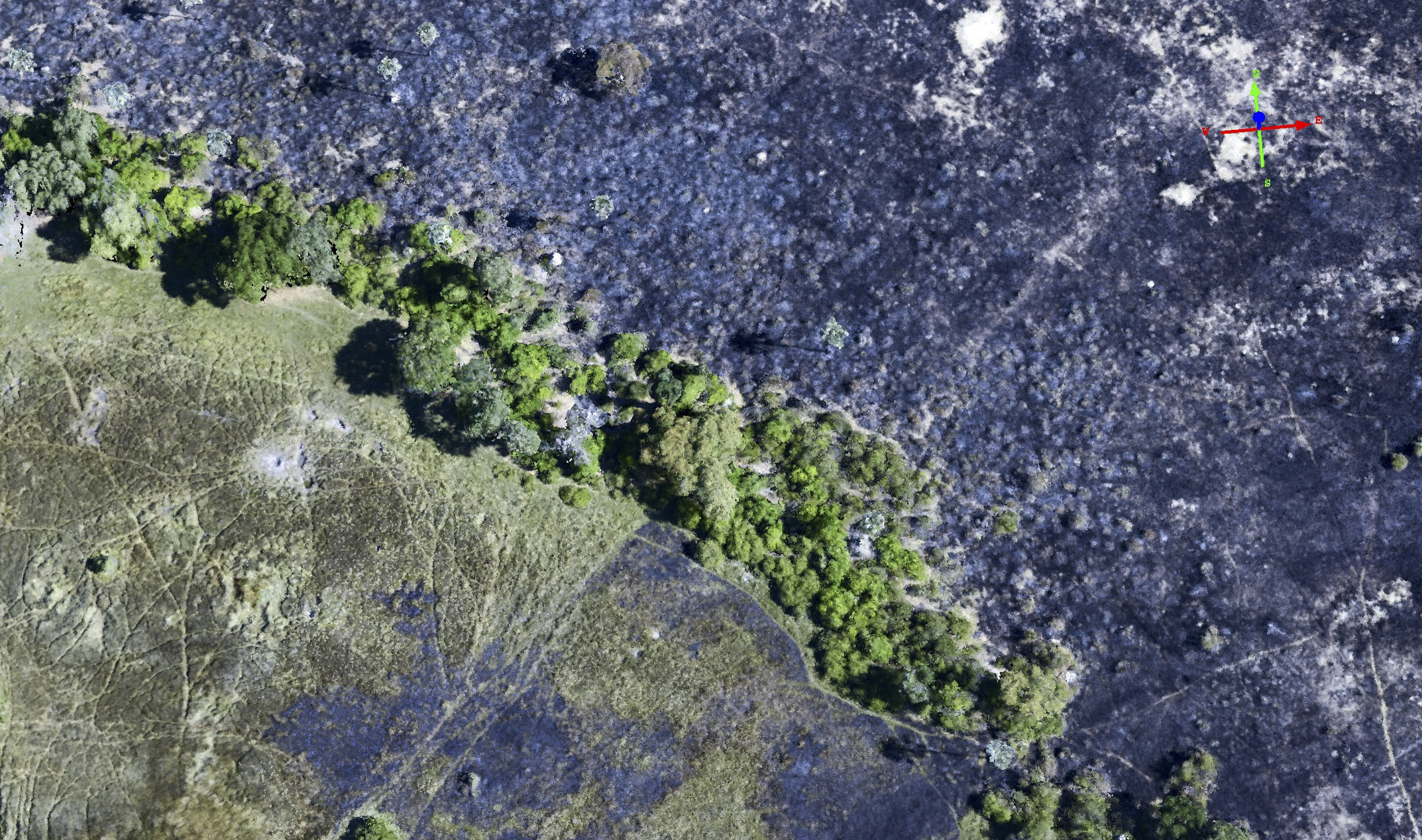
 Here is a top view of that same baobob. Even though you can’t make out the branch structure from the points of the point cloud, the fodar data still contains a wealth of information about structure in the shadows it captures. Note too that the game trails we walked on (leading to the tree from the bottom of this image) are clearly resolved in the topographic measurements (mouse-over).
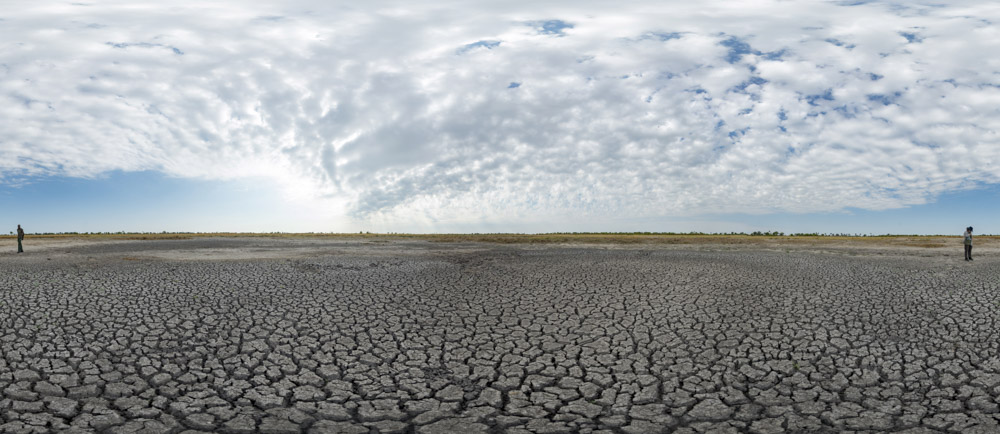
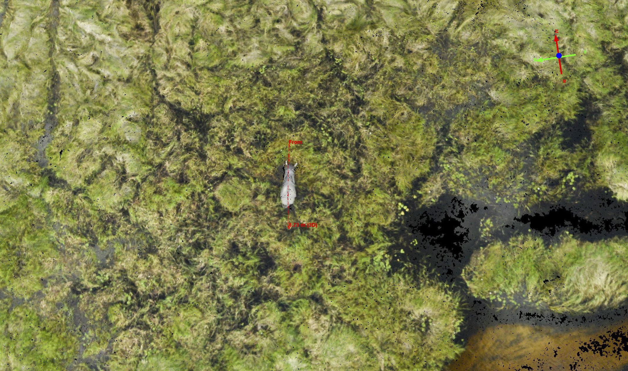
Here is a dry pan we came across. Click on the image to see it as a 360 degree panorama. You can see the relief here is subtle, less than a meter or so.
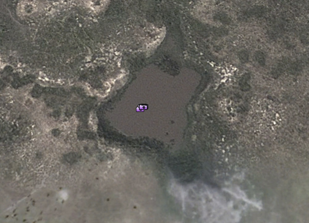
Here is that same pan, seen here in Google Earth filled with water. Mouse-over to see the fodar version taken in the dry season. With this Google Earth image, we would be able to extract the shoreline of the pan, then combine that shoreline with the fodar data (which essentially maps the bathymetry of the empty pan, example below) to determine the volume of water seen in the Google Earth image. That is, if we use fodar to map all of the pans in Botswana in the dry season when they are empty, all we need is a photo of the lake to determine the volume of water in that pan at the time that photo was taken. Perhaps more importantly, with this same fodar data we can model the volume of these pans so that, for example, we can determine whether they will evaporate completely or not given a future weather scenario, which would presumably aid in a variety of wildlife ecology studies.
 Here is that pan in fodar. When you mouse-over, you will see that this pan is part of a larger depression. The color bar here is set to show only 3 m of relief between red and blue, so these terrain features are subtle, but their features fully resolved. This dry season topography essentially become pan bathymetry during the rainy season. With this topography, therefore, we could determine how much rain is needed to fill the basin completely.
Here is the elevation profile from that pan. The horizontal gridlines are only 10 cm apart, with a total relief of about a meter.
Oh, and one more thing…
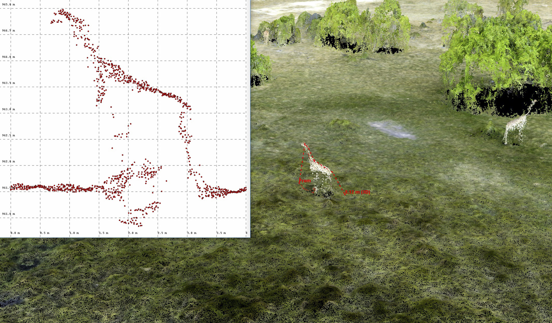
Remember that photo of the tusker from the first day?
Mouse-over to see him in 3D, tusks and all…
That is his profile.
 Here are some of his girlfriends. Mouse-over to see their lovely shape, as well as the tracks they leave behind.
 With fodar, anything on the terrain becomes part of the map.
Just to clarify, this not some drone video — this is a 3D visualization of fodar data of a small herd of elephants.
And its not just elephants that fodar can map, but giraffes, zebra, wildebeest… Speaking as an expert glaciologist, I’m thinking these were most juvenile and female giraffes, I couldn’t find any taller than about 3.5 meters.
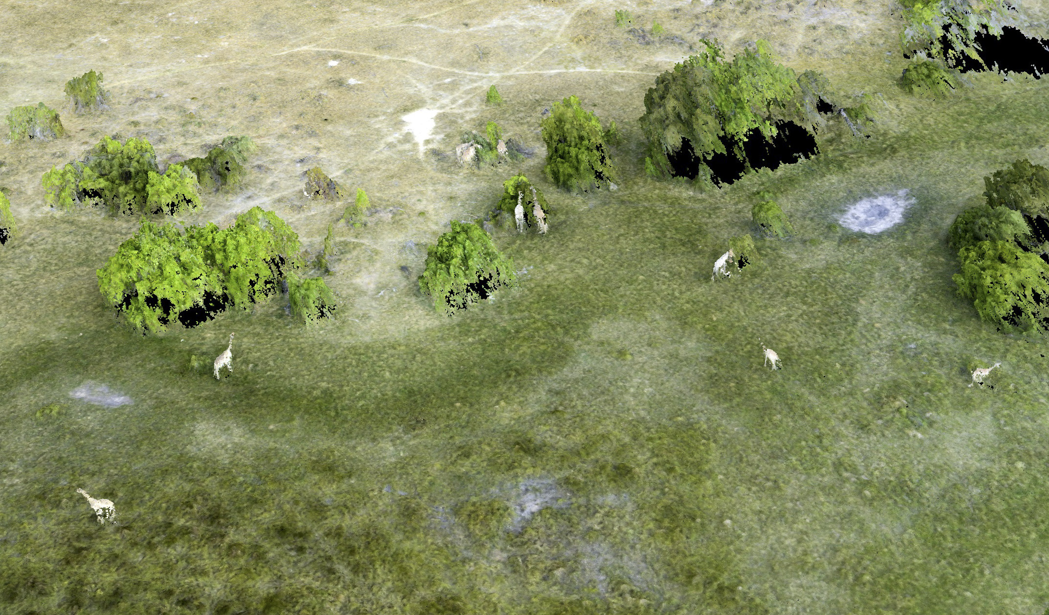
Not only can we measure the topography of what giraffes are eating, but the topography of the giraffes themselves while they are eating it. Imagine game counts the fodar way…
I could not have asked for a more successful test of fodar in Botswana, or for a better experience there in general. Botswana appears to be an island of stability and sanity in an otherwise unstable region. We made some great friends and colleagues there and already had one come to visit us in Fairbanks. Both Turner and I look forward to returning there for work and pleasure.
During this trip we seem to have overcome all of the major technical and logistical challenges and this points to a bright future — we have tested the system fully in locally available aircraft and the data are superb, more than sufficient for all of the projects we discussed while there. Data accuracy seems to be better than 20 cm, which is sufficient for pulling out change detection signals on the centimeter to decimeter level or higher and I see no technical or logistical reasons why we could not map huge areas of Botswana. Indeed, after some back of the envelope calculations talking with the owner of Helicopter Horizons, Andrew Baker, we calculated that using his entire fleet flying en echelon we could map the entire Okavango Delta in a single day. That would of course require 10 acquisition systems, but even so these 10 fodar systems cost less than a single lidar system, which was the state-of-the-art until fodar came along. Why not think big? Mapping the Delta several times per year like this would open up a watershed of new scientific and land management possibilities, including accurate game counting. For that matter, the entire country could be mapped in this manner, ranking Botswana as having the highest resolution and most accurate maps of any country in the world.
To think even bigger, what’s really happened here is not simply that I’ve demonstrated fodar works great in Botswana, but that it will work great anywhere in the world, as this was the first time I tried it outside of Alaska. In some sense, the Botswana GPS infrastructure is worse than Antarctica’s, so if works in Botswana I’m confident that it will work anywhere. While Botswana’s earth science, ecology, and land management issues may be unique to Botswana, every country has its own unique scientific, ecological and land management issues. Often these problems are not about what questions to ask or how to answer them, but rather how to fund those answers. Even US land managers and earth scientists face this problem — there is simply not enough funding, manpower, or political will from our government to make rational, science-based decisions on the conflicts between conservation and development of public lands. Without taking any sides, if development is going to happen, I believe it should only be allowed to happen responsibly. In many locations, Alaska included, our official topographic maps are 50 years out of date and most of newer ones made since then are not nearly this accurate or useful, and the situation is similar around the world. Scientists from smaller countries who’s governments are struggling with just keeping it’s people fed or from killing each other have an even harder time. This is where fodar can help. It’s a low cost method to figure out what our current topographic situation is so that we can track how it is changing in the future. Without such information, our ability to detect problems or make responsible course-corrections to infrastructure developments on or surrounding public lands is severely hamstrung, and history can attest to the fact that most problems are not discovered until it is too late to prevent them from becoming permanent or ridiculously expensive to solve. So for me this case study was more than just about helping Botswana, which was a great enough goal on its own, but as a case study. That’s why some friends and I funded this project out of own pockets — we believed that we could play a role in making the world a better place by putting this technology into the hands of scientists and land managers in this situation across the globe. So this project was the technical validation I needed before moving forward with those plans, and I hope you will agree that the future seems quite bright.
Camp Xakanaxa was our last lodge on our Desert and Delta’s safari tour. Thanks to our guides Calvin, Slodge, and Zak and all of the staff at Deserts and Deltas, including Oscar the hippo, for making us feel welcome and giving us an education we could get no other way! And special thanks to Andrew and Barry and all the staff at Helicopter Horizons for being so patient, friendly, and accommodating with the mad professor from America, it was our great pleasure to work with you!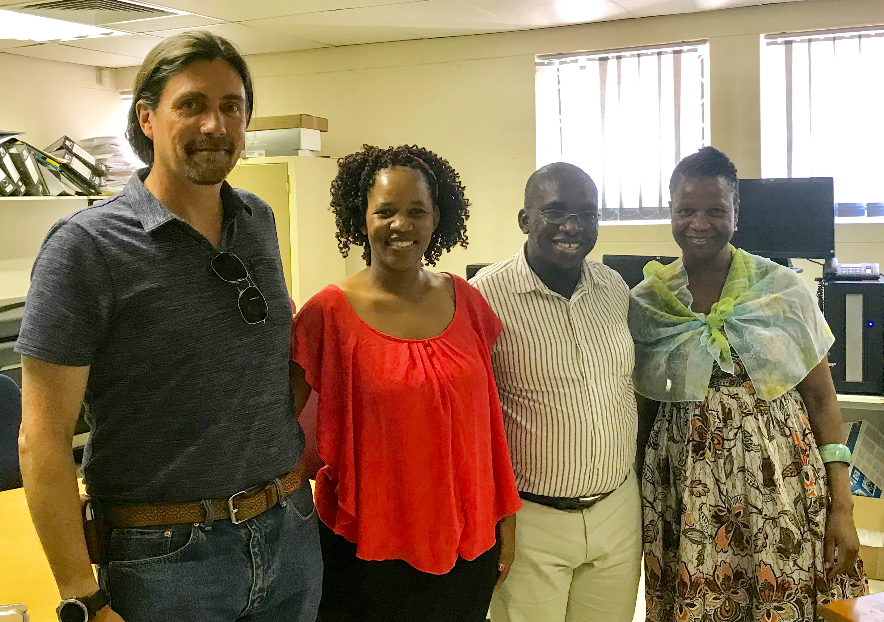 And of course a very special thanks to my hosts at ORI — Anastacia, Masego, and Kele! None of this would have been possible without your interest and hospitality!